Roger Oddone, a senior graphical designer at Google, has provided a rare look behind the scenes at Google’s design principles, putting the company’s Visual Assets Guidelines online (via Gizmodo). The aim of the documents is to create a …
solid, yet flexible, set of guidelines that have been helping Google’s designers and vendors to produce high-quality work that helps strengthen Google’s identity …
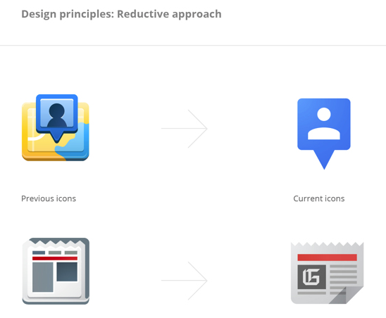
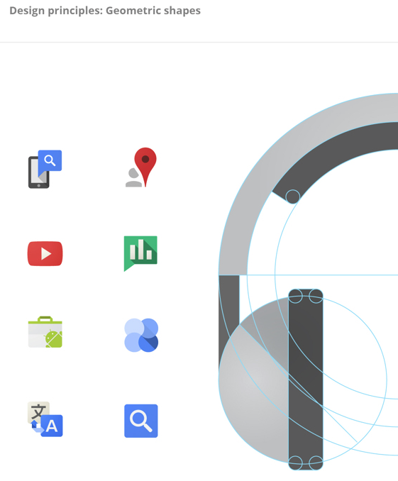
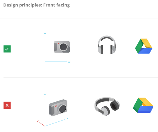
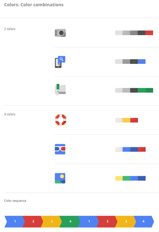
Work on the guidelines for product icons and logos and user interface icons and illustrations began in January 2012. Prior to that, Google very much prioritised function over form.
You can see a few of the slides below, and view the complete documents at the links above. Overall, the approach favours simplicity, though not quite the flat and minimalist approach adopted by Microsoft in Windows 8 and expected to be adopted by Apple in iOS 7.
FTC: We use income earning auto affiliate links. More.


Comments