After officially unveiling the device yesterday after months of speculation, LG has today shared an infographic in which it breaks down all of the specifications of its G4 flagship. The image, seen below in its entirety, highlights the camera features of device, which LG went on about for an extended period of time during the unveil.
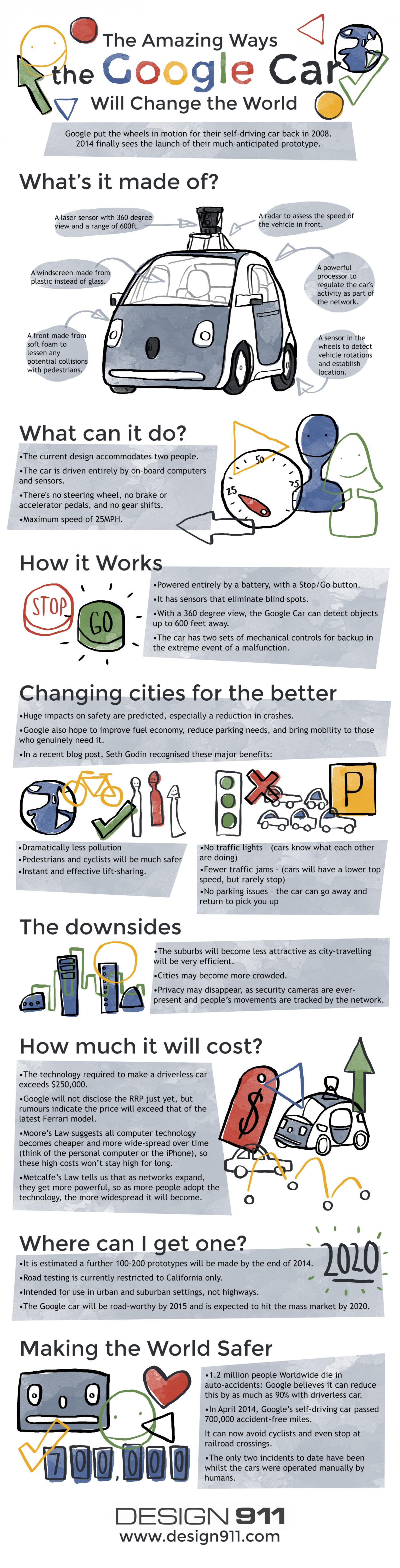
This neat infographic from visual.ly explains Google’s plans for self driving cars. The diagram details that cars will be have a soft foam front to cushion impact if it hits a pedestrian, a laser sensor with 360 degree view, front windshield made of plastic rather than glass, and much, much, more.
LG published an infographic this afternoon that details the history of smart- (and not-so-smart-) phones. The chart covers major jumps in cell phone technology from 1992 when the first SMS message was sent, all the way to 2013 when LG launched the G2 handset.
The chart also contains some interesting survey results about where people use their smartphones (an example of which is seen above), and a look at LG’s next-gen phone, the G Flex. The phone’s hardware is detailed and benefits like improved battery life and “more accurate selfies” are explained.
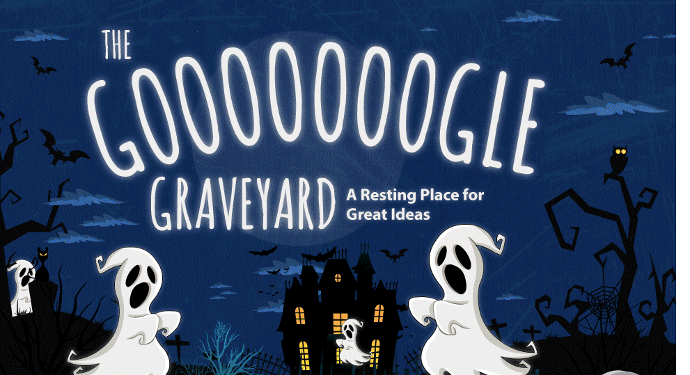
It’s no secret that Google has a tendency to buy a lot of companies and it is now getting a reputation for shutting a lot of products down. In fact, we’re just a few days away from its biggest closure to date in Google Reader. iGoogle, the customizable Google homepage, is also set to shut down this November. Earlier this year, the company closed up Google Talk and replaced it with Hangouts. Google has always said, however, that it “celebrates its failures,” and there have sure been a lot of them. Marketing company WordStream has put together an infographic breaking down all the services Google has closed up, including the dates they were shut down…then be sure to check the new companies Google has been buying up below… Expand Expanding Close
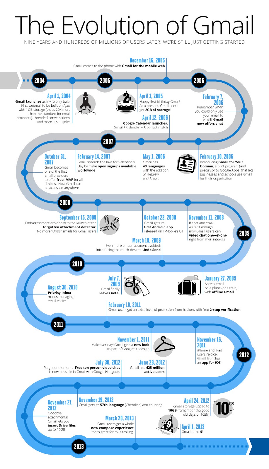
Gmail is officially turning nine years old this month after originating as a project created on an employee’s spare “20% time” and launching on April 1st as an invite only beta in 2004. To celebrate, Google has put together the info graphic below showing some of the milestones for its massively popular email service:
While it might feel like yesterday in comparison to the other browsers, Chrome is celebrating its third birthday this month after having launched the Windows beta in September of 2008. In celebration, Google has posted an interactive HTML5 graphic charting innovations of Chrome that you can check out here.
They’ve also posted some of Chrome’s highlights over the years including innovations in prerendering technology, the Chrome Web Store, hardware accelerated 3D CSS, and the launch of the Chromebook.
Chrome has come a long way in just three short years, having released support for Mac and Linux a year in with its sixth release, and not long after moving to a six-week release cycle. Recent stats have Chrome steadily growing in market share and recently benchmarked as the fastest browser for real world use. Expand Expanding Close
Call it a mobile platform heat map of sorts, but we love it. Mobile ad firm Jumptap is out with their July 2011 report analyzing ad-tracking data of about 83 million users on its ad network. The above info graphic immediately captured our attention (viaGigaOM) because it tells the story of the iOS vs. Android war in an electoral manner that evening newscasters had trained us to get. As you can see, iOS is doing pretty well in the Northeast and Midweast states, while Android leads in the South and Southweast parts (no, we ain’t making any conclusions here).
Also, Hawaii is a state that falls in the iOS camp, and Alaska over-indexes for both Android and iOS. One word of warning: That pretty chart is sourced from a limited selection of people on Jumptap’s ad network rather then actual sales numbers so the usual caveats apply. One other surprising factoid:


")