redesigns

See All Stories

Blogger’s revamped interface goes live for everyone, more face-lifting underway
Site default logo image

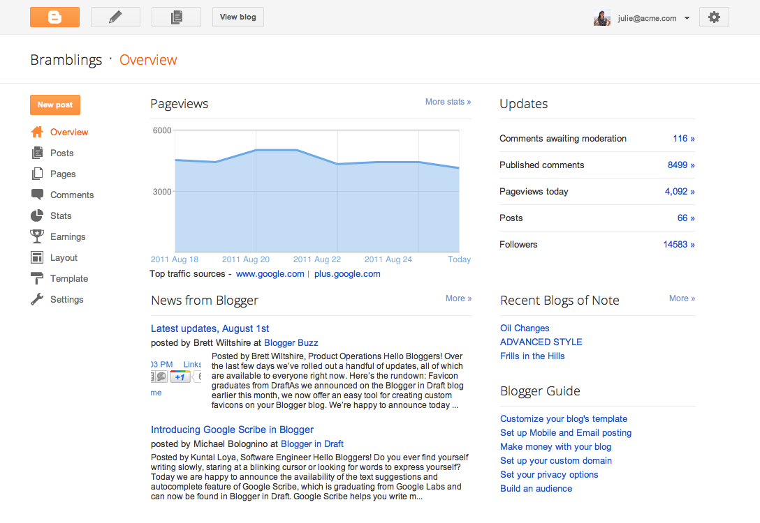
Google embarked on a Blogger redesign back in July, part of a broader push to update the look and feel of their many services that now resemble the clean, elegant appearance of the Google+ service. The revamped UI today went live for everyone, the first in a “series of major updates” due over the course of the coming months, Blogger product manager Chang Kim wrote in a blog post.

Thorough changes are evident in all parts of the Blogger interface, from the post editor to Dashboard. Code has also been optimized and parts of it rewritten from scratch, mainly the editing and management experience.

We here at 9to5Google are all for Google’s new design language stemming from the work of the original Macintosh designer, Andy Hertzfeld. Design-wise, Blogger never felt like a Google service. Updating the Blogger interface to conform to the broader design changes in other Google’ products makes sense from the usability point of view, and especially if you live in a Google world. The new design has to be enabled manually in your dashboard, mind you.

Expand
Expanding
Close

Revamped Google search layout revealed

Site default logo image

Digital Inspiration reports Google is testing out a new search page design created specifically for tablets, but likely to make its way onto desktops as well. The new tablet-optimized search home page puts forth a cleaner layout with new visual features recently applied to Gmail, Calendar and their other properties. Old graphics is gone and replaced with a Google+-like appearance, along with the black Google navigation bar at the top that recently appeared on desktop.

A brand new thing: The top row of icons for filtering down search results by type (images, news, web, etc.) has been replaced with the traditional lefthand column with search tools, still present on desktop. Does this change signal the new design for search silos across desktop and mobile? If Google’s recent focus on consistency in design is an indication, than the answer should be a resounding ‘yes’. Google has not officially rolled out the new design, but we’re expecting them to make an announcement soon. Another screenshot right below the fold.

Expand
Expanding
Close

Black navigation bar live on Google.com, coming soon to Maps, Gmail and more

Site default logo image

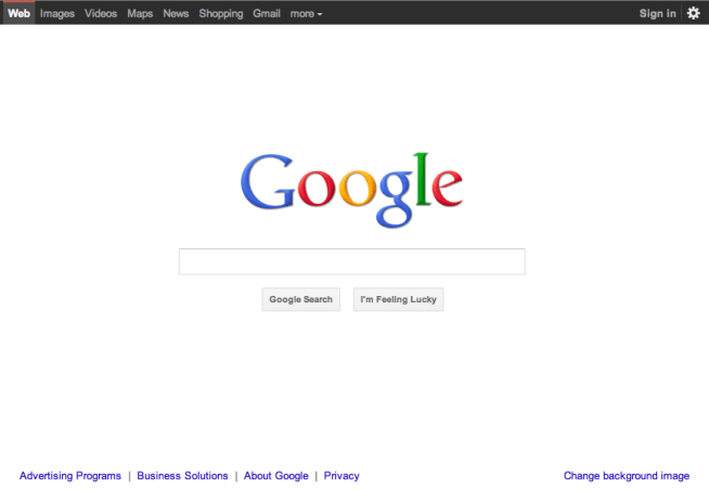
Search Engine Land discovered Monday that Google is experimenting with a brand new black navigation bar. Today, the revamped bar goes live for some as the company gradually rolls out the changes to everyone. The search firm rarely messes with its legendary homepage design, so their creative director Chris Wiggins lays out in a post over at the official Google blog the main principles behind the redesign. It’s about focus, elasticity and effortlessness, he explains:

We’re bringing forward the stuff that matters to you and getting all the other clutter out of your way. Even simple changes, like using bolder colors for actionable buttons or hiding navigation buttons until they’re actually needed, can help you better focus on only what you need at the moment.

He says the new design lends itself to a consistent visual experience across desktop and mobile, “without sacrificing style or usefulness”. Google says a crucial part of the new experience is the use of the latest technologies like HTML5 and WebGL so “you have all the power of the web behind you”. They will roll out the new bar over the course of the following months to other properties, including Google Maps and Gmail.


The original Google.com homepage in 1997.


Expand
Expanding
Close