
More than ever in the time of COVID, Slack is a valuable tool for communication at work. As with any work tool, little changes don’t usually go unnoticed as users settle into the things they’re used to. That’s why some of the most recent Slack updates, at least on Android, have been absolute torture as subtle tweaks to fonts, spacing, and notifications leave us scratching our heads.
Rolled out in late January, Slack for Android made a very annoying change to its font and, more specifically, the spacing between lines and words. In older versions of the app, Slack left spacing between different messages mostly uniform, keeping information fairly dense. After pushing a later update, the spacing changed, making the size of the sender’s name larger and pushing the message itself slightly closer to that. After that first message, and subsequent messages left an abnormally larger gap between.
It’s a minor tweak for sure, but one that didn’t go unnoticed. On a Twitter thread, some users called for the change to be rolled back or at least be optional, but Slack confirmed it was not an optional change. They did accept feedback, but it doesn’t seem like anything is changing. After a couple of weeks, it still annoys me daily, and when looking at the comparison below, our own Abner Li appropriately called it “density hell” as it literally cuts off two messages on my Fold 2.

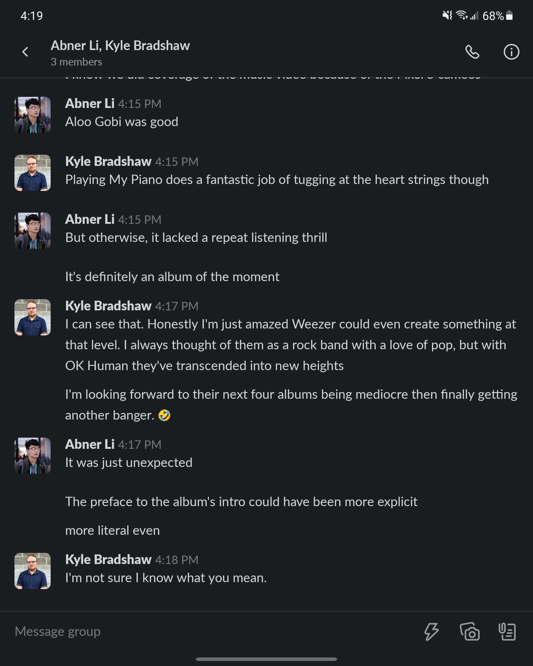
Slack v20 compared to Slack v21
Unfortunately, though, it doesn’t seem like Slack’s journey to ruin its own Android app ends there. Today, another update is rolling out to users, which changes the layout of notifications. Previously, notifications for incoming messages showed the room first and messages below with the sender’s profile picture off to the right side.
Now, Slack shows notifications on Android with generic icons for types of rooms off to the left side, grouping profile pictures for DMs, with message content off to the right side with totally different layouts for user’s names and messages too. It’s quite a jarring change.

It’s worth noting that the change to notification design is currently limited to the beta channel, but there’s no reason to believe it won’t be coming to the general release track in the near future. It’s not like they seem to listen to feedback anyway.
More on Android:
- Slack completely revamps Android app w/ swipe-based UI
- Chrome OS may soon be able to mirror your Google Pixel phone’s screen
- Gmail for Android adds confirmatory vibration feedback when swiping
FTC: We use income earning auto affiliate links. More.

Comments