With the Pixel 2, the Pixel Launcher was revamped to place the search field at the bottom of your screen. Four years later, the Google app looks to be readying something similar with a bottom Search bar redesign.
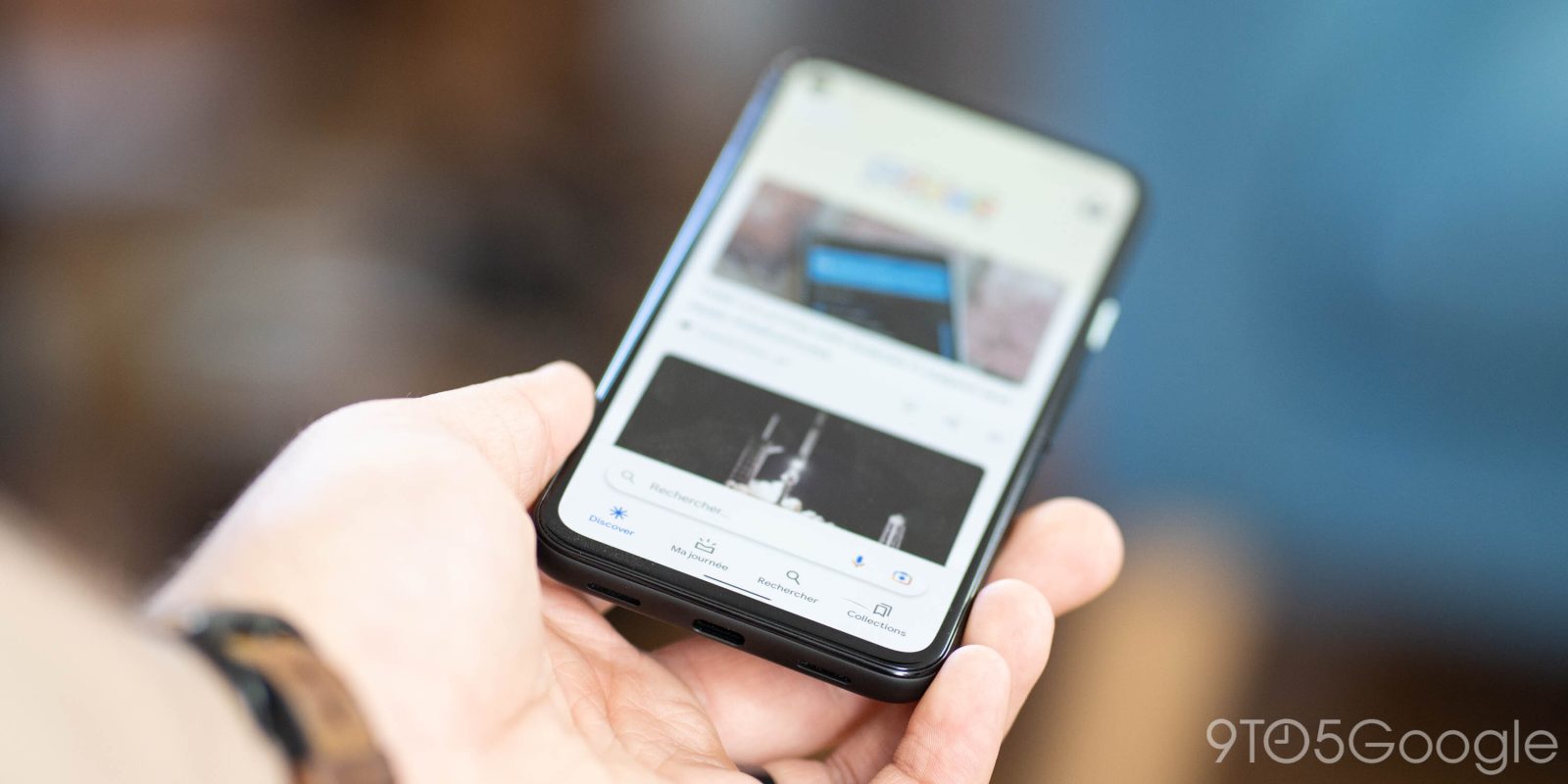
Today, the Google app has the Search bar just underneath the company logo/daily Doodle at the top of the screen. Some users are now seeing the field appear just above the bottom bar in a rather busy design. Your profile avatar and the weather pill remain unchanged.
It’s visible when you open the app, but disappears when you scroll up and reappears when doing the opposite.
For one user with this bottom Search bar redesign, force stopping the Google app and clearing cache does not remove the change. As such, this appears to be a purposeful design decision rather than a visual bug. That said, Google could decide not to widely introduce this revamp.


In all, this move aids reachability on ever-growing screen sizes. However, it comes as the expense of a very cluttered bottom bar that’s now quite unconventional in Android app design. In the dark theme screenshots, we see how the search bar is not exactly attached to the bottom bar, but rather part of a new background layer. There’s already a “Search” tab that opens the keyboard immediately, but Google needs to have its iconic field always visible.
More on Google Search:
- Search adds 3D monuments, including Big Ben, Eiffel Tower, Parthenon, & Tokyo Skytree
- Google working to make sure food banks that aren’t online appear in Maps, Search
- Google app readying a Search chat head for quick text & voice queries on Android
- Search will rank desktop sites based on ‘page experience’ starting in February
Thanks Timothée
FTC: We use income earning auto affiliate links. More.
Comments