
If you’re not using security keys, the Google Prompt is the next best two-factor authentication method to protect accounts. Google is now updating the Prompt’s Android UI with a much-needed dark theme.
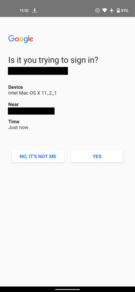
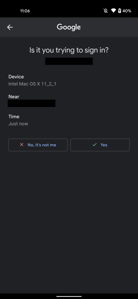
Compared to the previous iteration, the new Google Prompt centers the company logo, “Is it you trying to sign in?” title, and email address. While seemingly minor, it improves readability by no longer grouping it with Device, Near, and Time Information.
Meanwhile, the “No, it’s not me” and “Yes” buttons now use proper case instead of being all capitalized. Along with a red “X” and green checkmark, this makes for nice visual improvements that also conform to the Material Theme outline style. Of course, the biggest one is the dark theme that helps replace the previously stark white nature of this screen.
The Google Prompt dark theme is still rolling out. For example, it’s live on personal accounts but not Workspace addresses. This change was first spotted in early 2019, but it did not widely launch then and underwent a handful of tweaks since, including moving the buttons higher up on the screen to aid reachability.
More about Google Prompt:
- Google Prompt is the new default 2-step verification method, enabled on all phones [Updated]
- Google Authenticator for iOS gets dark theme redesign, bulk 2FA account transfers
- You can now use iPhones as Google security keys for 2FA
- All Android 7+ phones are now 2FA security keys for signing into Google
FTC: We use income earning auto affiliate links. More.


Comments