
With Android 12, Google introduced Material You, a colorful third-generation of Material Design which will eventually expand beyond Android. To that end, Google has begun experimenting with bringing Material You design cues to Chrome OS.
While the biggest hallmark of Material You – especially on Android 12 – is the introduction of the dynamic colors system that re-themes your apps based on your wallpaper, Google’s latest design language also comes with a variety of other visual overhauls. Where Material Theming put a heavy emphasis on layers, shadows, and brand customization, Material You is a bit more flat, colorful, and rounded.
This look can also be achieved without dynamic colors, as proven by the way recent updates to Google Drive appear on pre-Android 12 devices. This is important, as the company has expressed that Material You will be making its way beyond Android, including to the web.
According to a recent work-in-progress code change, it seems that Google has begun looking at what it would take to bring Material You to Chrome OS. Things are still in the early stages, with this being marked as a “prototype,” but it should offer an early glimpse at what Google has planned.
All of the Material You related work done so far focuses on changing the shape and color of individual windows in Chrome OS. On Chromebooks today, when you have an app opened in a window (not maximized or full screen), you’ll see that the corners of the window are fairly sharp with little or no rounding. As of the current Material You prototype, windows in Chrome OS are set to have smooth, rounded corners, which leans heavily into the “card” metaphor so prevalent in every generation of Material Design.
Another notable change is that Chrome OS windows may no longer have a solid-colored frame. Instead, the top of the window may be semi transparent, meaning you’ll be able to see some of whatever is behind the window shining through.
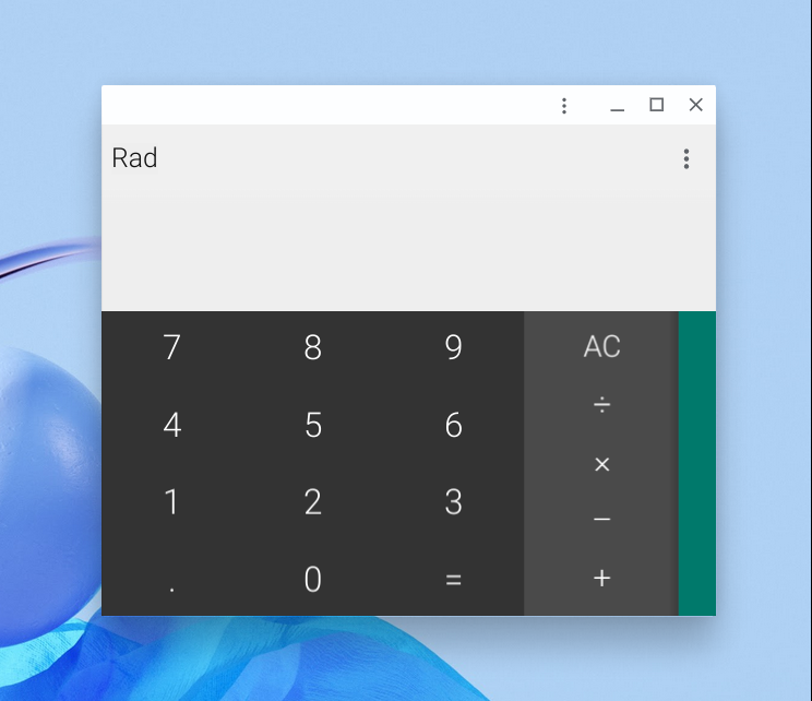
Reading through the code, we were able to piece together a close approximation mockup of what these first steps of a Material You redesign for Chrome OS may look like. In this example, we’ve taken the built-in Calculator app, made the window’s top bar a bit transparent, and given it the newly rounded corners.
Before 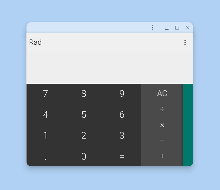
After (Mockup)
At this stage, this is clearly not a radical overhaul of Chrome OS as we know it, nor are the “Material You” aspects of the design too obvious at this stage. With time, things should gradually shape up, or it’s also possible this particular redesign could fizzle out before it ever reaches the public.
9to5Google’s Take
It’s great to see that Google is actively pursuing bringing a fresh new design to Chrome OS, especially given the operating system’s newfound competition with Windows 11. Microsoft has managed to catch up to the refined simplicity of Chromebooks and in some cases exceed it, while Chrome OS has felt visually stagnant over the last few years.
Considering Android has gotten multiple major visual overhauls in the last few years, especially with Android Pie and Android 12, it’s a bit surprising that Chrome OS has maintained roughly the same look since 2018.
FTC: We use income earning auto affiliate links. More.

Comments