
As first tested in November, Google is rolling out a big redesign of the web Play Store that brings it inline with other services after many years of the same user interface.
Update 5/26: The Google Play web redesign is now widely appearing. Other notable highlights include:
- On mobile, this revamp leverages a bottom bar.
- The tab indicator slides/animates over to a section upon selection.
- A developer page will immediately show all available apps instead of you having to first click a button.
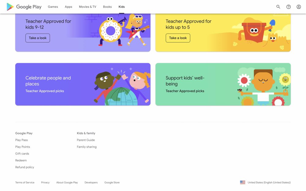
- The bottom of the page contains links to: Play Pass, Play Points, Gift cards, Redeem, and Refund policy, as well as Parent Guide and Family sharing.
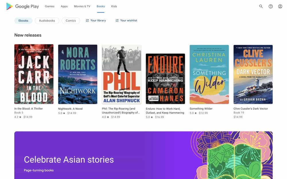
- The Books tab links to Your library and Your wishlist where you’ll find the old design still in use.
- The Play Movies & TV player is unchanged.
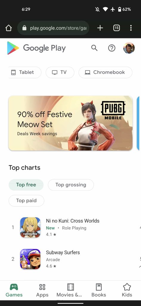
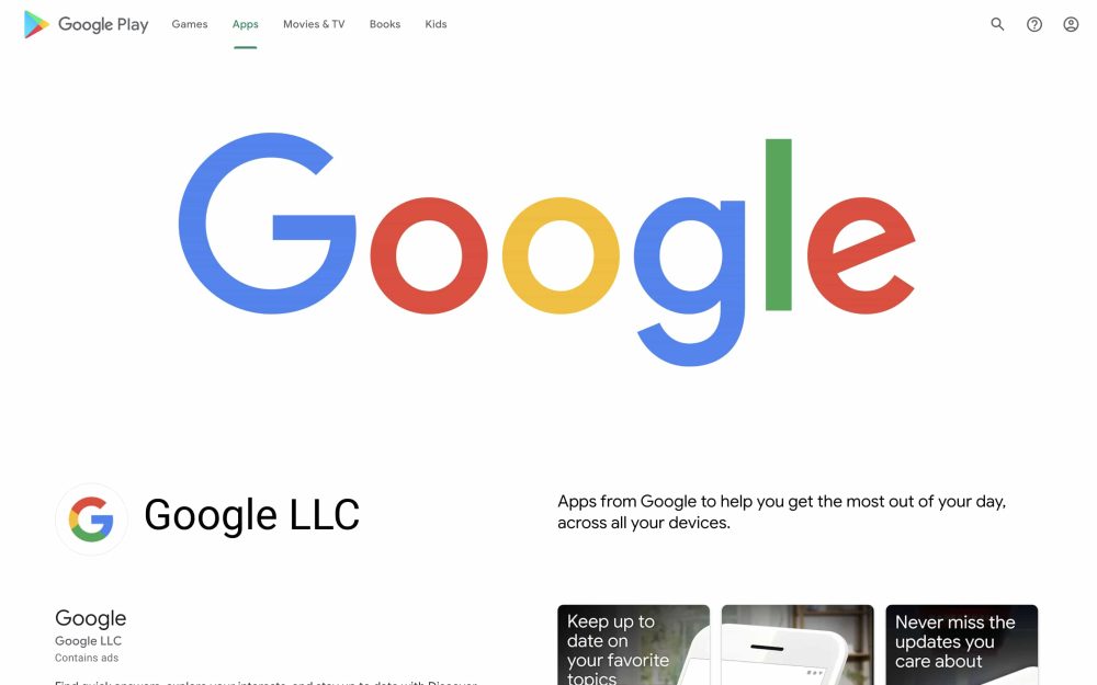
Original 5/23: For a website, it’s rather app-like and looks right at home on a tablet, though the design shown for large screen Android form factors is a bit different. It starts with the Google Play logo and tabs for Games, Apps, Movies & TV, Books, and Kids. Search is now just a button at the right along with help and your account switcher. This top bar is visible on every page as Google no longer links to “Devices” when the Play Store sold hardware in the Nexus era.
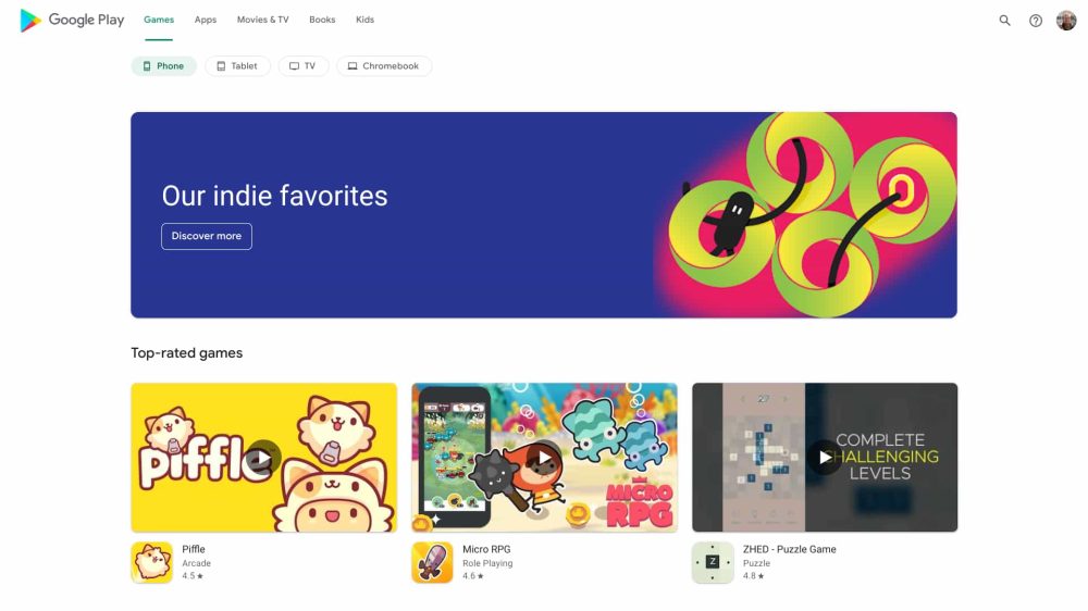
In the Apps view, you get device filters for: Phone, Tablet, TV, Chromebook, Watch and Car. The usual row of app carousels follows. The Games section is similar, though the Watch and Car filters are gone, and there are much larger application previews.
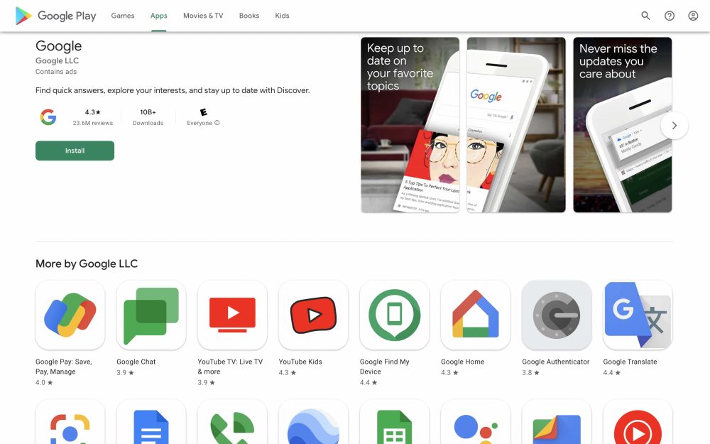
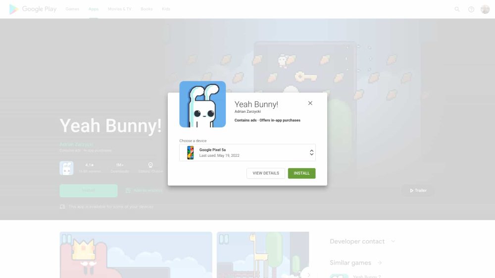
When looking at an app listing, there is now a large section up top that notes key details (rating/reviews, downloads, and rating) against a blurred background. This is rather similar to Play Games for PC. The install button appears below, though the actual prompt and “Choose a device” list hasn’t really been modernized.

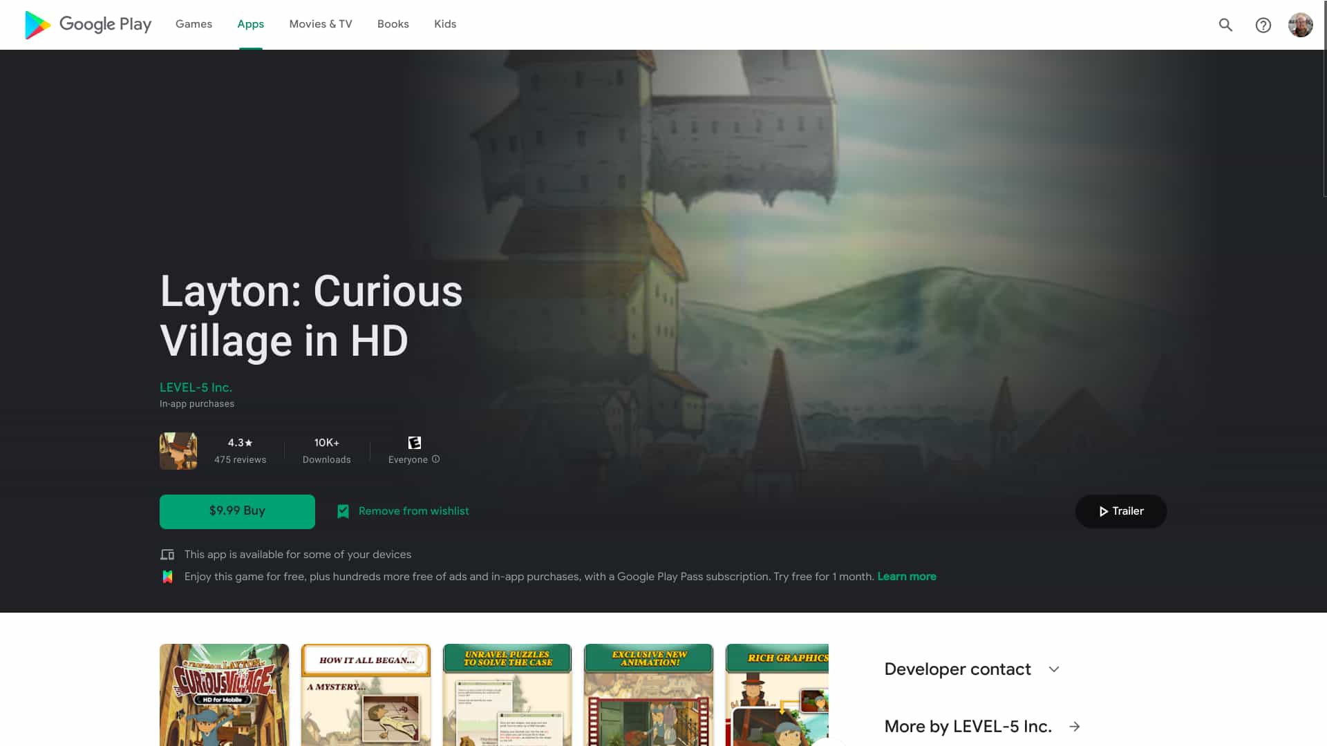
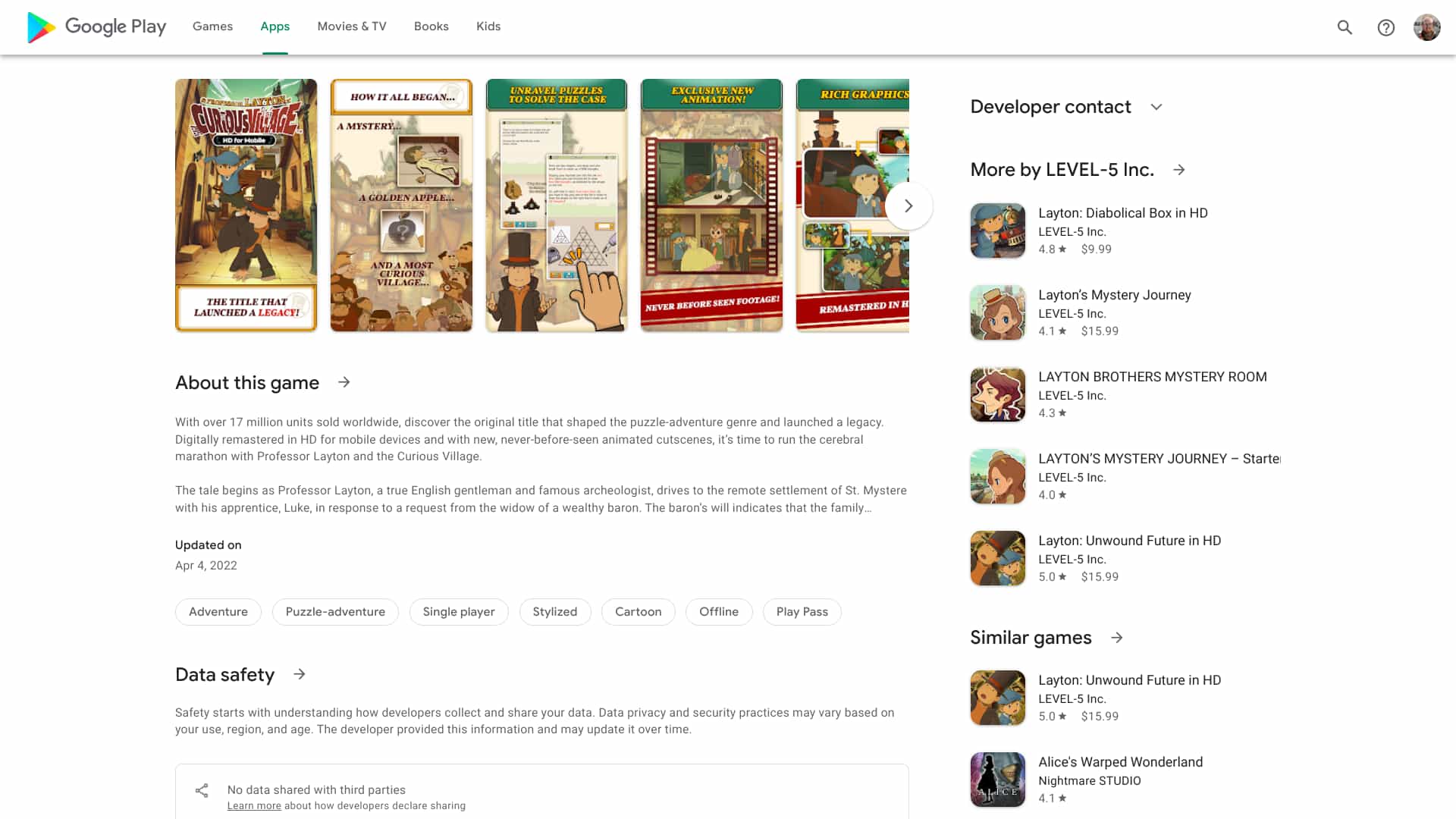

The rest of the app listing shows screenshots, About this game, and the Data safety section, while there’s heavy use of a right sidebar to recommend more things to download. As seen in the third screenshot above, it makes for a quite busy view.
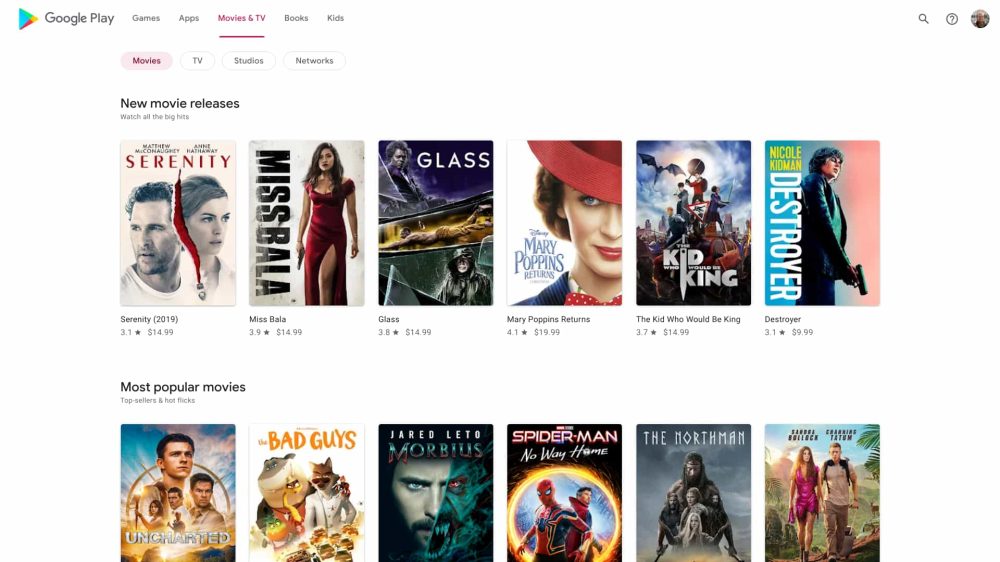
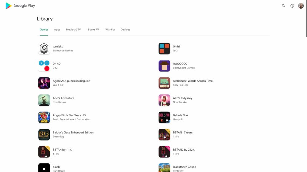
Movies & TV gets a similar treatment and has a nice browsing experience, while the Library tab is very much like the Android version. Unfortunately, as far as we can tell, there’s no dark theme. This follows the Android redesign in October that brought over Material You.
Compared to last year, the Google Play Store’s web redesign is more widely rolling out, though not all users are seeing it just yet. It started to appear for people over the weekend and availability appears to be International.
More on Google Play:
- Apex Legends Mobile is now available to download on the Google Play Store
- PayPal offering $10 reward for your first purchase on Google Play
- Google Play users in Russia can no longer update or download paid apps
- Play Store showing more app info without having to open listings
FTC: We use income earning auto affiliate links. More.
Comments