After testing in October, Google Messages looks to be widely rolling out a redesign of read receipts with icons replacing words (sent, delivered, and read).
Update 3/15: Google has updated its support documentation to explain the new Messages Read Receipt icons:
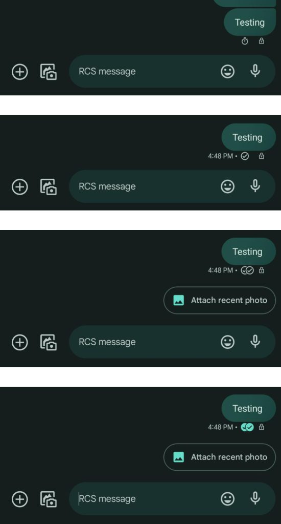
- Timer: Your message is being sent.
- Single check: Your message has been sent.
- Double check: Your message has been delivered.
- Color-filled double check: Your message has been read.
Now official, Google is open to feedback in the community thread of via the in-app mechanism Tap (Your profile > Help & feedback > Send feedback):
If you have a question or concern that is not answered in the article above, please submit feedback (instructions below) and/or post a question in the forum.
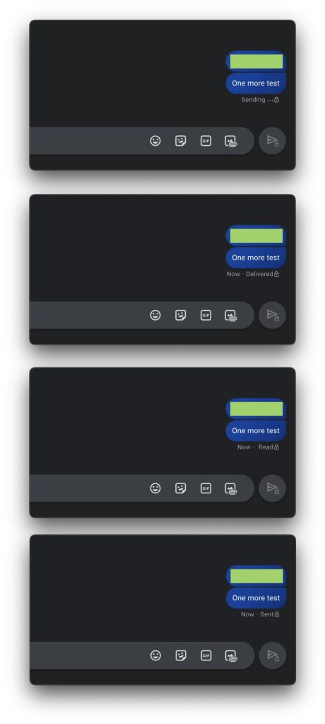
Original 3/7: Previously, the status of an RCS chat would cycle through “Sending,” “Sent,” “Delivered,” and “Read.” Google Messages has now switched to an approach that takes after other messaging apps.
| Sending… | Stopwatch/clock |
| Sent | One checkmark, empty |
| Delivered | Two checkmarks, empty |
| Read | Two checkmarks, filled |
In the new system, group conversations use “Seen by [x]” and “Read by all.”
Top comment by Dustin Erickson
I want a feature where to actually show "read" a user must "mouse over" or click the text box... Too many times my screen is still open after unlocking or I quickly glance at a text thread not actually reading it, and the read receipt is sent and looked at poorly because I didn't respond immediately or shortly thereafter the receipt was sent regardless if I really read the message...
😮💨
Very few people had this new icon system for read receipts in late October, with more Android users in the Google Messages Beta gaining the redesign in recent weeks. As of the past few days, those using the stable version of the app are now seeing it.
Following the testing period, it’s unfortunate that Google did not add a prompt thoroughly explaining each icon. At first glance, it’s not as obvious as just using words. That said, feedback must have proved positive for the company to proceed in widely rolling it out.
Old (Messages for web) vs. new
One possible upside of this approach is that icons are more universal than text (and required translations), but again it’s not immediately straightforward and can be quite confusing. For example, you might not realize the difference between empty and filled checkmarks if the first person you use this system with doesn’t read your message immediately.
More on Google Messages:
- Google Messages is finally just calling it ‘RCS’
- Messages rolling out vertical photo picker gallery
- Vodafone will adopt Google’s RCS in new deal that also puts Pixel in retail stores and more
- New Google Messages notification icon finally appearing for some
FTC: We use income earning auto affiliate links. More.

Comments