The Galaxy S24 series has received a lot of flak for repackaging the previous generation and sprinkling some AI on top, and that doesn’t feel far from the truth. Of all of the Galaxy S24 models, the S24+ is the one I’d actually consider buying, for a number of reasons.
Hardware
It’s all about preferences
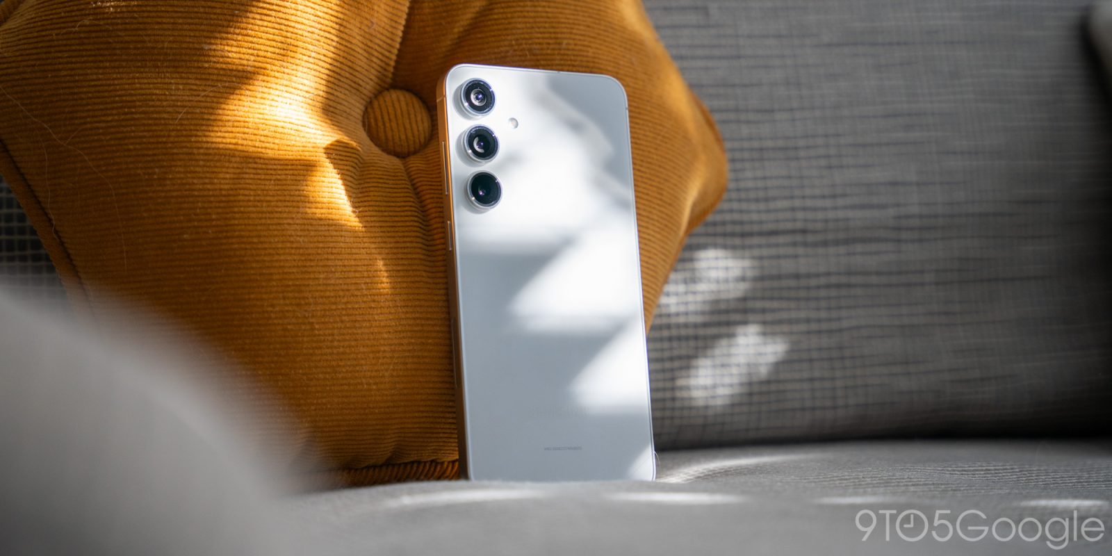
Samsung has changed very little in terms of design on the Galaxy S24 and S24+.
Each carries a flat display and flat back, with three camera sensors sitting on the back. The biggest departure this past year was dropping the mount around the camera lenses, and going for a minimal look with the S23. That design cue continues this year with the same camera setup on the S24+.
This year, however, there is really only one significant change to the physical appearance. The frame of the device – which is inherently not titanium – is matte aluminum instead of glossed. It also comes in completely flat, saured up to the front and rear panel of the phone.
Personally, I find the change to make a huge difference in appearance. It balances out the device and gives it a quintessential modern look that might feel played out at this point, but still proves to be an attractive design choice.
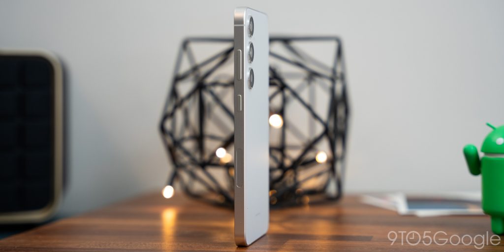
Of course, it’s completely a preference thing. With the only physical change being the level of buffing on the side rails, the Galaxy S24+ and Galaxy S23+ are two identical phones.
The funny thing is that the chances are good most users will slap a case on the device, hiding that one distinction from anybody’s view.
The Galaxy S24+ does feel great in the hand. I think the edge shape now adds a little bit more grip, which is always welcome.
It’s also worth mentioning that the display is slightly larger on the Galaxy S24+, coming in at 6.7 inches. It’s essentially the same AMOLED panel with the S23 Ultra’s resolution – 1440 x 3120. Of course, the device is going to default to 1080 x 2340 to save you battery life and hit the promised lifespan that Samsung advertises. In my experience, bumping up the resolution does affect battery life to some degree, but it also doesn’t really come into play unless you’re watching high-res content.
The Galaxy S24+ also carries a slightly higher peak brightness at 2,600 nits instead of 1,750. In direct sunlight, it’ll make a huge difference.
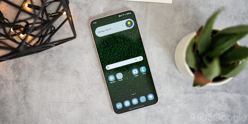
The Galaxy S24+ does not carry the same Gorilla Glass Armor panel as the Ultra, which provides it with that inherent resistance to glare. The panel on the S24+ is a Gorilla Glass Victus 2 cover, which still has a reputation for strength in modern flagships but doesn’t have the latest and greatest glare resistance. This is where the Ultra actually gets a one-up over the S24+. Those instances are few and far between, I’ve found.
Software
One UI 6.1 is the snappiest iteration of Google’s Android yet
I’m sure I’ve stated multiple times throughout my time writing that One UI is just not my favorite OS. I prefer the more casual look of stock Android as opposed to the sometimes thin and rigid appearance of One UI.
However, with that being said, One UI is beloved by many, and if you find an OS that you enjoy using day in and day out, use it. For those who love One UI 6.1, the Galaxy S24+ provides the best possible experience. The hardware allows the OS to shine through, which is key for a competent flagship at $999.
One UI 6.1 does bring a lot of new features to the Galaxy lineup. Features that really start to close that gap between Google’s base OS and itself. With that, One UI feels at home on the Galaxy S24+, as it’s supposed to.
In my time using the Galaxy S24+, I’ve never run into any problems with speed or the phone’s ability to perform everyday functions. It just works. Whether or not I can navigate to the proper settings in a convenient amount of time is another thing, but I know there’s generally a way to change just about everything in One UI.
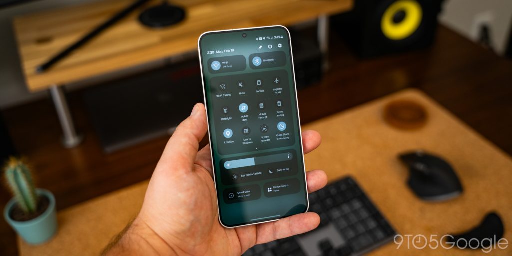
The dropdown panel of Quick Settings adds a huge amount of value in itself. The new pills for Wi-Fi and Bluetooth really come in handy. They also separate themselves visually from other minor settings, like the power saving mode or Quick Share.
Another huge standout feature, at least for myself, is One UI’s ability now to show the wallpaper in the always-on display mode. Previously, AOD would simply display the clock and notifications. Now, you can let your wallpaper show at the lowest brightness, which really ties the look of the phone together.
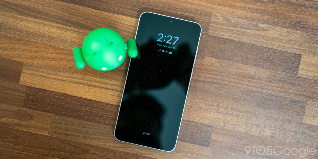
Being able to customize the lock screen as a whole also ties everything together. It’s little familiar design cues that we’re used to with phones like the iPhone or Pixel that Samsung is able to incorporate rather well.
Of course, One UI 6 is not perfect, but the Galaxy S24+ has offered the best experience so far.
Have you heard of AI? Because the Galaxy S24+ is full of it
Maybe “filled” isn’t the right word because there are definitely areas where AI could be implemented, but is limited by hardware. In AI’s current state, the Galaxy S24+ has plenty of it, which sets a tone for every device after this going forward.
Samsung has done a fine job of sprinkling in little features that rely on AI here and there. The Snapdragon 8 Gen 3 is built with that in mind, and it gets some usage in the S24+.
For instance, the Samsung Keyboard has taken on a few key AI features that have proven to be fantastic additions to the phone. A new AI generation button appears on the keyboard, and hitting it uncovers two options. First, it lets you completely change the written text’s writing style to anything from professional to polite. There’s even a setting to alter the text for social posts, which acts as a dedicated tag generator.
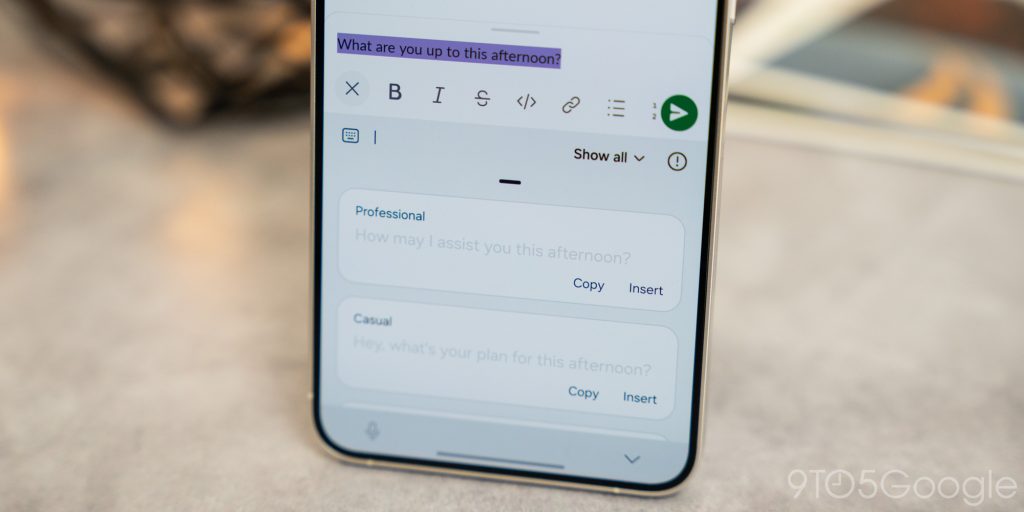
The AI section in the Samsung Keyboard also allows you to check spelling and grammar. The feature works pretty well, but I didn’t often find myself taking advantage of it. If I were writing this review on the S24+, maybe. But not in everyday use.
However, I do love the addition of built-in text translation when texting someone speaking a different language. The Ai button in the keyboard has a translation tool that will translate your written text to a different language. The list of available languages is healthy, and you’re likely to find your preferred language. The feature shows both your language and the translated text at the same time, which makes it a lot easier to communicate efficiently.
Translation has also made its way to Samsung’s phone app, which now allows you to use “Live Translate.” Live translate essentially takes your voice and converts it into an AI-generated voice that speaks a different language. It does the same to the recipient’s voice, as well. This is all powered by one Galaxy S24+, meaning you don’t need to worry about compatibility. The phone can take speech and convert it using Samsung’s AI model into generated speech.
We haven’t had a chance to play with this feature outside of Samsung’s demo. But that demonstration proved to work pretty well. At the very least, it lays the foundation for this feature to improve while it assists with translation now significantly.
The Galaxy S24+ also packs enough power to facilitate Samsung’s version of Magic Editor, which is aptly named Generative Edit in One UI.
Generative Edit works pretty well. Over the period I’ve used the S24+, I’ve tried editing similar images on the Pixel 8 Pro just to see what the limitations are in Samsung’s version. It didn’t really surprise me to see that each version of AI editing was essentially the same, offering up the ability to completely alter images with little effort.
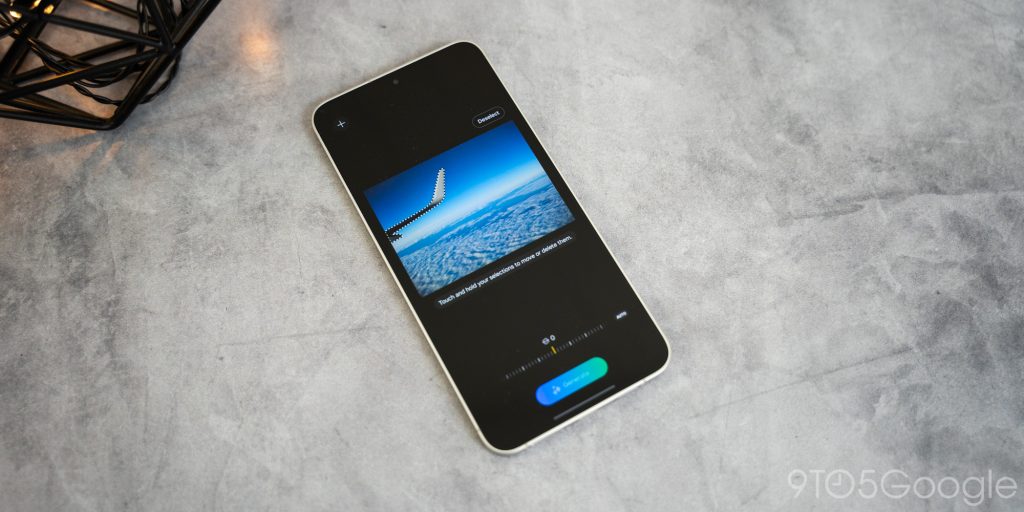
I found Samsung’s Generative Edit features intuitive, with moving objects in the image around being pretty easy to do, even if you had no experience with image editing. That’s what makes the feature so inviting. It’s just easy to pick up and use on just about any image. It, of course, has its drawbacks. It can’t generate complex, highly-detailed backgrounds with unique features, but it can sure try. It’s another case of “it can be useful now, but let’s wait and see what it can do in a year or two.”
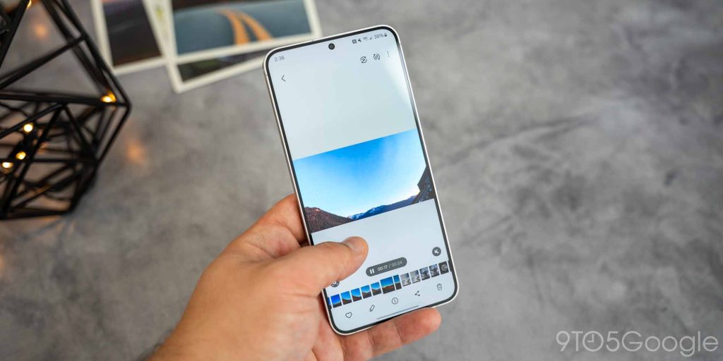
The last tool I actually found myself using was the Gallery app’s ability to create slow-mo videos out of regular ones. A regular video shot at 30 frames per second will never look good in slow motion. That’s because those frames are so few that slowing the video down results in a lot of choppy action. However, the Gallery app now allows you to simply tap and hold on a playing video to show you a slow-motion version instantly. Once you let go, it returns to normal, and the video is officially unedited.
The Galaxy S24+ is essentially just generating frames to fit between the existing ones in the video. I don’t see this as a solution – at least in its current form – to creating full slow-motion videos out of regular ones. However, if you’re looking through your videos and just want to see a slow-mo version of one video just for fun, this feature is fantastic. I love the ease of tapping and seeing a slow-mo version of videos I never had the foresight to record in 60fps. It’s just a great feature I feel flew under the radar.
Other than those few features, I didn’t find myself using many other AI tools often. We have a breakdown of all the AI features that Samsung released with the S24 series, so you can check that out if you want to see more.
It’s also important to note that the Galaxy S24+ can do everything that the S24 Ultra can in terms of AI, which plays heavily into why I believe the S24+ is the best option for most users, but we’ll hit on that a little later.
Battery
Probably more than you need, but who’s complaining?
Another main difference between the Galaxy S23+ and Galaxy S24+ is the battery size. The S24+ carries 4,900mAh in its cell. That’s generally on the iffy side for most phones regarding lifespan, but the Snapdragon 8 Gen 3 has proven to be a rather efficient chip.
I’m currently getting full days and then some out of the S24+. It charges very fast and lasts for as long as I need it to, reliably. At the end of the day, I saw another 30% or so left in the tank when I put it on the charger.
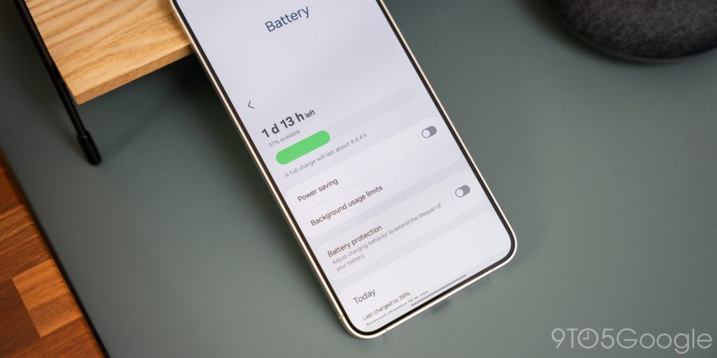
That seems to best the experience we’ve had with the Ultra. Of course, that has a bigger and better display, which makes a difference. If you were to up the phone’s display to the full 1440 x 3120, you’d likely see a dip under a full day.
Camera
Not much has changed
The Galaxy S24+ equips a 50MP main sensor, which doesn’t take on a lot of change from previous generations. It’s supported by a 10MP telephoto lens and a 12MP ultrawide lens to give you a little extra room for different shots.
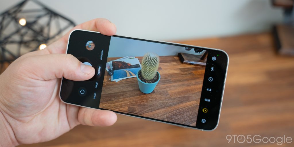
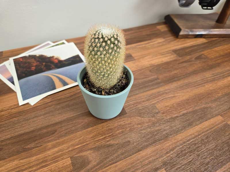
On paper, 50MP always sounds really good, but we’ve learned with Samsung that paper doesn’t always tell the full story. In the past, I’ve always shied away from using Samsung’s cameras if I could, simply because I don’t find the Galaxy line’s post-processing to be very good. This year, parts of that story remain true, and I can’t get behind the cameras on the Galaxy S24+ fully.
It does look like Samsung has adjusted how the Galaxy S24+ processes images in comparison to previous generations. Images look a little softer and take on a less grainy profile. But overall, I felt like every picture I took came out a little rough, and none of them had the quality I would expect from a 50MP camera.
It isn’t really even a product of camera quality. The Galaxy S24 Ultra has the same woes and really falls short when it comes to taking gorgeous photos. Hopefully, this is something Samsung can address down the line. As it stands, the camera is the only portion of the Galaxy S24+ I don’t like.
Final thoughts
The Galaxy S24+ is a better buy than the Ultra
As with everything else, a price markup was expected with the Galaxy S24+. However, that price increase didn’t come, and the $999 phone stuck to the same price tag, even with a new chip and several AI features sprinkled throughout.
The Galaxy S24 Ultra, however, did come with a price increase, bringing it to $1,300. That’s inching closer to the price of a foldable phone, and it doesn’t carry nearly the same “wow” factor that a phone over $1,000 should. In reality, the Ultra only brings a couple of changes. It carries a new flat display and cover. Along with that, not much else comes to the scene. It leaves a lot of would-be buyers wondering if spending the money on a Galaxy S24 Ultra is really worth it.
In my opinion, no, I don’t think the S24 Ultra is worth it. Yes, it comes with an S Pen and a front glass element that’s genuinely impressive at blocking reflection, but I don’t believe it warrants the price tag or an upgrade from the S23 Ultra.
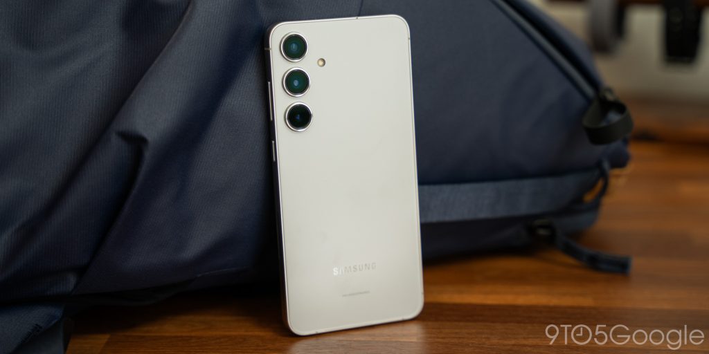
That said, the Galaxy S24+ brings almost every feature for a lower price. It performs perfectly on the speed front and brings everything that One UI 6.1 offers to users. The battery life is phenomenal for a powerful flagship, and the camera array does a fine job of getting you by. Hands down, the Galaxy S24+ is the best Galaxy S device currently on the market.
Buy the Galaxy S24+
FTC: We use income earning auto affiliate links. More.



Comments