Google is following last year’s Material 3 Expressive redesign on phones by introducing significantly more blur across Android 17.
Based on images of internal builds that we and others have seen, Google is continuing to update Android’s visual design with this year’s major release. Additionally, system flags we’ve found explicitly refer to this look as “blur.”
Throughout the OS, you can expect a system UI that switches from solid light or dark backgrounds to a blur effect that allows you to see what’s immediately behind the component you’re interacting with.
In the case of the volume bar, the pill-shaped container that houses the slider, mode switcher, and other elements will be translucent. On your homescreen, you’ll see your wallpaper and app icons in the background. If activated inside an app, you can make out what is beneath the slider. The full volume sheet and power menus are other examples of system UI elements that will be blurred.
These blurs are tinted by your Dynamic Color theme. However, for the most part, Android 17 is a smaller visual redesign than last year’s big overhaul. Some components will see updates, but the interface largely looks and functions the same way.
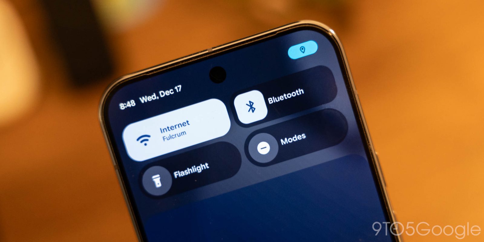
With the Android 16 QPR1 redesign, Google first introduced blur to the notification and Quick Settings panels. Google said this decision to “subtly blur” the shade background provides a “sense of depth, so the motion feels lightweight and you’re able to stay aware of the apps you’re using in the background.”
Android 17 continues that work. Compared to Liquid Glass on iOS, Android’s new look is more subtle.
Blur today is not part of Material 3 Expressive for apps. It remains to be seen whether Google will reserve this translucency for the operating system, or whether apps will be overhauled in a similar manner.
FTC: We use income earning auto affiliate links. More.


Comments