Google is working on a redesign of Quick Settings that might launch with Android 16.
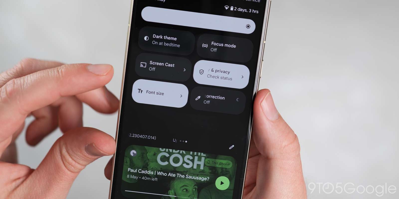
Quick Settings have largely stayed the same since Android 12. The full UI gives you eight large Tiles arranged in a 2×4 grid, which is one less per screen compared to what came two generations earlier.
Android 10, 11, and 12


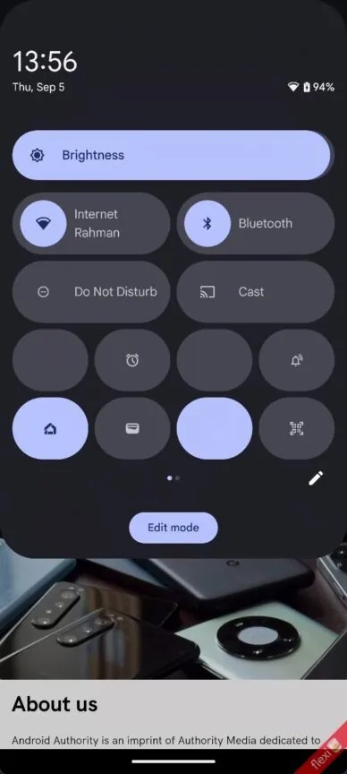
An early state of a Quick Settings and notification shade redesign has been uncovered in Android 15 QPR1 by Android Authority. This will most likely launch with Android 16 rather than the 15 QPR cycle, while this is far from the final design.
Top comment by deepdvd
Why can't we click on images anymore? Also, the image for Android 10 quick settings says "This image is not available"
Instead of a fullscreen notification shade, Android 16 might be going back to an overlay, with the app you were previously using visible underneath. Again, this is an early design, but you see a large clock, day, date, battery, and status icons immediately, but no Quick Settings. You get four QS Tiles today, and Google abandoning that would be odd.
Then there’s an odd container shape that features more rounded corners at the bottom than the top. When there are no alerts, it still says “No notifications.”
The full Quick Settings panel, which is currently only accessed by swiping down with two fingers, starts with a fully modernized brightness slider housed in a pill. You then get a 2×2 grid of pill-shaped Tiles accompanied by text descriptions.
There’s a 4×2 grid of narrower Tiles that just feature icons after. You can swipe for more Tiles on additional page. From the images we have today, you can have 12-16 Quick Settings Tiles per page in a significant density boost. Meanwhile, Google is working on a light theme for Quick Settings:


FTC: We use income earning auto affiliate links. More.


Comments