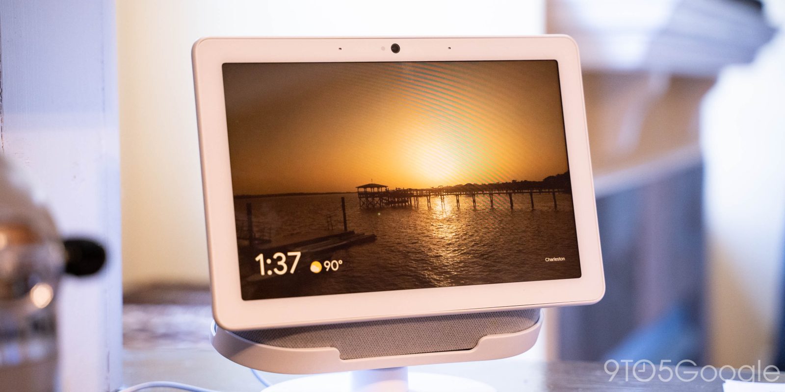
As previewed last month, Google is redesigning the interface of Smart Displays. This includes a dark theme, support for personal and work accounts, productivity actions, and much more.
Update 10/21: Announced on Monday, the Smart Display redesign is widely rolling out for Nest Hub and Hub Max devices enrolled in the Preview Program (version 32.28.38.336575889).. The trick is to reboot by pulling the power cable for a few seconds.
On first launch, an interactive walkthrough guides you through the “updated Smart Display” experience. The dark mode, which also themes the slide-up settings bar, is enabled by default for many. Meanwhile, you can tap and hold on cards to reveal a menu that lets you “Dismiss” most items. One small tweak sees the ‘mic/camera is off’ indicator moved to the top-right, while it no longer appears on the ambient mode.
Original 10/19: It starts with a “Your mornings” page that serves as a “new visual experience to jumpstart your day.” Broadly, the Smart Display UI is now tab-based rather than a carousel of cards. The time is always shown in the top-right corner.
You’ll see things like a reminder for your first meeting, a run down of the morning news and a glance at the weather ahead. This page evolves throughout the day to reflect “Your afternoon” and “Your evening” so that the recommendations you see changes as your day does.
“Your evening” will let you select relaxing sounds from “tranquil rainfall” to “crickets,” with a sleep timer available to fade out audio and ease you into a slumber. Once up, there are now Sunrise Alarms:
With Sunrise Alarm—coming to Smart Displays soon—the brightness of the screen will gradually increase starting 30 minutes before your alarm goes off, mimicking the sunrise so you wake up naturally. You can also set different alarms for different days of the week and choose different ringtones for them (because who wants to wake up at 7 a.m. on Saturday!?). The best part? When the alarm goes off, you can just say “stop” without having to say “Hey Google.”

Next up is the “Home control” tab that shows a grid of your various smart device categories: Lights, Locks, Speakers & TVs, Connectivity (Google/Nest Wifi), Cameras, Routines, Climate, and Rooms. There will also be a big card to control one lighting fixture.

The “Media” page will suggest things for you to consume. For example, you might get a podcast in the morning and a TV show at night. Music and video suggestions are sourced from Disney+, Netflix, YouTube TV, and Spotify.
“Communicate” is billed as surfacing “tools for staying in touch and staying productive.” You can start a new meeting, call a Household Contact, or Broadcast. Additionally, you can now cancel and reschedule Meet meetings, as well as send a message to participants.
Google Meet will also let you customize the grid view, “so it’s easier to see a specific person or details in a presentation with pinning, four-person grids and pinch and zoom — coming later this year.”
Lastly, there’s a dedicated Discover tab, while swiping to the very left lets you launch “Photo frame.”


Meanwhile, Smart Displays now support simultaneous personal and work accounts. This means you can see your full calendar and list of meetings without having to switch:
This is now supported on Assistant-enabled devices where you can access your Calendar, like phones (Android and iOS), shared devices such as smart speakers and Smart Displays, and for Google Workspace users enrolled in the Google Assistant Beta Program.
Smart Displays finally sport a dark theme, with Google touting how it “reduces light emission, so it’s easier on the eyes at night.”
You can also keep the classic Light Theme or set to “Automatic” so that the display will adjust naturally based on the ambient light or when the sun rises and sets.
Google is rolling out this Smart Display redesign now.
FTC: We use income earning auto affiliate links. More.


Comments