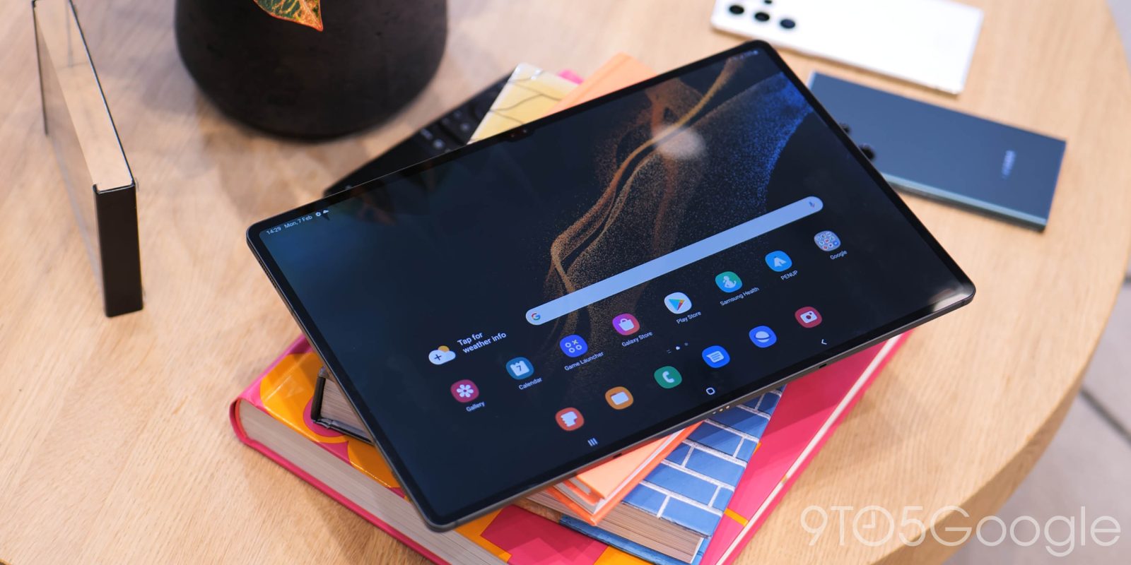
Taking a backseat to the launch of the Galaxy S22 series is the introduction of three more high-end Galaxy Tab devices – namely the Tab S8, Tab S8+, and Tab S8 Ultra. While not the star attraction, they could be the more interesting trio.
In the world of “extra” tech, a dedicated tablet can offer a great second-screen experience, and on the Android side of the fence, the newly unveiled Galaxy Tab S8 series is vying for your hard-earned money. Are they worth the high entry price? We have gone hands-on to find out.
Subscribe to 9to5Google on YouTube for more videos
The new Galaxy Tab S8 series falls into three distinct sizes: 11 inches, 12.9 inches, and 14.6-inches. The latter Galaxy Tab S8 Ultra is a behemoth that has some issues – and a few benefits – of its own.
Here’s the major problem right from the get-go: It’s unclear to us just how many people are looking for such a large Android tablet form factor. Sure, there are some undoubted benefits, but Android’s limitations on such a large display feel like a hindrance. Because of that, despite only spending a short period with the trio, the largest model in the lineup is simultaneously the most interesting and confusing.
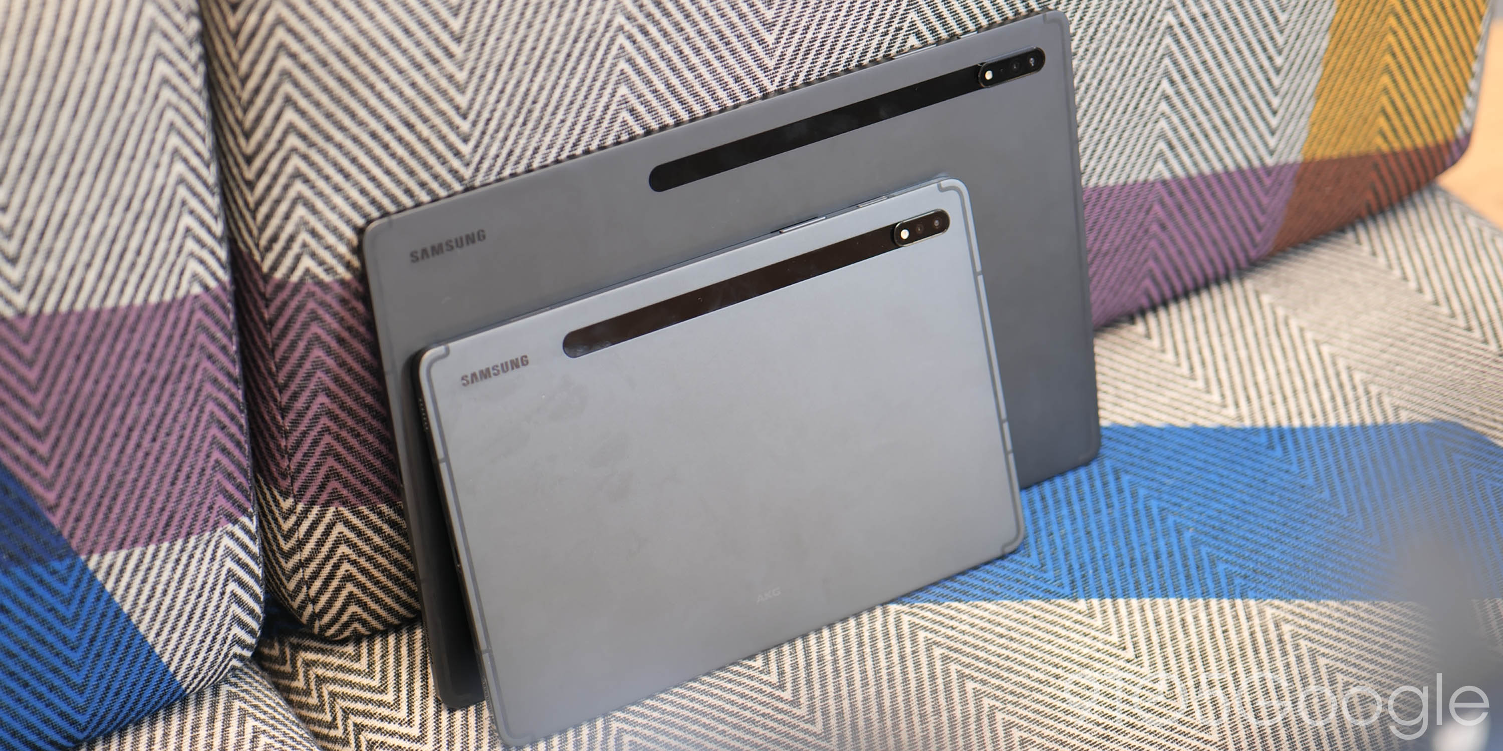
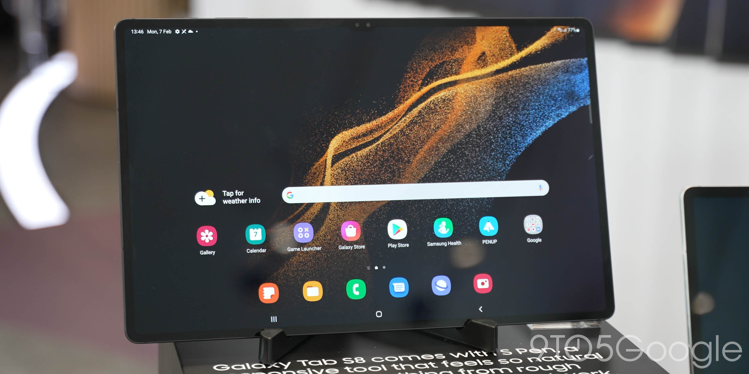
The major standout issue is that Android 12 does not lend itself well to this oversized form factor. Samsung will not ship the device with the upcoming Android 12L. This means, at least shortly after launch, any tweaks made to help usability need to come from One UI with no obvious or direct input from Google.
My biggest criticism and concern is that the stretched smartphone UI utilized by most Android tablets feels even worse on the Galaxy Tab S8 Ultra. Icon spacing is almost bonkers and you simply cannot use this piece of tech without multiple hands. The optional kickstand, therefore, becomes a must, and, at that point, a high-end tablet seems to make less sense than a dedicated laptop as you get few benefits simply because public Android builds are not yet optimized for such a large form factor.
That said, it’s hard to argue that the oversized 14-inch is exceptional for media consumption and the speakers are similarly good – so long as your hands don’t cover the grilles. The central notch seems odd at first, but I will admit that I simply stopped noticing when zipping around this version of One UI 4.1. The Galaxy Tab S8 Ultra’s minor display bezel incursion – if it wasn’t obvious – means it’s intended for use in landscape mode.

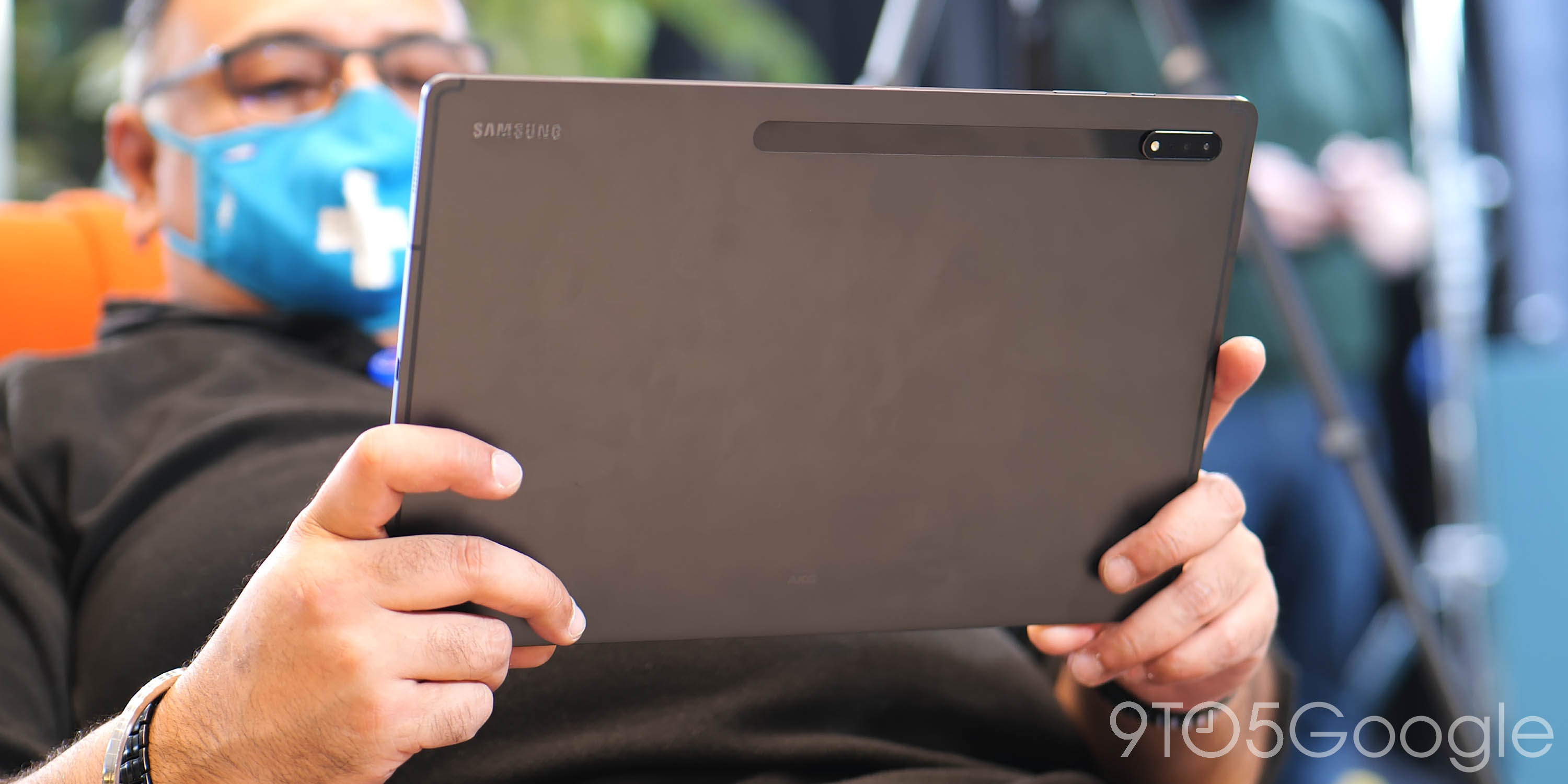
There are some multi-window and split-screen tweaks to take advantage of the full 2,960 x 1,848 pixel AMOLED panel, and this does help things, but it’s still unwieldy and awkward to manage without placing on a surface. That kind of lets the package down in many ways, but I can clearly see that some people would see this as a major benefit. Being able to run multiple apps in large panels concurrently is a great feature in its own right.
The same split-screen features and expansion controls are available on the Tab S8 and S8+. However, the resolutions dip to 2,560 x 1,600 and 2,800 x 1,752 pixels respectively. Then adding to that, the entry-level model comes with an LCD panel rather than an AMOLED screen used with the Tab S8+ and S8 Ultra.
It’s in these two models that I feel Samsung offers Android tablet fans a better overall package. Slick 120Hz screens, the Snapdragon 8 Gen 1 processor and more manageable forms. Little is lost and that also makes the packages more palatable. Sadly, we were not able to test out some of the added cohesion features due to time constraints, but we’re hoping that DeX can really provide a desktop-like experience that has been touted and teased.
Initial thoughts
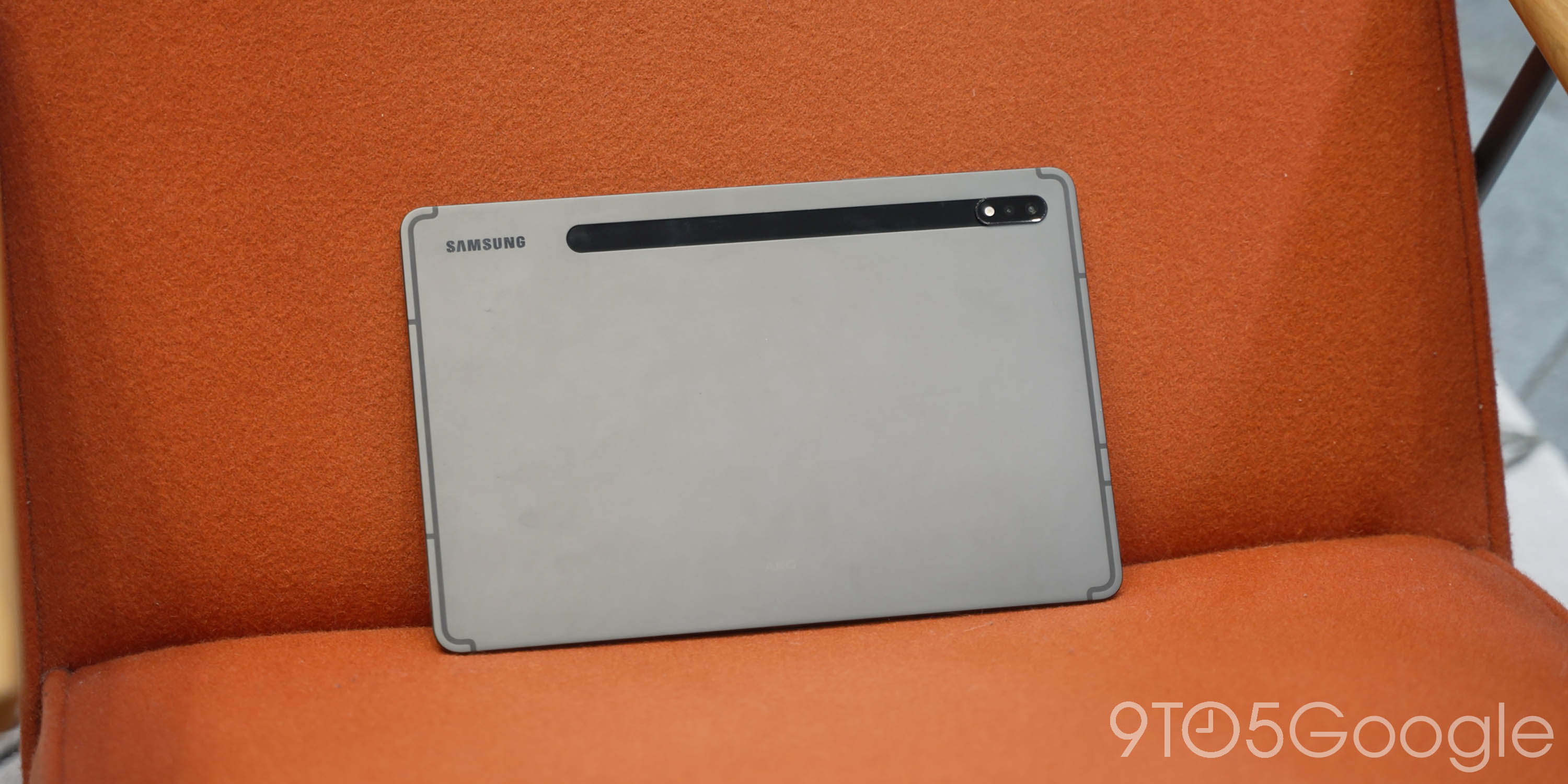
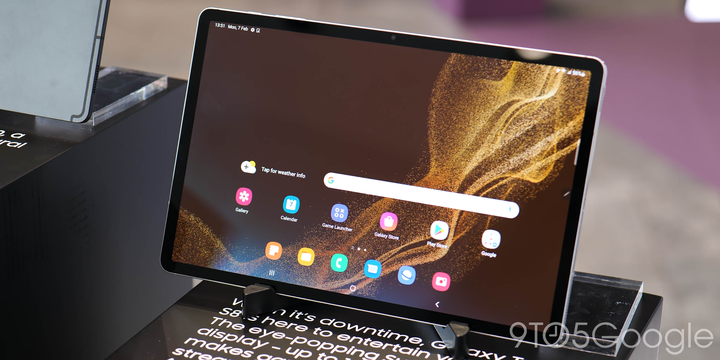
While the Galaxy S22 series is confusing in its own way, the Galaxy Tab S8 lineup seemingly doesn’t quite understand what it wants to be. It’s fantastic to see Samsung continue to invest in high-end Android tablets, but most prominently the Ultra model feels a little too big and inhibited by the actual OS. The size encroaches too closely upon many dedicated two-in-one laptop forms. Forms that often include far more power under the hood and, therefore, greater productivity capabilities.
Although expensive, the smaller Galaxy Tab S8 and S8+ feel like better overall additions to the series and provide a great second-screen experience – albeit with similar but less problematic OS drawbacks courtesy of reduced sizes. Sadly, productivity tools for Android are still not yet comparable with the iPad, and so even though the Tab S8 lineup is capable, it is bound to be relegated to a secondary screen use case.
More on Samsung:
- Galaxy S22 series hands-on: Welcome to the peak smartphone plateau [Video]
- Samsung brings four years of Android updates to Galaxy S22, S21, Flip 3, and Fold 3; beats Pixel 6
- Samsung confirms Android 12L is coming to tablets, such as the Galaxy Tab S8
FTC: We use income earning auto affiliate links. More.


Comments