With its new foldables out on the market, Samsung’s schedule now has the Galaxy S23 series as its next major release. According to one source, the Galaxy S23 won’t see much of a change in design compared to the year prior, but the Ultra might see a meaningful improvement.
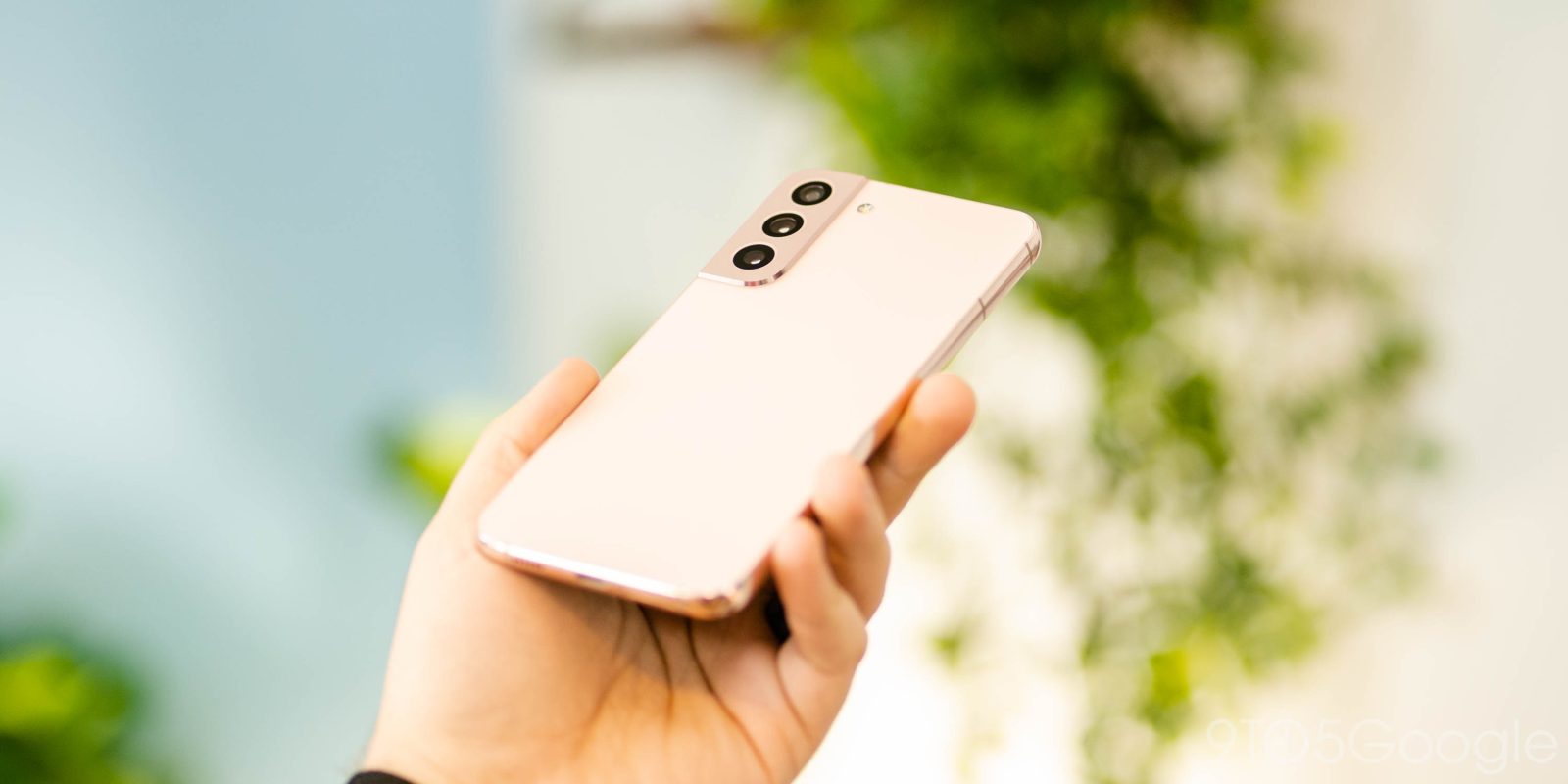
According to Ice Universe, the Galaxy S23 and Galaxy S23+ will look a lot like the Galaxy S22 and Galaxy S22+. The design is described as “the same” with very similar specs under the hood as well.
This rumor claims that the battery, display, and even the camera sensors will be unchanged from the prior generation. The only major change, apparently, will be to the processor with a Snapdragon 8 Gen 2 chip under the hood.
Notably, this would mark the third year in a row that Samsung is using this same core design and spec sheet. The Galaxy S21 series introduced a new look for Samsung’s flagship line, which the Galaxy S22 series refined a bit while also introducing a rather large camera upgrade to the package. But if the Galaxy S23 series truly does change nothing but the chip, it would certainly be a bit uneventful.
But clearly, Samsung’s attention in the premium market is elsewhere. The company has huge expectations for foldables going forward, and the Galaxy S22 Ultra was far more popular than the standard S22 and S22+. In Q2 of this year, it was the single most popular Android phone available.
Speaking of, Ice also claims that Samsung will have at least one design change in its Galaxy S23 Ultra. Apparently, the frame of the device will become larger which will reduce the curve on the display.
Samsung has gone back and forth on curved displays over the past several years, with some devices going all-in on the design trend, and others shying away from it quite heavily. The Galaxy S22 ditched the curve entirely, but the S22 Ultra still had a noticeable curve on either side.
9to5Google’s Take
Flatter screens are always something I can appreciate, but it feels especially important for the Galaxy S23 Ultra to adopt this. For the last few generations, Samsung’s Galaxy Note lineup has used a curved screen which I’ve never been a fan of when paired with the S Pen. The same applied to last year’s S22 Ultra, as I said in our review:
Curved glass edges result in the S Pen being physically harder to use along the sides of the display, as it easily slips down the side if you get too close to the edge. I’ve long questioned the sanity of using curved edges on a device designed for handwriting with a pen, but at this point it’s just ridiculous.
If the Galaxy S23 Ultra finally moves away from this design point, it’s something I’ll be ecstatic to see.
More on Samsung:
- Hands-on: Samsung’s Galaxy Z Fold 4 kickstand case is great, but a bit disappointing
- Samsung Galaxy Z Fold 4 review: Android 12L boosts this iterative but important upgrade
- Android 12L arrives on Samsung’s Galaxy Tab S8 with taskbar and more
FTC: We use income earning auto affiliate links. More.


Comments