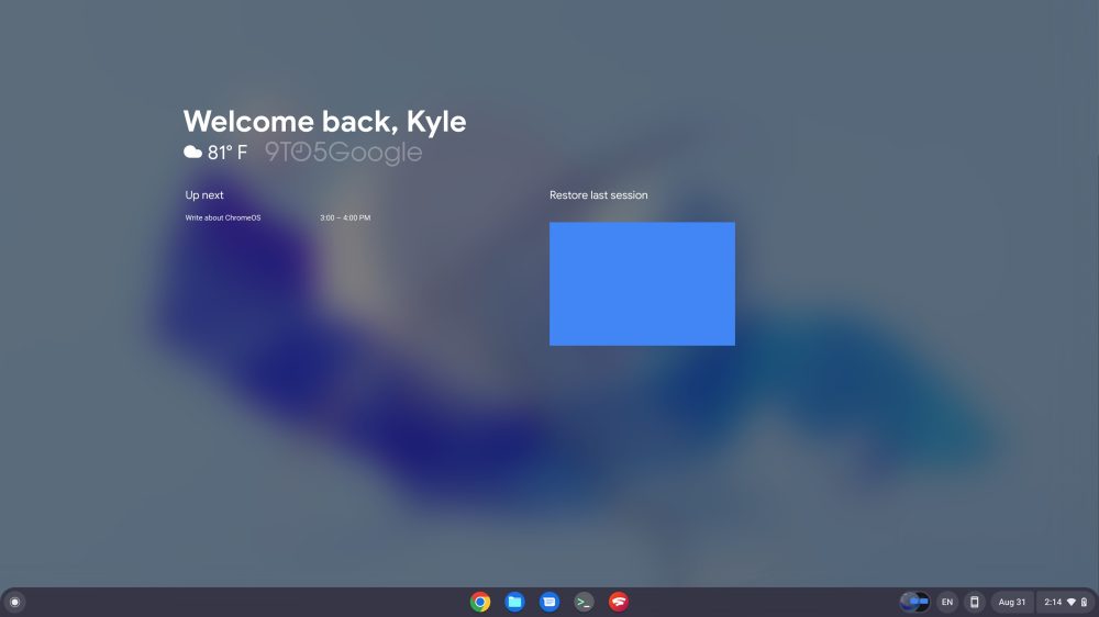
Here’s your first look at the upcoming welcome screen for ChromeOS that brings “glanceable” widgets with meaningful, proactive information, similar to At A Glance on the Pixel series.
Earlier this month, we were first to report that ChromeOS would be gaining a new feature called “glanceables” that would add widgets to your Chromebook’s desktop. From what we could piece together at the time, the widgets would be visible on the desktop and would offer useful bits of information such as the current weather.
Since then, Google has built out quite a bit more of this area for widgets, and the feature is now far enough along for us to get a better idea of what to expect. For starters, Google is now referring to this feature as a “welcome screen” for ChromeOS. This makes sense, as the widgets are mainly designed to appear when you first sign into your Chromebook for the day.
Further, there’s a new flag coming soon — exclusively for Chromebooks on Canary, though — that will let you try the ChromeOS welcome screen for yourself. It’s worth noting that Google refers to it as a “Productivity Experiment,” which is the same label that was initially given to the massive redesign of ChromeOS’s launcher.
Productivity Experiment: Reorient with welcome screen
When a user is about to start a new task, provide them with relevant information and tools to help them orient and get started.
Once the feature is actually enabled on your device, the welcome screen will appear immediately upon signing in to your Chromebook. For now, the main element is a simple “Welcome back” message, immediately below which you’ll find the current weather.
A little further down, there are two sections titled “Up next” and “Restore last session.” The “Up next” area shows upcoming events for today from your Google Calendar, similar to the At A Glance area on Pixel phones.

Meanwhile, Google plans for the “Restore last session” area to include a full screenshot of what was on screen when last you used that Chromebook. Clicking the screenshot would reopen all of your windows how you left them.
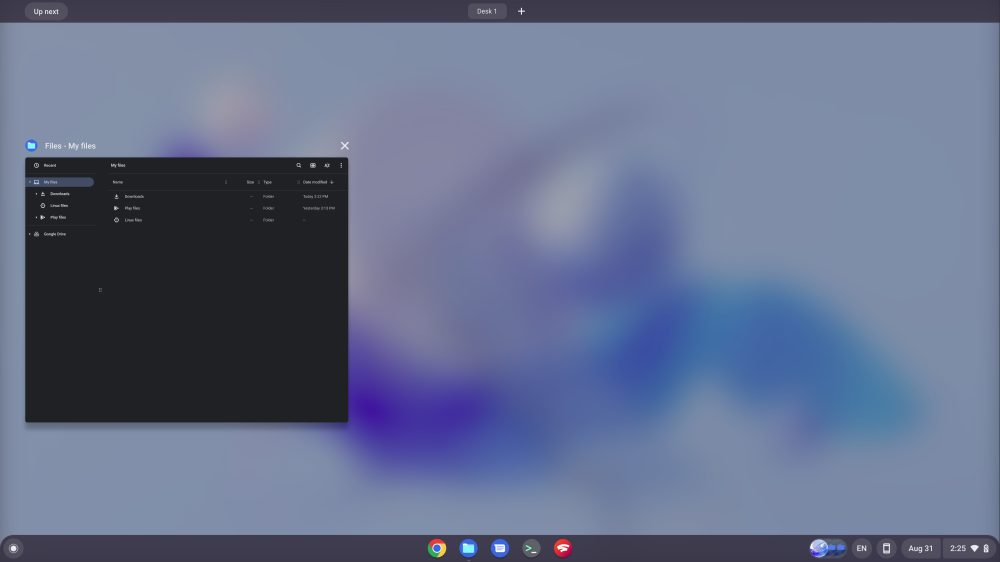
As soon as you open any app or window, the ChromeOS welcome screen disappears. It seems Google is still working out the details of how and when the welcome screen and its widgets should reappear, but for now they’ve simply added an “Up next” button to the top-left of the Desks overview, seen below.

All said and done, it seems we’re still at least a few months from the ChromeOS welcome screen widgets being ready for primetime. What do you think of the new feature its very early state? Would you use the welcome screen when it’s finished, and what else would you like it to show? Let us know down in the comments.
More on ChromeOS:
- Acer’s first Vero Chromebook is repairable, upgradeable, and eco-conscious
- Comment: Chromebooks need better Google app integration, and one-click Calendar is a start
- ChromeOS 104 rolling out: Dark theme, Shelf calendar, Google Photos wallpapers, and more
FTC: We use income earning auto affiliate links. More.


Comments