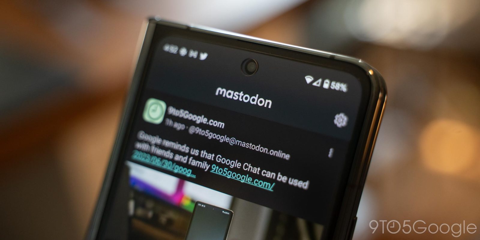
Mastodon saw a moment in the spotlight when Elon Musk first took over Twitter, but the hype seems to have died down. For those still active on the fledgling social network, though, Mastodon for Android has a special treat in a Material You redesign to its official Android app.
Rolling out just ahead of the (US) holiday weekend, Mastodon’s official Android app has been updated with a Material You revamp. The major update comes with version 2.0 of the app.
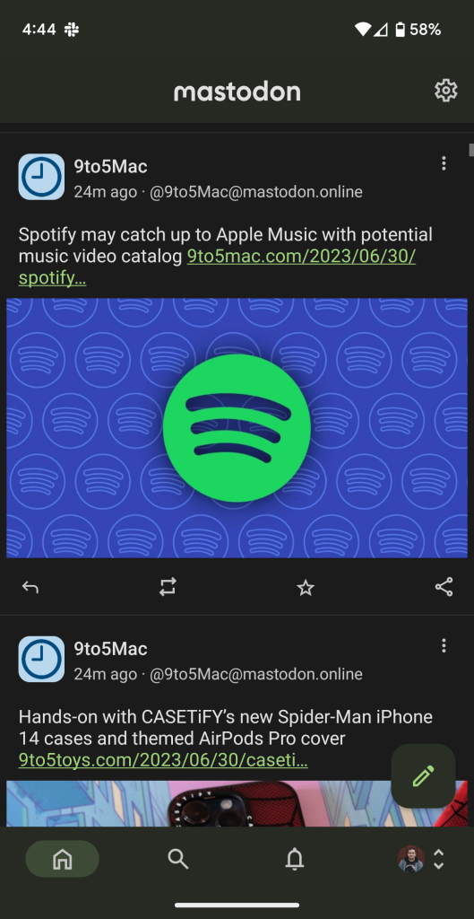
In terms of functionality, there’s not much new. You’ll get the same UI with four tabs for home, search, notifications, and your profile. A floating action button leads to making a new “toot,” and there’s a settings icon in the top corner. The new tweaks to the UI are subtle, with the biggest change being an embrace of Material You theming.
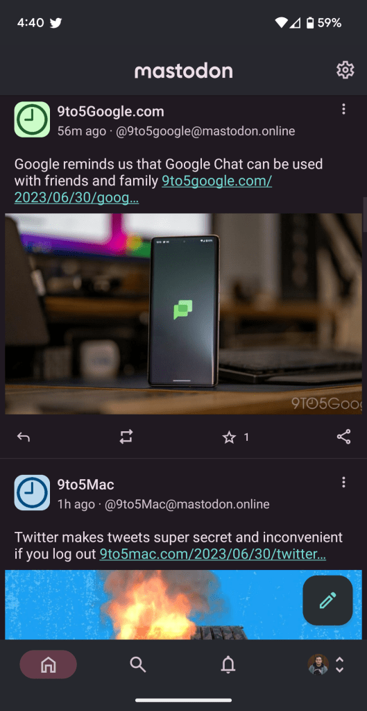
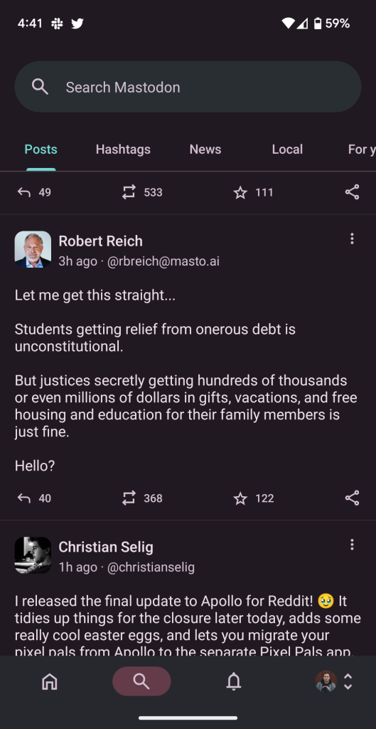
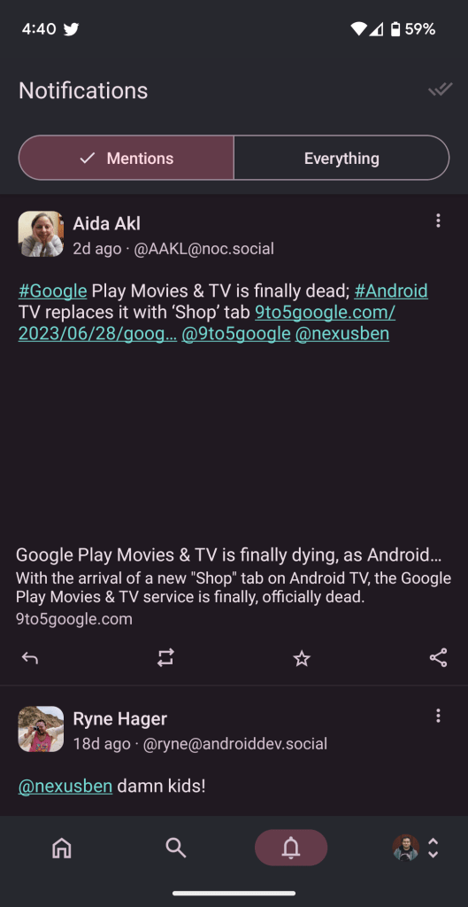
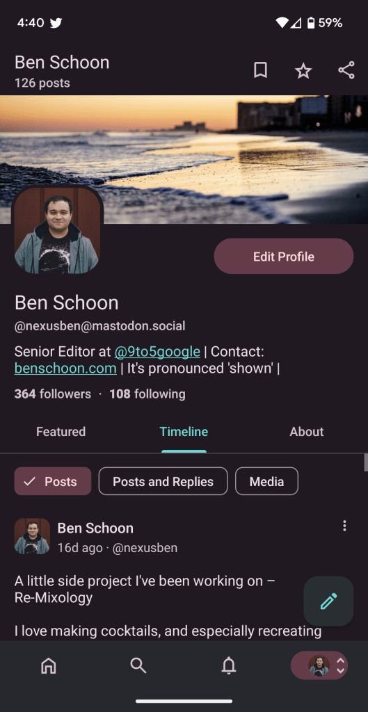
Colors throughout the app now respond to your designated system-wide accent colors, usually generated through your wallpaper. The colors are reasonably subtle, especially in light mode, but are often seen in links and certain accents. Overall, it looks quite nice, and it’s great to see a social network’s official app adopting this support.
Unfortunately, there are no large-screen enhancements here.
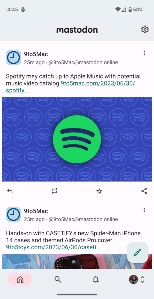
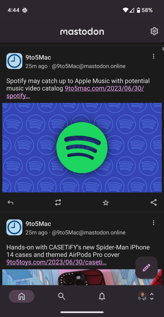
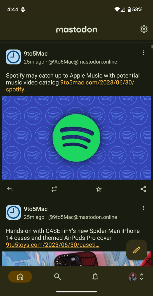
Of course, if you weren’t a huge fan of the official Mastodon app before, this probably won’t change anything. Luckily, unlike Reddit and Twitter, there’s a hefty collection of third-party Mastodon apps.
You can follow 9to5Google (and myself) on Mastodon, too.
More on Social:
- Reddit’s API changes kill Android’s best third-party apps, including RIF and Sync
- Boost for Reddit app gains Material You colors days before Reddit shuts it down
- Twitter makes tweets super secret and inconvenient if you log out as ’emergency measure’
Dylan Roussel contributed to this article.
FTC: We use income earning auto affiliate links. More.


Comments