WhatsApp is the biggest messaging service on the planet, but also one that’s had effectively the same visual look for several years now. Soon, though, WhatsApp may get a shockingly major redesign.
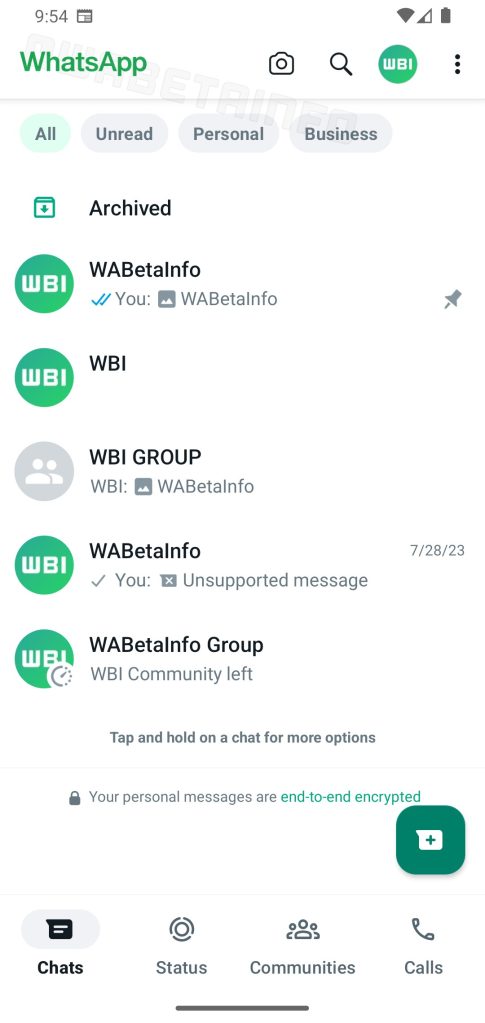
Uncovered by the folks over at WABetaInfo, WhatsApp version 2.23.13.16 on Android contains a brand-new design buried under the hood. The design ditches the darker green top bar of the interface and trades it for a mostly stark white design with a prominent WhatsApp logo at the top in place of the previous generic text wordmark.
The new look also moves most key section markers to a bottom-bar UI. The bottom bar shows chats, status, communities, and calls. It has a clearer design than the current look, and also makes more sense alongside the new floating button for starting a new chat. The bottom bar first appeared in another beta version in June but didn’t roll out.
There are also new filters at the top of the chats list, with filters for all, unread, personal, and business chats. That functionality doesn’t exist for most users today, but has appeared in other versions of this upcoming redesign.

It’s unclear when WhatsApp might roll out this new redesign to all users, but it’s certainly a nice tweak to the overall look and feel. Hopefully, we’ll see it launch soon.
More on Messaging:
- WhatsApp may soon support more advanced text formatting
- How to get Google Messages and iMessage in the same app with Beeper
- WhatsApp tests custom AI-generated stickers in beta
FTC: We use income earning auto affiliate links. More.


Comments