
Google Drive has added a new “Home” page that brings suggested folders and documents to the forefront, and it’s starting to become available. Here’s how to use it.
Spotted back in May, Google Drive’s Home section is a dedicated page for suggested documents and folders. Rather than leaving users with a simple and traditional file structure – as seen on the My Drive page – the new page is meant to show you files before you go digging for them.
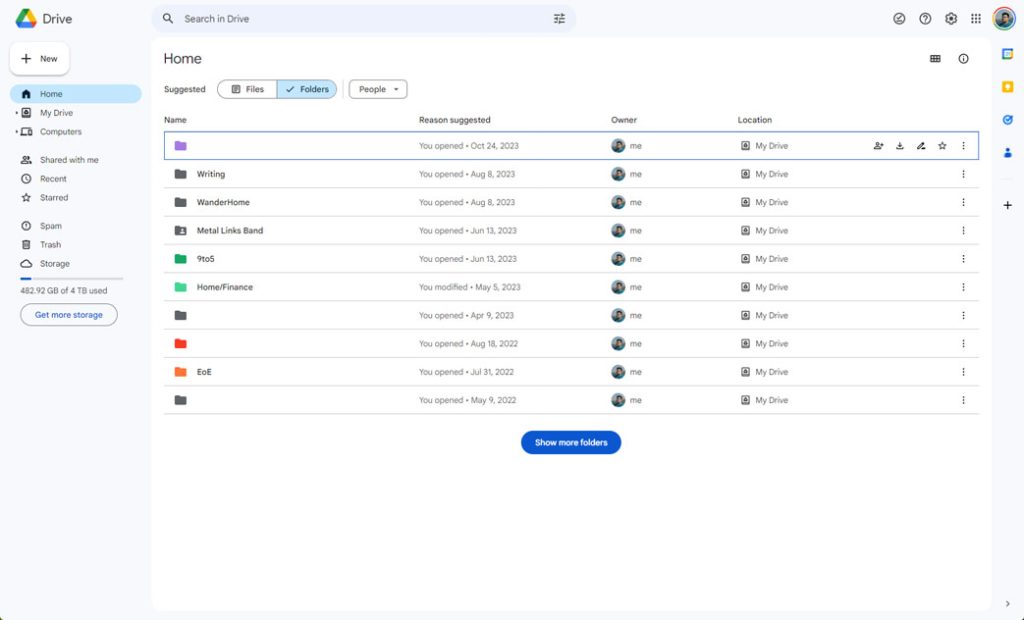
The new page can be seen as a modified version of the recent section on the My Drive page, though Google is seemingly injecting a little AI into the file storage tool. On the Home page, you’ll see a selection of suggested files and folders.
You can switch between each, depending on what you’re looking for. Besides the storage type identifier, there’s a selection of filters that should be familiar. They’re the same ones on the My Drive page. The only difference in filter selection is the lack of “Location” in the My Drive section.
Top comment by shaughn
Google cant seem to leave things that work alone. First it removed the download bar in Chrome so I dumped that for Firefox which lets me have a downlaod bar with an add on. Now they add this home button mess to drive. I hate it. Guess Ill be dumping Drive for Microsofts One Drive now. I already dropped android for Iphone. These changes should be offered as a choice not forced on customers.
In either a list or grid, you’ll see a selection of suggested files or folders on Google Drive’s Home page. In the list view, you’ll see sections identifying the name, reason suggested, owner, and location in Google Drive. The reason suggested will let you know why it’s on that list in the first place, divulging when it was opened or edited and even when a shared file is edited. For instance, you might see a suggested file if another user changed it or commented on it. Seeing a file placed at the top of the list because someone changed it is a welcome feature of the new page.
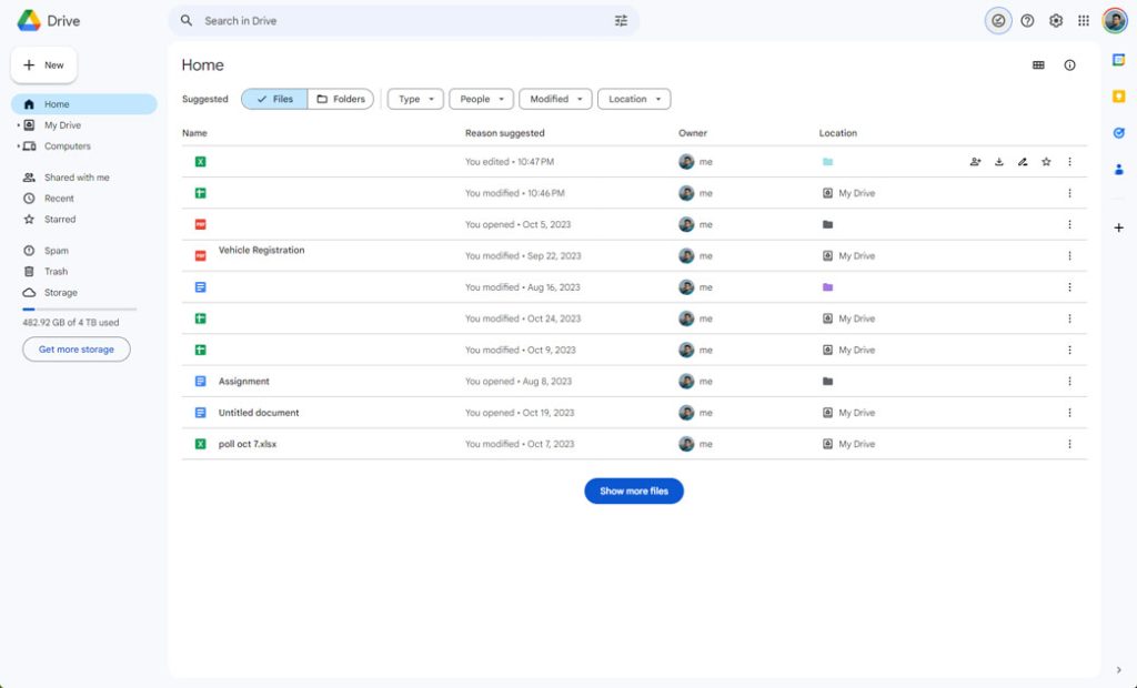
A “Show more files” button will appear at the bottom of the page, which allows you to see more suggestions if you can’t find what you’re looking for.
There is one subtle difference between the final version of the Home page and the test version released in May. At the top of the test phase version, there was a “Suggested” and “Activity” selection. Now, the word “Suggested” is moved in front of the file button, and the activity button is gone. We assume the new Home page can be sorted by both, and they’re combined on this page.
Overall, the new Home page in Google Drive is simple and easy to use. It seems to be rolling out to some users, so if you haven’t seen it yet, you might soon.


FTC: We use income earning auto affiliate links. More.



Comments