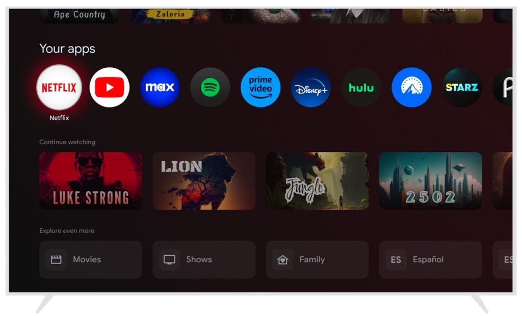
Google TV is a really solid platform for streaming, but one criticism that many share is how the platform’s homescreen minimizes app icons, with apps being smaller than most other elements of the homescreen. Soon, though, Google has confirmed a change that will make them even smaller as well as switching to a circular design.
In a developer-centric blog post on Medium this week, Google has confirmed a redesign for the homescreen of Google TV which will bring circular app icons to all apps.
Google says the redesign will arrive in “early 2024.”
Why the change? Google explains that having smaller, circular app icons on Google TV’s “For You” tab will make it easier to users to set their favorites on the homescreen as there will be more room for more apps. As it stands today, Google TV can show a maximum of 12 apps before pushing users to a “See All” overflow menu.
In the screenshot below, we can already see 10 apps, and that’s before scrolling off to the left.
Google notes that this change will require developers to tweak their apps, which is why the Google TV homescreen redesign is being announced now. All apps will now be required to submit square app icons that can adapt to this circular format. Google details some best practices and common issues on its post, which includes using adaptive icon principles and vector formats. Google TV will still force app icons to appear in this circular format, but it might not look correct if the developer hasn’t set things up properly.
While further minimizing the size of app icons on the homescreen feels like a move in the wrong direction, this seems like a net positive as it will allow users to see more apps at once. Google TV apps will still show their larger banners in other parts of the UI, too, such as the “Apps” page.

Notably, too, this device choice would really set Google TV apart a fair bit, as competing platforms such as Roku, Apple TV, and Amazon’s Fire TV all use rectangular icons.
It’s not clear exactly when this redesign will debut, but the “early 2024” date implies it could be sometime over the next three or four months.
More on Google TV:
- Report: OnePlus and Realme will stop making Google TV sets for India
- Spotify rolls out major TV app redesign, live now on Google TV [Gallery]
- Why is Android TV better at showing your movie library than Google TV?
FTC: We use income earning auto affiliate links. More.


Comments