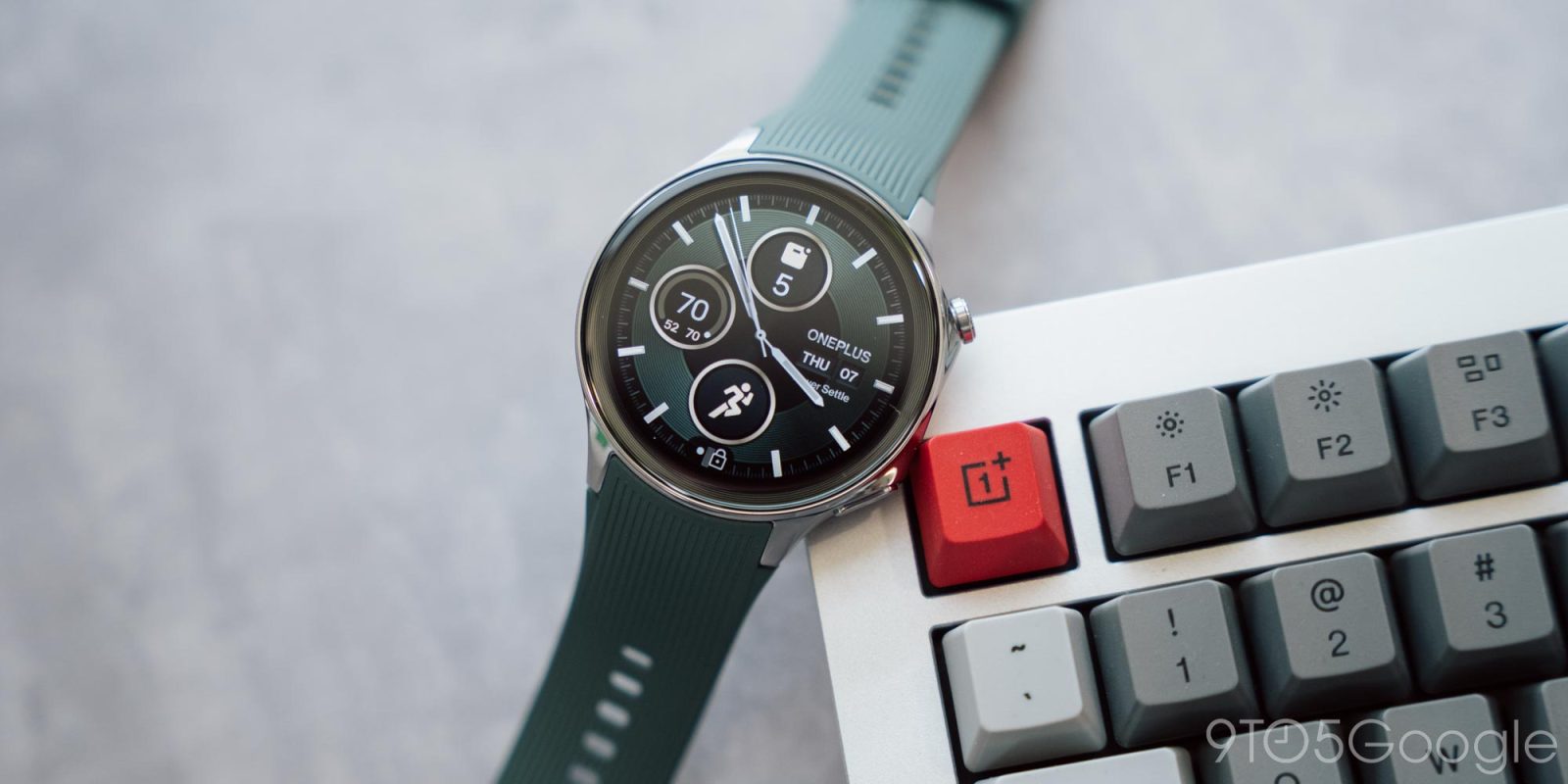
The first OnePlus Watch was one of the worst products in the brand’s history, but with a revamped vision, clever tricks, and Wear OS at its core, the OnePlus Watch 2 is drastically improved. It’s still not perfect, but its redeeming qualities make up for its deficiencies.
Table of contents
Excellent hardware with one stupid omission
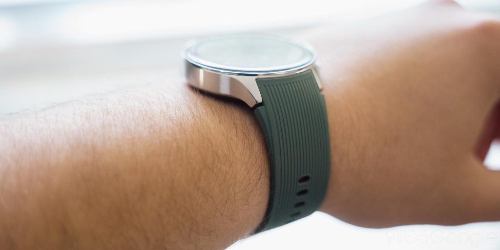
Looking first at the hardware, this is an area where OnePlus Watch 2 really shines. The stainless steel chassis isn’t apologetic about being big with a 47mm size, but for the first time in a while, it’s a size that I didn’t really mind. The smooth curves and surprisingly light weight of the watch keep it feeling super comfortable on the wrist all day and all night, even coming from the much smaller Pixel Watch 2 prior to it. And the sapphire glass up top left me not worrying one bit about scratches.
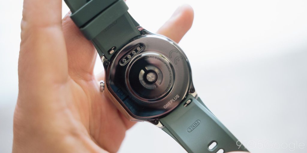
The included band is also stellar, with its “Fluororubber” material feeling better on the skin than typical silicone and just adding the comfortable on-wrist feel. The band’s design also matches well with the striped ring around the bezel of the display. Plus, it’s just a typical 22mm band, meaning you can easily swap it out, and it looks rather nice if I do say so myself with a brown leather band attached.
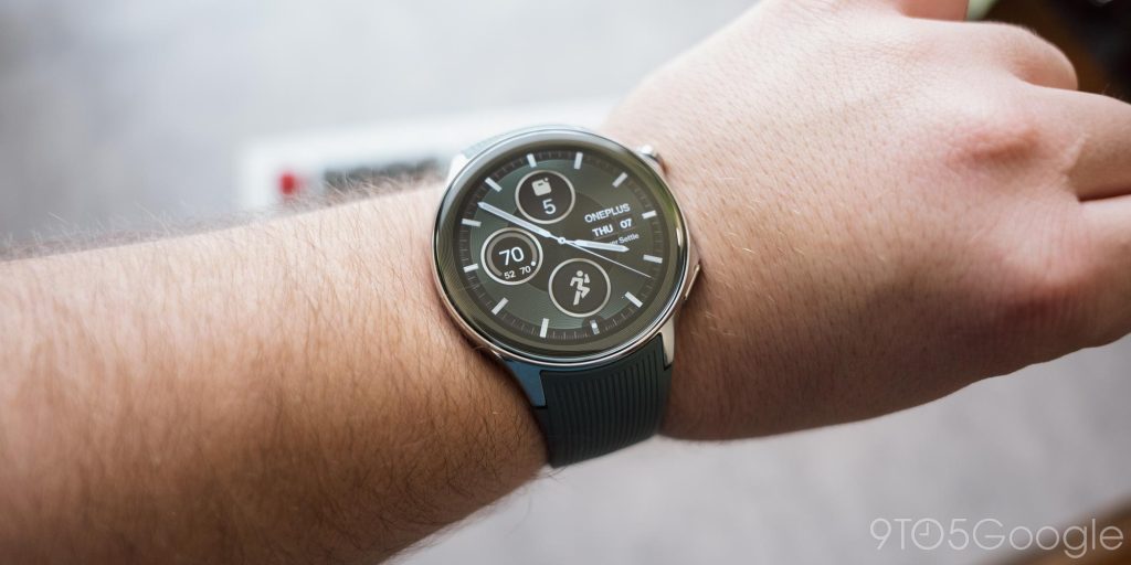
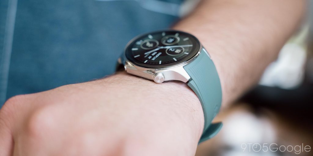
The only real oddity to the design is the asymmetric section off to the right side which houses the buttons. Both buttons serve multiple functions with the top mainly used to open the app drawer and Google Wallet, and the bottom to start workouts, but they’re both fully remappable in the Settings to suit your preferences. That top button, though, faces both a hardware and a software issue.
The crown button rotates, it just doesn’t do anything.
The lack of a rotating crown isn’t a new problem with Wear OS watches. For a while, Fossil (RIP) didn’t offer any function for its spinning crown button. Back then, though, this was still an emerging market, and it was within the realm of acceptability for a smartwatch to not have this functionality. But over time, Fossil added it. Mobvoi was the last domino to fall with the rotating crown, with the TicWatch Pro 5 finally adding the long-awaited functionality.
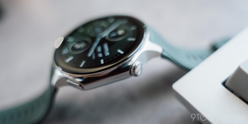
All of that is to say, this is something customers expect in a high-end smartwatch. A rotating crown is now among the features that are essentially a requirement once a smartwatch reaches a certain cost, and the $299 price tag of the OnePlus Watch 2 is far beyond that line. If you have a protruding physical button like this, it just has to control the UI. The only exception to this, at least in my eyes, is a more sporty smartwatch, like the Galaxy Watch 6, but even Samsung employs a touch-sensitive bezel to replace the rotating crown.
Worse yet, OnePlus basically makes you assume the crown does something with its ripoff of the Apple Watch app drawer. The “planet” view shows apps in a grid that you can move around or zoom in and out of, but without a rotating button, it feels even more cumbersome than it does on the Apple Watch.
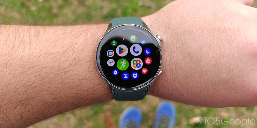
There’s simply no excuse for having left this out.
Luckily, that’s perhaps the single biggest negative of both the hardware and the software (and you can change the app drawer to more traditional styles too).
OnePlus admits that Wear OS is what was missing
The biggest change on OnePlus Watch 2 is the pivot to using Google’s Wear OS as the main operating system. This means you get access to the same huge library of apps and services as smartwatches from Google and Samsung. It fixes the biggest complaint I had about the first OnePlus Watch simply because it makes the watch useful for more than just notifications and health tracking. Apps, and Wear OS 4 as a whole, runs flawlessly on the Snapdragon W5 Gen 1 chipset under the hood too.
OnePlus’ software skin on top of Wear OS is reasonably light, and feels much like the RTOS software that was used on its predecessor, but in a good way. If you’re using a OnePlus phone, you’ll definitely feel at home on the watch, but it feels “standard” enough that anyone will likely be happy with the experience.
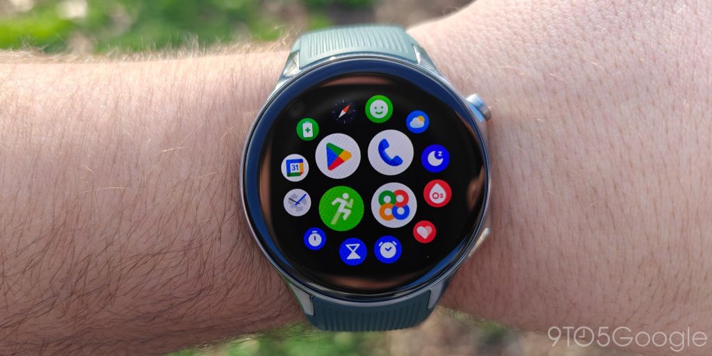
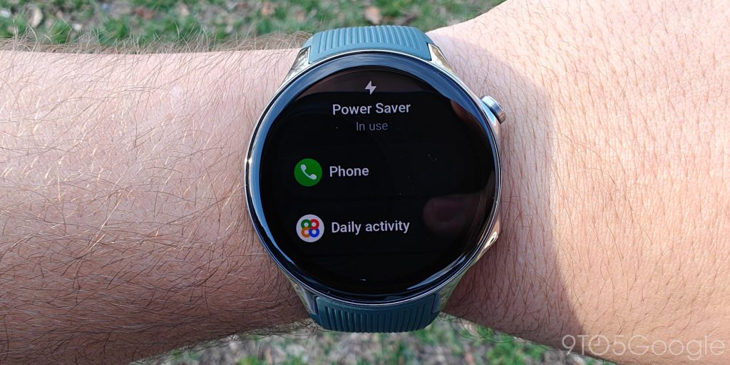
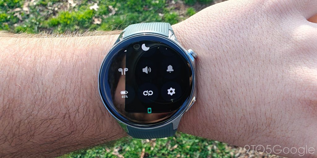
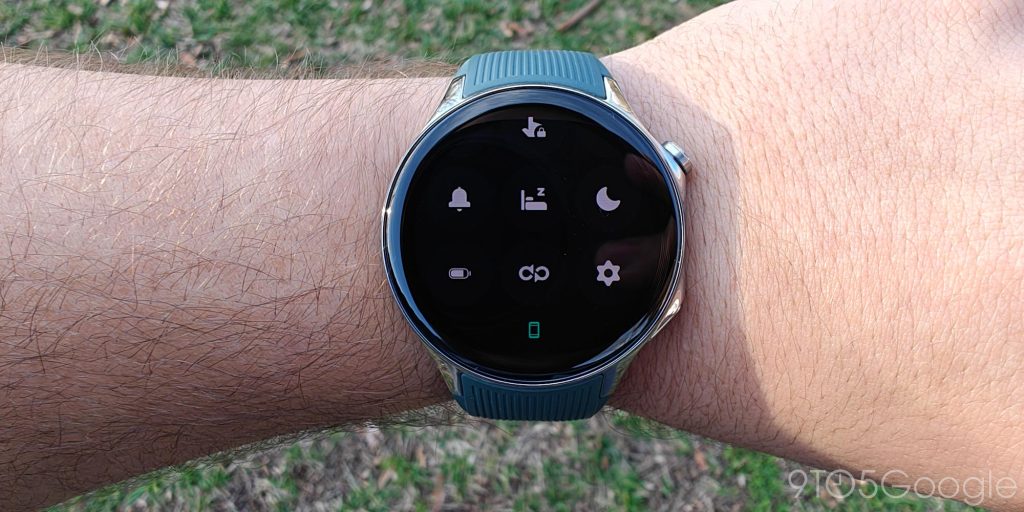
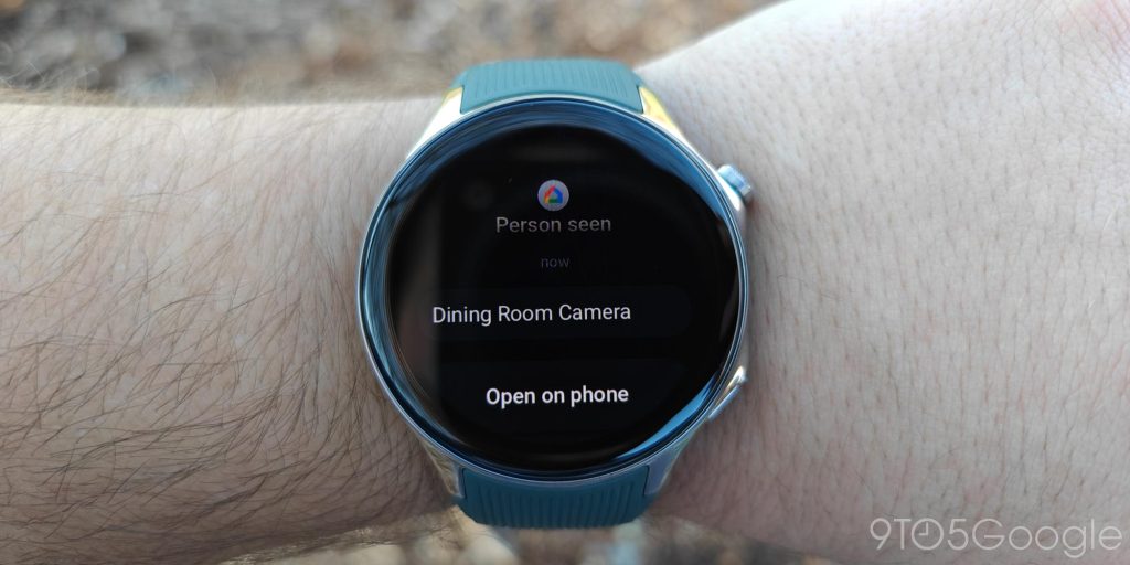
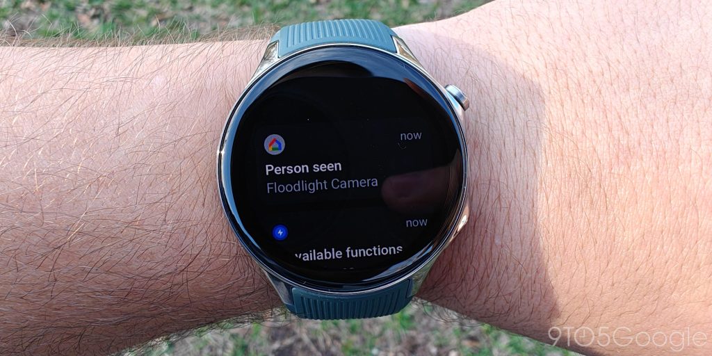
After the disaster that was the previous RTOS-only experience, using a OnePlus smartwatch with Wear OS just feels right, and even OnePlus admitted to its mistake.
That said, it’s not perfect.
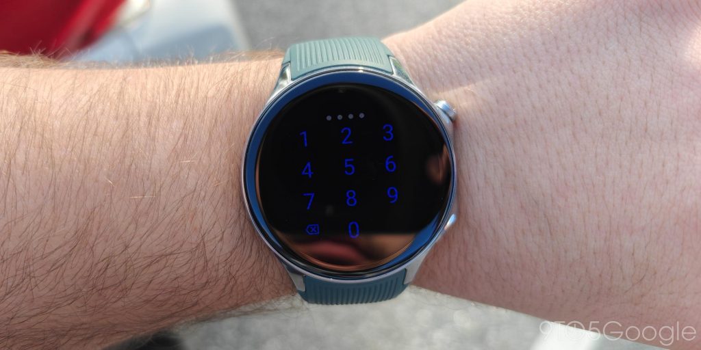
There’s the aforementioned app drawer situation, but there are also some other little pain points throughout the software. For example, I think the blue color of the PIN unlock screen is harsh and hard to read against the black background. It’s little things like that which add up, but don’t really overpower the good things.
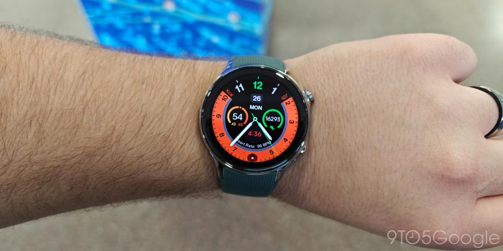
The only big negative I found that hurt the overall experience was the lack of good watch faces. OnePlus has quite a few built-in faces, but I wasn’t a big fan of the design of all of them. They’re all loud, crowded, or too skeuomorphic. But, since this is a Wear OS watch, you can just swap it out with something else, though you do lose a lot of battery savings when you do.
Decent health tracking that does the opposite of encourage
OnePlus has bet pretty heavily on health tracking when talking about Watch 2, but my experience hasn’t been great on that front.
Generally speaking, health tracking metrics on the OnePlus Watch 2 are off by at least 30% compared to my Pixel Watch 2 (going based on history, as I didn’t wear both simultaneously). The Watch 2 has a tendency of either under or over-counting steps and generally doesn’t seem to get sleep data correct either. There’s no real trend to how this data is off, as it’s usually either saying I slept more or way less than I actually did. But, that’s honestly pretty typical of smartwatch health data. You shouldn’t use this information as fact, but rather to find trends based on the device. In that sense, it’s fine, but more than others you shouldn’t use the data to compare.
In terms of workout tracking, OnePlus’ handoff between Wear OS and RTOS (which handles workouts) is completely seamless, and the UI is really solid. It’s easy to understand and works well enough, though I wish it was able to detect when you’ve finished a workout. On a “freestyle” workout (while playing disc golf), the Watch 2 never thought to end the workout on my 20 minute drive home, leading to almost four hours of tracking.
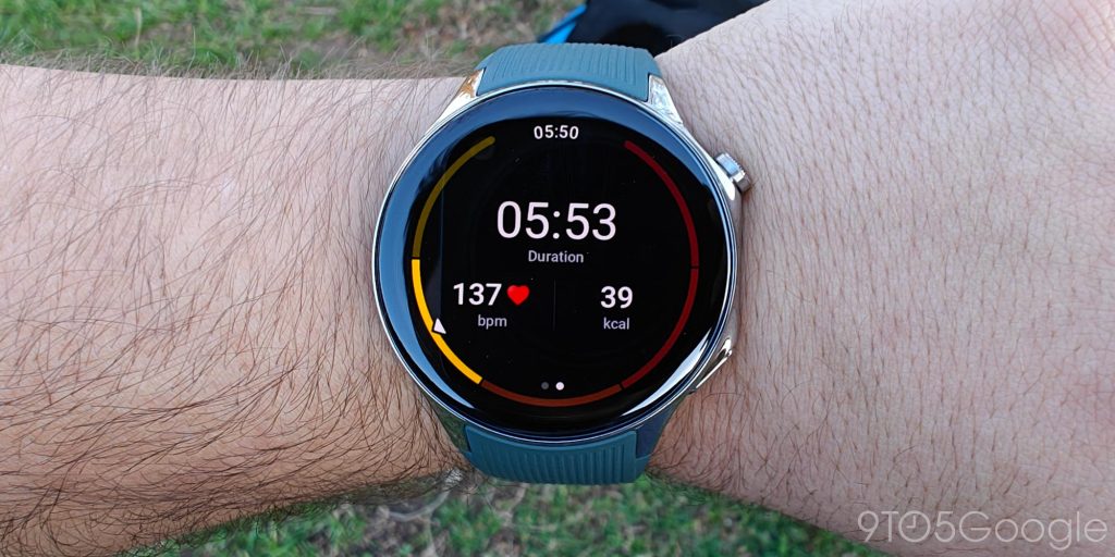
Really, the health tracking itself felt completely acceptable to me. It gets the job done. But what felt like a big detractor was how OnePlus shows that data.
The “OHealth” app has a super basic UI (both on the watch and the phone) which isn’t pleasant to use. It also won’t sync the data across devices unless you use Health Connect to sync it to another compatible app.
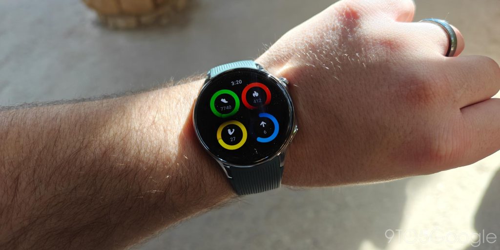
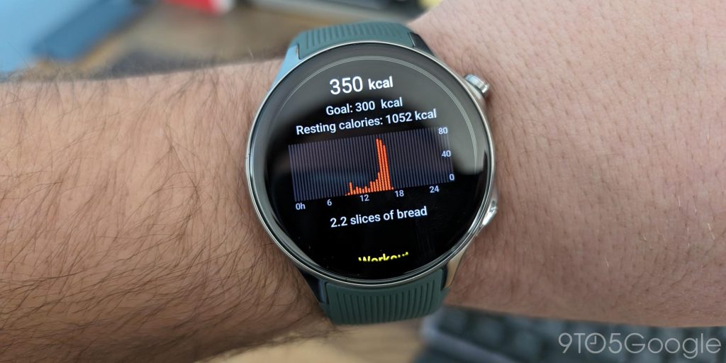
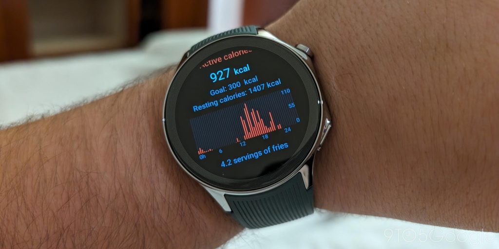
The big problem in my eyes was how OnePlus compares the data. On the watch, you can see “Active Calories” you’ve burned through the day by walking, working out, etc. Calories are always a tough metric to get right, but OnePlus compares the calories you’ve burned to different types of food. This is often represented by things like lattes, fries, slices of bread, or egg tarts.
The metric of comparing calories burnt to a food item is… a choice. I can see how OnePlus got there. Not everyone knows calories very well, and comparing it to common food items is a recognizable metric.
But it’s also so depressing.
Imagine you’re someone trying to lose weight, and you bought a OnePlus Watch 2 all excited to start tracking your progress. You hop on a treadmill for an hour and work hard to burn those calories, only to look at your stats and find out you burned off a couple of slices of bread. That’s not encouraging! That won’t help someone lose weight, it would only hinder their progress. Personally, as someone who has struggled with this for years, I hate this approach. If you know what calories burnt means for you, this is something you can just ignore. But for someone just starting? This is awfully sad. If it were up to me, I’d remove this from the software as soon as possible, or at the very least make it optional, because it’s doing the opposite of what I think OnePlus (and/or Oppo) want it to be. Luckily, OnePlus tells me that a software update will be removing this, but it’s unclear if that’ll be available before customers get their hands on the watch.
Battery life is the main reason to buy OnePlus Watch 2
But, looking past the quirks and downsides, there’s a big reason to buy the OnePlus Watch 2, and that’s battery life.
OnePlus advertises the smartwatch with 100 hours of battery life, a staggering figure in the world of smartwatches that have actually-useful functionality. That’s accomplished using the new hybrid architecture of Wear OS that debuted with this very smartwatch, and essentially allows the device to run two different operating systems at once. Wear OS handles useful functions while a simpler RTOS handles things like notifications and various other background tasks. In practice, you’d never know this is happening, and it leads to a truly good Wear OS experience that easily lasts a couple of days or more.
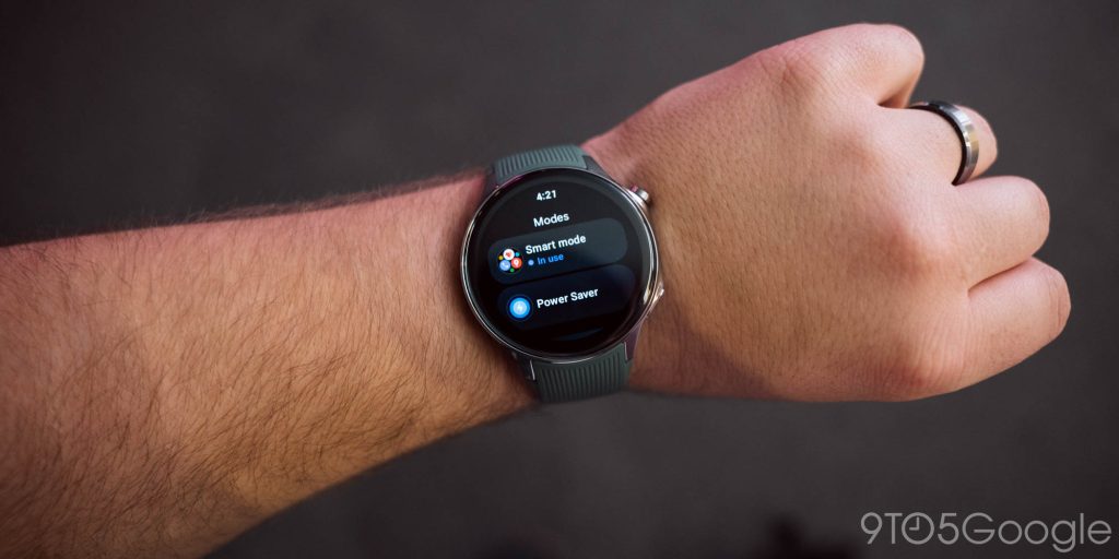
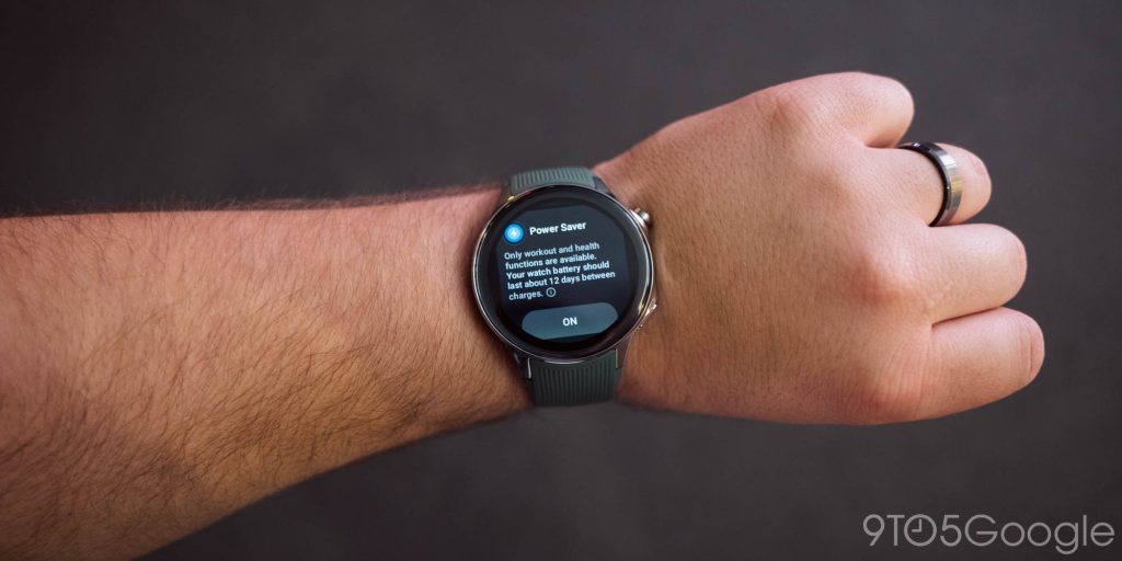
As for OnePlus’ 100-hour claim, I never quite reached it. Just shy of 80 hours was the best I could get before the Watch 2 kicked into its limited “Power Saver” mode, but I think that mode is key to what makes this watch so good.
Smartwatches that run super basic operating systems have been able to deliver week-long battery life for years now. That’s why the original OnePlus Watch had no trouble lasting days off of the charger. But you’re effectively trading actual functionality, like apps and actionable notifications, for a bit more time between charges. Not worth it if you ask me. But the OnePlus Watch 2 gets the best of both worlds. You can run it as a fully functional Wear OS watch, but then just flip on Power Saver mode to jump into an experience that’s fully using RTOS. You still get notifications, some apps, and other key functions, but with the better part of two weeks off the charger. And, if you need a Wear OS app, you can just switch back.
This is big, and easily the single-most attractive part of this smartwatch. It’s something no other offering does, and it certainly came in handy for me. The only thing I don’t love is that the watch forces you into this mode when you have less than 10% battery left, even if you want to keep using “Smart Mode” for the last little bit.
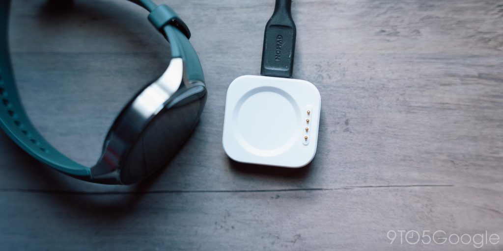
When it does come time to charge, you get one of the best charging methods I’ve ever seen. The OnePlus Watch 2 has a magnetic charging dock with pins like many other watches, but the dock doesn’t have a fixed cable. Rather, you can just plug any other USB-C cable into it. This is hugely convenient for travel, especially given the speed at which the Watch 2 fills back up.
Seriously, kudos to OnePlus on this one. It’s absolutely brilliant, and something I hope to see become a standard across other brands.
Final Thoughts
You should at least consider buying the OnePlus Watch 2
Back in 2021, I said that “not one person should buy the OnePlus Watch in its current state.” It was that bad. And that’s almost entirely because of OnePlus’ choice to put out a smartwatch that wasn’t using an established, fundamentally good operating system. In fact, OnePlus effectively taunted Wear OS at the time saying that it wanted the original Watch to do more than “indicate the time and heart rate” when, in reality, the choice to use RTOS meant the original OnePlus Watch was really only good for those two functions.
But OnePlus has really, truly done a good job this time around. The OnePlus Watch 2 is great, and that’s because Wear OS makes it an actual smartwatch.
I don’t think the OnePlus Watch 2 is perfect or even the single-best Wear OS smartwatch, but it’s a fantastic product that virtually anyone in the market should at least give consideration. I’ve never used a sequel product that’s so vastly improved from its predecessor. OnePlus should be proud of the Watch 2, and I can’t wait to see how it gets better over time.
At its $299 price tag, too, the Watch 2 is a pretty decent value. You can even score $50 off if you trade in any watch (even if it’s not a smartwatch) when buying at OnePlus.com. At the time we’re posting, it’s also $50 off at Amazon.
Where to buy OnePlus Watch 2
FTC: We use income earning auto affiliate links. More.


Comments