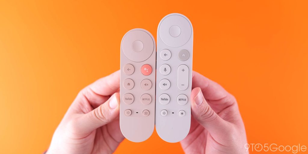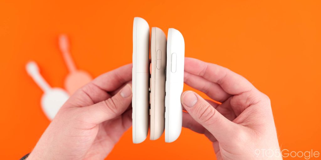
Google’s new remote for the Google TV Streamer has some clear upgrades, but when it comes to the volume buttons, I strongly feel the Chromecast got it right the first time around.
This issue of 9to5Google Weekender is a part of 9to5Google’s rebooted newsletter that highlights the biggest Google stories with added commentary and other tidbits. Sign up here to get it delivered to your inbox early!
The Chromecast with Google TV was the first streaming device that Google put out (on its own) with a dedicated remote. The Chromecast remote was a small remote with a curved back, eight buttons on top, and a navigational pad. Around its side, though, were two more buttons used for controlling the volume.
Volume buttons are some of the most-used on any TV remote, and Google’s decision to place them on the side was met with mixed opinions. Some appreciated the ergonomics, while others felt the buttons should be visible on top.
Personally, I always liked the side buttons on the Chromecast remote, but I didn’t have any strong feelings about it until I upgraded to the Google TV Streamer last month. After a few weeks with the Streamer in my main two viewing areas, I’ve come to a conclusion – the Chromecast remote got the volume buttons right.


The side-mounted buttons may not have been quite as intuitive as the top-facing buttons on the Streamer’s remote, but once you do learn them, they’re considerably better in this specific style of remote. That’s because of the rounded bottom. While Google did make the remote a bit more steady this time around, it still doesn’t stay still if you reach for the remote to adjust the volume. No, rather it rocks around and essentially forces you to pick up the remote to change the volume. The benefit of the older remote was that the grip you’d naturally use to press the buttons kept it steady the whole time, whether you picked up the remote or not.
While the Google TV Streamer remote has benefits elsewhere, such as the new shortcut button, I wish Google hadn’t walked back this design choice.
What do you think? Do you prefer the volume buttons on the side, or on top?
This Week’s Top Stories
Google confirms early Android 16 release
Through the reveal of a new, more frequent SDK schedule coming in 2025, Google also confirmed that Android 16 will be released earlier in the year with a release date that’s likely to fall in or around August 2025.
OnePlus 13 revealed
While its global release is still a ways out, the OnePlus 13 has been officially announced in China, revealing that the Snapdragon 8 Elite-powered device will have a flat display, better water resistance, a bigger battery, and other upgrades.
- OnePlus 13 debuts with flat display and a higher price ahead of global launch
- Here are the official cases for OnePlus 13, complete with wood grain and magnets
- OnePlus 13 officially gets ultrasonic fingerprint sensor
- OnePlus 13 officially has a massive battery and magnetic wireless charging

‘Jarvis’ AI is coming to Chrome
Top comment by Lucas de Eiroz Rodrigues
I do prefer the side volume buttons, but I don't think it's that big of a deal.
A new report this week revealed that Google is working on a new “AI agent” currently codenamed “Jarvis” which would integrate with Google Chrome and automate tasks on the web including “gathering research, purchasing a product or booking a flight.”
More Top Stories
- The ‘Pixel Cap’ is technically Google’s newest wearable
- Google widely rolling out Pixel Weather to Pixel 6-8a
- Project Astra shipping ‘as early as 2025,’ Google sees ‘strong demand’ for Pixel 9
- Nintendo’s new music app is a clone of YouTube Music
- Latest One UI 7 leak reveals Samsung features and new lock screen coming with Android 15
- Google TV’s ‘Apps only’ mode now has ads and recommendations for many more users
- Pixel 9a reportedly gets a bigger 5,000 mAh battery despite being the same size
- You can’t remove your Android phone from Windows 11’s Phone Link app anymore
- Xiaomi 15 series launches as first phones with Snapdragon 8 Elite
- This $1,000 foldable is far better than I ever anticipated
From the rest of 9to5
9to5Mac: Apple unveils new MacBook Pro line with M4, nano-texture display
9to5Toys: Tested: Hands-on with Journey’s new light-up 15W wood-accented MagSafe charger
Electrek: Tesla gives update on self-driving roadmap, v13 slips, more promises
FTC: We use income earning auto affiliate links. More.


Comments