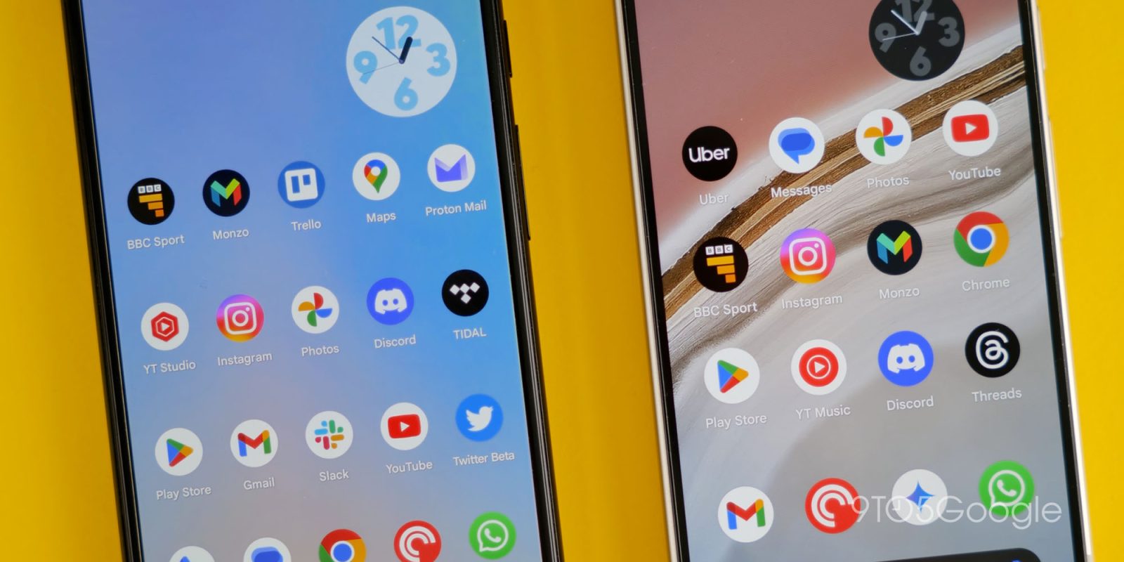
After four days of voting, we have a winner in our single-elimination tournament for the best Google four-color app icon.
Chrome beat Google Maps by a clear margin: 53.9% vs 46.1%.
The browser triumphed over Google Home (66.3% vs 33.7%) in the Round of 16 and Gmail (56.2% vs 43.8%) during the quarterfinals. The semifinal against Google Wallet was a different story at 50.4% vs 49.6% in what would have been a seeding upset.
Chrome is one of the few Google apps to have a full-bleed icon on Android. It really does help the application stand out on a homescreen. (Other icons include: Clock, Earth, Rewards, Translate. YouTube Music, which is naturally a circle, is frustratingly placed in another container.) The name is also unique in that it breaks the Google convention of just being called after its main function/role.
Over the rounds of voting, some took issue with the icon not really representing anything compared to something like Maps (a location pin) or Gmail’s ‘M’ and envelope. That said, its popularity has arguably earned it some leeway.
The icon was last updated in 2022 with version 100 of the browser. Google looked at a few other designs that were more drastic before deciding on a completely flat logo that matches most other first-party services.

Thanks to everyone for partaking in our little competition over the break!
FTC: We use income earning auto affiliate links. More.


Comments