Gemini for Android has rolled out tweaks to the chat page that make sharing and the overflow menu more prominent actions.
Previously, the app/top bar of Gemini conversations centered the chat title, with a tap bringing up a bottom sheet menu with various options. At the top-right corner, you got a new chat button.
This redesign sees the title left-aligned, with new chat next to it. This is followed by share (which immediately generates a link and then opens the system sheet), and the more traditional three-dot overflow button to access: Pin, Rename, Delete, Help, and Feedback.
Old vs. new


It’s a more conventional and familiar approach than the downward-facing caret, but clutters things up, especially with the hamburger icon on the other side. Moving the share button into the three-dot menu would help.
The side-by-side share and overflow icons are also available on gemini.google.com, but not Gemini for iOS.
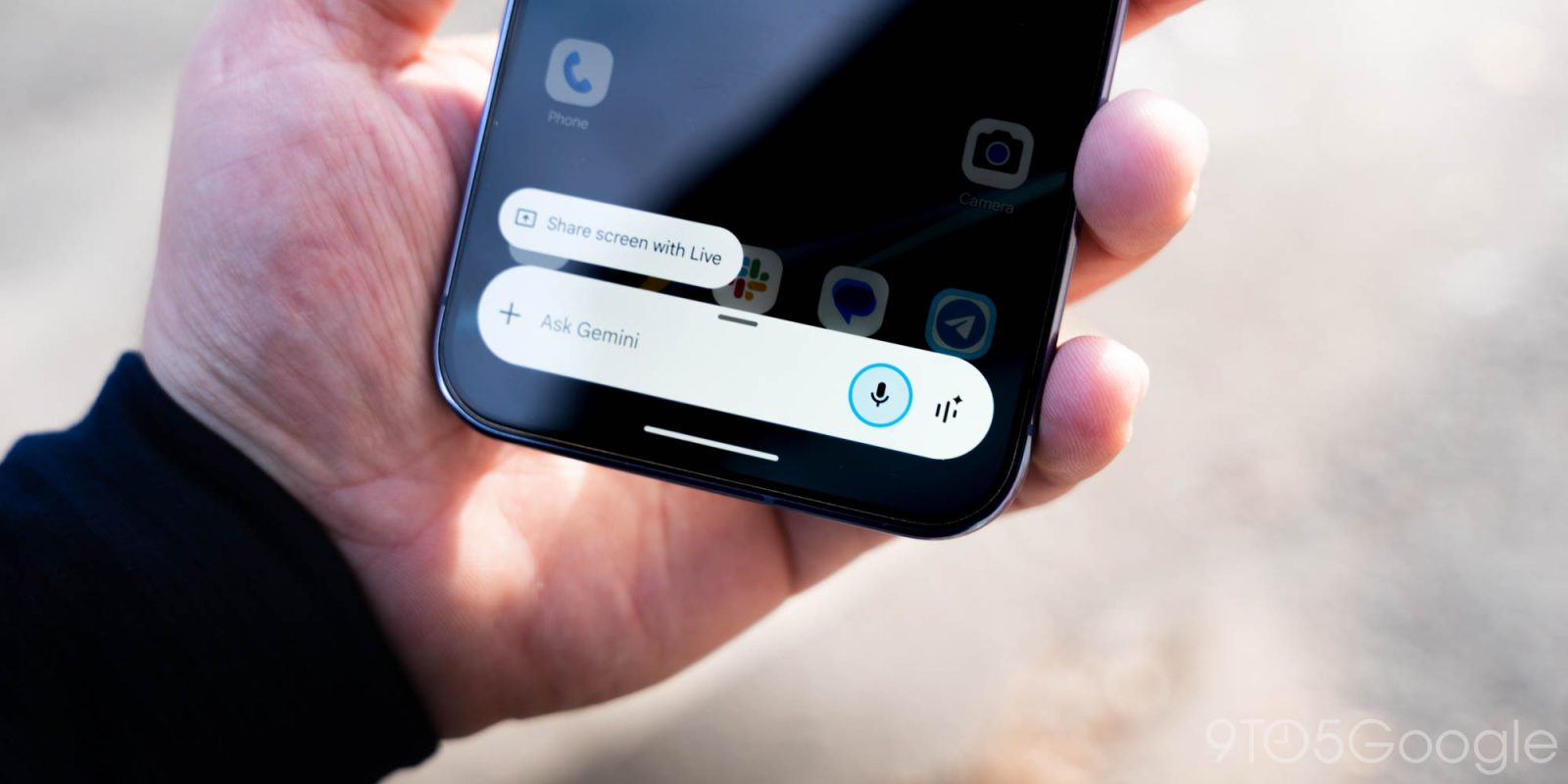
Speaking of the iPhone and iPad app, an update (version 1.2026.0570001) earlier this week noticeably increased the size of the Gemini spark. This large sparkle is much closer to the perimeter of the rounded square, and better matches other Google apps.
More on Gemini:
- Gemini 3 Deep Think gets ‘major upgrade’ aimed at practical applications
- Gemini ‘Tools’ redesign comes to Android & iOS as ‘My stuff’ drops preview
- Gemini ‘screen automation’ will place orders, book rides for you on Android [APK Insight]
FTC: We use income earning auto affiliate links. More.


Comments