Amazon announced a new UI for Fire TV last month that, at the very least, seems heavily inspired by Google TV. Now, it’s actively rolling out in the US.
The new homescreen design for Amazon Fire TV was announced at CES 2026 last month, and is a pretty big redesign. To quote our original coverage:
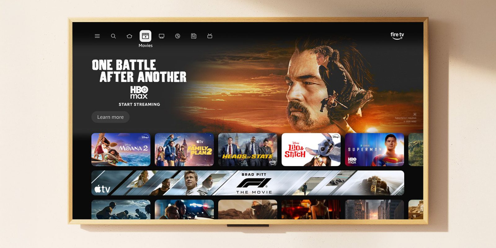
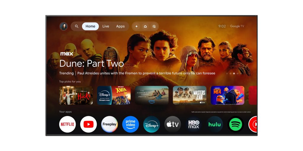
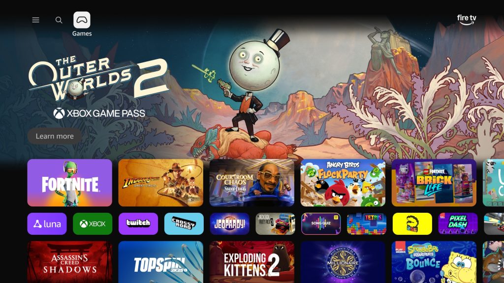
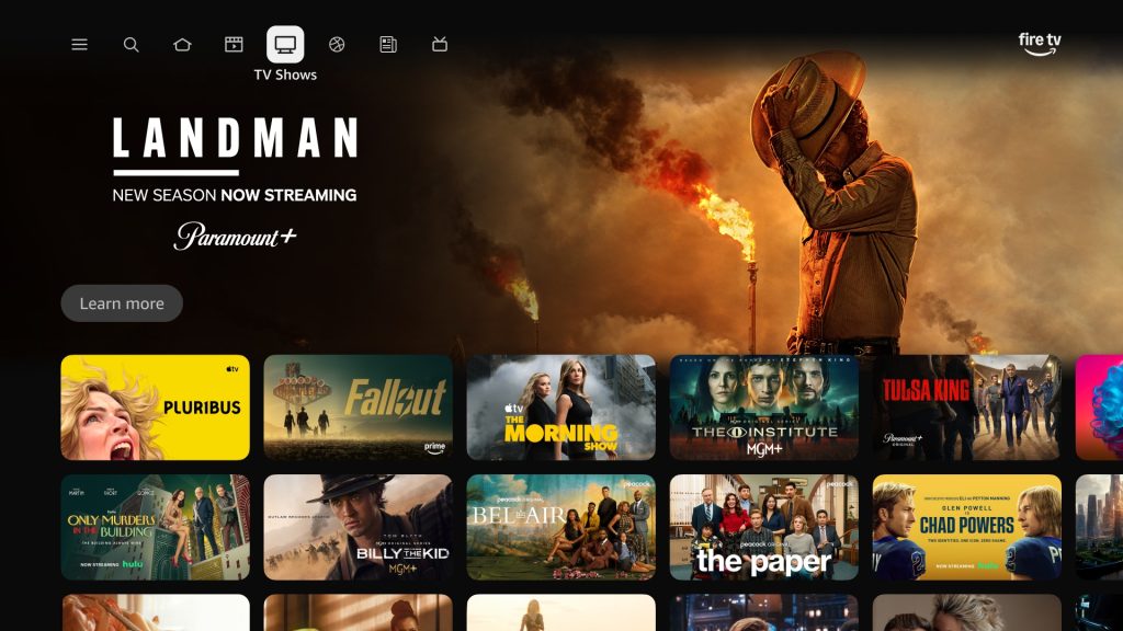
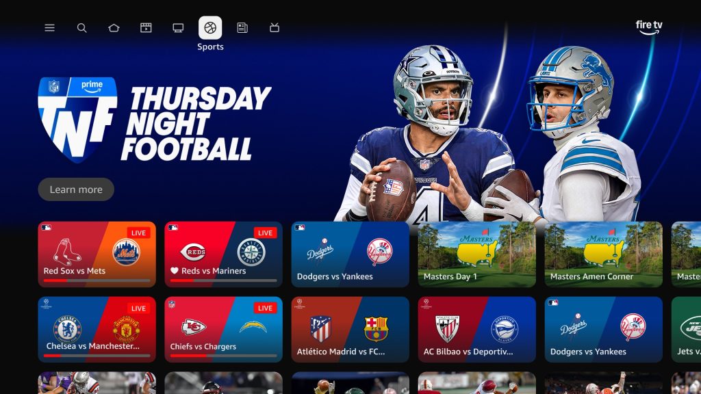
…Amazon says that it is redesigning Fire TV “to be cleaner, faster, and better organized.” And it does certainly look like that is the case. Amazon’s preview images show the new design with navigation across the top bar, featured content taking up the bulk of the main page, a row of content recommendations below that, and then a horizontally scrolling list of apps installed on the TV.
Amazon, speaking to TechCrunch, Engadget, and others, confirmed that Fire TV users in the US will start seeing the new design today. The rollout starts on Fire TV Stick 4K Plus, Fire TV Stick 4K Max (2nd Gen), and the Fire TV Omni Series Mini-LED TVs, with other devices getting the redesign starting in “Spring” of this year.
In other words, Fire TV devices in the States just turned into a Google TV of sorts. Amazon’s redesign, as we pointed out, is basically a copy of Google’s UI, with the same core layout and experience throughout. It’s a pretty blatant copy, as you can see when the two are put side by side.
Here’s what the new design for Fire TV looks like compared to Google TV:
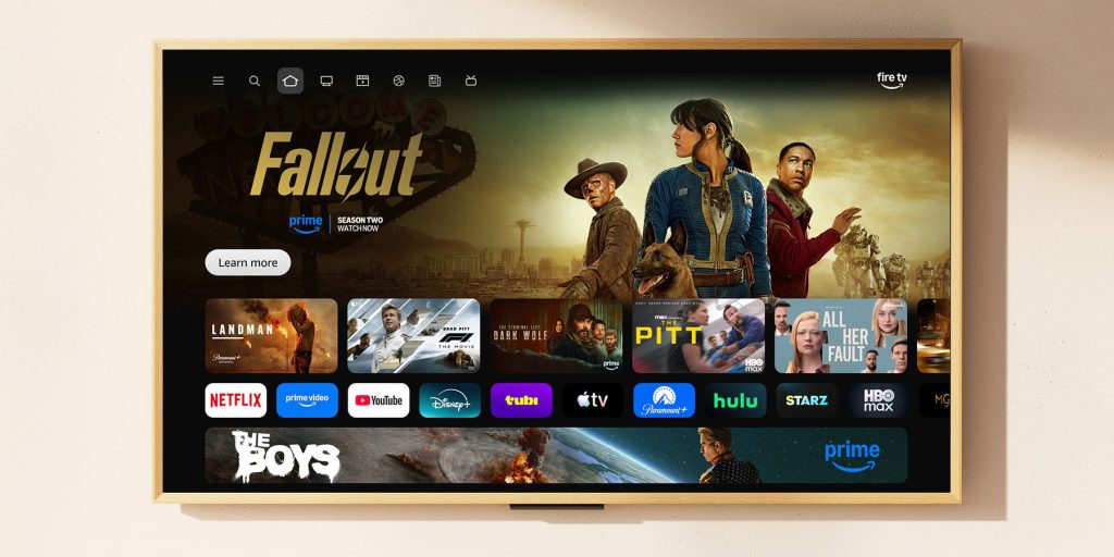
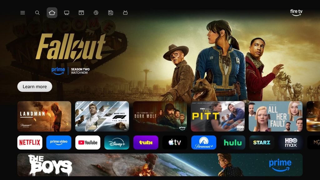
Amazon also shared a few new stills of the UI today, as seen below.
What do you think of the update?
More on TV:
- Amazon Fire TV Sticks get access to GeForce Now’s cloud gaming library
- Amazon Fire TV is now blocking the installation of some sideloaded apps
- Google TV tests new ‘Free’ and ‘Shop’ tabs to showcase additional content [Gallery]
Follow Ben: Twitter/X, Threads, Bluesky, and Instagram
FTC: We use income earning auto affiliate links. More.

Comments