
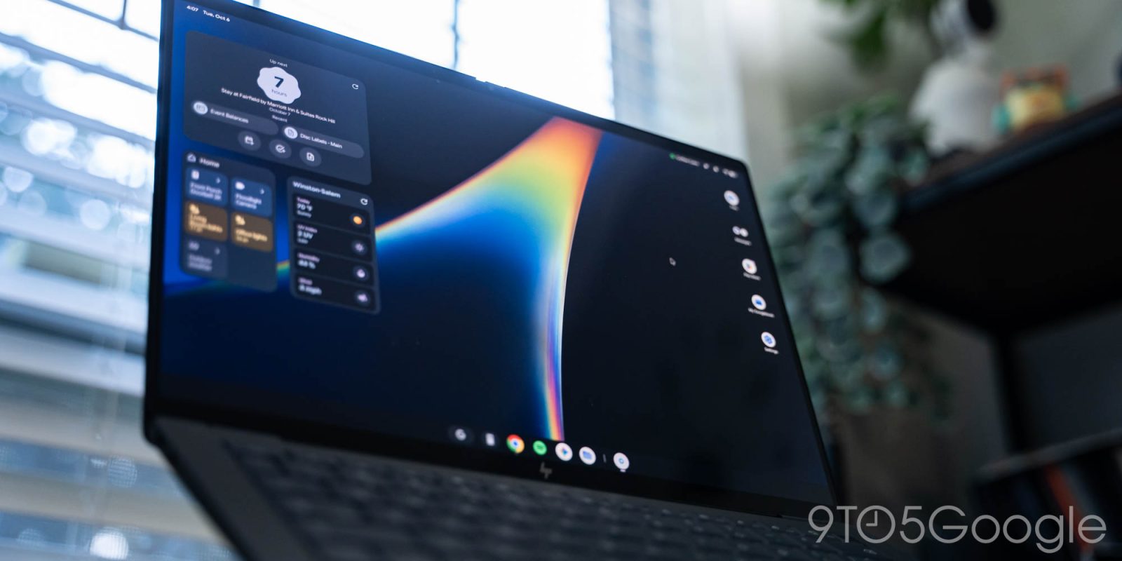
All attempts to bring the lessons and benefits of the touch era to PCs have failed, from Windows 8 to the era after the iPad when the Mac gained fullscreen apps. From an experience perspective, the iPad came closest because it was built on iOS, but it still failed due to the locked-down limitations at its core.
After using Googlebook OS for over a week, I think Google has the beginnings of a desktop OS for the Android smartphone generation, but the inherent strategy reset makes for a rough first take.
System
Googlebook OS looks like ChromeOS on the surface but feels like Android. However, it is more optimized than any large-screen iteration of Android to date, including foldables and especially tablets. This is infinitely better than other desktop Android experiences, especially plugging your Pixel into an external display.
There is a level of nativeness here that I always thought was missing from Chromebooks. ChromeOS from the very start felt like an extension of the web and never outgrew that in my opinion. Googlebook OS does not have that issue.
As a Pixel user, I quickly adjusted to the Googlebook UI and UX, with the only real learning curve being keyboard shortcuts. I think that will be true for any proficient user of Android smartphones, and that immediate familiarity could be very appealing for both the average and more advanced users.
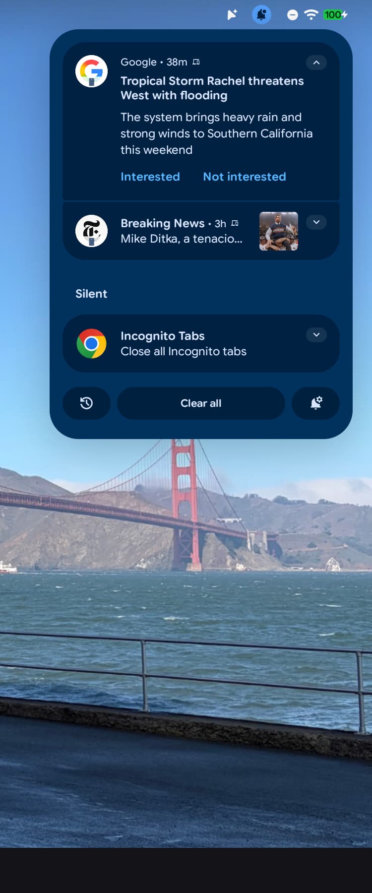
In the top-right corner, you’ll find familiar Android status icons. A tap opens Quick Settings that are identical to the Pixel experience save for a volume slider. The bell icon opens notifications with access to notification history in the bottom-left corner.
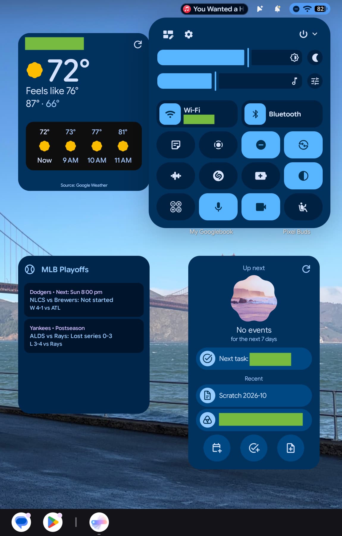
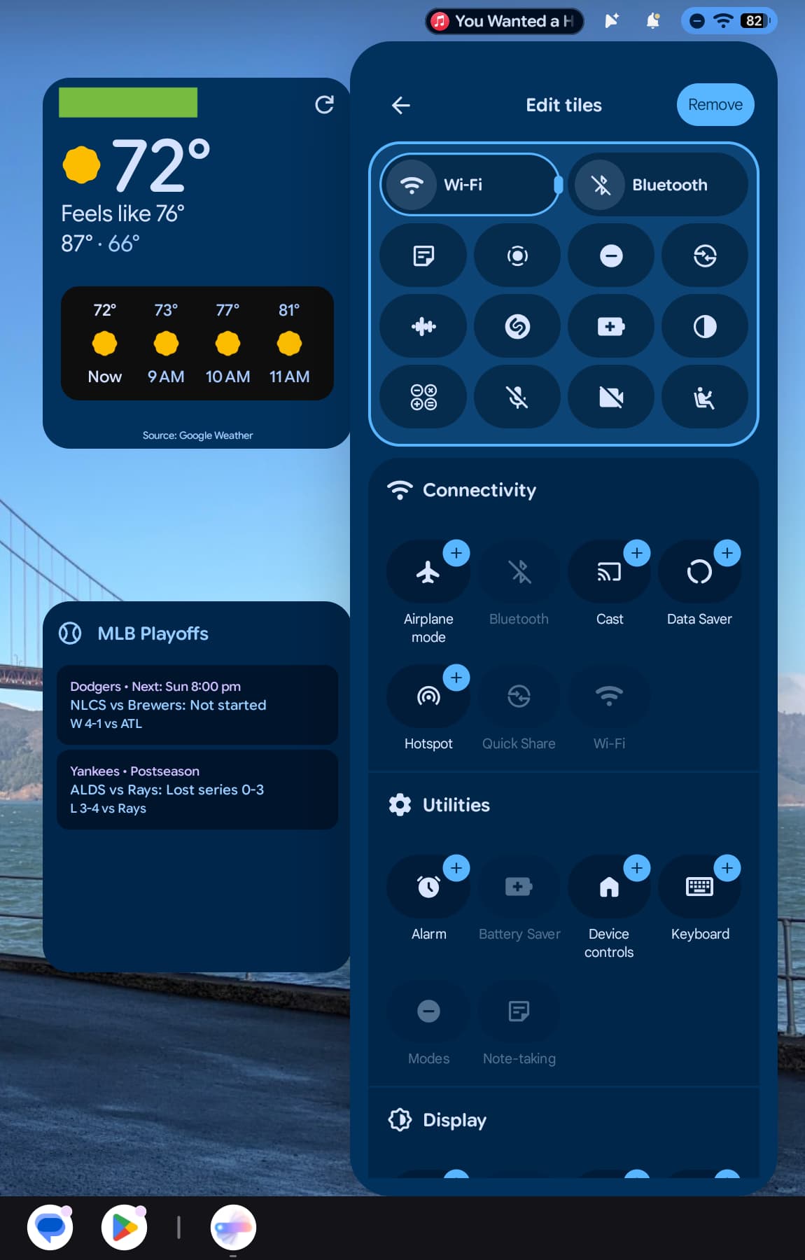
A shortcut that activates Magic Pointer is next, useful if you don’t want to enable the “cursor wiggle” gesture. There’s also a Live Update for any currently playing media. This tiny pill shows the responsible app and track name. Hovering over the icon lets you quickly play/pause and a tap brings up full media controls, which are also available in the notification shade. On other desktop OSes, pausing media always requires two clicks, with Googlebook’s implementation a really nice touch that takes advantage of having a cursor.
The top-left corner is home to time, day, and date, with a tap opening a useful calendar, like on ChromeOS.
On the HP Googlebook 14, the F1 key is Android’s back button and a genuinely useful hardware shortcut for quickly navigating apps. F2 is a Home button that takes you to the desktop, while F3 is Recents. F4 full-screens windows and F5 is for partial screen captures. F6 and F7 let you adjust screen brightness, while F8 lets you control the keyboard backlight. F9 is a microphone mute switch that works in conjunction with the Quick Settings Tile. F10, F11, and F12 are for volume, with F13 physically letting you start voice typing with Rambler. The icons could use some revamping, especially the fullscreen and screenshot symbols as both are too similar to the Recents key and too vague for glanceability. These rely on prior knowledge and are not designed intuitively.
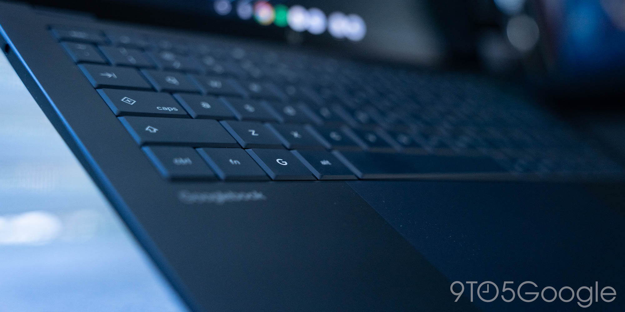
The Quick Insert key that’s physically shared with Caps Lock opens a floating window that lets you quickly add emoji, access copied text, recent screenshots, and tabs. Carried over from Chromebook Plus, it’s deeply integrated with Gboard from Emoji Kitchen to GIFs and Stickers. You can also access the Gboard Clipboard Manager found on phones (and leave it open as a floating window), as well as invoke voice transcription. It’s pretty useful for surfacing common functionality for those who don’t remember or expertly use keyboard shortcuts, and more than worthy of being a physical key. The capability I’m missing from my Mac workflow is a text expander for macros.
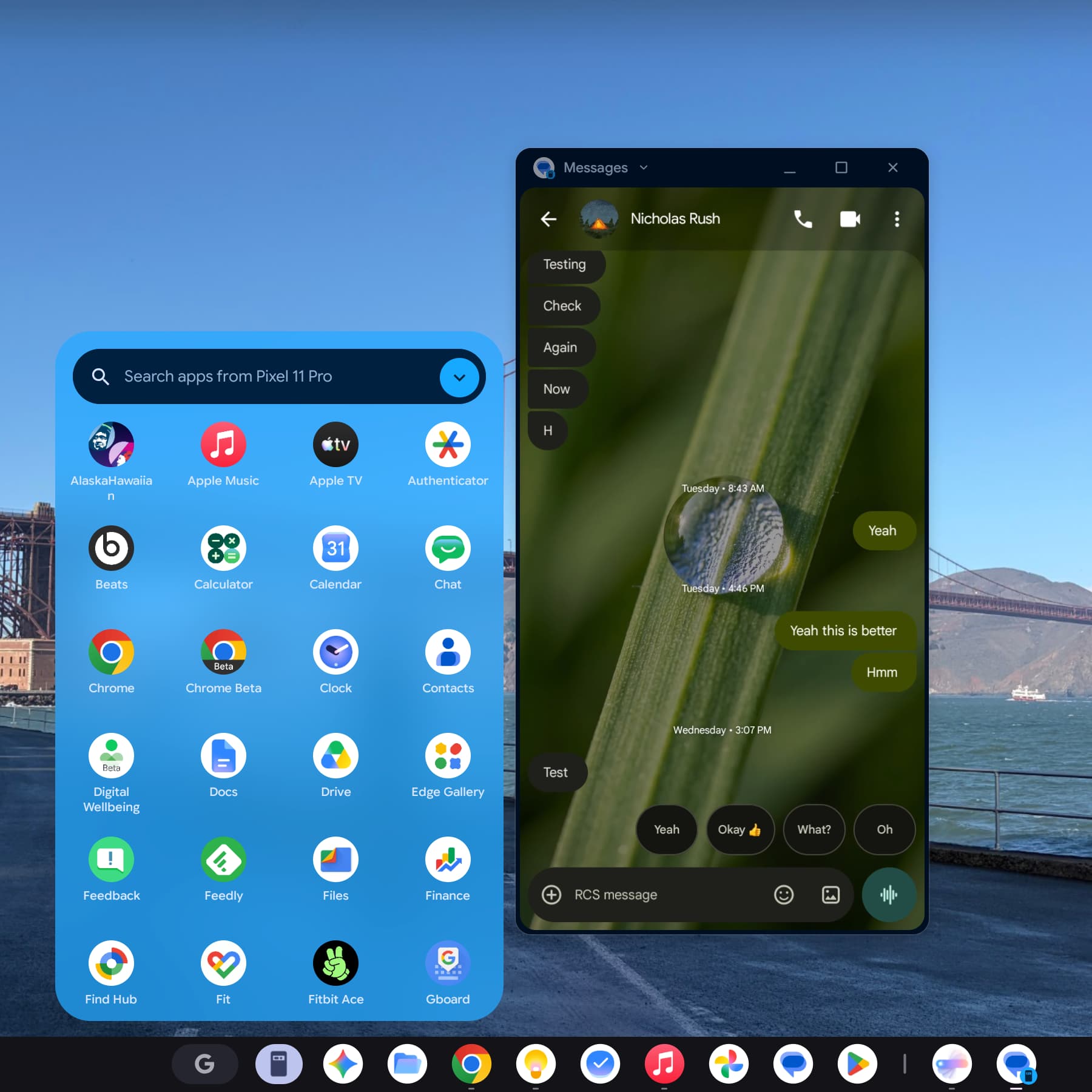
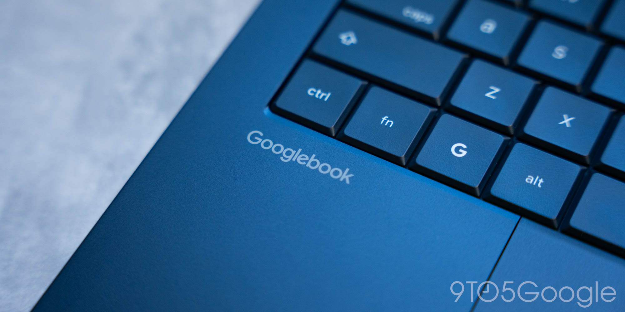
The stylized ‘G’ or Action key opens the floating app launcher. This is basically Pixel Launcher device and web search, and I wish there was Gemini integration here. You will use this key in combination with a host of other shortcuts.
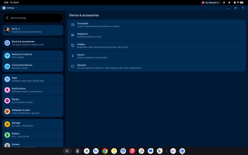
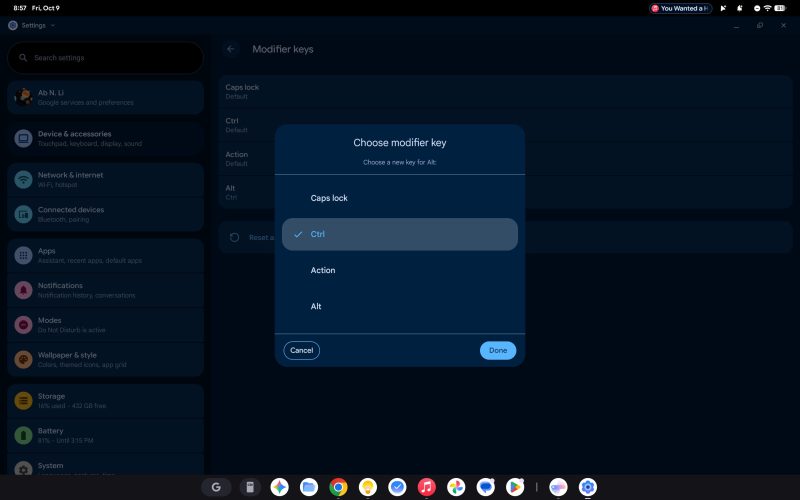
The Settings app is identical to the Pixel experience, with a dual-column layout. Controls you’d expect on a desktop OS appear first with “Device & accessories.” This lets you adjust the Touchpad, Keyboard, Display, Sound, and Glowbar. You can remap Modifier keys like Caps lock, Ctrl, Action (G), and Alt.
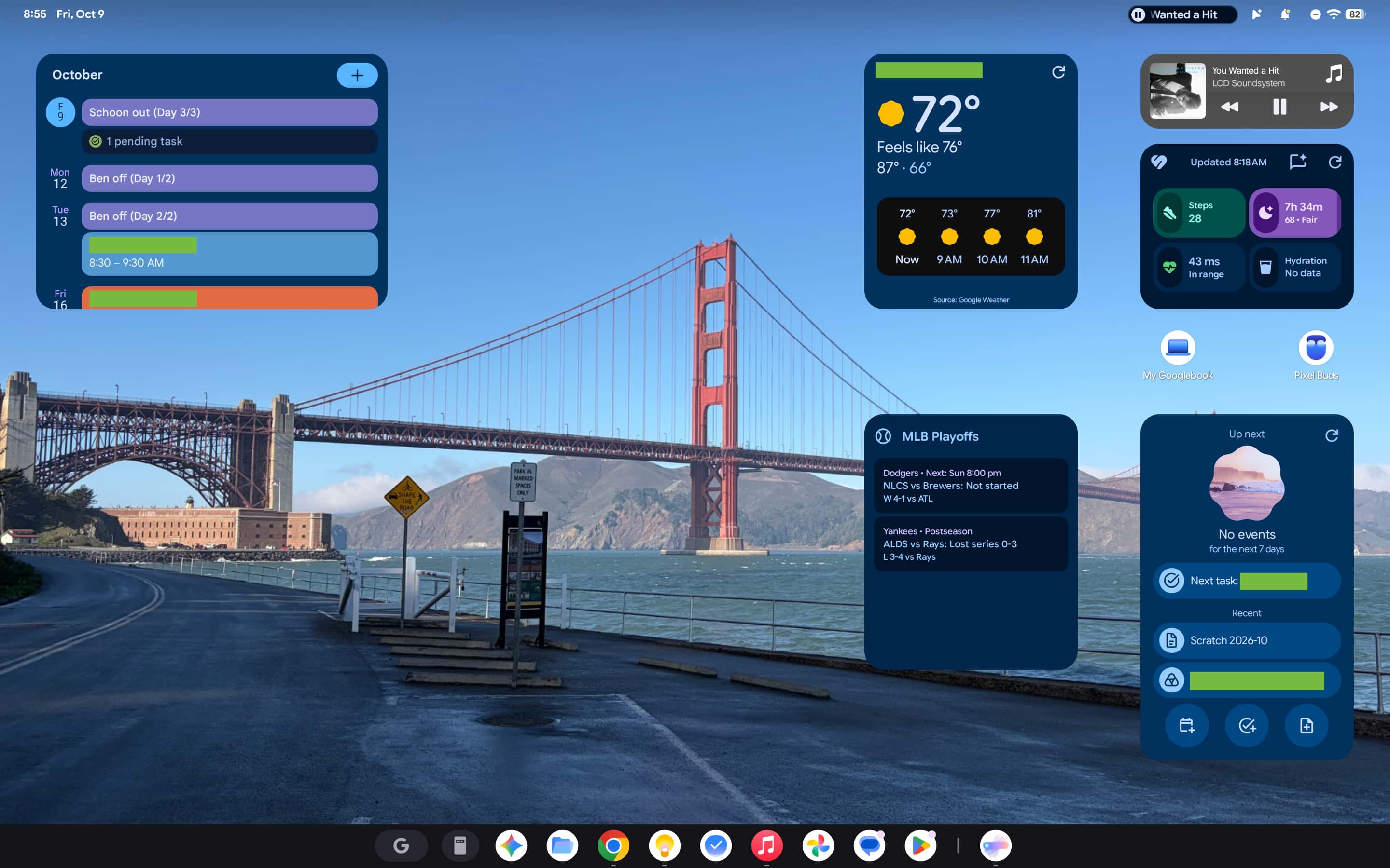
I greatly enjoy having Android widgets on my desktop (officially the “Home screen”). The first few times I saw them on this bigger screen, I had to do a double-take. It’s amusing to see the widgets, with Dynamic Color on full display, you see all the time on your phone, but now on your desktop. The larger size makes it a great surface for passive information throughout the day. For example, I use the Google Health widget to remind me to move and quickly log water consumption. You can also place app icons and folders, as well as folders and files for quick access.
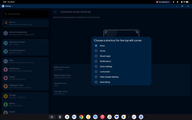
Corner shortcuts (like on Mac) are great, and let you move your cursor to any of the four corners to trigger shortcuts like “Peek/unpeek desktop” or show notifications. My favorite is a Note-taking hot corner that opens my current Google Keep note. There’s also a Quick Settings Tile shortcut for that.
Multi-touch and text selection are all solid and feel like a desktop OS. Touchpad gestures include swiping three fingers up to get a zoomed-out Recents view of all open windows. Meanwhile, my external keyboard works normally on Googlebooks.
That said, there are some very annoying interfaces that come directly from smartphones and just enlarged for desktops. Taking fullscreen screenshots (G + S) results in a fullscreen flash that is okay on phones but incredibly distracting on a big laptop screen. I also find the copied text pop-up, which matches mobile Android, in the bottom-right corner to be equally distracting and would like an option to disable it. Similarly, the Tap & click sounds enabled by default are very annoying.
I haven’t really found myself using Cross-device services. Notification sync that shows all your phone alerts is a straightforward capability, but I always have my phone with me when I’m working on the laptop.
I used Cast My Apps, which has a prominent access point in the Taskbar, primarily for Google Messages over the PWA (more on that later). Otherwise, I would just install any Android apps I needed directly on the Googlebook. “Continue on” is something I haven’t really used, with Google intending the feature to pick up an activity from my phone on the bigger screen.
After first setting up the device, it might take some time for these Cross-device features to become available. That in itself is a bad first impression, but worse is how Googlebooks launched without day one support for the biggest player: Samsung.
Finally, I want to genuinely applaud Google for controlling the update process, like it did with Chromebooks before, rather than allowing OEMs to do so. Manufacturer customization is limited to preloaded OEM apps, like Acer’s that provides product registration, warranty information, and system stats.
Chrome
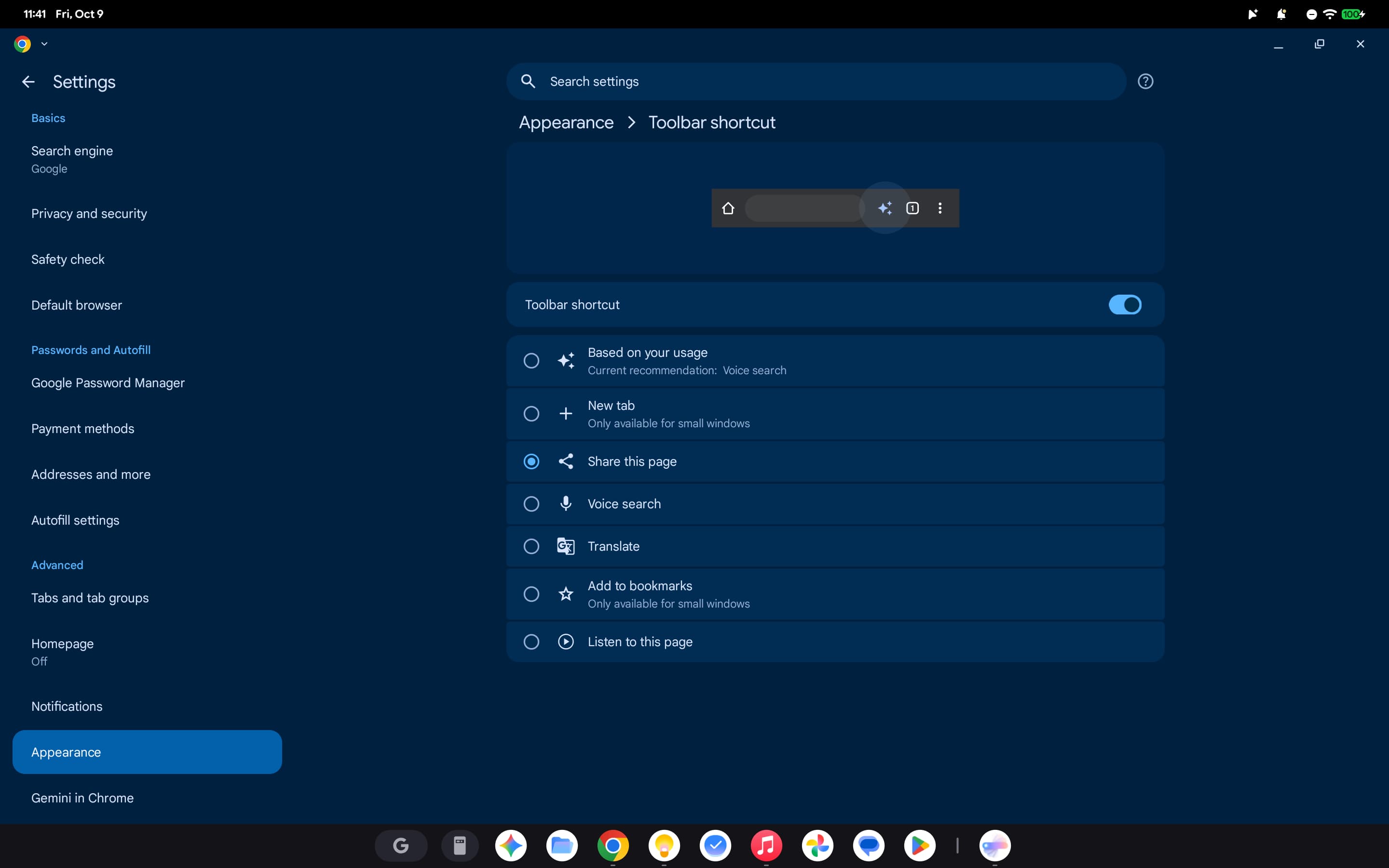
Under-the-hood, Chrome on Googlebooks is built upon the Android version. Functionality added to the mobile browser includes extensions support, vertical tabs, and the full Gemini in Chrome side panel.
The browser delivers desktop-class performance that has not caused any website compatibility issues for me this past week.
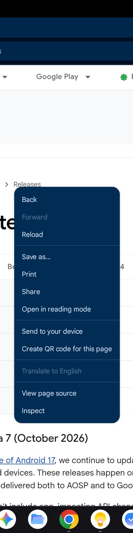
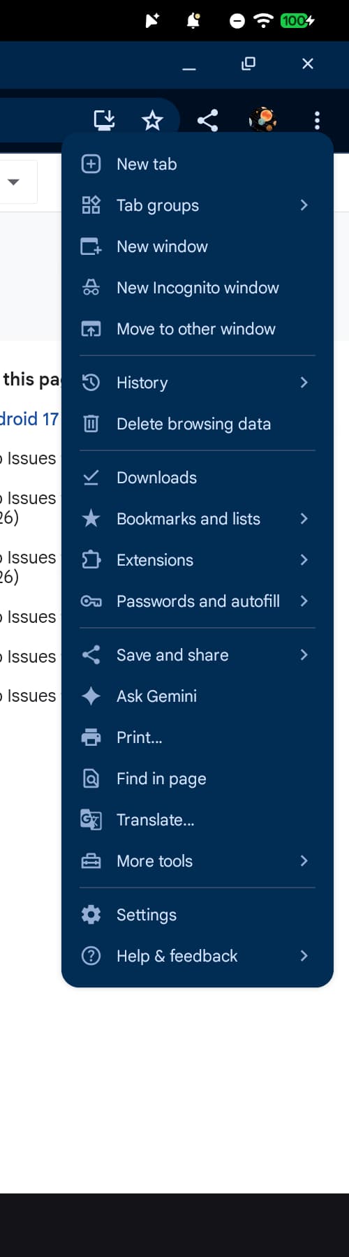
However, the page reloads you’re familiar with on phones are definitely on our 16GB Googlebooks. There are also annoyances like Chrome Settings opening as a fullscreen interface that replaces all your other browser windows. Another is how right-click desktop menu items you expect are not available. Opening a new window (including Incognito) also won’t let you type until you tap the URL bar, unlike Chrome on every other desktop platform. For this initial release, Google did not port over all functionality and the result is an experience that feels barebones.
The browser is fine for 1.0, but I very much want Google to bring over all desktop functionality and every behavior — no matter how small — to this version. Chrome is truly a constant in most people’s desktop computing history and there is so much muscle memory built over years of use that any regression feels painful.
AI
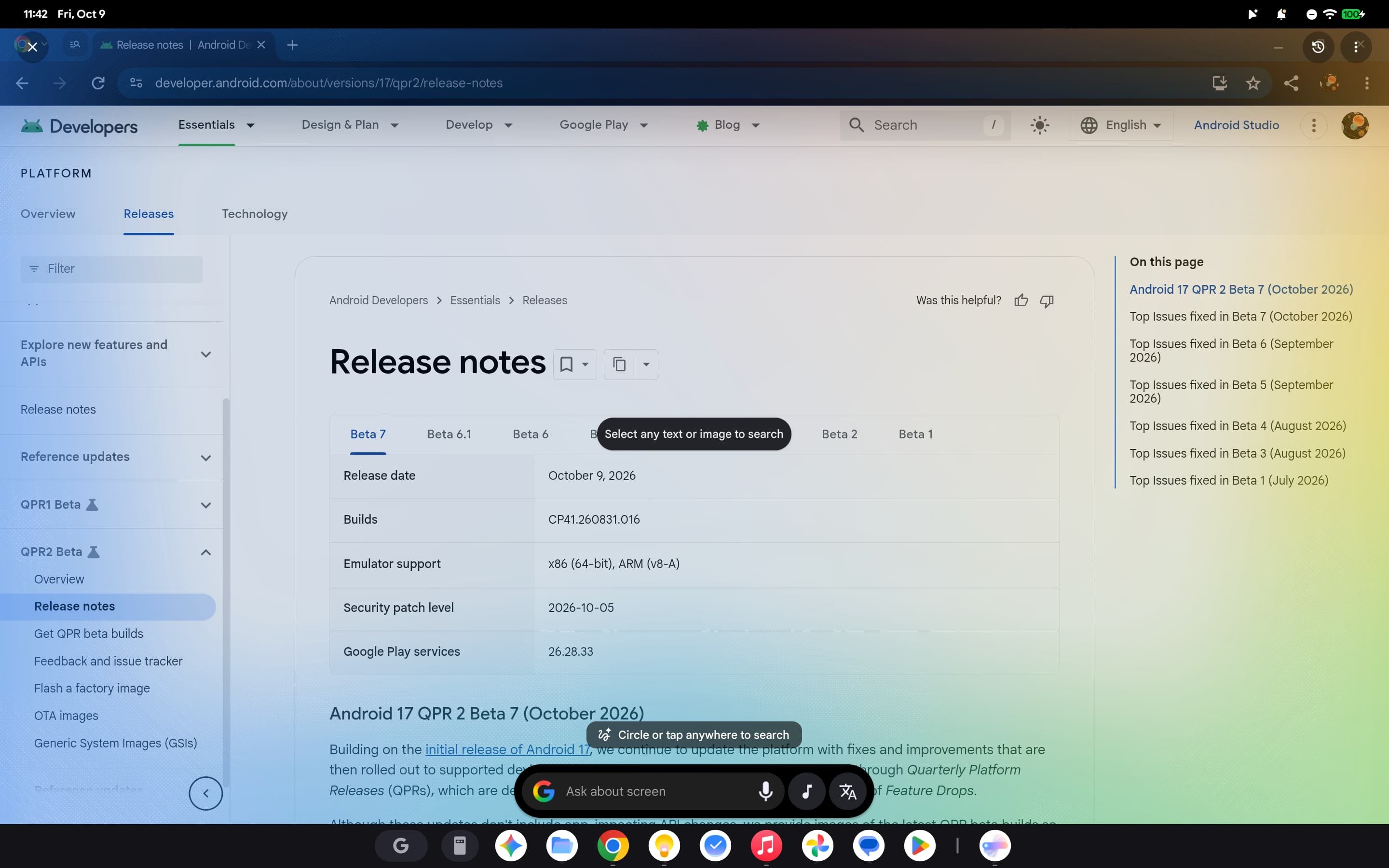
Magic Pointer is fine and basically the Gemini overlay on phones. The cursor “wiggle” gesture is fundamentally intuitive, while the persistent shortcut in the top right lets you start it without the shake. I would not mind the ability to disable the corner icon from a visual standpoint.
That said, in what feels like a prime example of shipping your org chart, both Magic Pointer and Circle to Search are available on Googlebooks. The latter, invoked by G + A, is billed as Contextual Search and arguably convenient for OCR copying, while Magic Pointer is more for taking action on information. However, it feels wild for there to be two similar features in the OS.
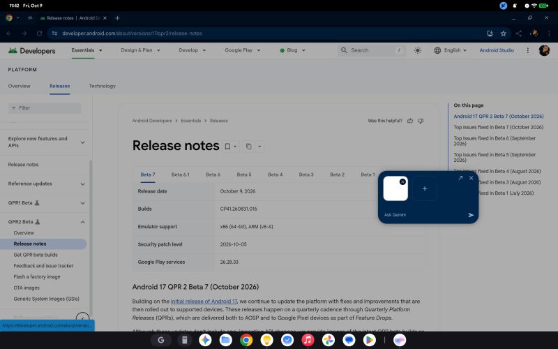
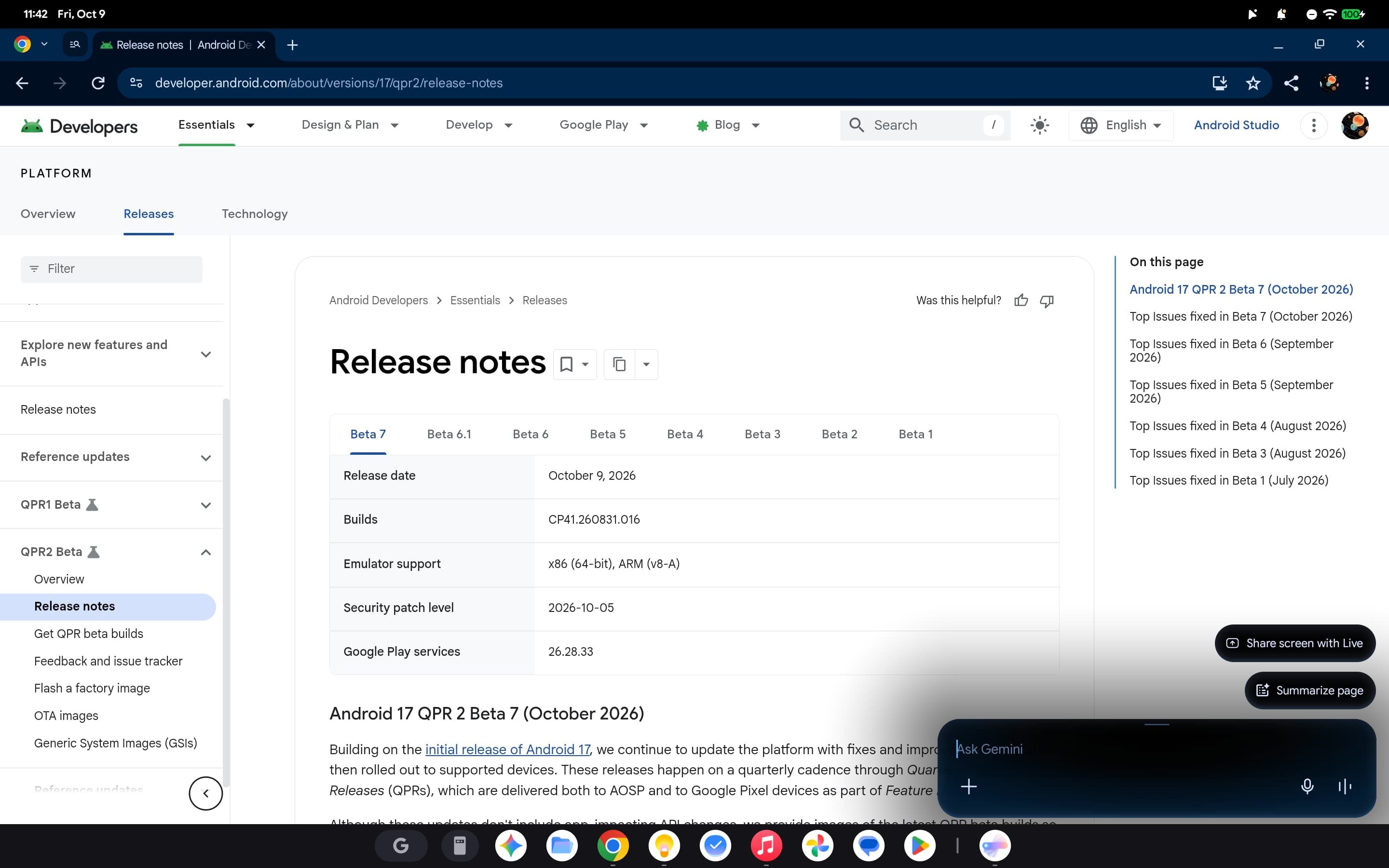
On Googlebook, Gemini is powered by the Google (Search) app, with the large-screen interface looking quite nice. My preferred way of accessing it is via the actual Gemini overlay, launched using G + Space bar.
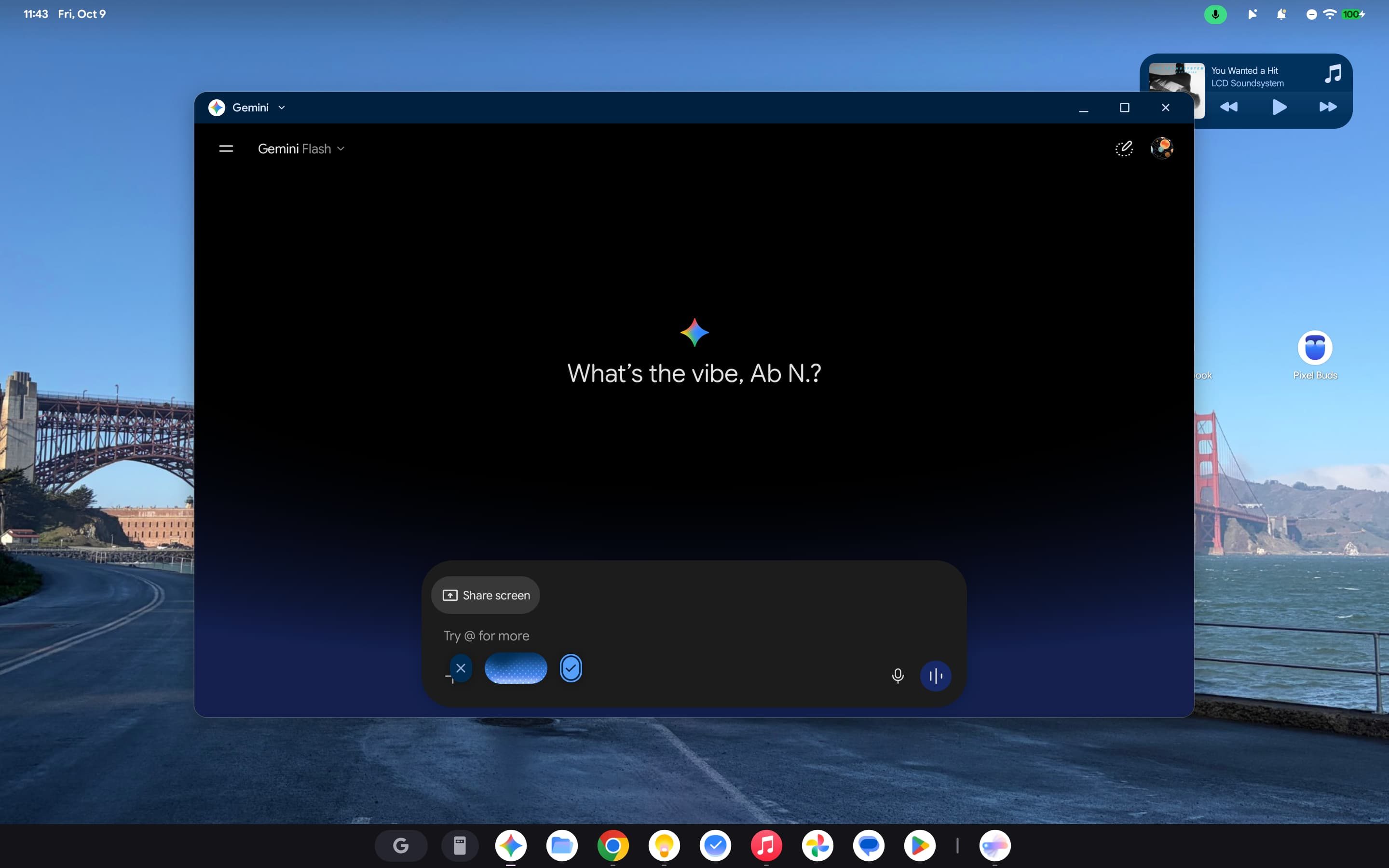
The obvious and more useful AI feature is Rambler. I’ve never really used voice dictation on a desktop until Googlebook OS. It’s surprisingly hard to remember that it’s available given the full hardware keyboard in front of you, but the F13 key that starts voice input helps.
The less apparent feature is Create My Widget. Generative UI where you specify what information you want to see is the future of computing. Google is starting with a friendly widget creator that gets the point across. I’ve been using this to keep track of how the Dodgers and Yankees are progressing through the playoffs, while a flight countdown is another widget of mine.
Apps
From life to work, I can get everything I need done in a web browser. My MacBook Air is a glorified Chromebook in that regard.
I’ve resized most of the native Android apps I frequently use to a phone-sized window. It makes for an even more familiar experience and lets me fit more onto each screen. That said, most of Google’s large-screen layouts are pretty good at this point.
All the Google Workspace “apps” installed on Googlebooks are Trusted Web Activities (TWAs). These are essentially Progressive Web Apps (PWAs), but support homescreen widgets. For example, Google Calendar opens calendar.google.com in a window, but you can add the schedule widget you’re familiar with from your phone.
I think Googlebooks would have been an excellent opportunity to mandate that Gmail for Android and other Workspace apps have full feature parity with their web versions, but Google’s strategy of letting developers choose whether to use the web or Android is the right call to boost adoption and support. I have not felt the need to change any of the Workspace TWAs to the Android version.
Google Keep and Tasks use their Android versions, which are better than keep.google.com and tasks.google.com, respectively. I wrote most of this review on Keep for Android.
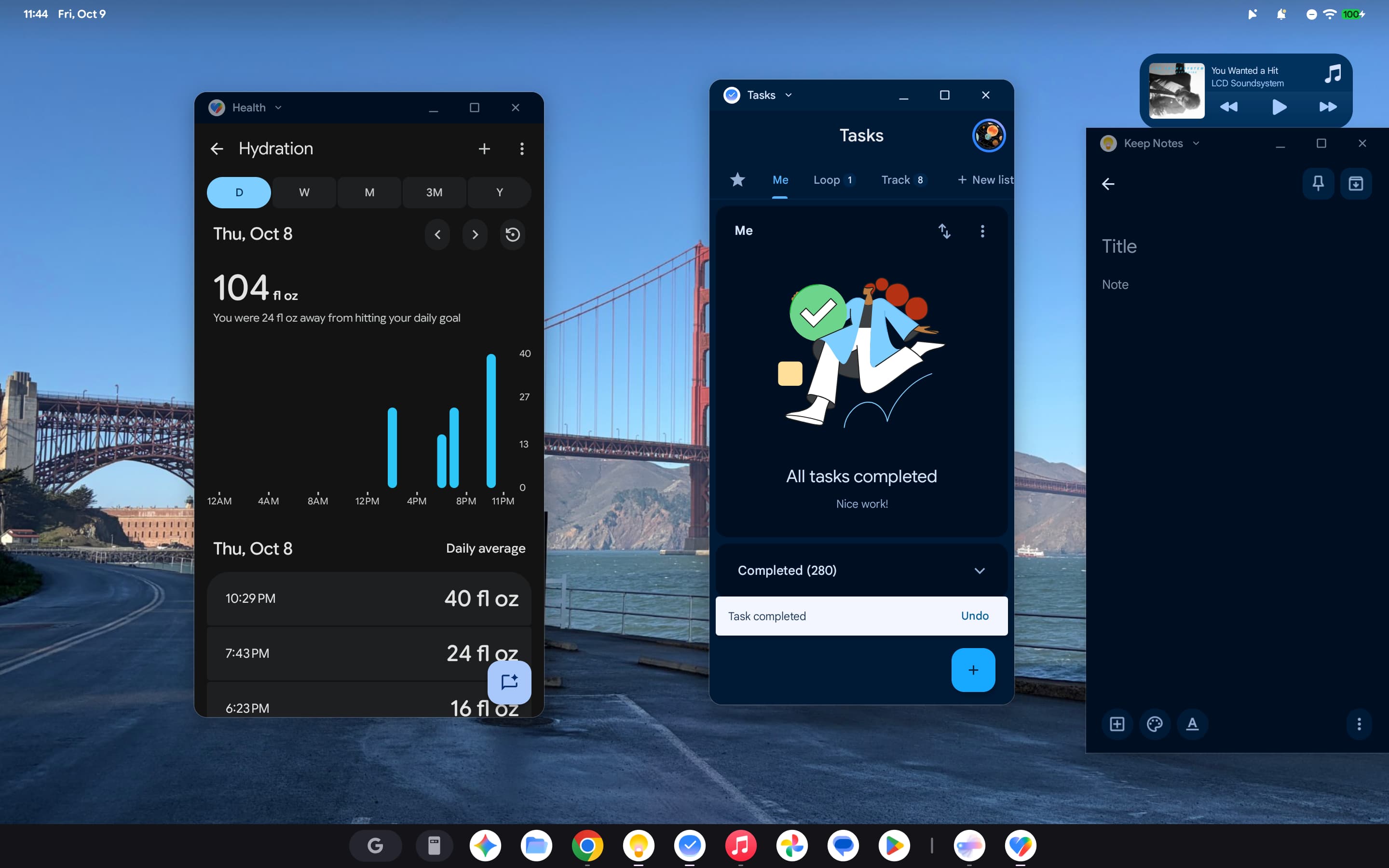
When I reviewed the Pixel Tablet in 2023, one of my complaints was that its Google Messages app was essentially just messages.google.com/web. That has frustratingly not changed on Googlebooks. Google desperately needs to offer a native experience that would ideally just be the large-screen interface found on foldables with a sync system.
Other Android apps I’ve been using include Pixel Weather, Recorder, and Journal (marking the first time I’ve journaled with a full-size keyboard). As a Pixel user, I’m immensely glad that these three experiences are available on Googlebooks.
On the media front, YouTube and YouTube Music both open their websites rather than the Android apps. I’m enjoying Apple Music’s in-beta Liquid Glass redesign for the tablet interface. It’s basically the iPad app with top tabs and a floating Now Playing bar.
A big annoyance I immediately noticed in Android apps is that the primary text field is often not active and requires a tap/click. This is so annoying that I’ve found myself tapping the touchscreen rather than using the trackpad. It’s almost second nature. The issue is particularly pronounced in the Gemini app, though a new Chrome tab always selects the address bar.
In terms of native apps:
- The Files app is carried over from ChromeOS with a nice, modern icon. AI file summaries that are generated locally are pretty convenient when quickly browsing.
- The Text app is code-oriented with a modern Material 3 Expressive design.
- The Viewer app is basic compared to macOS Preview.
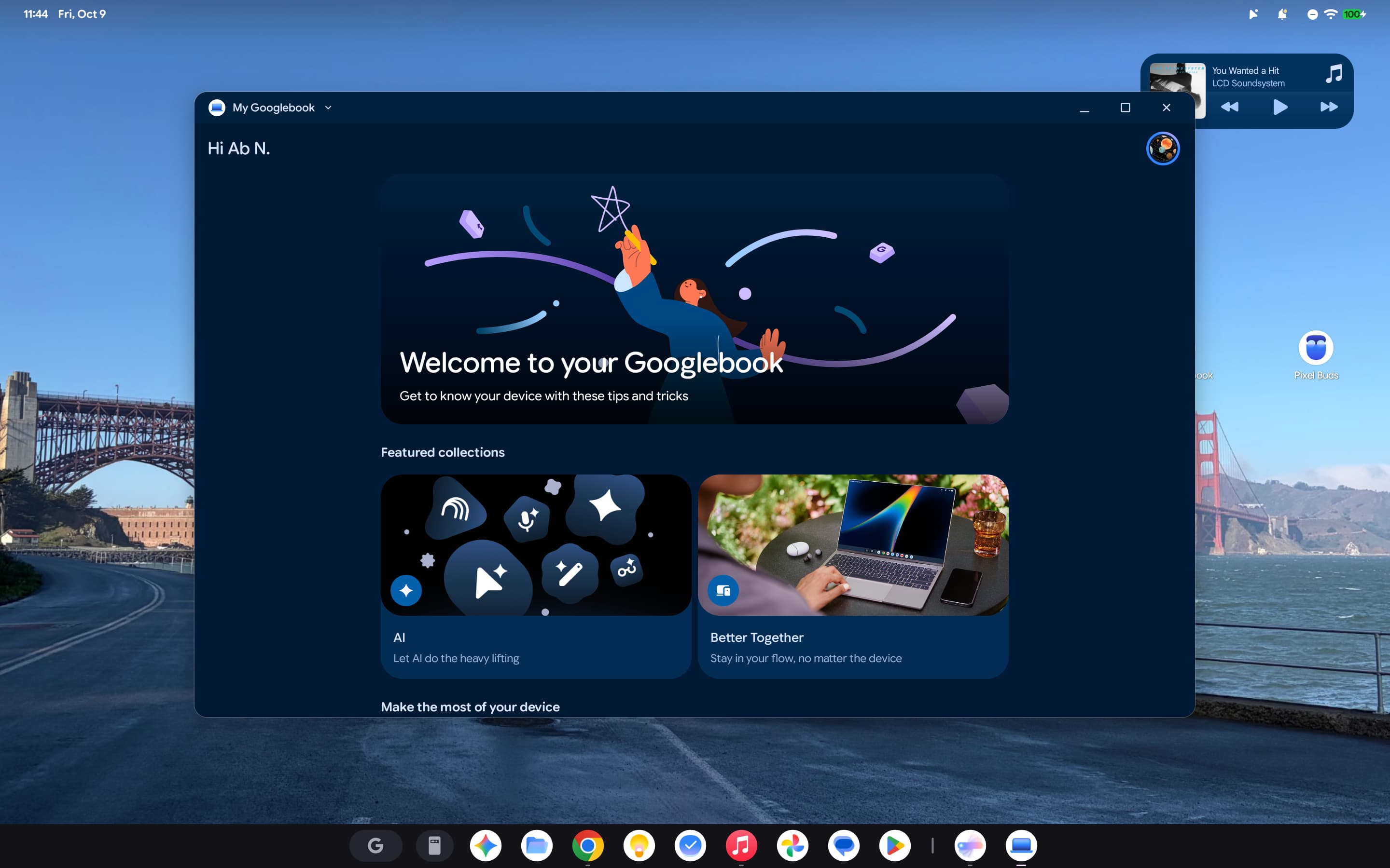
- The “My Googlebook” app is strangely responsible for an “Up next” widget that shows data from Google Calendar, Drive, and Keep.
Of course, there’s also the elephant in the room. For the most part, Googlebooks haven’t fixed the app gap that Chromebooks have faced for over a decade. While there have been some expansions and Android as a whole delivers more of a foundation for desktop-class apps than ChromeOS did, Google hasn’t made the partnerships or the push to actually fix the problem. Those who, like me, can already do most things from a browser will be happy, but demanding that users adopt a new platform in 2026 without staples of the desktop ecosystem — Adobe’s suite sticks out like a sore thumb — is a tough ask.
Hardware
I’ve been using Googlebook OS full-time this past week across the Acer Googlebook 14 and HP Googlebook 14.
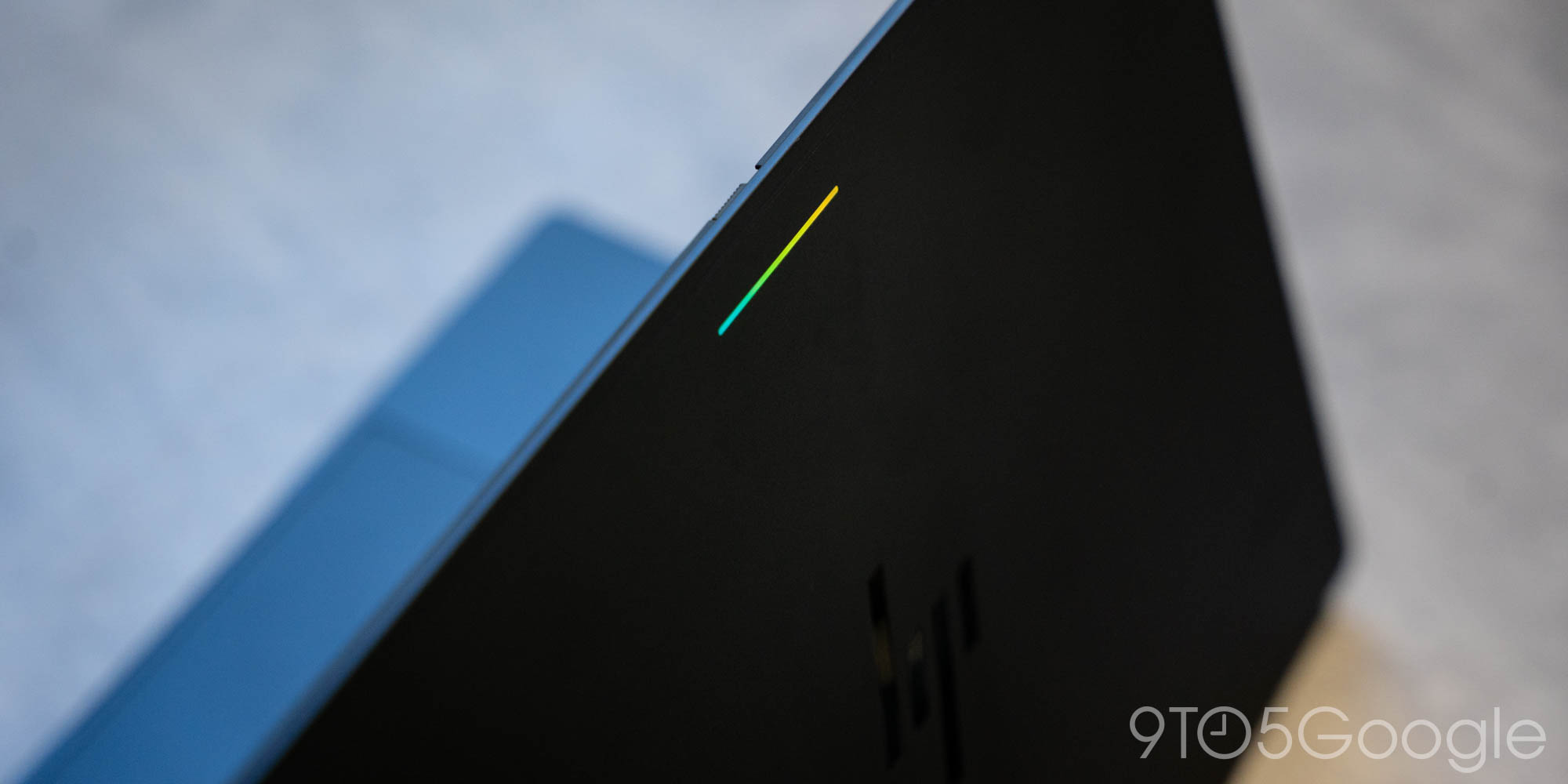
On the lid, the primary branding is the manufacturer’s logo followed by the Glowbar. Once open, there’s a logo beneath the screen and “Googlebook” on the left palm rest.
The Glowbar is additive, with the battery indicator proving useful when plugging in to charge. However, I would have liked a double-tap/knock gesture to invoke it at any time to see the charge level. In public, having a strip of light facing the world feels somewhat loud. Fortunately, you can turn it off in Settings.
Face unlock has worked as expected on the HP Googlebook 14. The setup experience is identical to what’s found on Pixel phones, and I wonder if the exact same recognition algorithms are leveraged.
This could be an edge case tied to how I use “Tap to click,” but the trackpad might be too wide on the HP as I keep unintentionally activating it with the sides of my thumbs when typing. Most times the cursor just briefly appears and then disappears. However, there are occasions when moving a hand to reach the number row registers a tap and very disruptively moves my position on the page. Disabling the option, and thus getting the benefit of the haptic trackpad, negates the latter annoyance.
For being a 2-in-1, the Acer Googlebook 14 is incredibly light with a fairly solid build. USI stylus support is nice, especially on such a large canvas.
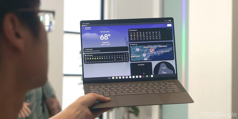
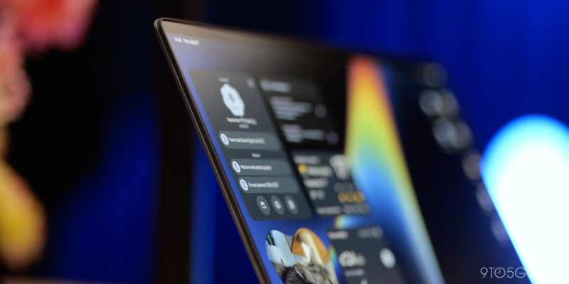
Between Acer’s Intel chip and Snapdragon on the HP, I have to give the clear advantage to ARM. I’d say the latter runs a bit smoother, while I’ve seen fewer webpage reloads as well when over a dozen tabs/windows and several Android apps are open.
We’ll be reviewing all five Googlebooks in the coming weeks, so stay tuned to 9to5Google.
Conclusion
In going all-in on Googlebook OS for the past eight days, it’s clear that Google put the work in to design a native desktop experience for Android. My biggest fear in the lead-up to using Googlebooks was that the company just stretched out Android as seen on the Pixel Tablet and the Android (16+) desktop mode. That is not the case, with a number of well-thought-out power user features and customizations.
The switch from Chromebooks to Googlebooks gives Google a solid foundation to grow. But, at the same time, it’s hard to ignore that Googlebook OS on day one has taken some clear steps back from ChromeOS. A handful of issues are expected in a strategy reset like this, but missing features (e.g., Linux app support) and other shortcomings are hard to accept when this is Google’s replacement for an OS that’s been around for over a decade now. There are no fatal flaws for the general user, but there are plenty of “death by a thousand cuts” examples that will keep even Chromebook switchers away from Googlebooks for the time being. That said, I don’t think Googlebook OS has any foundational issues that can’t be remedied in future updates.
I think I’m fairly representative of the average user in that everything I use has web-based equivalents. As such, I can use Googlebook OS for everything I do on macOS. However, the Mac has a level of system polish that I appreciate and some native applications that upgrade the workflows I have. This is my barrier to switching.
That polish and charm are not fully there yet on Googlebook OS, but there are a number of good UI and UX ideas here. The familiarity offered by sharing the Android OS and apps from your phone is a real competitive advantage. If you know how to use an Android phone, the jump to a Googlebook will be immediate. Personally, that similarity is motivating me to add a Googlebook to my daily driver lineup. Google just needs to continue iterating and updating quickly.


FTC: We use income earning auto affiliate links. More.


Comments