Google Wallet is apparently preparing a new app redesign on Android that will show more of your cards at once, as well as letting you pin cards.
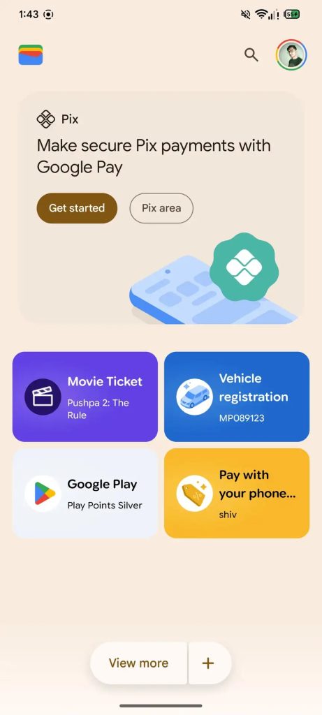
Spotted by the folks at Android Authority, the latest Google Wallet update has a complete redesign hiding behind the scenes. Whereas the current Google Wallet UI shows your payment cards at the top of the screen followed by a long list of loyalty cards, transit passes, and other passes, the new UI seems to aim for less scrolling and easier access.
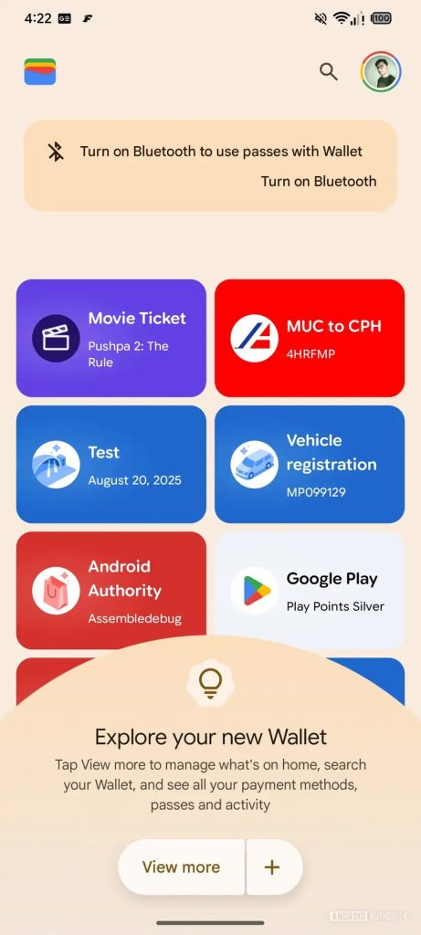
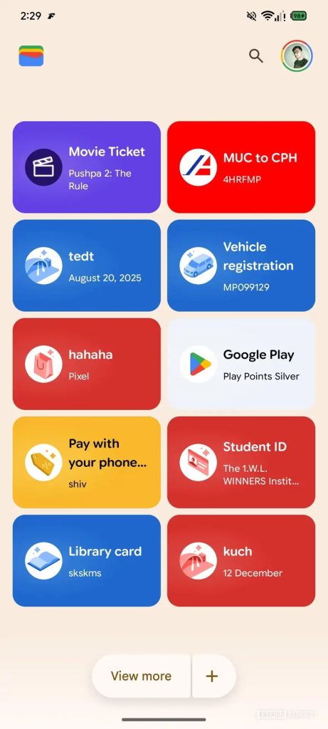
The new UI appears to keep payment cards at the top of the screen, though no payment cards were added to the demo screenshots, but passes now fill up a two-column layout with a “View more” button lower on the page to show additional items.
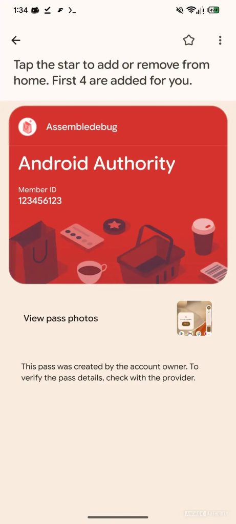
It’s hard to say exactly how this will work based on the screenshots and somewhat vague description given, but it’s also shown that Google is adding a “Star” button that acts as a favorite button, giving users the option to pin up to four cards and passes, with everything else presumably showing behind the “View more” button.
Android Authority never specifies which Google Wallet version this new UI is appearing within, but it was manually enabled, so there’s no indication when it might arrive. Then again, there’s no guarantee it will roll out at all – that’s the trouble with seeing these in-development changes so early, it’s just too early to say anything definitively or with confidence.
That said, this looks like it’d be a welcome update to Google Wallet, as the current UI can be a little cumbersome when you have more than a few cards and passes populating the app.
More on Google Wallet:
- Google Wallet for Android preps full transaction history, search
- Chrome Autofill getting two-line design on Android, Google Wallet integration, more
- Google Wallet rolling out nearby notifications, flight check-in alerts
Follow Ben: Twitter/X, Threads, Bluesky, and Instagram
FTC: We use income earning auto affiliate links. More.

Comments