From always running the latest version of Android to “more opinionated” software customizations, there are many reasons Google’s Pixel is ‘one of the best phones‘ of this year. In an industry where smaller usually means degraded, I greatly appreciate the near identical specifications between the two screen sizes.
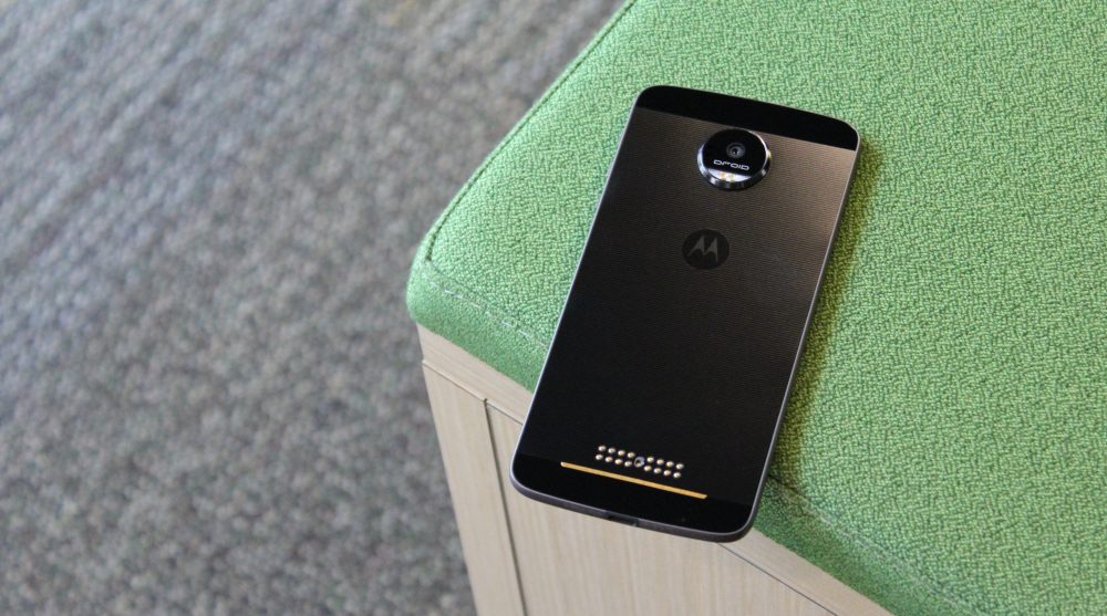
While I think the design of that phone is quite nuanced thanks to curved edges that further help holdability, the Pixel won’t be getting any awards in that department. However, there is a clear standout for the most interestingly designed phone of 2016. For better or worse, that title goes to the Moto Z in my view. And yes, I am primarily referring to its thinness.
It’s been few months since the phone launched and I’ve just recently gotten my hands on it, so I thought I would share some of my thoughts…
Announced in the early summer, the Moto Z family represented a drastic departure that coincided with full Lenovo integration of the once Google-owned company. Gone was the natural curvature of previous Moto X phones and in was a stark looking piece of metal and glass. And one initial shock of its design was its thinness.
Crazy Thin
A design can be good in terms of engineering feats, but equally bad for not having practical benefits. It is quite incredible how Lenovo’s engineers fit a phone with a large 5.5-inch display and decent battery into a sturdy 5.19mm thick aluminum chassis.
After using the Pixel for two months (and previously the quite boring Nexus 5X), the Moto Z is an absolute joy. An aspect I assumed to be a gimmick is actually highly perceptible in hand. The phone is just impressive to hold — it feels like you’re holding a piece of paper.
If I — as a techy — have one natural desire, it’s to live as futuristic a life as possible. After watching Westworld, I could not help but think I was doing that with the Moto Z. Every time I use the phone, I am reminded of the futuristic paper-thin behavioral tablets used by the Westworld staff to interact and communicate with the robots.

Android Alive
Amidst the Lenovo acquisition and fears that putting a different launcher on the Chinese variant of the Moto Z would spread, the stock experience that started with the original Moto X still stands. From the very early days of mobile operating systems, I thought that Android was so much more alive than iOS.
These include simple things like live wallpapers (which have fortunately made a return with the Pixel) to widgets that allow you quickly see info and control apps without needing to go into the full experience. Just a few years later, these features don’t quite seem as standout as they were before.
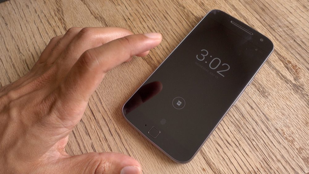
However, I noticed Android being “alive” once more when using the Moto Z. The Active Display is quite wonderful for notifications and Moto still has the best implementation hands down. Google was wise to adopt this on the Pixel with Android 7.1.1, but Moto’s take results in a phone that feels vibrant and connected to the world.
Things like the double-twist camera gesture and the flashlight chop make you feel like you can do so much more with your phone. I’ve very quickly integrated those features into my workflow, with the camera fast launch being the most useful.

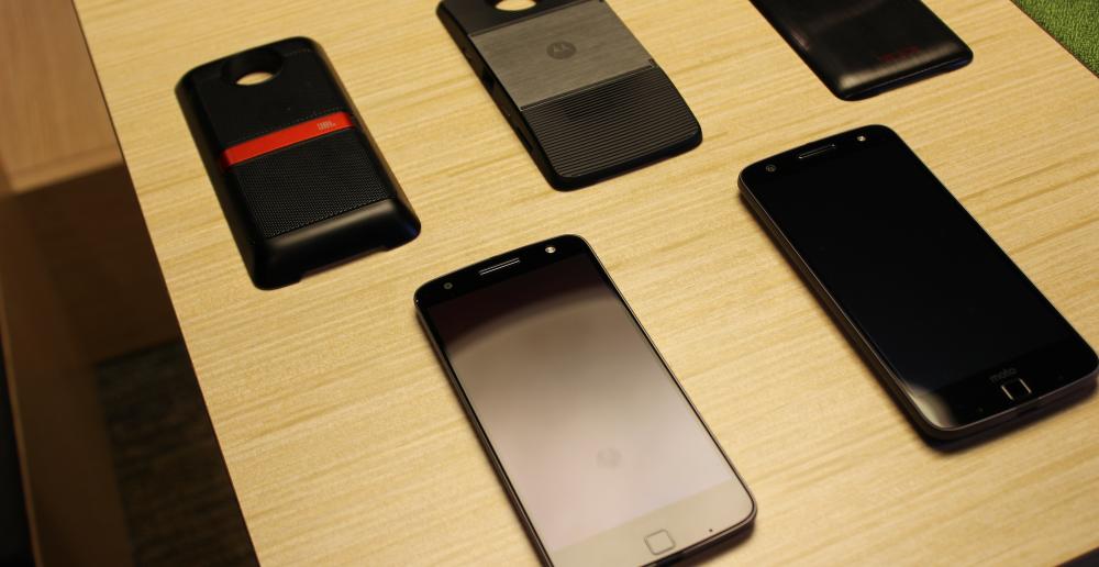
In pursuit of modularity, 2016’s supposed “next big thing”
These engineering feats are undeniably impressive, but there are some compromises. It’s clear that besides the wow factor, Lenovo focussed on thinness as a way to keep Moto Mods from being too thick and unwieldy when in use.
Early in the year, modularity seemed to be one area the Android phone industry could collectively coalesce. Now, in just 12 short months since, Google’s new hardware division has abandoned Project Ara and LG’s mobile division is financially flailing with the LG G5.
Compared to LG, I definitely think Moto had the better implementation of this supposed next big thing. They have a good foundation and a few months later are still committed to the idea with the possibility of a Tango mod, but ultimately I do not think people will flock to them in a way that will become standard in years to come. It begs asking whether modularity is really worth the attention and effort that Lenovo is spending when there could be more focus on the core product.

My one complaint with the hardware is how the bottom bezel is noticeably larger than the top. While I am not sure if the fingerprint sensor could be larger, it feels as if the smallness is meant to ensure the inclusion of the gratuitous “Moto” logo just above it.
It also goes without saying that I find the lack of a standard headphone jack to be highly impractical. Throughout the day, I frequently switch between listening to audio on my laptop and on my phone. Listening on the Moto Z requires and results in the included USB-C adaptor remaining attached to the phone at all times. Others suggested, the adaptor can’t simply be kept attached to the headphones because they are constantly being moved around from device-to-device.
Conclusion
I am chagrined that I did not take a look at the Moto Z until later in the year. The phone is quite futuristic and a drastic departure from the general plainness I feel with my Pixel. Due to the hardware’s novelty and genuinely useful software customizations, I am more inclined to reach for the Moto device.
However, the fact still remains that it will never be the first to get the latest and greatest version of Android. And in truth, I probably would not have seriously given it a thought until it received Nougat just last month.
Additionally, it might be important to take into consideration Moto’s high commitment to modularity. The phone can absolutely be used without Mods, but using a product and purposely ignoring a major part of it — for better or worse — feels like a huge waste. And those Mods are expensive.
That aside, if you enjoy unique and standout hardware as much as I do, the Moto Z might deserve a second look. At least for me, it is the most unique and interesting designed phone of 2016.
Be sure to check out our full review from earlier this year:
FTC: We use income earning auto affiliate links. More.


Comments