It appears as though Google is testing some tweaked icons within Gmail on desktop to more closely mimic the icons already seen on the Android and iOS apps.
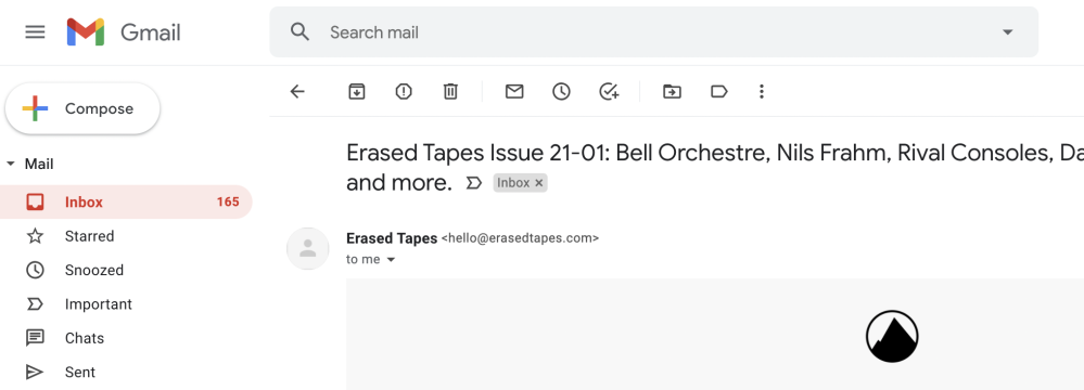
According to Android Police, some users are now starting to see the app-like icons on Gmail in their desktop browsers. Rather than the completely filled-in gray icons, the newer options look to have an outline design. We’ve seen Google tweak plenty of apps with more outline-styled shapes and icons, so this comes as no great surprise — even less so when you consider just how many A/B tests are running in a multitude of first-party apps at any one time.
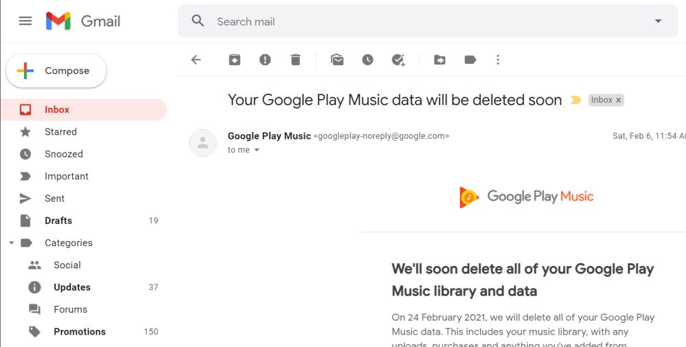
We’re not seeing these new icons on Gmail for desktop on our end in any browser, but as AP notes, the outline look-and-feel closer ties the mobile and desktop Gmail experience together. It’s a really subtle look that you probably wouldn’t notice at first glance, but it’s most obvious with the Tasks, Read later, and Label icons. All of your sidebar tabs are also included in the UI refresh, but it’s still not that immediately obvious if something has changed.

Current Gmail icons 
New Gmail icons
None of the functionality is altered, these new icons simply bring a little extra cohesion between the look and feel of the mobile and desktop Gmail interfaces. We’d imagine that this change will be a slow one, but it isn’t appearing very widely just yet. It could also be yet another A/B test for selected users.
Do these refreshed icons make any difference or is it just a change for the sake of change? Be sure to let us know what you think of these outline-style icons in Gmail for desktop down in the comments section below.
More on Gmail:
- Gmail now lets you resize Google Chat, Rooms in the web sidebar
- [Update: Fixed] Partial Gmail outage causing ‘Address not found’ error when sending emails
- Google Docs adding more Word features as Gmail gets streamlined Office attachment editing
FTC: We use income earning auto affiliate links. More.


Comments