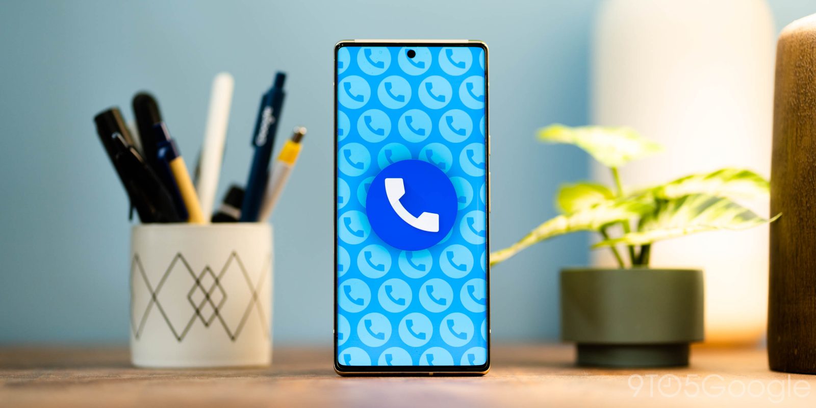
Material You elements quickly took over various Google apps in the lead-up and following the rollout of Android 12, but it seems Google isn’t done. Hidden in the latest Google Phone update is a new dialer design that has some familiar Material You elements.
Google first added Material You’s signature color accents to its dialer app for Pixel phones last year, with the colors appearing on buttons and the background of the app. But that’s really as far as things went, with the overall visual design mostly looking the same.
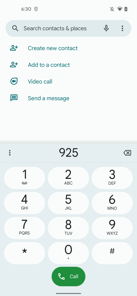
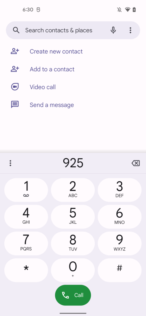
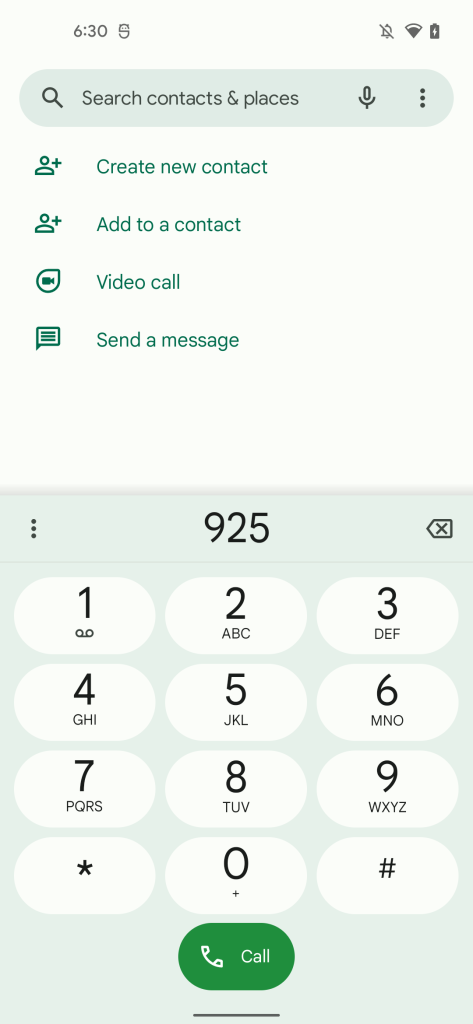
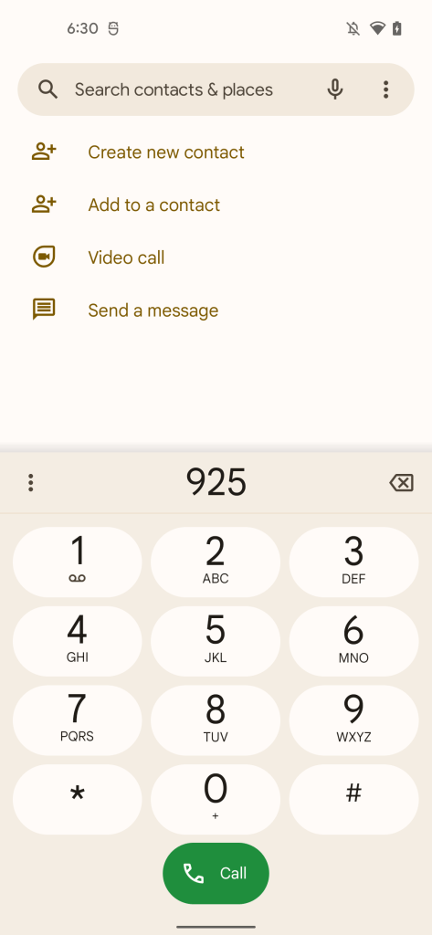
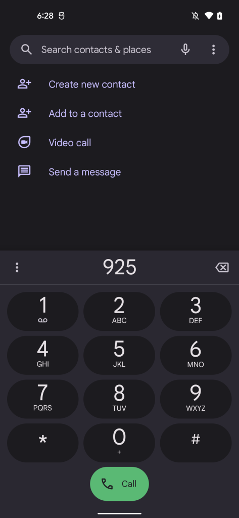
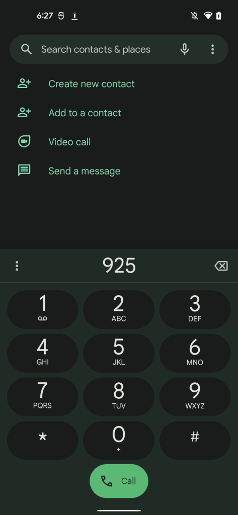
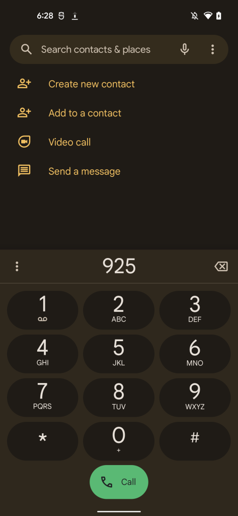
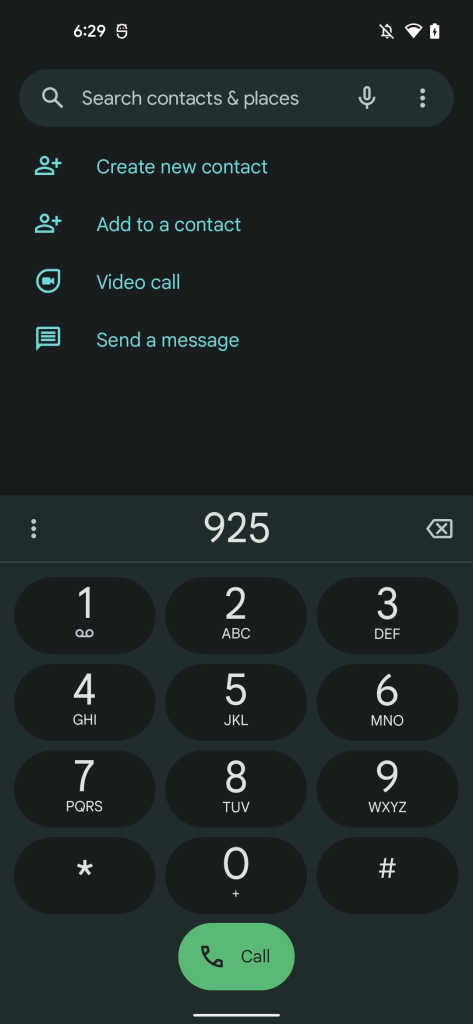
That’s something Google is apparently ready to fix as the latest Google Phone update delivers a revamped dialer. We were able to enable the feature ahead of its formal debut, and it’s a great design on the whole. Google Phone is essentially adopting the same Material You style as Android 12’s lockscreen on the Pixel.
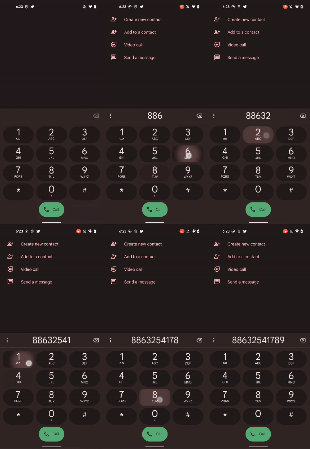
This includes a prominent border for each button on the dialer, in stark contrast to the current design, which has no border around each button at all. These buttons each have a small animation that’s basically identical to what’s seen on Android 12’s lockscreen, with a touch on the button radiating out towards the edges, also showing a slightly different shape on each touch.
Below, you can see the new design in a few colors, as well as in both light and dark mode. Further, we were able to capture a video showing the new design in action.
Dylan Roussel contributed to this article.
More on Material You:
- Google releases the code for Material You Dynamic Color, open source library also coming to iOS
- Android 13 DP1: Any app can now offer a Material You-style Themed Icon
- Google explains how Material You balances Dynamic Color with colors predefined by apps
FTC: We use income earning auto affiliate links. More.


Comments