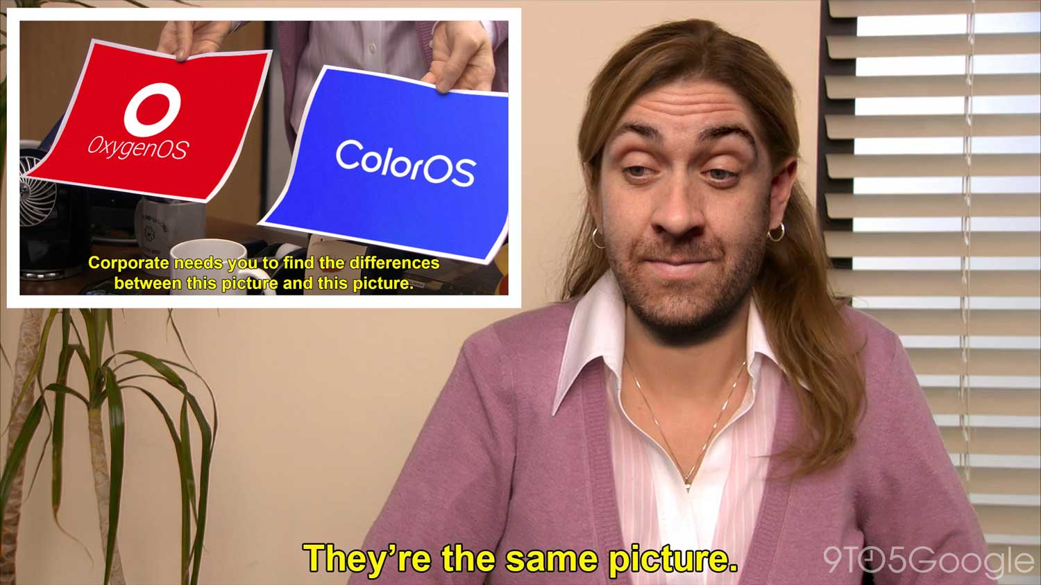
OxygenOS 13 and ColorOS 13 share more than a few similarities – they are effectively the same OS masquerading as different “versions.” Toss in Realme UI 4.0 and it’s an inconvenient truth that BBK appears unwilling to own up to.
Given that Pete Lau claimed OxygenOS and ColorOS’s unified platform was set to be walked back, it’s all the more frustrating as we once lauded the former as the “best Android experience.” It’s amazing to see how much times have changed the industry’s disrupter. Some might say that this has been inevitable. None of this is more apparent when using ColorOS 13 and OxygenOS 13 side-by-side.
Sharing components and hardware production pipelines is one thing, but for many, the crux of why they still continued to persevere with OnePlus was OxygenOS. Just what is in store? Here’s everything you need to know – the good and the bad.
Table of contents
Video – OxygenOS 13 vs. ColorOS 13: The same in all but name
For more video content, subscribe to 9to5Google on YouTube.
Merging all in Android 13
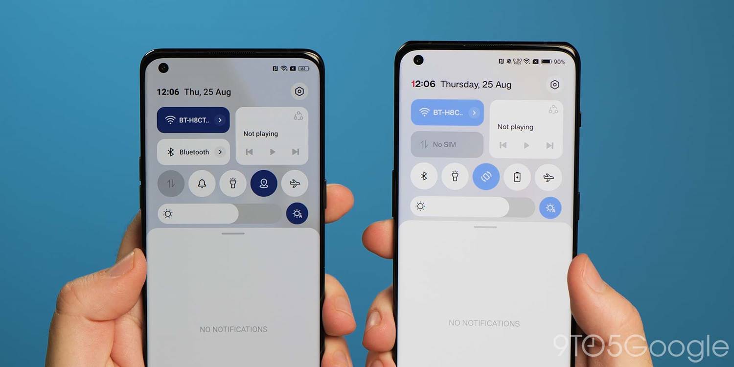
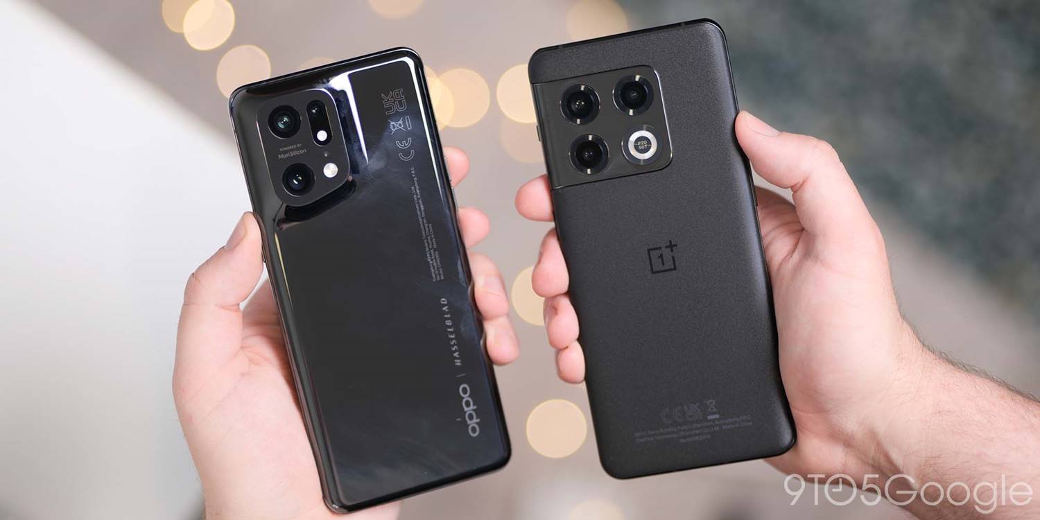
We saw the first steps of the merger between ColorOS and OxygenOS with the Android 12 update. It’s even more pronounced this time around, to the point that it’s actively hard to tell the two Android skins apart. The similarities are so pronounced that it’s almost easier to point out the minor changes than what is the same.
Notification center
There are big changes right away in the pull-down Notification center in OxygenOS and ColorOS 13. It is eerily reminiscent of the Android 11 Developer Preview 1 whereby the media controls were tested inside the Quick Settings panel alongside common toggles. You can certainly see some iOS influences, but the addition of the Android 12 Wi-Fi and Bluetooth pill-style toggles are an important alteration.
It’s hard to argue that this does limit utility and does so at the expense of some identity. With many Chinese OEMs doing similar things, it’s a tad disappointing to see the simple Quick Settings panel and Notification center removed in favor of this iOS-lite combination.
Settings page changes
A number of changes have been made in the Settings menu and a number of associated submenus so that OxygenOS 13 is even more like ColorOS 13. You can see it instantly from the injection of color to the Settings sectional icons. There are other changes such as to the About phone screen, which is now identical on both devices including the “share” button to send or post your device specs to apps and other services.
If you’re in any doubt about whether the changes are fully merged across, even the SystemUI icon within the processes and battery section now has the same icon in OxygenOS and ColorOS 13 based upon Oppo’s system icon design.
AOD features
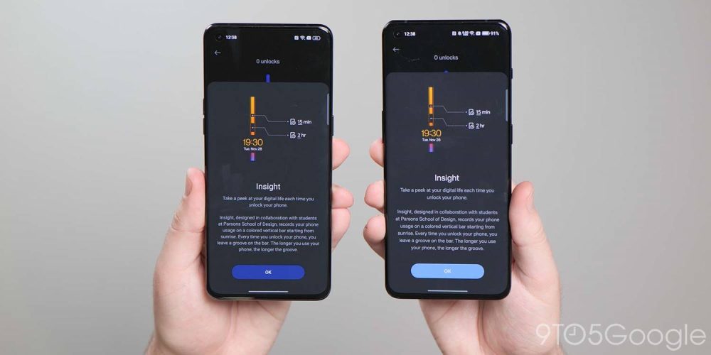
For years we hoped that OnePlus would add Always-on display support and finally it was introduced with OxygenOS 11 and Android 11. Since then, the feature has evolved, and to be fair to OnePlus the implementation has been solid overall.
A case in point is the brand-new Spotify widget for the Always-on display. Spotify is pushed like a banner ad within the Shelf section here too, which some might find intrusive. However, if you do use the music streaming service, you can enable a new widget that will appear when the Always-on display function is active. It’s a neat integration but is artificially limited. We’d like to see it come to more streaming and media services or just have a generic option available.
Because so much of the software is now bleeding into ColorOS, one-time exclusive Canvas AOD functions are now available to Oppo phones. Even the exclusive Parsons School of Design “Insight” feature is now part and parcel of ColorOS 13. Many of the widgets and customization options are set to be made available to Oppo and OnePlus owners.
Homescreen changes
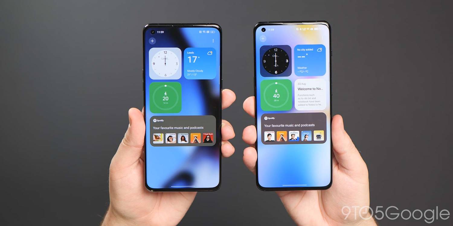
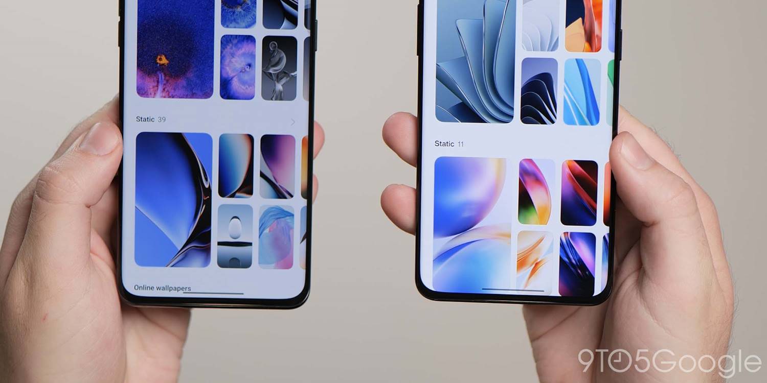
A number of changes have been made to the homescreen including to how things look and operate, but, again, everything is visible across both versions of OxygenOS 13 and ColorOS 13. One of the most notable changes that feels like it has been lifted right out of Nothing OS is the ability to enlarge any homescreen folders for easier access.
ColorOS 13’s “Aquamorphic” icon style is available here too, which is another indication of the merging visual identities. Google’s themed icons have also made the jump over to ColorOS and OxygenOS for the first time. System apps and any supported Google apps will adhere to your preset system wallpaper colors. This relies upon greater support for Dynamic color with wallpaper-based theming available more extensively via the “Wallpaper & style” app in the Settings section.
This works in a similar manner to the Color palette feature in One UI. You can select from some preset basic color swatches with previews of just how certain menus and app controls will look. It’s nothing new, it’s just tuned here again in Android 13. Even the new wallpaper selection in OxygenOS 13 and ColorOS 13 have similarities. The stock selection feels like a copycat without the effort being made to hide it.
Global device search is in the works for the App drawer in both versions of Android 13. This looks like it is going to work in a similar manner to how Pixel devices offer the search functions when swiping up from the homescreen. It’s not fully functional or doesn’t appear to be at this stage, but this is a good move regardless.
Shelf alterations
The OnePlus Shelf function has jumped over to ColorOS for the first time in Android 13. This is one of the few features alongside Zen Mode and Work-Life Balance that has survived the UI overhaul. You can still activate by swiping down at the homescreen but it’s here in ColorOS 13 for the first time.
There is no ability to add toggles or on-device storage data with a limited selection of widgets including a Step tracker, Weather data, Notes, Clock, Photos, and Spotify control tab. Sadly, it looks like the ability to choose a right corner swipe gesture to access this quick panel has also been fully removed as you can only toggle via a homescreen swipe down here in Android 13 in ColorOS 13 and OxygenOS 13.
O-haptics
OnePlus and Oppo are among the best on Android when it comes to haptic feedback. The O-haptic feature has been available for a little while but joined OxygenOS 12.1 and ColorOS 12.1 when the Find X5 Pro launched. With Android 13, it’s likely coming to even more OnePlus and Oppo devices. This lets you tune the haptic intensity and how vibrations “feel” when active.
Charging animations
For years OnePlus and Oppo have remained adamant that Warp Charge and SuperVOOC charging utilized different technology despite evidence to the contrary. Now even the charging animation is identical across OxygenOS and ColorOS. It’s pretty nice too, but the “SuperVOOC” branding is now more prominent after bleeding into OnePlus devices over the past 18 months.
Removal of OnePlus identity
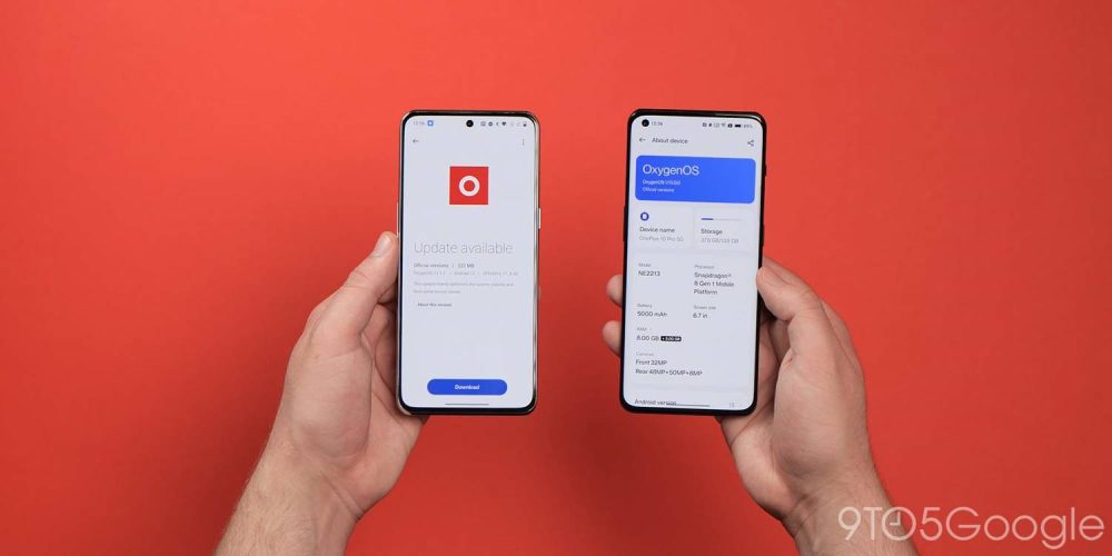
You could very easily argue that the OnePlus identity is slowly being airbrushed out of existence, and there are a few key areas where that is evident here in the Android 13 beta. Of course, changes could be simply due to the fact that ColorOS and OxygenOS 13 are still in the early preview phase. We’re not quite as convinced given the bulk of changes over the past couple of years. Even so, here’s a few key areas you’ll notice the watering down of the OxygenOS branding:
No Never Settle in Shelf
The useful Shelf feature has evolved over time to include many new tweaks and functions, but you’ll spot right away that the iconic “Never Settle” tagline and branding has been wiped from the pulldown section. ColorOS 13 has added the Shelf feature to add yet more confusion. It looks and functions in the same way.
Lack of 1+ calculator easter egg
Another removal in the OxygenOS 13 beta is the popular calculator easter egg. For those unaware, you can launch the stock calculator app and enter “1+” then tap “=” to reveal an animated “Never Settle” logo in the output box. Attempting to do this in the latest OxygenOS beta does nothing.
OxygenOS logo removed in Settings
In the Settings menu, there is no more room for the traditional OxygenOS logo that has been used for a number of years. You’ll usually find this by heading to Settings > About phone > Software version. While Oppo’s ColorOS logo is emblazoned within the same pane on Find X5 Pro, it’s curiously missing on the OnePlus 10 Pro. This could be a simple oversight within the Android 13 preview, given that the animated OxygenOS logo remains in place upon device startup.
Final thoughts
Oppo and OnePlus need to stop this charade of trying to claim that ColorOS and OxygenOS are different builds. While there may be under-the-hood differences, at least functionally the two are now identical. Some of the identity of OnePlus has been sacrificed and for hardened fans, the lack of transparency is not only frustrating, but it’s also insulting.
It’s exacerbated as OxygenOS 13 and ColorOS 13 are, in fact, absolutely fine. In fact, ColorOS has come a long way in recent years. It was once quite poor and now it’s very good in its own right. Oppo’s third-party Android skin can stand on its own with a number of impressive features, well-organized sections, and genuinely useful changes.
A bigger problem with this update choice is that the OnePlus of years gone by could almost sell devices courtesy of the clean, lightweight version of OxygenOS that offered a genuine alternative to the Google Pixel series.Things deteriorated over the past few years and any individuality has been ripped from the brand. Fans will be disappointed, and we’re saddened too. It almost makes it hard to recommend that you go out and buy a OnePlus phone, because, from Android 13 onwards, you’re buying an Oppo phone in all but name.
FTC: We use income earning auto affiliate links. More.




Comments