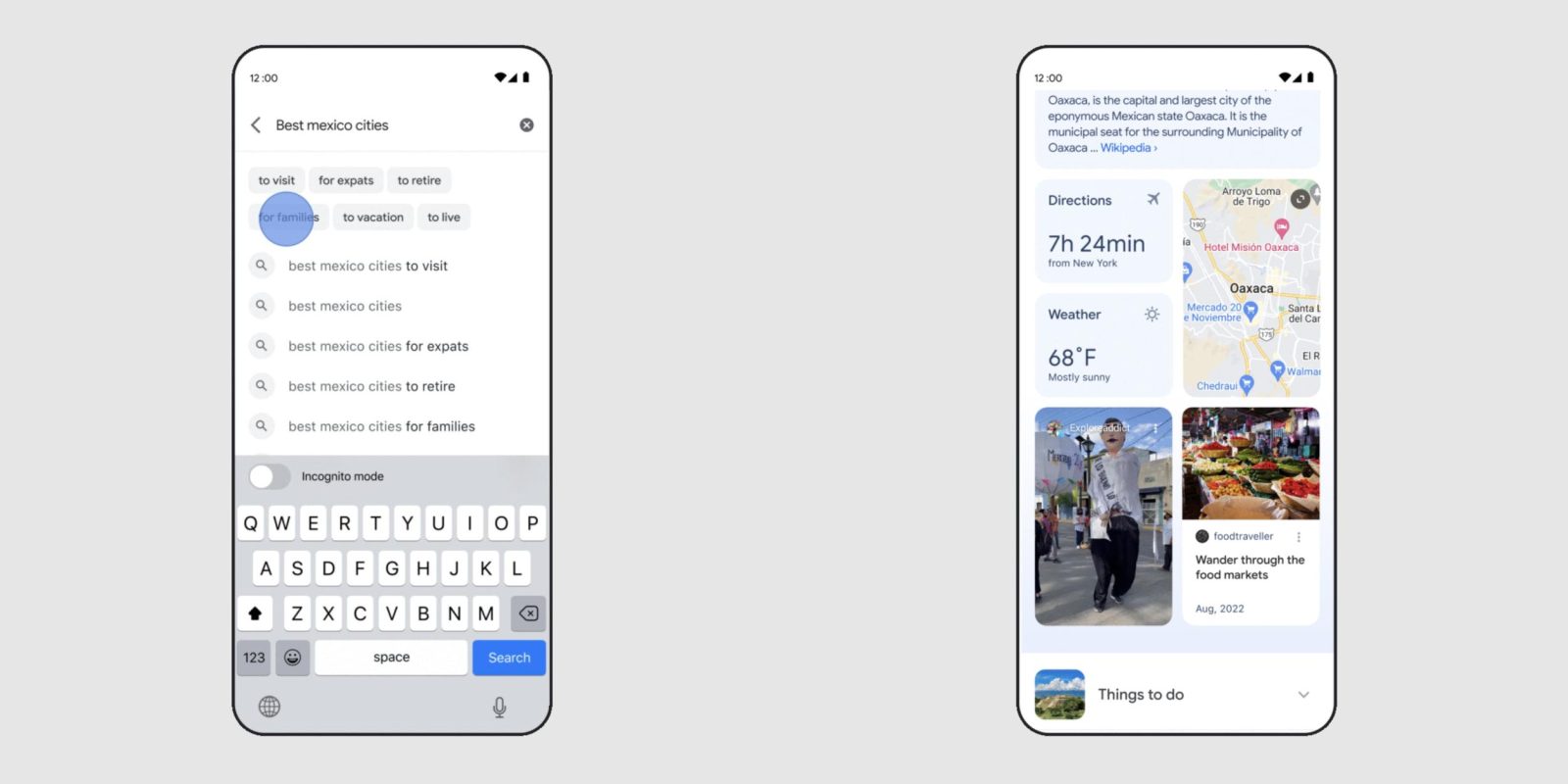
As you type in the Search box, Google is going to start showing more suggestions and ways to refine your query, while certain results will look drastically different from the current 10 blue links approach.
Google wants to “provide relevant content straight away, before you’ve even finished typing” with more detailed location cards that feature a cover image, rating, hours, and distance instead of just the address.
Meanwhile, tappable chips of keywords and topics that add to your query will appear below the search field. These Google Search box suggestions are rolling out over the coming months.
Say you’re looking for a destination in Mexico. We’ll help you specify your question — for example, “best cities in Mexico for families” — so you can navigate to more relevant results for you.
Searches for certain queries will also look different as part of Google’s push to make it “easier to explore a subject by highlighting the most relevant and helpful information.” Cards are leveraged to show image carousels, summaries/descriptions (from Wikipedia), maps, and key articles. Google will also note the weather and time to destination from your current location in a rather prominent manner. Meanwhile:
For topics like cities, you may see visual stories and short videos from people who have visited, tips on how to explore the city, things to do, how to get there and other important aspects you might want to know about as you plan your travels.
Overall, search results are getting more image-heavy, with large cover pictures from articles and videos. This is Google “reimagining the way we display results to better reflect the ways people explore topics.” Additionally, related topics to your search will appear at the bottom for an endless scrolling experience.
More on Google Search:
- Google Lens getting ‘AR Translate’ and expanding Multisearch to more languages
- Live View getting nearby search and elevated to the Google Maps search bar
FTC: We use income earning auto affiliate links. More.


Comments