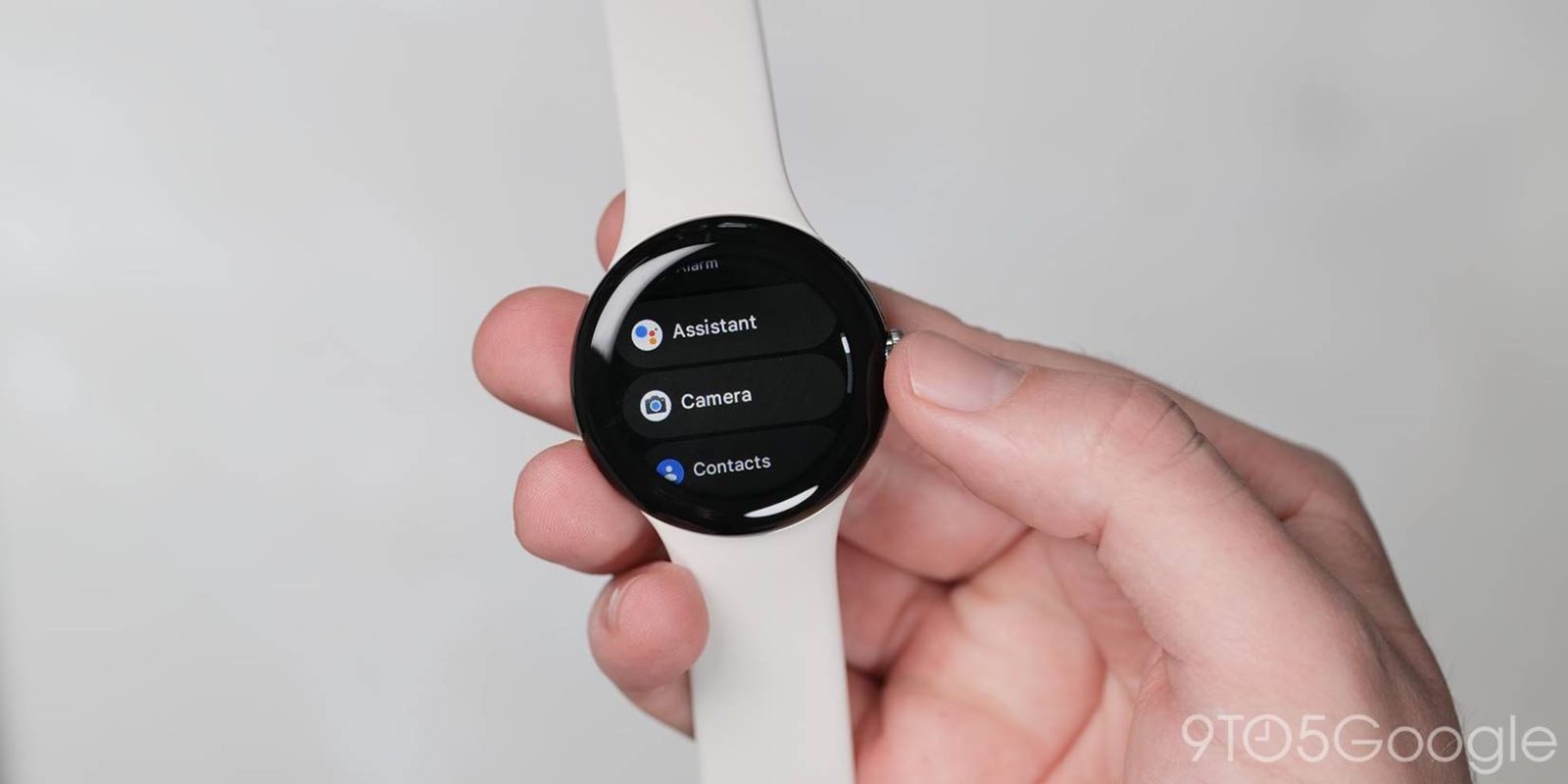
Jetpack Compose is Google’s recommended approach for building UIs on Wear OS and version 1.1 is rolling out with a handful of tweaks that you might encounter in apps.
Compose for Wear OS 1.0 hit stable in late July, and the latest release contains “new features and brings improvements to existing components, focusing on UX and accessibility.” Developers can now take advantage of a new outlined style for Chips and Buttons:
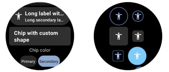
New OutlinedChip and OutlinedButton composables provide a transparent component with a thin border that can be used for medium-emphasis actions. Also available for compact versions: OutlinedCompactChip and OutlinedCompactButton.
Meanwhile, those Chip/ToggleChip and Button/ToggleButton components can now have different shapes.
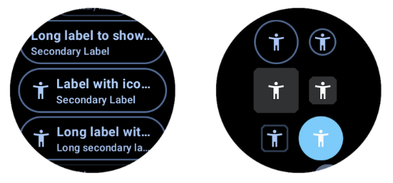
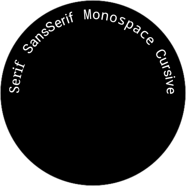
Curved text at the top can now be customized with fontFamily, fontWeight, fontStyle, fontSynthesis.
Compose for Wear OS 1.1 also contains UX like:
- ToggleChip and SplitToggleChip support usage of animated toggle controls (Checkbox, Switch and RadioButton) that can be used instead of the static icons provided by ToggleChipDefaults.
- Default gradient colors for Chip/ToggleChip and Cards were adjusted to match the latest UX specification.
- Updated a number of the default colors in the MaterialTheme to improve accessibility as the original colors did not have sufficient contrast.
Accessibility improvements include:
- Accessibility improvements to Picker so that multi-picker screens are navigable with screen readers and the content description is accessible.
- InlineSlider and Stepper now have button roles, so that TalkBack can recognize them as buttons.
- The PositionIndicator in Scaffold is now positioned and sized so that it only takes the space needed. This is useful when semantic information is added to it, so TalkBack gets the correct bounds of the PositionIndicator on screen.
Google says it’s “excited to see a growing number of apps using Compose for Wear OS in production.”
Note that using version 1.1 of Compose for Wear OS requires using the version 1.3 of androidx.compose libraries and therefore Kotlin 1.7.10. Check out the Compose to Kotlin Compatibility Map for more information.
FTC: We use income earning auto affiliate links. More.
Comments