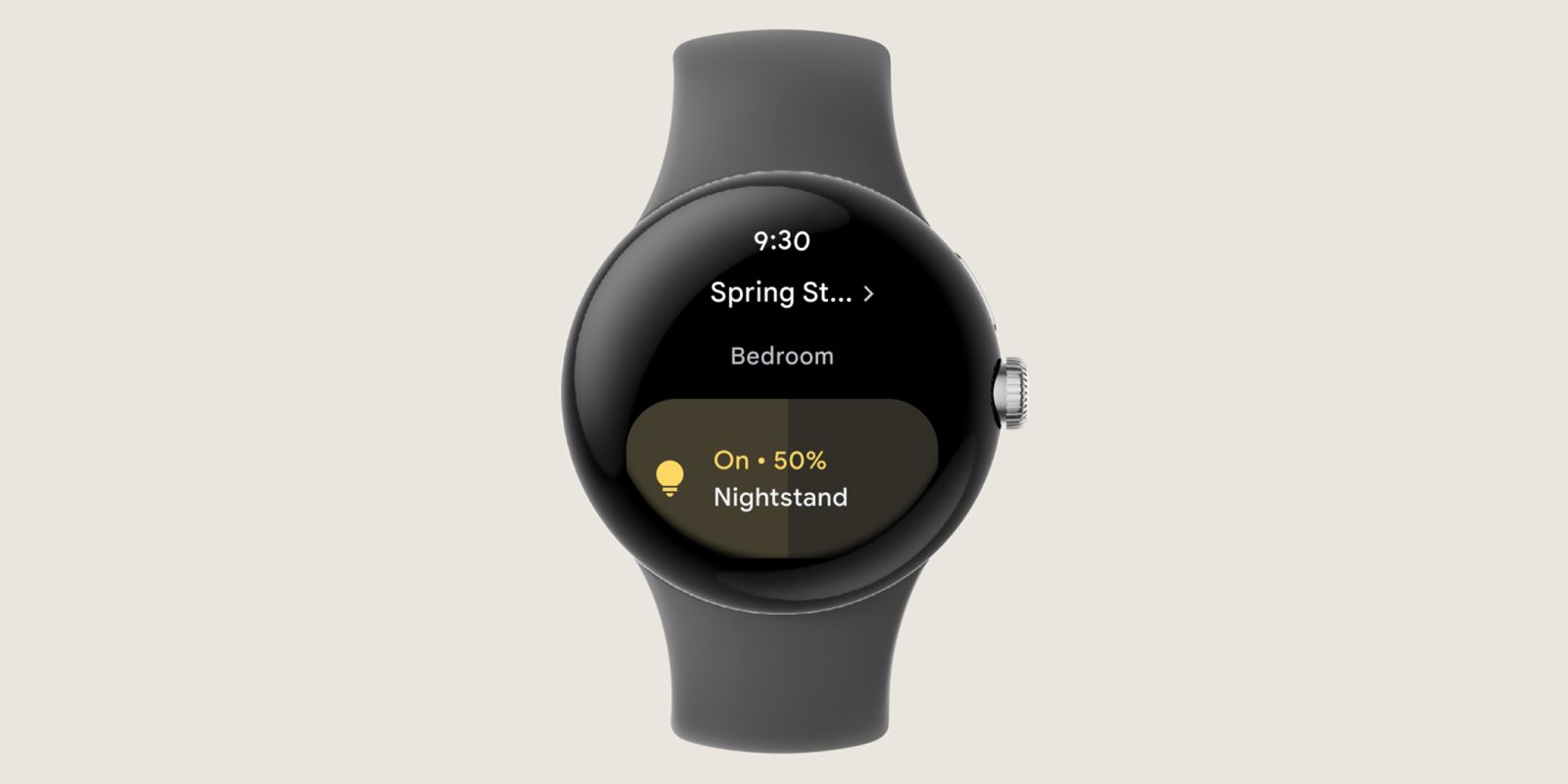
Citing user feedback since the Public Preview launched in October, Google is rolling out an update to the Home for Wear OS app.
The two main aspects of this update are “speed and performance improvements” and easier navigation. Google Home for Wear OS is getting a new list view that can simply be scrolled through “if you have 10 devices or less.”
As such, the app’s new homescreen immediately starts showing device tiles instead of the room list, though headers/dividers are present. It helps make the app more lively in appearance, given the color used by the tiles. This should make using the app even faster, with launching already possible from the top of the Quick Setting shade or watch face complications.
This is an alternative to “having to go room by room,” with tapping into menus on small screens not ideal. It comes as list views have widely become the primary interface layout on wearable apps across Wear OS and the Apple Watch.
Wear OS app today
As a result of this change, Google also notes how you can now “control devices that are linked to you and are not yet assigned to a specific home.”
These Google Home for Wear OS updates are “rolling out to Preview over the next few days.” Version 2.62.7.5 of Google Home is appearing in the Play Store, but there’s a server-side component to these new features, and we still have the old design as of this morning.
Google says it’s working on more features and to “keep the feedback coming!”
More on Google Home:
- Google Home routines disappear for some users as home control settings get a new UI
- Google Home routines keep saying that the Nest x Yale lock has ‘been unlocked’
- Google Nest Cam previews are still broken on Pixel Watch & Wear OS, but work on Apple Watch
FTC: We use income earning auto affiliate links. More.


Comments