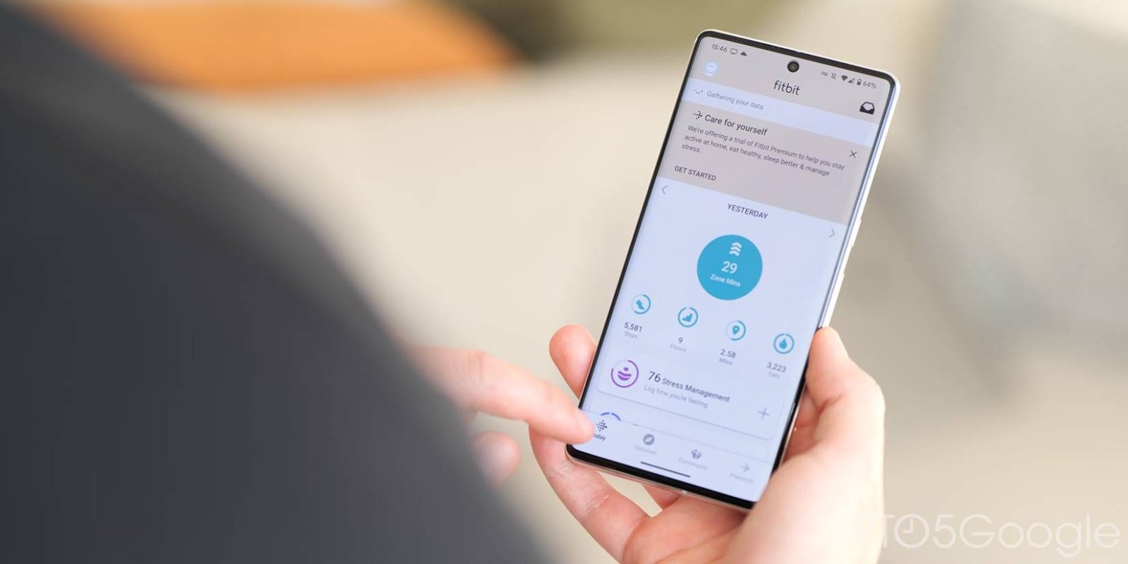
Last fall, it looked like Fitbit was going to revamp its mobile apps. That has yet to launch, and Fitbit has now removed screenshots showing off what was presumably the Android and iOS redesign.
When Fitbit for Wear OS screenshots were added ahead of the Pixel Watch launch, the Android listing was updated with pictures of a redesigned Android app. Fitbit switched to an arc-shaped bottom bar that was quite different and certainly unique.
“Today” was centered instead of being the first tab. “Discover” appeared to the left, while “Community” was to the right. The current tab saw its bottom bar icon filled in, while this design looked like it wouldn’t support a fourth “Premium” tab (which just notes benefits).
There was no arc on iOS screenshots, but Today also moved to the middle with some icon tweaks that distinguish it from what’s live today.
Fitbit has now removed those Android and iOS redesign screenshots. We’re now left with Google Play and App Store screenshots of what the application looks like today.
Reporting from IFA 2022 said Fitbit was planning a Material You bottom bar with pill-shaped indicators and no Dynamic Color. Android Police was told to expect this redesign with the launch of the Sense 2 and Versa 4.
The screenshots, which are decidedly not Material You, that appeared on both app listings in the fall suggest that something was definitely planned. However, the removal suggests this might be further away.
It could always be bundled with an upcoming Fitbit launch. Whatever the case, it will hopefully introduce a dark theme, something that the Fitbit app has shockingly lacked all these years.
More on Fitbit:
- Fitbit was never teasing its own Wear OS smartwatch, just the Pixel Watch
- Fitbit step and heart rate data is appearing in Google Fit
- Fitbit ending Pandora and Deezer support on Sense, Versa 2/3 in March
FTC: We use income earning auto affiliate links. More.


Comments