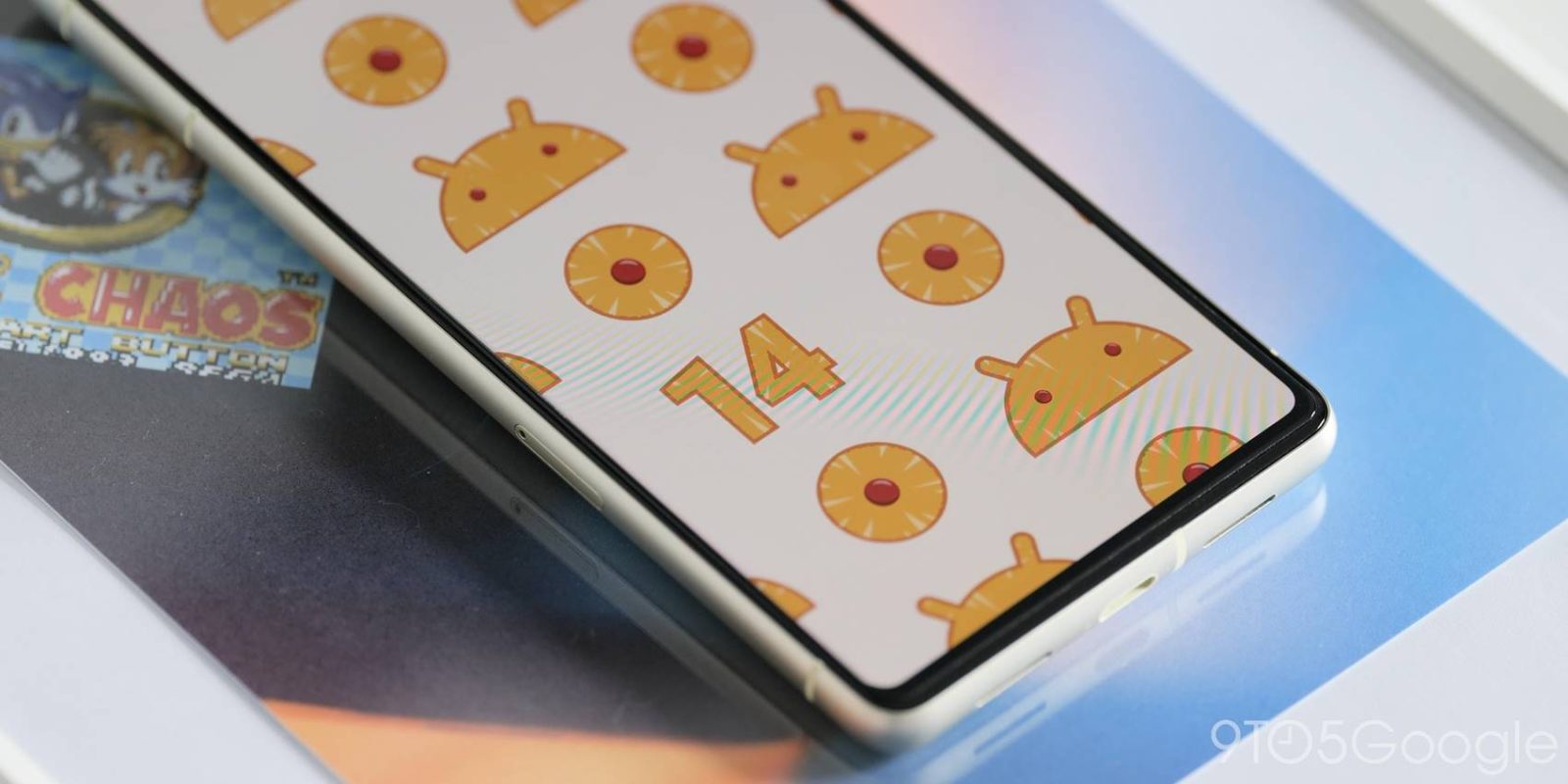
The Android 14 Developer Preview 1 is the very start of a potential seven-month love affair with the nuances of Google’s next mobile operating system. Here’s everything you need to know.
It’s not clear just how many changes we’ll see moving through the Developer Preview phase up to the public Beta at this stage. However, Android builds are always a big deal around these parts. Just like every year before, we’ll be diving into the intricacies to give you a lowdown on the best functions and features. As this is not intended for the “average” Pixel user, you probably shouldn’t sideload or install it on your main handset. We’ll take the risks and report back with our findings.
If you must try it for yourself then follow our installation guide here.
Table of contents
- Video — Android 14 Developer Preview 1 hands-on: Top new features!
- “UpsideDownCake” version number
- February 2023 security patch
- Altered “Security & privacy” section
- Enhanced Battery Saver UI
- Screen time returns to Battery usage section
- Taskbar text labels on larger displays
- Fast Pair added to Connection preferences menu
- Improved default “Basic color” options in Wallpaper & style
- Android 14 Developer Preview 1: What is your favorite new feature?
Video — Android 14 Developer Preview 1 hands-on: Top new features!
For more video content, subscribe to 9to5Google on YouTube.
“UpsideDownCake” version number


Google may have publically stepped away from the classic Android build desert codenames, but that doesn’t stop the internal versions from being shared. We’ve known for a long time that Android 14 or Android U would be referred to internally as “Upside Down Cake” and that is now visible if you sideload Developer Preview 1 on your device.
Heading to Settings > About phone or Settings > System > System update and you’ll see the latest version is “UpsideDownCake.” Sadly, the new system icon has not yet changed. Instead, you’ll see the Android 13 “T” logo when you plug in a cable or access USB preferences.
February 2023 security patch
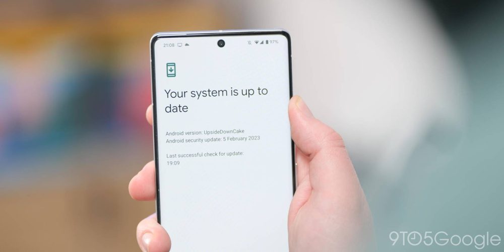
Android 14 Developer Preview 1 also comes with the latest publicly available security patch pre-loaded. The February 2023 security patch is packed into this developer-focused build so you’re secure from the jump.
Altered “Security & privacy” section
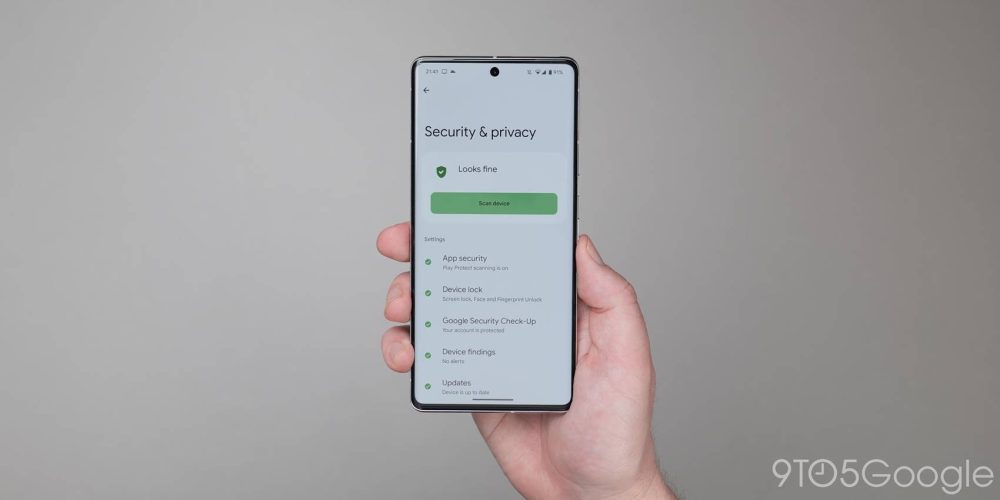
The introduction of Android 13 included a slow rollout of an enhanced Security & privacy section to help you better manage your on-device and account security. This section is getting some minor changes in Android 14 Developer Preview 1, with section subheadings seeing the removal of dropdown menus.
Not only does this mimic the wider Settings sections, but it also streamlines with a tap opening the prerequisite menu or subsection. All options are also visible without a user needing to expand smaller menus, therefore, speeding up access.
Enhanced Battery Saver UI
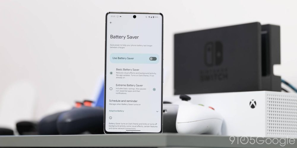
There are a couple of changes to the Battery section in Android 14 Developer Preview 1. One of the most notable is to the “Battery Saver” section and how this operates. Google has decided to streamline this system area with all options now available from here.
You’re able to choose between “Basic” and “Extreme Battery Saver” within one pane rather than needing to enable the battery saving option and then toggle the enhanced version. The “Adaptive Battery” toggle also has a new home here in the most obvious section for it to be found.
Another change is that scheduling is handled within the “Schedule and reminder” section. From here, you’ll notice that Google has removed the ability to set Battery saver to enable based on your routine. What’s more, the minimum battery percentage to active has been upped from 10% to 20% when automatically toggling based upon your device battery percentage. There’s also a new “Battery Saver reminders” toggle that will activate notifications when your running low on lifespan.
Screen time returns to Battery usage section
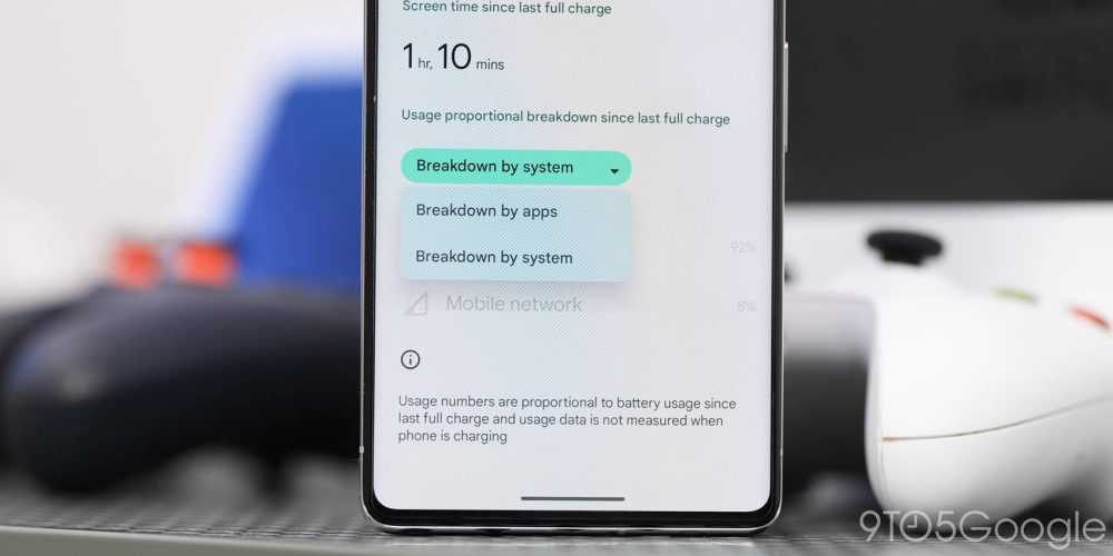
Back with the release of Android 12, Google changed the way in which the popular but flawed screen-on-time metric was displayed on Pixel phones. This change made it such that your device would show the battery usage of your display over a 24-hour period. Thankfully for those that care about this metric, Android 14 Developer Preview 1 has restored the ability to see just how long your screen has been on since your last full charge.
Provided you have charged your Pixel to 100% when viewing the “Battery usage” screen, there is now a prominent “Screen time since last full charge” section that will show just how long your screen has been powered on. As we note, this is a somewhat flawed metric as longevity is tough to decipher without usage context. That said, it’s nice to see this return for those of you that like being able to see how long your display has been powered on each day.
Another important change to this section is in how battery consumption is sectioned. Instead of an inline dropdown that lets you expand by applications and system use, both options are separate by a menu that toggles each in unique view panes. The result is similar, but it cleans up the process of analyzing battery consumption data on your device.
Taskbar text labels on larger displays
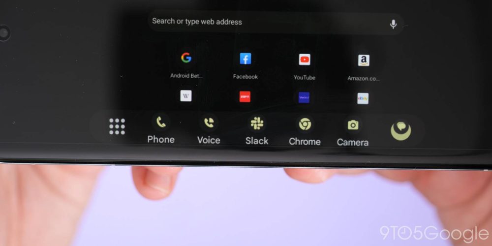
The taskbar is one of the biggest new features that has been added to Android for foldables and large screen devices like tablets in recent OS updates. Here in the first developer preview of Android 14, Google is making some changes to how this works with names now appearing underneath app icons.
Ordinarily, on your smartphone, this is not visible. For screens with a tablet DPI or 600+ on the first Android 14 Developer Preview, the taskbar will now show text names below dock app icons. It’s actually worth noting that his behaviour is not technically new. In fact, it has been seen before but this was not the default behaviour when seen previously. On larger devices, this will no doubt help identify unfamiliar app icons.
Fast Pair added to Connection preferences menu
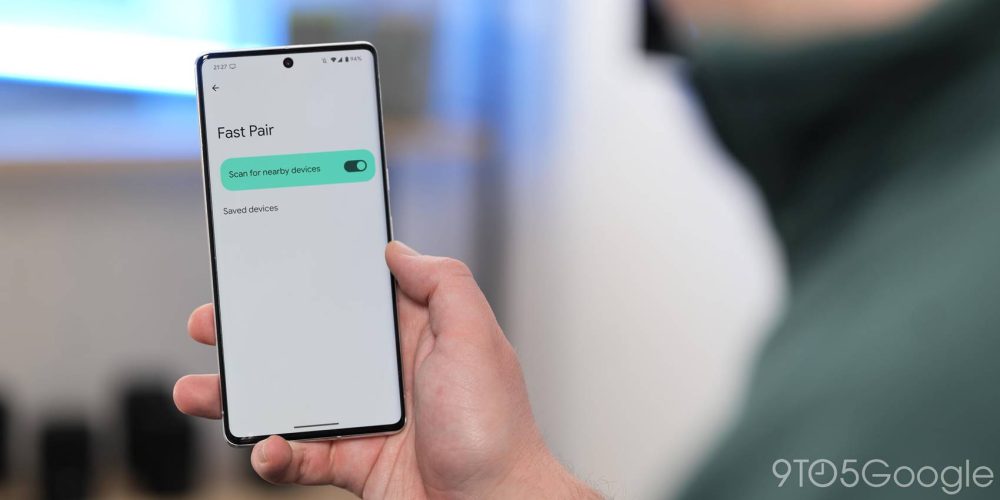
If you head to the “Connection preferences” section within Settings the “Fair Pair” option has reappeared. At this stage, it seems as though this area does not populate with any devices — including those that support Fast Pair. We’ll just have to wait and see what Google has in store for the option.
Improved default “Basic color” options in Wallpaper & style
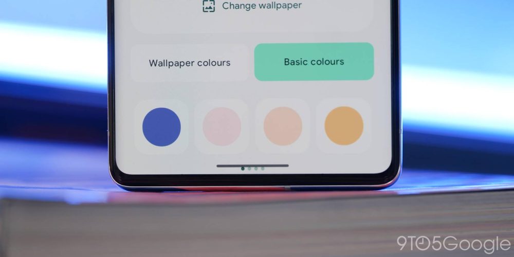
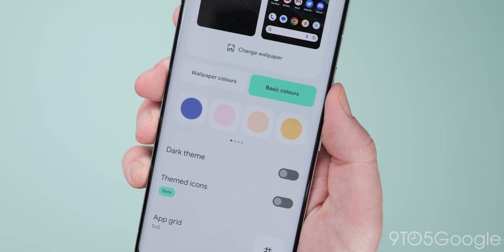
Material You and Dynamic Color are core tenets of Android 12, 13, and Android 14. We’ve seen a few tweaks since the first introduction and there are signs we could see more with Developer Preview 1. When launching the “Wallpaper & style” section, you may notice that the options within “Basic colors” seem to have more vibrancy.
It looks very much like Google has tweaked the first four color carousel with brighter, more visually stand-out options. In previous builds, you’ll often see earthy tones of green and brown. These appear to have been replaced with lighter options that better fit with a vibrant, visually appealing UI.
Android 14 Developer Preview 1: What is your favorite new feature?
There are more than just surface-level changes in the Android 14 Developer Preview 1, but this small selection includes the top user-facing features that we’ve found thus far. Naturally, we expect to see more little things that might have slipped through the cracks over the coming days and weeks. We likely have a deeper dive into every single thing that has been added, including some features that require a little work to get fully operational in our full overview coming very soon.
What is your favorite new feature or features? Let us know down in the comments section below!
FTC: We use income earning auto affiliate links. More.


Comments