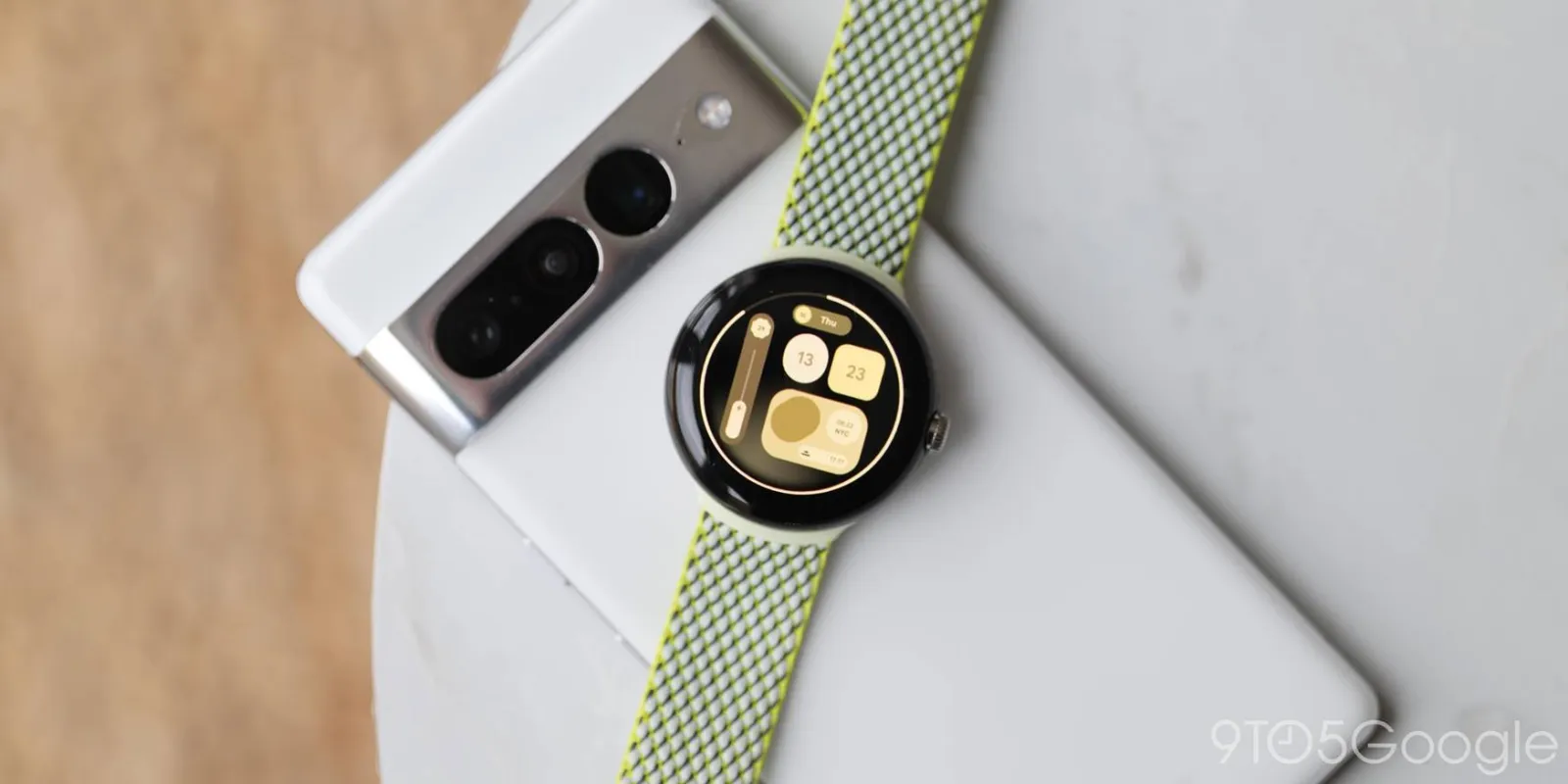
There’s a lot to love about the Pixel Watch including the default watch faces that Google designed. However, thanks to the Play Store, there are hundreds that you can install and customize to suit your own style. Here is a short list of some of our favorites.
We’ve refrained from suggesting apps like Facer. While it’s a fine app in terms of sheer volume, the quality and consistency of watch faces can be mixed. In most cases, all the designs we’ve tested are free but are noted if they are a paid option.
To help out, we have separated our list into different types of watch face for the Pixel Watch. The “Default” selection includes any alternatives that should be usable on just about any Wear OS watch. “Traditional” faces are classic dials that you’ll associate with mechanical watches. There’s “Digital” for the modern number-based UI that many are accustomed to and, finally, “Minimal” for simple time and data viewing.
Table of contents
Video — Some of the best watch faces for Pixel Watch
For more video content, subscribe to 9to5Google on YouTube.
Default Pixel Watch watch faces
“If it ain’t broke don’t fix it,” goes the saying. That’s certainly true with the default Pixel Watch face selection as there’s a solid set of options right out of the box. Not all are perfect, but here’s a few of our favorites:
Concentric
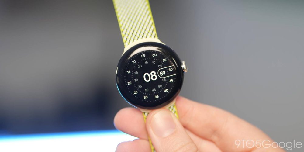
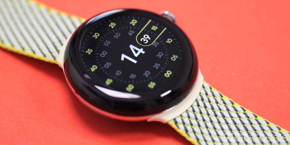
I’m personally of the opinion that Google straight-up used the Ressence Type 3 for reference when designing the “Concentric” watch face. To be honest, I’m absolutely fine with that as this is the signature Pixel Watch watch face. It’s not information-dense, but it looks sublime as each section turns independently.
This style of design simply wouldn’t work on square screens. You can add up to three complications. However, this changes the look quite drastically. You can try this on other Wear OS watches as there is an unofficial version available for free on the Play Store.
- Download Concentric (Free)
Index
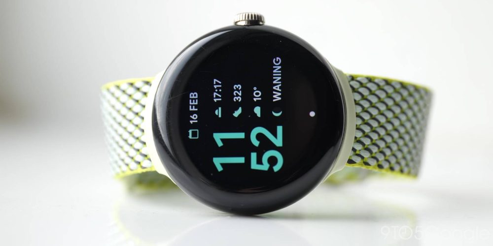

Probably the closest default watch face to that of the Pixel lock screen that you can use with Pixel Watch is the Index design. It’s admittedly basic but feels like an extension of the large lock double-line clock that the Pixel uses on the Always-on display. That’s flanked by up to four complications which are reminiscent of unread notification icons. Sadly, there doesn’t appear to be an equivalent available for Wear OS on the Play Store as yet.
Traditional
You’d often associate classic or traditional watch faces with mechanical watches or the type your dad or grandparents might have worn. They come in various styles, but you’ll get at least a minute hand and an hour hand. In a lot of cases, a second-hand is thrown in too. Here are some of our favourite “Traditional” watch faces for the Pixel Watch:
Shapes
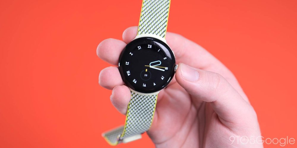
Expanding upon the default “Shapes” face, this third party option is arguably better in just about every way. For starters, it lets you replicate the Pixel Watch on any Wear OS. Then you have the option to combine up to six index styles with even more color combinations than Google’s own iteration. While it’s a third-party alternative, it’s a more complete one at that.
- Download Shapes ($0.79)
WatchBase – Tactical Watch face
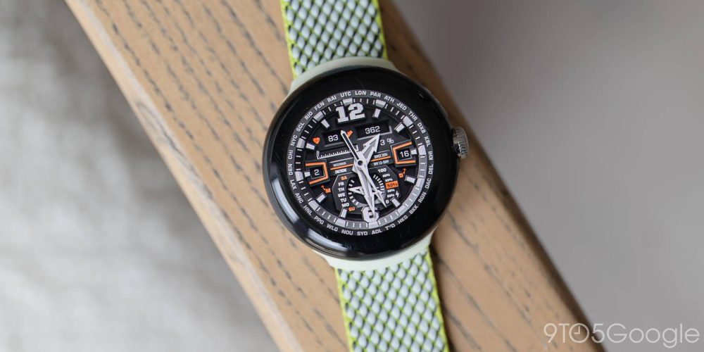
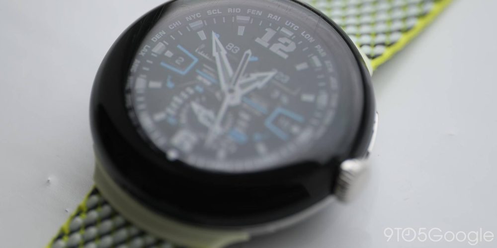
High-density watch faces don’t always work on smartwatches as it’s hard to replicate the internal depth of a mechanical watch. This tactical-style watch face is one of a few that manages to look great on a digital display and still retain a ton of information on screen. While it does have a military style, the color options mean that you can tone this down without sacrificing the data-rich element.
Digital
A “Digital” watch or clock does away with the circular style that is synonymous with most clocks. Instead, it’s just numerical digits rather than hands on a dial. Most modern timepieces use a digital dial and so you might want to on your Pixel Watch. Here’s a few of our favorite “Digital” watch faces for Pixel Watch:
Digital Material You
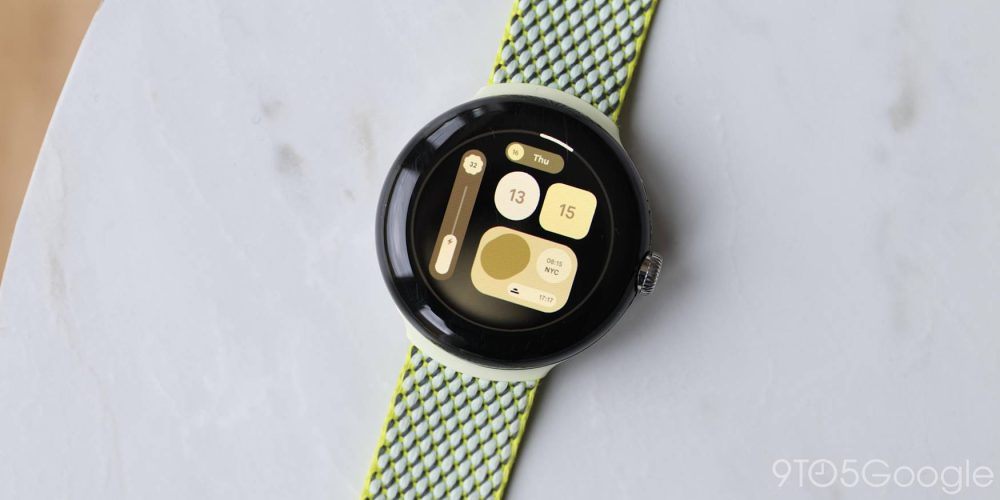

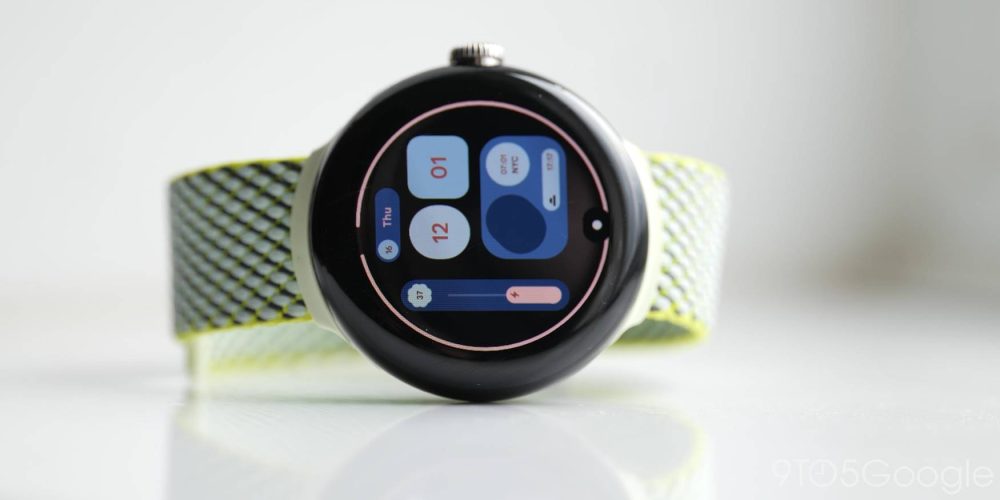
If you love all things Material You, then we point you to this watch face. It looks like the bubbly rounded widgets you probably already use on your Pixel home screen. The difference here is that it’s scaled down to a smartwatch screen. There are three customizable complications include a battery level indicator that mimics the volume slider in Android 13. For anyone all-in on Material You, this is a great watch face.
- Download Digital Material You ($0.79)
Pixel Minimal Watch Face
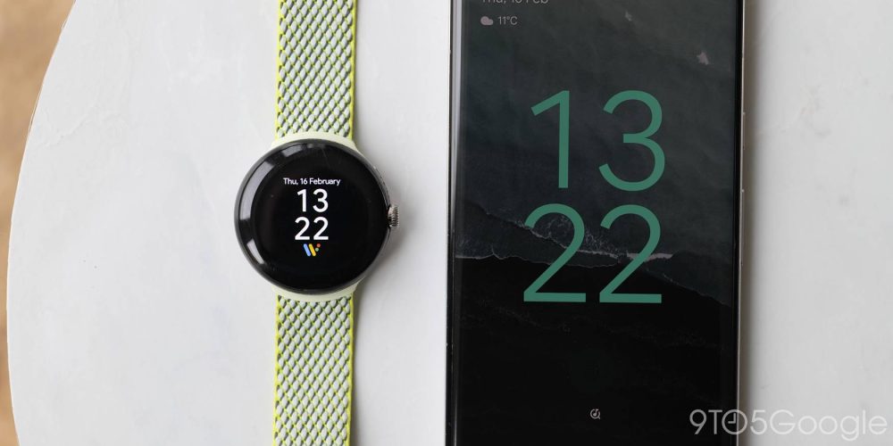
It might be labelled as a “Minimal” watch face but this Pixel-like option is far from it in our opinion. Inspired by the Google Pixel series, it has been available for a long time but is still one of the closest to Google’s own “At a Glance” widgets for smartwatches. It’s just a copy of the lock screen on Google Pixel with the “At a Glance” widget prominent along with customizable complications that fit with the Material You aesthetic. It’s a classic digital watch face for any Wear OS wearable but, most at home alongside a Pixel running Android 12 or higher.
Minimal
Top comment by Steven Allen
Concentric with 3 complications is the best looking and most functional. Especially when colors are paired up with your Material You theme on a Pixel phone.
Simple, abstract or just lacking in distractions. That’s probably how we’d describe a “Minimal” watch face. There are thousands of designs sold on such a promise. Heck, we’d even call the Pixel Watch minimal by design. If you like this style, here are some of our favorites:
Outer Rim
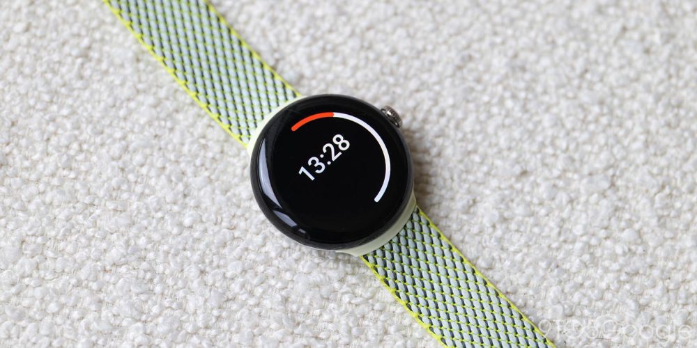
Although it fits into a couple of our categories, the Outer Rim watch face is the definition of “Minimal.” There’s a basic digital time in the upper portion of the display with a single two-tone circle that indicates hours and minutes. A white line indicates the minutes passed — i.e. 3/4 for 45 minutes — while an overlapping color line indicates the hours. You can start to build up to a less sleek finish with four complication slots. In it’s default state, it’s effortlessly simple and a great option.
- Download Outer Rim ($0.79)
Chronos
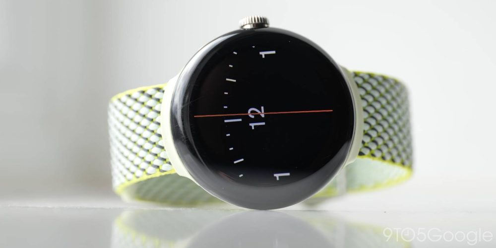
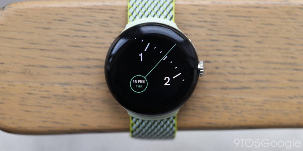
So minimal it barely counts as a watch face, the Chronos face in its default setup consists of a macro look at the time. It’s hard to decipher at first glance but it makes sense when used for a little while. The minute hand takes up all of the screen and rotates with a dash of color. The hour dials are zoomed in which is completely unique. You can only add one complication at a time, which makes it incredibly basic.
- Download Chronos ($0.99)
What is your favorite watch face for the Pixel Watch?
There are potentially thousands of watch face combinations that you can have with your Pixel Watch and we want to know some of your preferred styles. Let us know what you’re rocking on your wearable down in the comments section below.
FTC: We use income earning auto affiliate links. More.


Comments