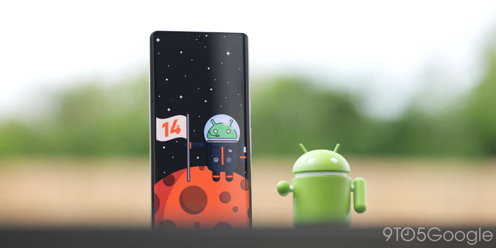
We’re now four (yes, 4) updates deep into the early Android 14 preview phase. There are some new bits and pieces to uncover on eligible Google Pixel handsets. Here are all of the top user-facing functions in Android 14 Beta 2.
If you’ve missed any of our previous coverage of the Android 14 Developer Preview and Beta 1, then be sure to check that out. It’s certainly worthwhile to get up to speed as some changes may seem minimal but have been incrementally updated and altered. You can find them here:
- Android 14 Developer Preview 1 hands-on: Top new features [Video]
- Android 14 Developer Preview 2 hands-on: Top new features [Video]
- Android 14 Beta 1 hands-on: Top new features [Video]
Android 14 won’t be a huge update from a user-facing perspective. Google is still refining Material You to better fit with the growing Pixel smartphone ecosystem. Other OEMs will also adopt some things here but not all.
Table of contents
- Lockscreen PIN input Material You icons
- Page indicator on Pixel Launcher
- Monochrome toggle returns to Wallpaper & style
- Separate Call and Ring volume controls
- Cleaner app menu pop-ups
- Keyboard and language sections in System section
- Improved animations
- Flash notifications page enhanced
- At a Glance widget alterations
- New Security & privacy logo in Settings
- Improved contrast control within Developer options
- Floating Clipboard tool
- Font Quick Settings tile
- May 2023 patch
- Android 14 Beta 2: What is your favorite new feature?
For more video content, subscribe to 9to5Google on YouTube.
Lockscreen PIN input Material You icons
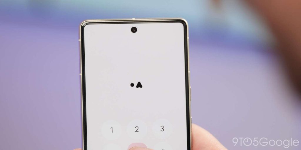
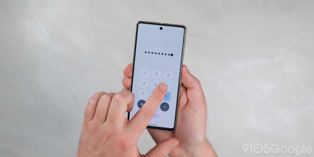
Google has added a neat extra touch to the lockscreen when you enter a PIN or passcode. Tapping any of the buttons and the input tracker will now be animated with abstract Material You-style icons such as rounded triangles, stars, and more to indicate that you have entered characters or numbers.
Page indicator on Pixel Launcher
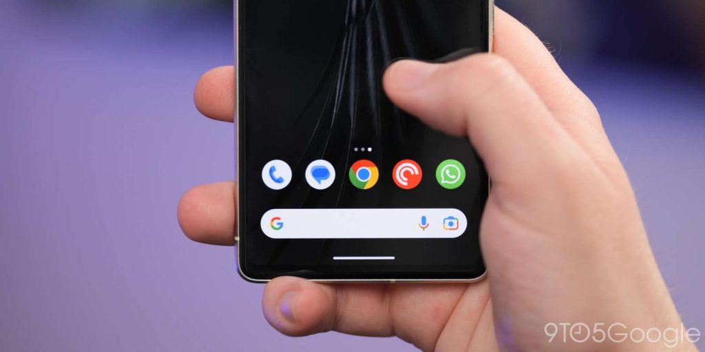
To help you understand just what page you’re currently looking at, the Pixel Launcher now has page indicators that are very iOS-like. These dot-style pop-ups will fade out of view after a prolonged period on one specific page but are actually lifted right from the Quick Settings panel – which has similar indicators already.
Monochrome toggle returns to Wallpaper & style
The monochrome theming option has returned to Wallpaper & style which overrides the default Dynamic Color settings. Instead of colorful Quick Settings toggles and menu panes, these areas will adopt a simple black or white color depending on whether you have the light or dark theme applied.
Separate Call and Ring volume controls
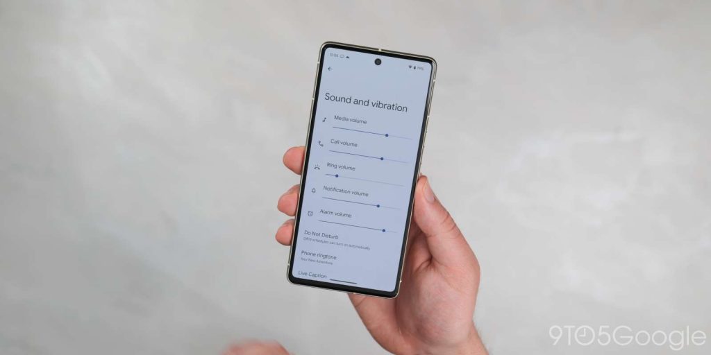
Although hinted at in a previous beta release, Android 14 Beta 2 has enabled separate Call and Ring volume controls for some users. This may still need to be enabled for many, but if you heading to Settings > Sound and vibration you will be able to adjust the volume at which you hear callers through the earpiece or the volume of your device ringer.
Cleaner app menu pop-ups
The expanded floating app menus that allow for quick access to specific in-app sections have also received attention in Android 14 Beta 2. When long-pressing an app icon you’ll see that dividing lines or separators are removed to clean up the look. This is more in-keeping with the Material You design principles but the pop-up section is also decreased slightly too.
Keyboard and language sections in System section
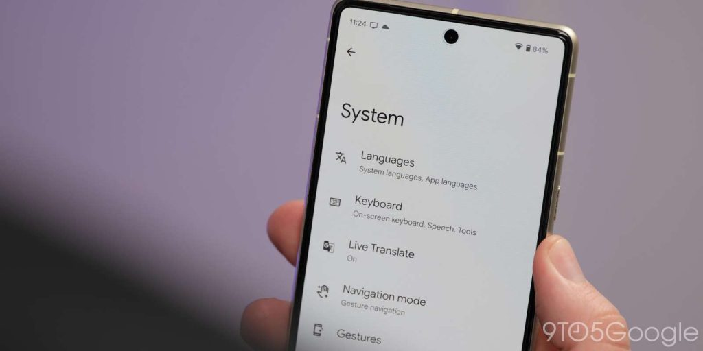
The Keyboard and Language sections have now been elevated within the System section of device Settings. Previously this was a combined “Languages & input” section that amalgamated all of the functions. This makes things easier to manage and less confusing.
Improved animations
Android 14 Beta 2 appears to refine and tune some of the animations that we’ve become accustomed to in our favorite mobile operating system. Swiping, scrolling and invoking menus just feels smoother than it did in previous builds. You can see some improvements to the pop-up customization menu in the Pixel Launcher too.
This floating panel fades in then pops into view rather than folding up as in Android 13. This looks cleaner and adds a little extra visual flair. It also mimics the Power menu animation when activating from the Quick Settings panel.
Flash notifications page enhanced
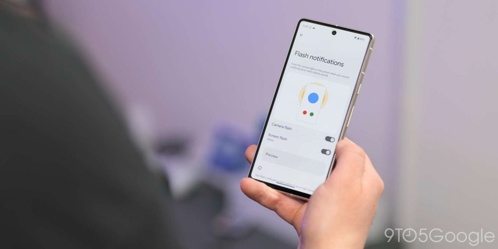
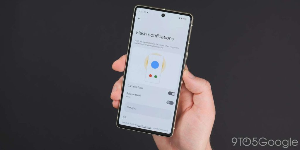
Added back in Developer Preview 2, the Flash notifications page now has an improved UI with a visual element to help you better understand the feature. The toggles are also simplified to “Camera flash” and “Screen flash” with the “Preview” button unaltered.
At a Glance widget alterations
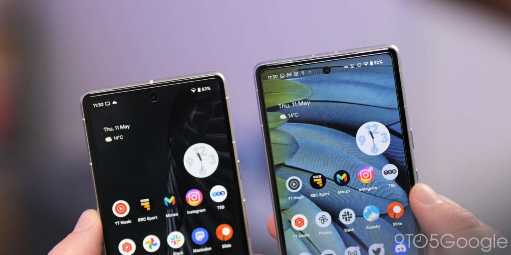
Whether it’s a bug or just a tweak before we see more controls and functions, the popular At a Glance widget appears to have shrunk on some Pixel units with Android 14 Beta 2. It’s still prominent but with the text and icons smaller than in previous updates.
On the lockscreen with media playing, the widget has further changes. The temperature and weather condition icon join the date information while the forecast data now takes up two lines. A new “Daily forecast” text is prominent – likely to confirm that this is data from weather tracking agencies.
New Security & privacy logo in Settings
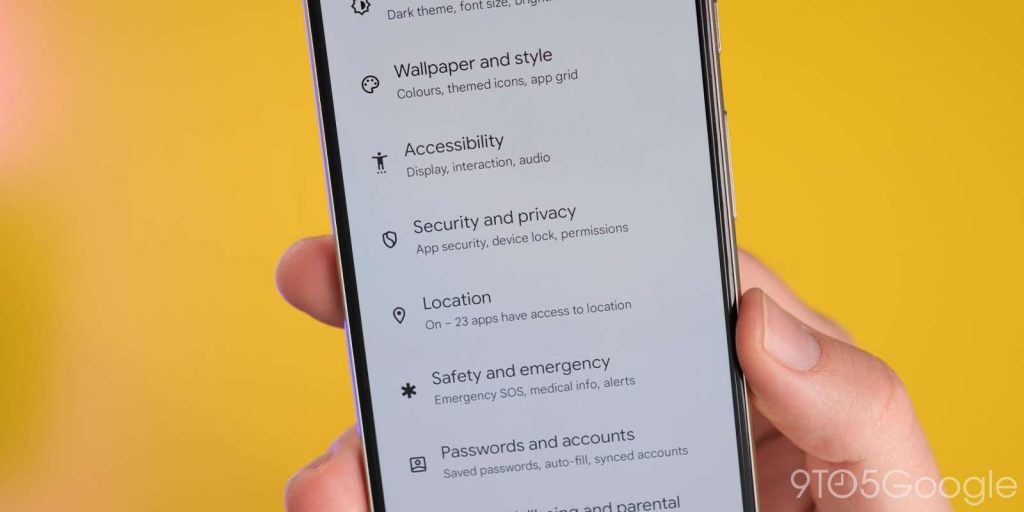
One cosmetic change you might not notice right away is a brand new “Security & privacy logo” in the Settings menu. The shield icon now has an “S” shape rather than a “check” icon.
Improved contrast control within Developer options
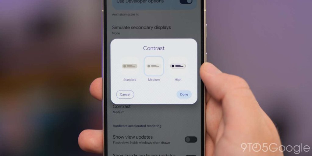
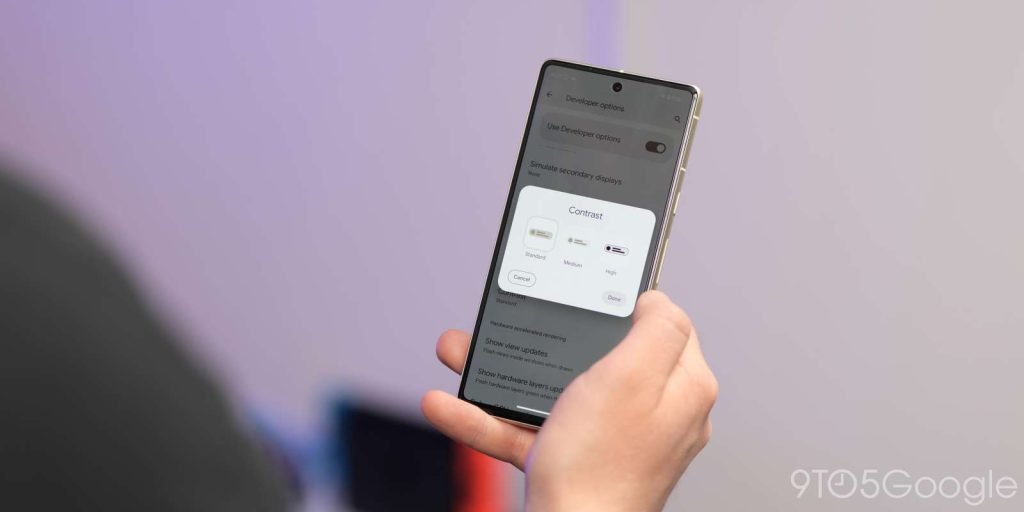
If you have Developer options enabled then you can try the enhanced “Contrast” control menu. Tapping this opens up a pop-up menu where you can choose from three options: Standard, Medium, and High. This looks like it will replace the touted contrast slider that would allow for better integration with your core color choices as part of the Material You and Dynamic Color theming system.
Floating Clipboard tool
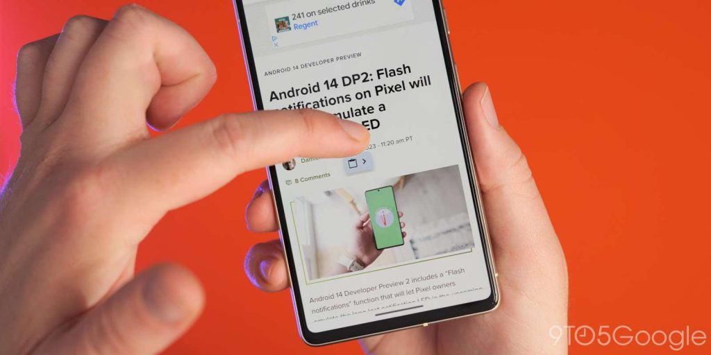
The enhanced Android 13 clipboard tool is getting some love in Android 14 Beta 2 but it seems very much like a work in progress. If you invoke the clipboard editing tool and then copy text again from this window you can activate a mini floating clipboard tool. This doesn’t always work perfectly in our testing but might be a neat option if it gets further attention.
Font Quick Settings tile
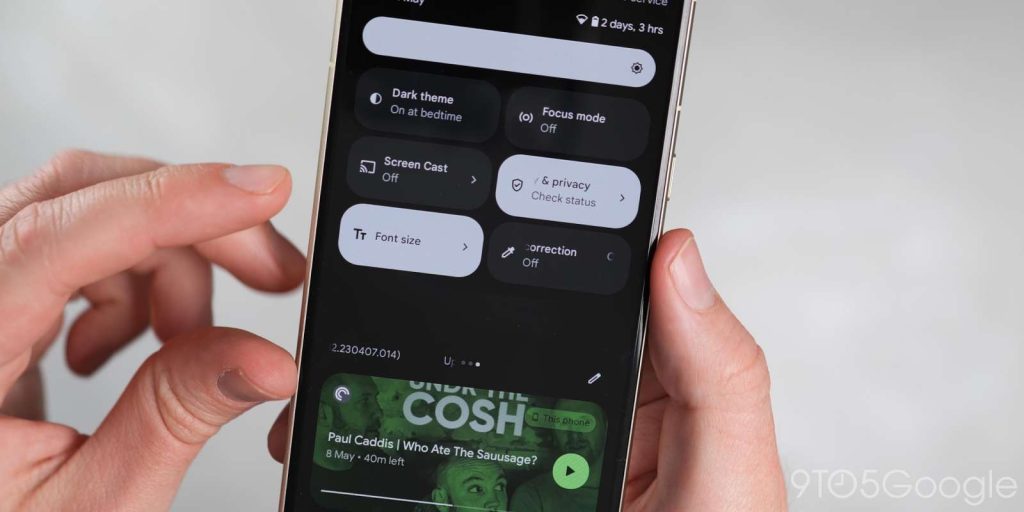
If you want to quickly adjust or alter system font size there’s a new “Font” Quick Settings tile that allows you to increase text across all areas of your device. This saves the effort of diving into the “Display size and text” menu in Settings.
May 2023 patch
As the most recent public Android build, you can bet that the latest May 2023 security patch is also bundled in with the Android 14 Beta 2 update. This should make it more secure for anyone foolhardy enough to run this preview build on their device.
Android 14 Beta 2: What is your favorite new feature?
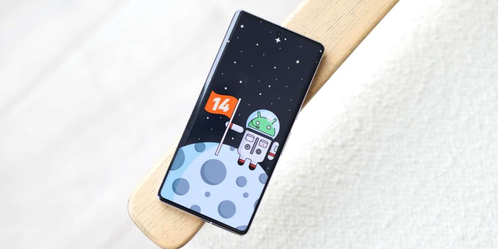
That’s everything new in Android 14 Beta 2. When combined with the original developer previews, there’s more to test drive on your device with more expected as the beta phase progresses. It’s important to note that our shortlist includes all of the top user-facing features that we’ve found at this stage.
We do expect to see more little things that might have slipped through the cracks over the coming days and weeks. We likely will have a deeper dive into every single thing that has been added, including some features that require a little work to get fully operational in our full overview, coming very soon.
What are your favorite new features? Let us know down in the comments section below!
FTC: We use income earning auto affiliate links. More.


Comments