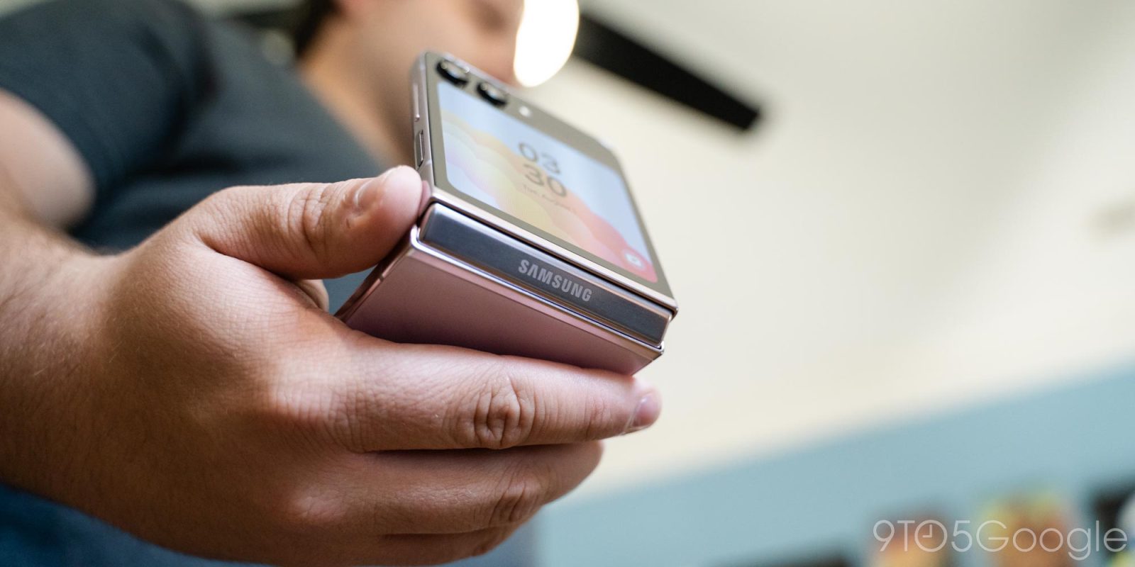
Foldable flip phones are the form factor that really seems to be catching on, and the new Galaxy Z Flip 5 is a near-perfect version of the idea. Or, at least, it would be if the software hadn’t fallen short.
Table of contents
Galaxy Z Flip 5 refines an already-great flip phone
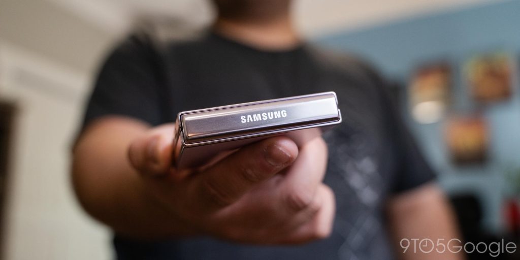
Samsung’s foldable hardware has the benefit of having five generations of experience under its belt, and the Galaxy Z Flip 5 is proof of that. The Flip 5 is, for the most part, almost the same as the Flip 4 before it. It has polished side rails with clicky buttons and a side-mounted fingerprint sensor. It also has a glossy glass back in one of eight total colors. My review unit from Samsung was the “Lavender” color, which is a delightful purple hue, but I think the best option is the “Mint” color, which has a subtle green tint that’s especially good-looking on the metal frame.
I’m not a huge fan of Samsung’s switch to glossy glass, but it has pros and cons. On the one hand, glossy glass, especially in humid environments, can actually sometimes be a little easier to grip. But, on the other hand, it’s also more slippery on a table or in a pocket. The matte finish also better hides scratches, which the back is sure to pick up over time.
I would have preferred last year’s matte finish, but it’s not a big deal by any means.
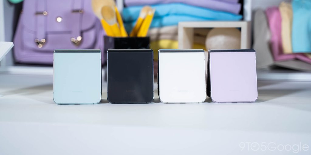
The “front” of the Flip 5 also ditches its two-tone look, which I have mixed feelings about. The Flip 4 was an objectively better-looking device, but Flip 5’s new design is based around making more room for the outer display – more on that later.
The big change this year is in the hinge, which now uses a “waterdrop” design for the display, allowing for two things. First, the display is folded with a bigger radius, which might have some eventual benefits – I’m hoping it will help with spontaneous ultrathin glass breakages, but Samsung hasn’t made any claims there.
But the bigger hardware benefit from this new hinge makes the Flip 5 much thinner. This is readily apparent from the moment you pick up the device. The Flip 5 just feels less chunky and much more refined compared to the previous generation. That’s not to say it was a perfect upgrade, though. The removal of the hinge gap is an overall win, but I did find that gap made it slightly easier to open the Flip one-handed, and I miss that.
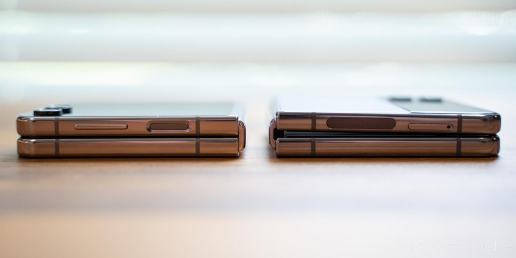
The new hinge also feels like a lateral move in terms of quality too. At least on my Flip 5, the hinge feels “loose” when at certain positions. This was most noticeable to me when the Flip was fully opened, with one degree of “give” if I pushed the display a bit, and this was also noticeable when using “Flex Mode” at certain angles. Is it a big deal? Absolutely not, and Samsung’s hinge still feels drastically better than those from Motorola and Oppo. But, it is a weird little quirk, and one I’ve noticed on two individual units so far but never on a Flip 3 or Flip 4.
The display crease is the only big flaw left
On a hardware level, it really feels like Samsung only has one flaw left to fix – the crease.
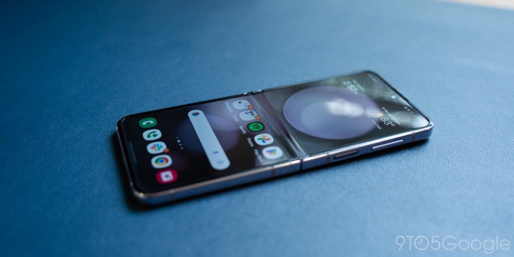
Despite implementing a new hinge that every other foldable maker is using to put out devices with virtually no crease, Samsung has made no noticeable improvement this time around. The steep canyon sitting in the middle of the Galaxy Z Flip 5’s display is easily noticeable and, frankly, annoying. Because it’s dead-center on the display, you feel it with a lot of swipes, and it’s visually quite easy to spot.
The display itself is mostly unchanged, with the same 6.7-inch size and 120Hz refresh rate, but it is brighter this time around, which is always nice.
It’s still not a deal-breaker, but when Samsung’s competitors are so drastically far ahead in this particular case, Samsung’s refusal to address this problem is all the more annoying.
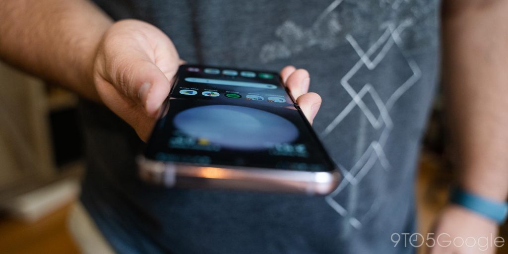
Snapdragon 8 Gen 2 is stellar, but One UI is overwhelming
Under the hood, the Galaxy Z Flip 5 is powered by the Snapdragon 8 Gen 2 from Qualcomm, which is paired with a new minimum of 256GB of storage. Put simply, the chip flies through everything you throw at it. It’s also super efficient, which helps with battery life and heat. It’s not a drastic improvement over the Snapdragon 8+ Gen 1 in the Flip 4, but it’s great nonetheless.
What soured the experience for me was One UI. Samsung’s Android skin is objectively not bad. It’s full of useful features and has a design that’s not bad. But on a device like this, it just feels cluttered and overwhelming. I feel like I’m wasting most of Samsung’s features and that so much of what’s there just isn’t relevant to this device. Even the features that are designed for the Flip, like Flex Panel, aren’t enabled by default and, even then, aren’t all that useful.
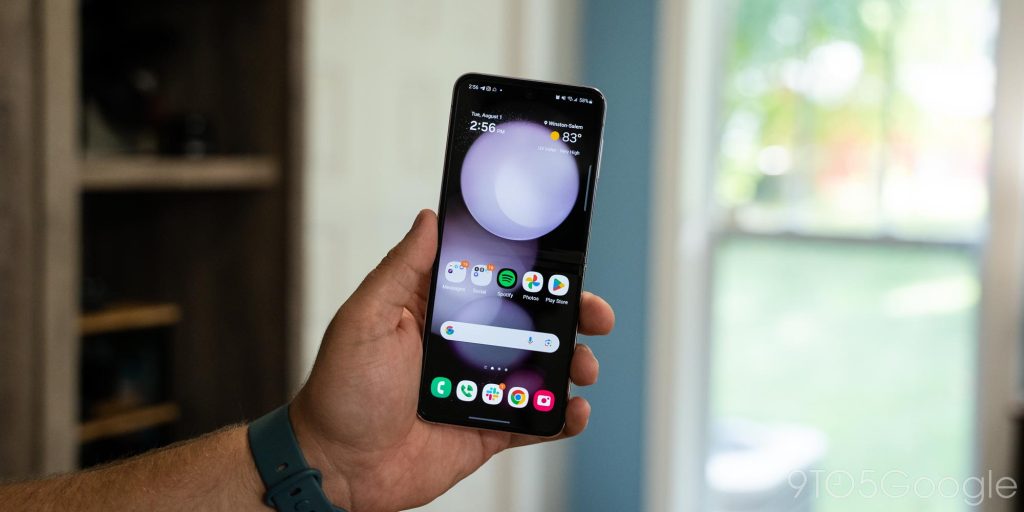
The good news is that, with Samsung’s experience, you’re not really pushed in any one direction. You can use Samsung’s apps, or you can use Google’s, or a mix of the two. When taking the “everything and the kitchen sink” approach that Samsung uses, no one really loses. But, still, I’d much prefer Google’s cleaner approach on a flip phone.
‘Flex Window’ makes a closed Flip more useful, but just barely
The big story on Galaxy Z Flip 5 is, of course, the new outer display which Samsung calls the “Flex Window.” This 3.4-inch display takes up the majority of the space on the outside of the Flip 5, and it’s four times larger than the display in the Flip 3 and Flip 4. The display isn’t as sharp as it could be, with a resolution of 720 x 748, but it’s bright and just a huge improvement over past models on a purely hardware level.
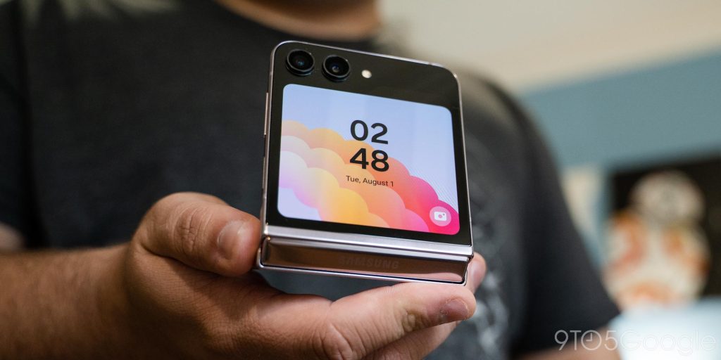
But despite all that extra screen real estate, it’s not nearly as useful as it should be.
The experience out there is built around widgets and clockfaces. It feels remarkably like a smartwatch, actually. The main clock face – which supports always-on display – can be customized to show different styles and fonts, add mini-widgets for showing battery life and such, and can be switched however you’d like. A long-press reveals a Rolodex-style carousel of clocks that you can change on the fly based on presets you created on the inner display.
Beyond that, a swipe to the left shows your notifications, any of which can be tapped to be expanded. Message notifications can then be replied to, while everything else will ask you to open the full app on the inner display. Opposite of that, a swipe to the right reveals a list of widgets. These can include the following:
- Calendar
- Weather
- Alarm
- Step counter
- Recent calls
- Stopwatch
- Direct Dial
- Timer
- SmartThings scenes
- Galaxy Buds controls
- Finance Watchlist (powered by Google Finance)
These are all from Samsung directly, which does feel rather limiting. I would have loved the ability to use regular Android widgets on the outer display for more flexibility in what’s shown, but Samsung just doesn’t give you that option. Most of these widgets are also old news, as they’re the same ones that were in place on Flip 3 and Flip 4. But still, Samsung deserves a lot of credit for the experience these deliver using that foundation. I love the weather widget, which essentially acts as a full weather app in the amount of information it can deliver, and the calendar widget takes advantage of the screen real estate by showing both a monthly and daily view of your events. The alarm widget also came in handy for late-night adjustments to my morning alarm.
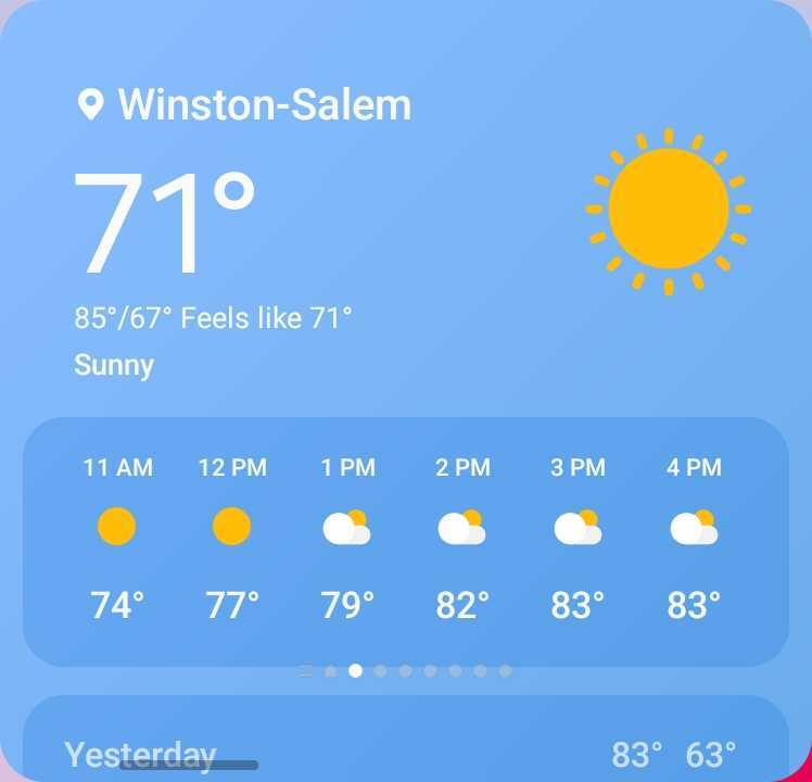
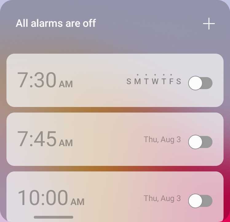

For the most part, though, a lot of these widgets just feel like they’re showing all of the same information as on previous Flips, just on a bigger screen. It’s less cramped, but not as useful as it should be.
The only real upgrade that comes from this bigger display by default, at least in my opinion, comes from the ability to reply to messages using a full QWERTY keyboard.
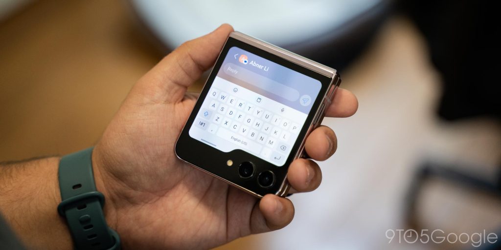
But there’s more you can do, thankfully.
Samsung’s burying of full apps ruins the experience
You can run full apps on the Galaxy Z Flip 5’s outer display; it’s just not enabled by default.
By diving into the Settings menu (Advanced Features > Labs), you can turn on support for a limited list of approved apps on the outer display. These are apps that Samsung feels run well on the outer display and largely include messaging apps such as Samsung Messages, Google Messages, and WhatsApp. There’s also support for YouTube and Netflix (for some reason), as well as Google Maps.
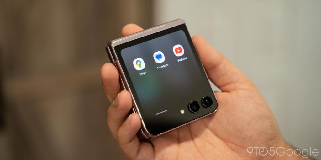
Samsung’s choice to bury this option seems rather shortsighted to me. All of the apps “approved” by Samsung run pretty flawlessly on the outer display and are genuinely useful. It’s great not having to open the phone for every single interaction, and messaging and navigation make a lot of sense on that outer display. Even YouTube has come in handy on that display for background entertainment.
But I want to do so much more.
Thankfully, I can. Samsung’s “Good Lock” customization tool has a module that allows you to run almost any app on the outer display.
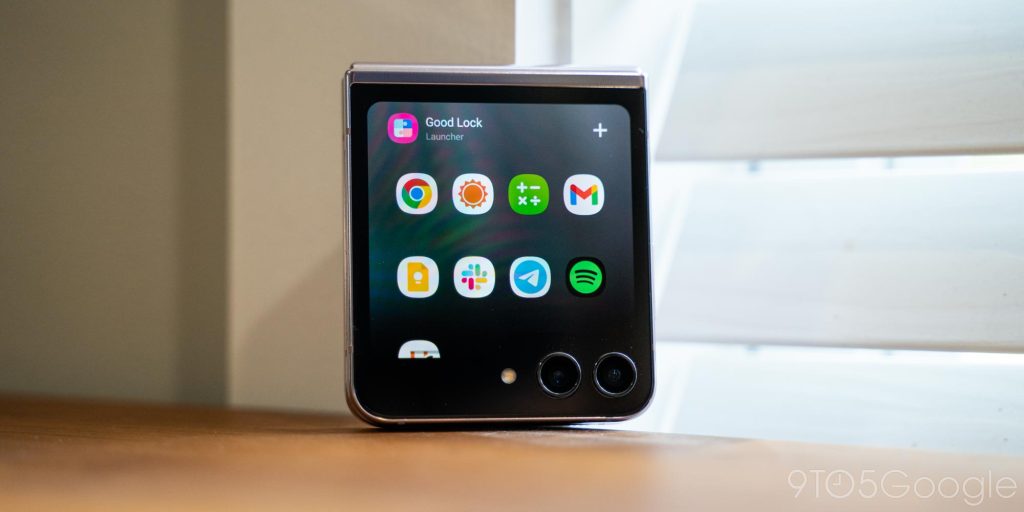
There are many apps that don’t work very well, but also plenty that work flawlessly. Really, you’d be surprised how many apps work well on the outer screen even though they weren’t built with a tiny screen in mind. There are bugs, definitely, but overall I’ve been super happy with the ability to run anything I want on this display. The experience just doesn’t feel complete or nearly as useful without it, which is why I’m a big fan of how Motorola implemented this on the Razr+.
Samsung’s concern that users could get frustrated with broken apps on the outer display is absolutely valid, but I think the company has been a bit too conservative in its approach here.
That conservative approach also means that Samsung left out some important aspects of the software out there, such as any form of multitasking. So, even if you put in the work to enable full apps, it’s still far from a complete experience.
Flip phones need better cameras, but this one is still good
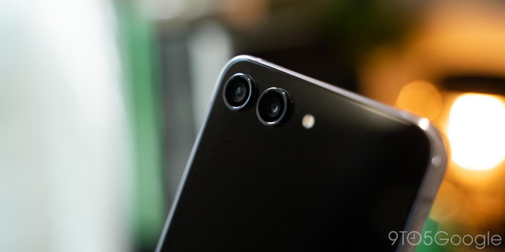
Cameras have always been a bit of a weak point on foldables, and that’s still the case on Galaxy Z Flip 5: pair of 12MP cameras on the outside, with one wide and one ultrawide, meaning there’s still no telephoto option.
The experience isn’t really winning any awards, but it’s also not bad.
Shots from the Galaxy Z Flip 5 usually feel alive, not drab and dull. But, with the mere 12MP sensor, they aren’t really capturing the most detail. There are plenty of misses, but overall I’ve been more pleased than I expected. There are even slight improvements compared to Flip 4, largely thanks to the new image signal processor (ISP) in the Snapdragon 8 Gen 2, but it definitely still struggles in low light – though my bigger complaint is Samsung’s night mode, which feels less clear on telling you when it’s active before you take the shot (I like Pixel’s approach of putting a night icon on the shutter, where Samsung has an easy-to-miss icon off to the side).
Compared to the Oppo Find N2, Samsung actually matches the hardware gap. Despite Oppo’s 50MP main camera, the Flip 5 generally matches or even beats the Find N2, in my opinion. It also drastically beats the Motorola Razr+, which has a very disappointing camera, despite it using similar 12MP hardware. I’ve even been happier on the Flip 5 compared to some of Samsung’s other flagship cameras because the software tuning is just so much better by comparison. Motion blur still has issues, but overall, it’s just good.
That said, my one big issue with the camera on flip phones is still that it’s tough to capture quick pictures. The outer display makes it easier to capture selfies, but taking pictures of other people, landscapes, pets, and more requires you to open the device. With every flip phone I’ve used thus far, I’ve found myself taking less photos in general because of that extra step, and that means missing out on capturing memories. I couldn’t imagine using a flip phone if I had a child, for instance, because I’d miss moments in the precious extra seconds it would take to open the device. It’s an inherent restriction of this form factor, but not necessarily a flaw. It’s just a choice you have to make.
Battery life is another sore point, but it is better
Like the prior models, Galaxy Z Flip 5 is powered by a 3,700 mAh battery. By modern standards, that’s quite small, and the Galaxy Z Flip 4 and Flip 3 before this felt the consequences.
However, where those flip phones suffered with very not-great battery life, the Flip 5 is overall decent. On average, I’ve been able to make it through my day without worrying about battery, but just barely. With around three hours of screen time, I’m able to run from 8 a.m. to midnight and go to bed with 10% or less left in the tank. If I use the phone more, I find myself needing a midday charge. On two particularly heavy days, I was down to 30% by 5 p.m., which required a charge to top off the battery for the evening.
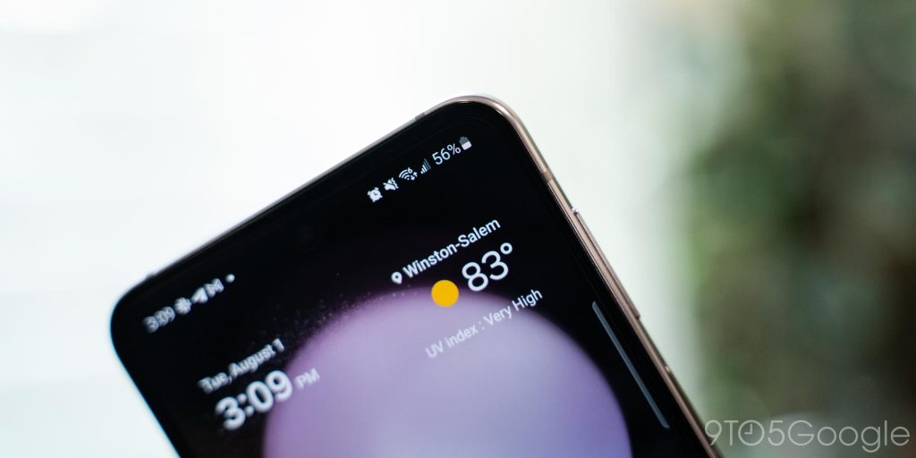
On the bright side, charging is quick thanks to that small battery, despite the charging rate topping out at 25W wired and 15W wirelessly.
The Galaxy Z Flip 5, even with its very-efficient chipset, remains a phone that can’t escape at least a little bit of battery anxiety, and that’s a shame.
Final Thoughts
The Galaxy Z Flip 5 is, on a hardware level, the best you can get from a foldable flip phone. Samsung’s four previous generations have brought along plenty of lessons, which can all be felt in this latest model. And, even compared to the Motorola Razr+ and Oppo Find N2, Samsung’s hardware is just flat-out better.

Samsung really only falls on its sword in software. One UI is a great experience on tablets and the Galaxy Z Fold series, but on the Flip 5, it feels overwhelming. And, despite Samsung’s approach of giving you everything, it somehow took the opposite approach on the outer display’s software by giving you nothing out of the box.
If you’re in the market for a foldable flip phone, the Galaxy Z Flip 5 is the most well-rounded choice. It’s super fast, has stellar hardware, and is more useful than ever. But like every device, it’s a question of your personal priorities that will make the final call.
Where to buy the Galaxy Z Flip 5
The best deal on the Galaxy Z Flip 5 is at Samsung.com, where you can get up to $900 in trade-in value, plus an additional $50 off with our exclusive link. Amazon and Best Buy are also offering gift cards with your purchase, but you’ll need to act fast. The best deals are only valid through August 11, when the Z Flip 5 hits stores.
FTC: We use income earning auto affiliate links. More.


Comments