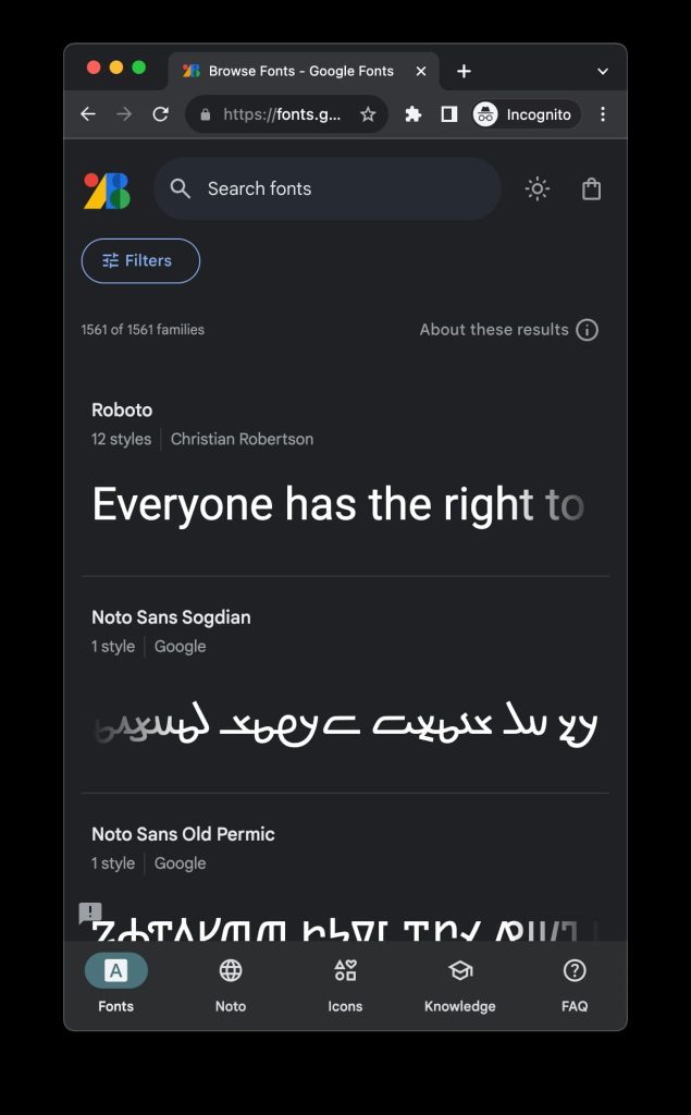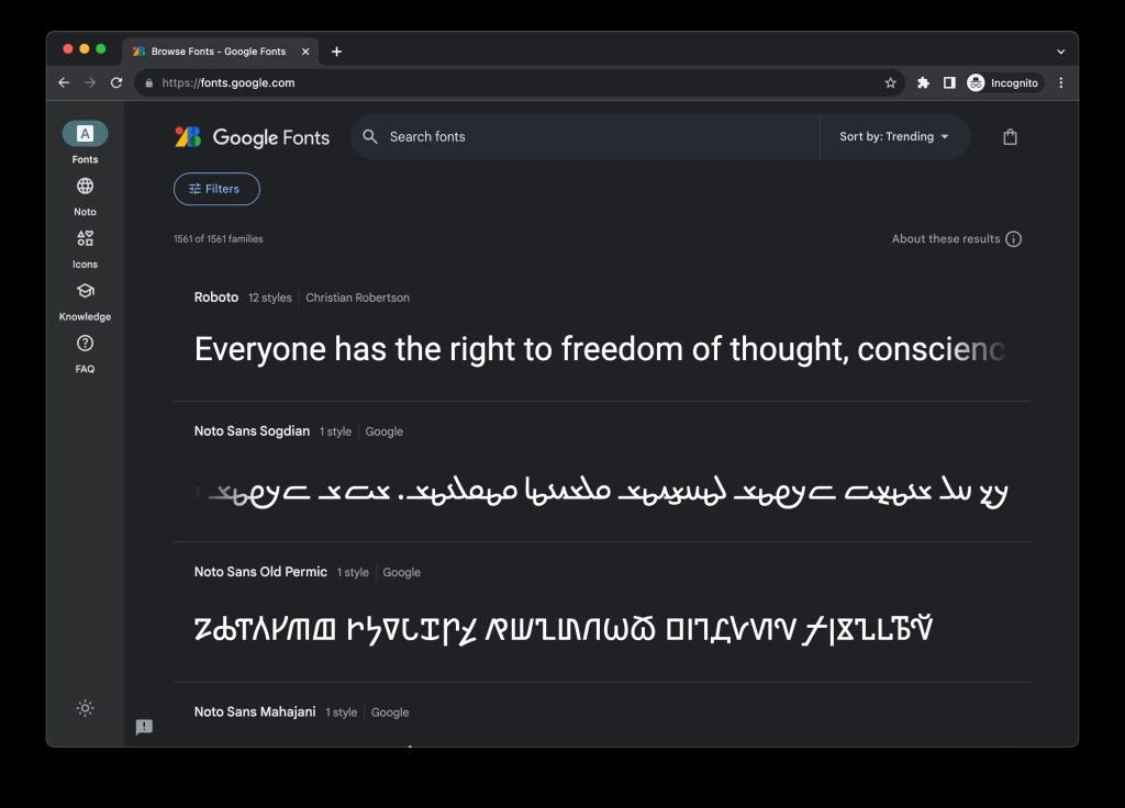
The Google Fonts website has been thoroughly updated with a Material 3 redesign that serves as an interesting showcase of the design language on mobile web.
On desktops/large screens, there’s a navigation rail at the left, while mobile leverages a tall bottom bar. This desktop design matches m3.material.io, while the mobile web experience’s layout feels quite rare. When Gmail and Google Drive got Material You redesigns on desktop web, the phone layout was not updated and remains several years, if not a decade, old.
The Google Fonts redesign is split into five tabs/sections:
Fonts: Note the updated search experience, with “Filters” sliding open a sheet that lets you enter your own preview phrase. Then select:
- Font size
- Language
- Technology: Variable, Color
- Decorative stroke: Serif, Slab Serif, Sans Serif
- Classification: Display, Handwriting, Monospace, Non text
- Properties” Number of styles
- Sort by: Trending, Most popular, Newest, Name
Noto: Google and Monotype’s “typeface for the world” with support for over 1,000 languages and 150 writing systems.
Icons: Introduced last year, Material Symbols offers 3,061 glyphs.
Knowledge: Google Fonts Knowledge is a “library of original guides to the world of typography, which the Google Fonts team is producing in collaboration with typographic experts from around the world.”
There’s a light/dark theme with no Dynamic Color, instead using blue as the accent.
More on Google Fonts:
- Roboto Flex is a ‘major upgrade’ that adds customization to Google’s most popular font
- Google brings back the blobs with simplified, black-and-white ‘Noto Emoji’ [Gallery]
- Google commissions ‘Roboto Serif’ as new font ideal for reading
Thanks, Anthony!
FTC: We use income earning auto affiliate links. More.


Comments