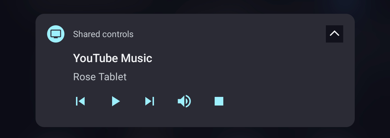
“Media controls for Cast devices” have long appeared as a standard notification (as shown above), but they are now part of the Android 13+ media player.
For many years, the Cast controller for devices playing media on your home network appeared as a regular Android notification that’s “Silent” at the bottom of the feed.
In the past week or so, Google has updated the experience so it no longer looks like every other app alert. Cast controls now appear in the Android (11+) media player instead of the feed below. As such, it’s part of Quick Settings, like all other audio/video applications for elevated prominence.
A generic icon appears in the top-left instead of the streaming service’s logo, while the device playing audio/video is noted in the corner (no switcher access) and again at the center of the screen below the streaming app name.
There’s a big play/pause button that morphs between states, while you get a timeline scrubber flanked by next and last. Your two actions are mute/unmute and end (to stop the entire Cast session). Tapping simply opens the Google Home app.
As of earlier this week, the previous design was still live. We’re seeing the update with version 23.44.14 of Google Play services, which powers the experience, today.
More on Google Cast:
- Using Google Cast in a car is cool, I guess the self-driving Waymo was too
- Google removes Chromecast Guest mode that didn’t need Wi-Fi
- YouTube Music rolls out miniplayer redesign with permanent Cast button
FTC: We use income earning auto affiliate links. More.


Comments