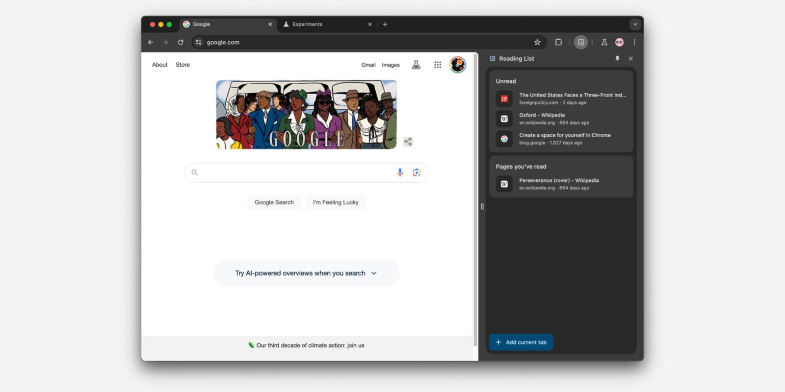
In 2022, Google updated desktop Chrome with a side panel UI that has since grown beyond providing access to your Bookmarks. Chrome is now looking to redesign the side panel, including how you launch it by getting rid of the icon.
Since launch, you’ve opened the side panel by tapping a square-ish icon that’s about half-way filled and appears next to your Google profile avatar. This (more times than not) opens Bookmarks in a right-hand column, while the open page at the left shrinks.
Meanwhile, you get a dropdown switcher for all the side panels: Reading List, Bookmarks, History, Reading Mode, Customize Chrome (on the New Tab Page), and Search.


Chrome is looking to get rid of the side panel button and instead let users pin individual side panels. Icons for those functions appear to the right of the address bar and Extensions menu with vertical dividers giving side panels its own section. You can conveniently adjust the order in which they appear.
Opening a side panel using the three-dot menu (e.g., Overflow > Bookmarks and Lists > Show All Bookmarks) will show a pin icon in the top-right corner. How users open the side panel without the button in the first place after this update feels a bit buried, and Google hopefully has an onboarding UI for it. (The dropdown menu should remain in place.)


At the moment (in Chrome 121 Beta), this is available as a flag: “Side panel navigation and pinning updates — Enables support for side panel pinning and updates to navigation. – Mac, Windows, Linux, ChromeOS, Fuchsia, Lacros.”
chrome://flags/#side-panel-pinning
The advantage of this approach is that you don’t have to use side panels if you don’t want to. With nothing pinned (and no Extensions), you’re down to the Omnibox and account picture. If you like side panels, you can get to the ones you want (i.e. Extensions) much faster.
FTC: We use income earning auto affiliate links. More.


Comments