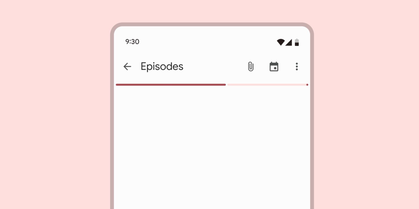
Google’s refinement of Material You components continues with an updated design for progress bars.
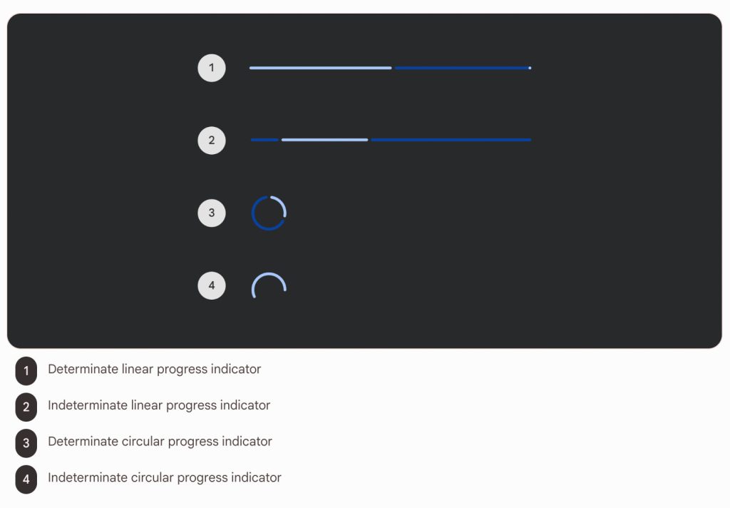
As spotted by Dylan Roussel on X/Twitter, Google in December introduced “visual design and color updates” for Material You’s linear and circular “progress indicators.”


Top: M2 | Bottom: M3
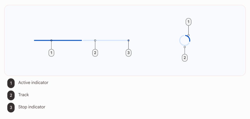
In Material 2, this UI element was very straightforward with a “boxier, neutral style.” They now feature rounded corners, with the biggest difference being a gap between the active indicator (what has already played, downloaded, etc.) and the “track” (remainder).
Besides Dynamic Color support and the “new motion behavior,” there’s also now “higher contrast between track and active indicator to enhance the perception of progress.” These Material You progress bars also add an “end stop indicator to improve accessibility”:
- “The stop indicator is a 4dp circle that marks the end of a linear determinate progress indicator to meet accessibility standards.”
- “The stop indicator is required if the track has a contrast below 3:1 with its container or the surface behind the container.”
Google has already implemented this element in some Android apps. Open the Play Store and tap your avatar to see the updated Play Points progress indicator. (For comparison, you can find the old style used by the storage indicator in Manage apps & devices.) It’s also live when you’re downloading the necessary resources for Google Assistant.
Update: You can also see it in Google Photos (version 6.66).


More on Material You:
- Chrome New Tab Page getting more Material You on Android [U]
- Google’s biggest Material You redesigns of 2023
- How does Google Chat’s new bottom bar fit in with Material You?
FTC: We use income earning auto affiliate links. More.


Comments