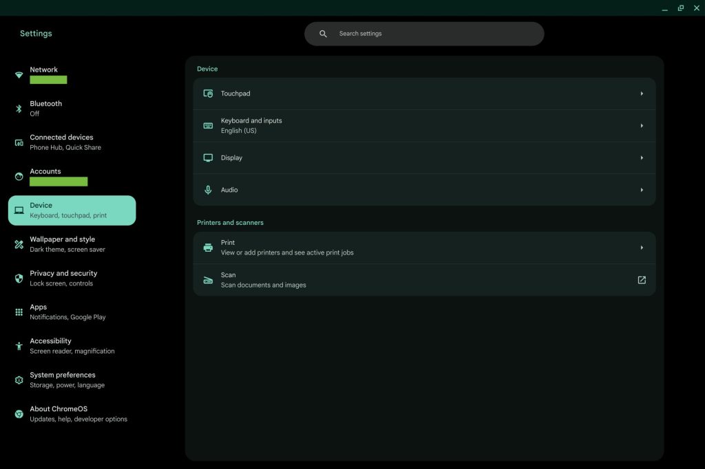
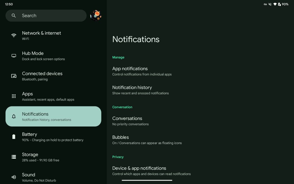
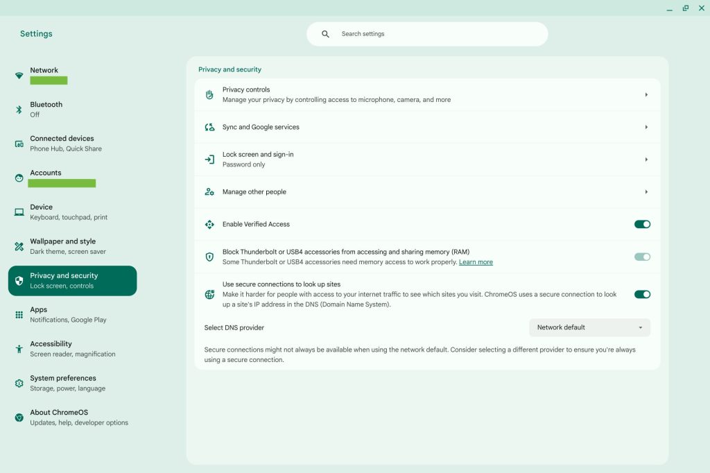
ChromeOS 124 is currently in beta, and it introduces a Settings app redesign that leverages Material You and looks a lot like the Android Settings app on tablets.
The current Settings app features a navigation drawer at the left with a continuous feed of preferences next to it.
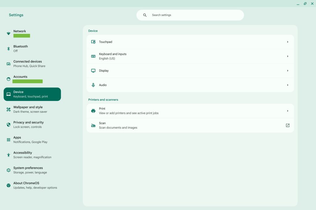
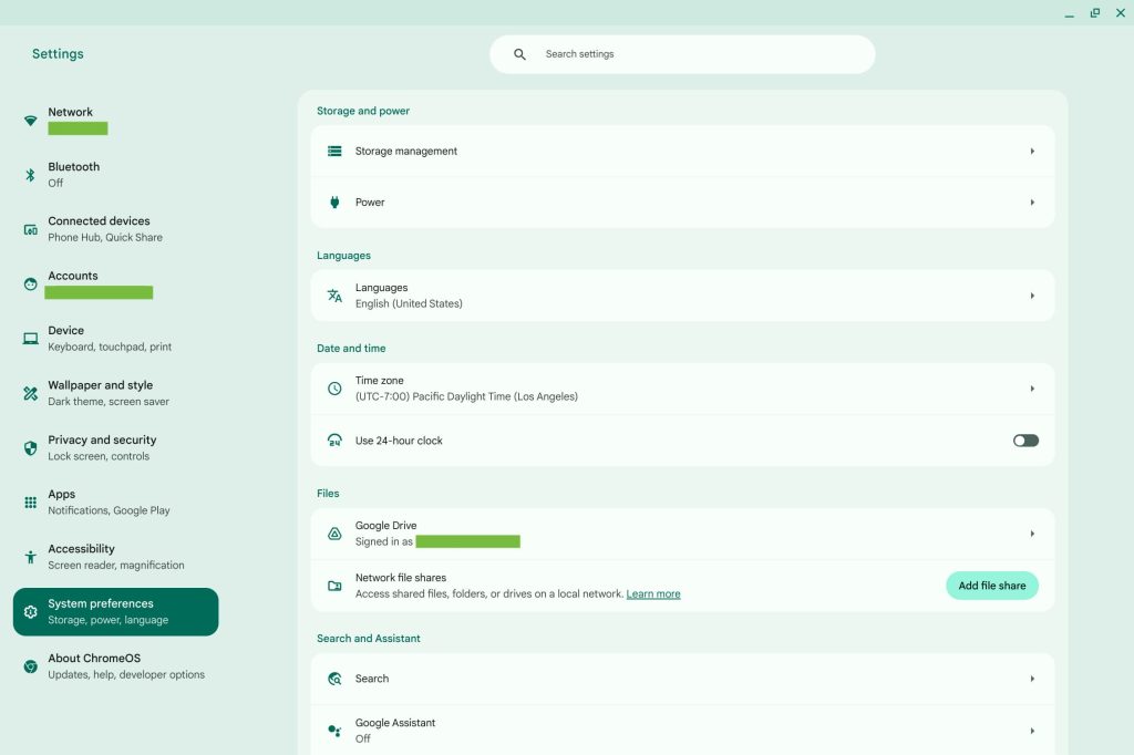
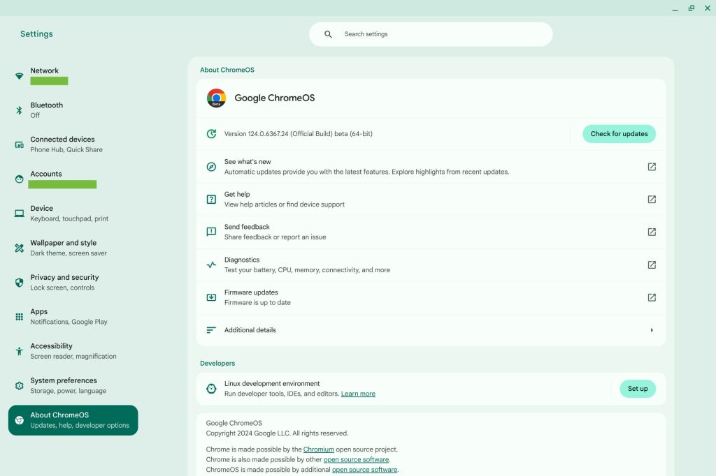
In this redesign, every section opens as its own page that’s housed in a container with a wider layout than before. Each entry is accompanied by an icon to aid discovery.
It looks a lot like the Android 14 Settings page on tablets. This includes the rounded rectangle highlight that identifies what you’re viewing and a brief summary of what each section includes.
Network, Bluetooth, Connected devices, Accounts, Device, Privacy and security (flipped around), Apps, Accessibility, and About ChromeOS remain mostly unchanged.
“Wallpaper and style” is new along with “System preferences,” which is home to: Search and Assistant, Storage management, Power, and settings that were previously housed under Advanced.
We’re seeing this Material You Settings app redesign in the beta channel with ChromeOS 124.
In the meantime, ChromeOS 123 has arrived in stable with mouse button customization. You can now assign actions like: Volume on/off, Microphone on/off, Media Play/Pause, Overview, Screenshot, Previous page, Next page, Emoji Picker, High contrast on/off, Magnifier on/off, and Dictation on/off.
Version 123 introduces “new natural sounding TTS voices that work offline and are available in 31 languages.” There’s also per-Android app language preferences: Settings > Apps > Manage your apps > App language.
If you have a cellular Chromebook, Google is adding hotspot creation. T-Mobile is the first supported carrier.
FTC: We use income earning auto affiliate links. More.


Comments