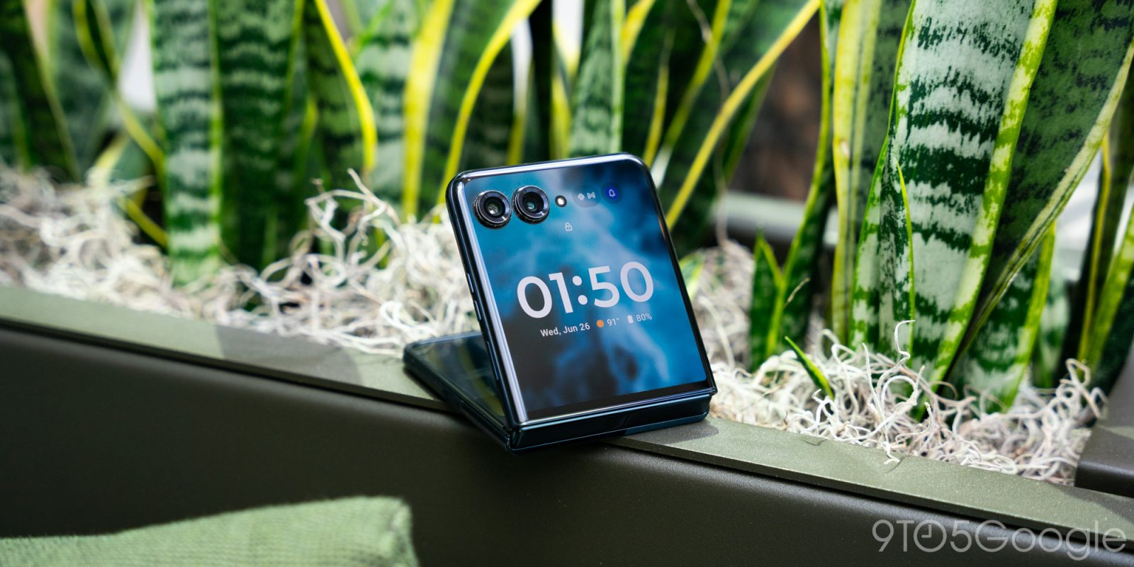
One year after the revitalization of Motorola’s most iconic phone, the company has released the Razr+ – the 2024 edition. This flip-style foldable knocks it out of the park in almost every aspect while maintaining one of the best foldable price points in 2024.
Motorola’s flip phone launch consists of two models, the Razr+ and the Razr. They’re not to be confused with last year’s lineup, which consisted of the same models. This 2024 series brings a much more enticing set of phones that are each upgraded in respective regards.
Table of contents
Redesigned hardware that just works
A display duo like no other
One of the best things the Motorola Razr+ in 2023 did was bring a display that covered almost the entire front panel of the phone and made it possible to use normal, everyday Android apps on it. Motorola brought that same concept to a Razr+ in 2024 and equipped the phone with a bigger, better display.
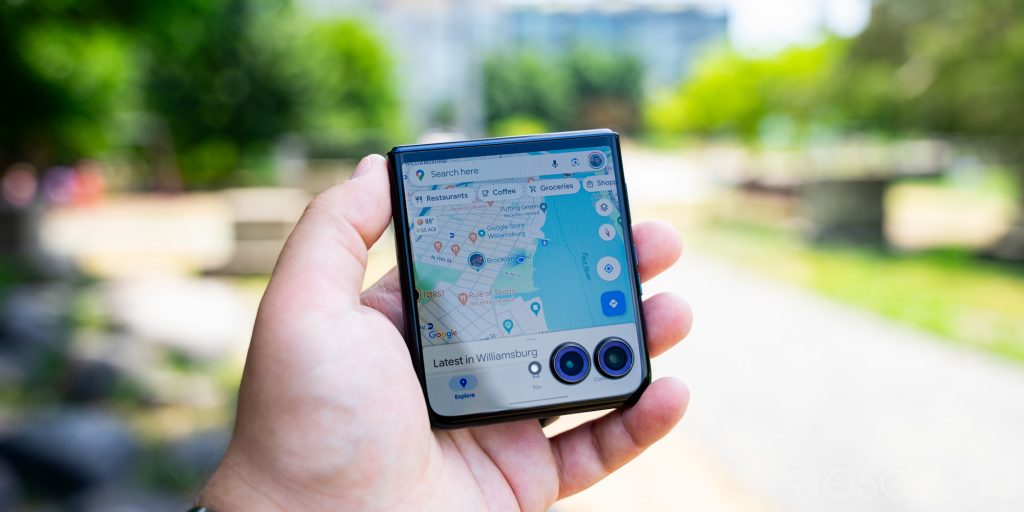
The outer display of the 2024 Razr+ is actually a little overengineered, to be honest. At a resolution of 1272 x 1080, the LPTO AMOLED screen hits a refresh rate of 165Hz – something that’d normally be a little overkill for the front 4-inch display. However, Motorola designed this phone to be used in two modes – folded and unfolded. The former mode only works if the cover display panel is able to perform in the same way an internal display could.
The internal display is also improved. It carries the same 6.9-inch profile but has a much higher peak of 3,000 nits. Like the outer display, it maintains a 165Hz refresh rate and handles colors really well through the AMOLED panel. The resolution from 2023 to 2024 is unchanged, though it still looks very good in daily use.
I’m admittedly entirely surprised with another aspect of the phone – the crease. I would have thought Samsung or OnePlus would be the first companies to actually make decent strides in hiding the dreaded foldable crease, but it’s Motorola.
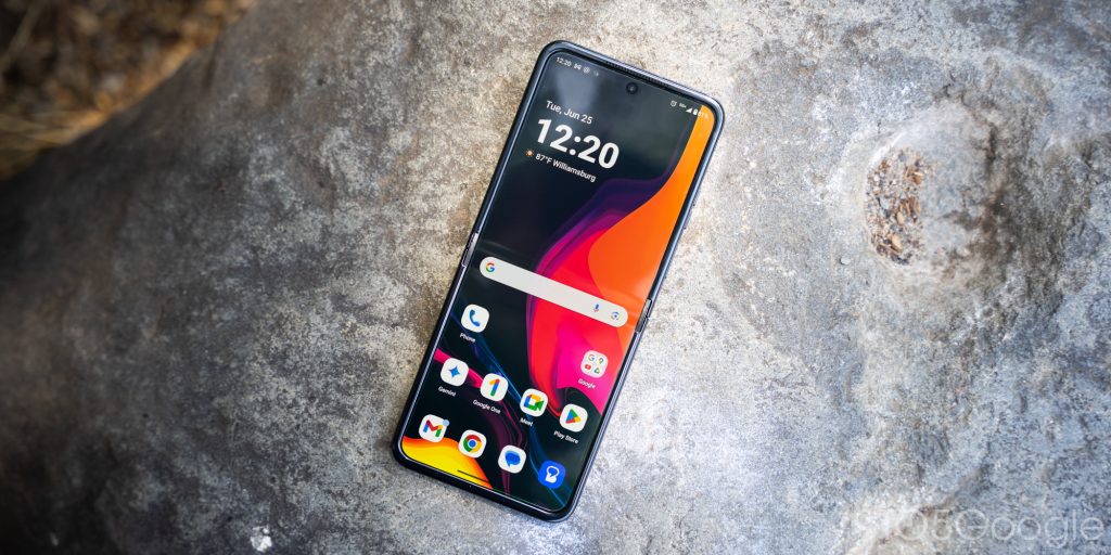
The Razr+ has been folded by myself hundreds of times, if not more. Yet, the crease on the internal display is much less noticeable than on any of Samsung’s phones or OnePlus. You have to really try to see the crease in the display indoors, which makes for a much better experience – outdoors may be a different story. It also inspires a little more confidence in the longevity of the display itself, as it is still folding glass.
You wouldn’t even know the phone opens
Because of the better cover panel, which brings HDR10+, Dolby Vision certification, and an impressive refresh rate, it can be used in the same capacity as the inner display. Over the last two weeks, I’ve focused on using the cover display as much as I can, even going days where I’ve barely opened the phone. The experience on the smaller outer display is just so good.
I’ve had success with every single app I’ve tried using on the front. Everything, from messaging apps like Google Messages and Discord to streaming like YouTube and Disney+, are all perfectly usable on the front. By usable, I don’t mean sacrifices besides size have to be made. They all work as intended – just smaller.
Google Gemini even gets a default shortcut through the power key. Gemini will pop up on the cover display in a native fashion, ready for any command or query. It’s a nice touch.
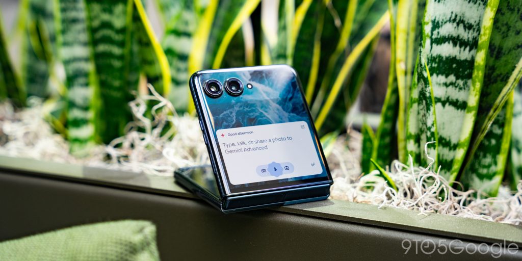
Motorola has done a phenomenal job of marrying its own minimal version of Android with the front display’s size. A simple homescreen greets you when you turn on the phone. From there, you can swipe to reach an app drawer, calendar, widgets, and a dedicated game page. Those windows can be moved around and configured, which is a huge improvement.
The cover display also utilizes the gesture bar in Android to get to the homescreen quickly. In any app, tapping it will fullscreen the content. That little trick makes it so easy to use any third-party app on the front display without the camera lenses getting in the way
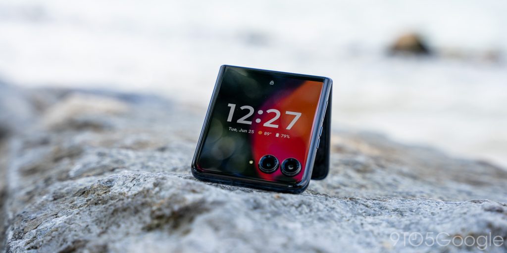
The biggest improvement, however, is the addition of always-on display functionality for the cover display. Believe it or not, the 2023 version did not have AOD, which was a huge miss. Adding it now means a massive advancement over last year’s variant. The always-on display screen has a few clock styles to choose from. Themes are available as well that really tweak what the welcome screen on the 2024 Razr+ looks like.
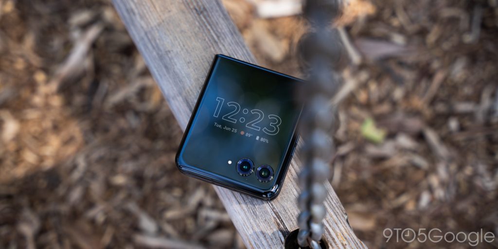
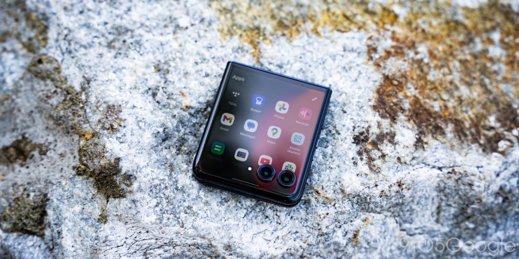
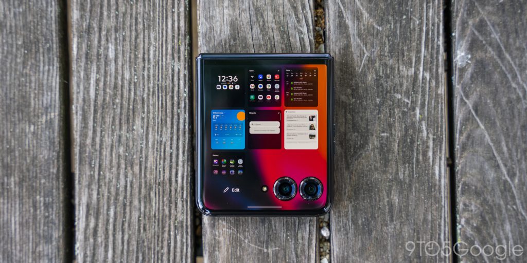
I’ve also enjoyed how Motorola handles notifications on the Razr+. From the homescreen, a small tray to the left of the camera lenses showcases notifications icons, expandable via a single tap.
The Razr+ even feels like a better phone
One of our complaints with the Razr+ 2023 was the hinge. It was sometimes loose and didn’t inspire confidence. This year, Motorola claims to have redesigned the entire hinge system. The new hinge is 30% smaller and more reliable. In use, it physically echoes that sentiment, and I’ve noticed a change in between years.
Opening the foldable feels pretty good. Motorola noted in its conference that it’s even easier to open with one hand, though I’ve not felt that to be the case. Even if the hinge doesn’t resist as much, the rails of the phone are a glossy, slippery metal. While I don’t mind the look, it’s definitely a little more precarious if you’re one-handing the foldable.
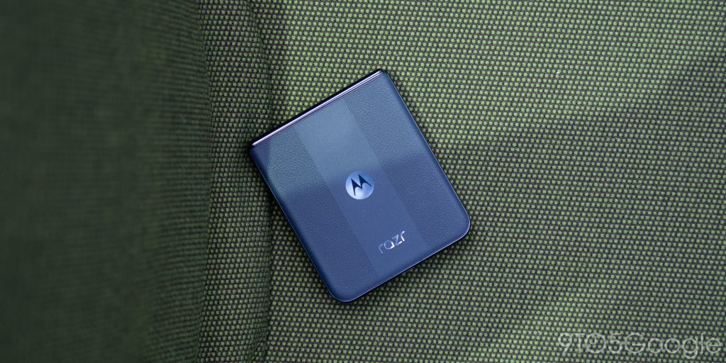
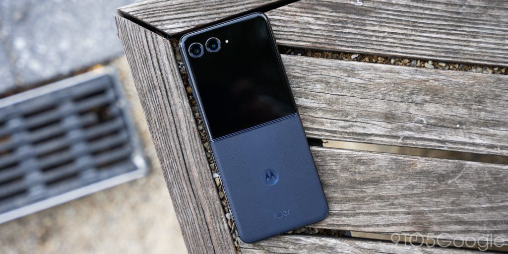
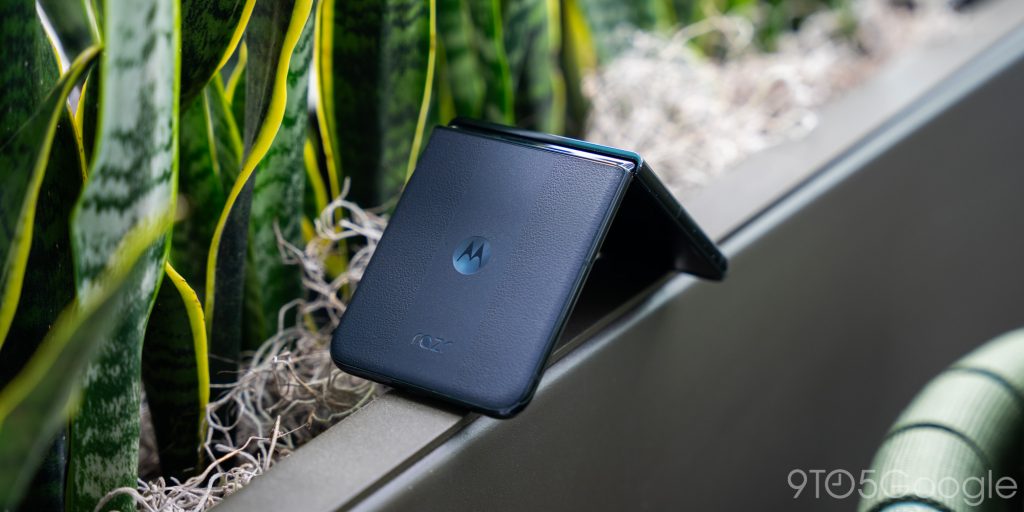
The Razr+ has a textured back panel that I love, and depending on the color you get, you may see a different look. For instance, my Midnight Blue Razr+ has a racing stripe down the back, whereas no other colorway does. The Spring Green brings a tighter, somewhat fabric faux leather texture. In any case, Motorola put some effort into these fashion-forward phones, and it shows.
A superior but unreliable software experience
Motorola nails the minimal Android skin
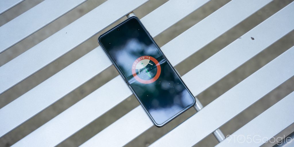
From the cover display to the internal one, the Motorola Razr+ carries an excellent version of Android that I never take issue with using.
Small tweaks throughout the phone are made that carry the Motorola name, like the personalization menu when holding a tap on the home screen. You’ll also see it in the notification tray or Quick Settings panel. However, no matter how much I use the phone, the experience never feels otherworldly or inherently difficult to use. The phone does launch with Android 14, which means you’ll see a lot of newer features that have been hacked into the OS.
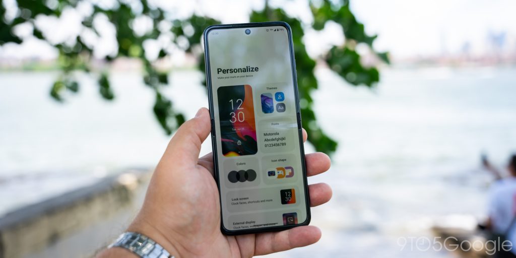
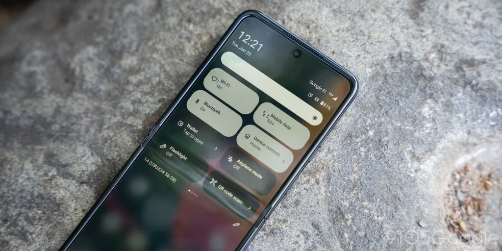
The only thing I didn’t see and really wish I did was Google’s Circle to Search. There’s no telling when this device will see the recent feature, but it would be the cherry on top.
Compared to other OEM skins, Motorola’s feels like one of the best by far. If you enjoy using stock Android on the Pixel series, you’ll enjoy Motorola’s UI.
The Razr+ packs a Snapdragon 8s Gen 3. It isn’t the latest and greatest, but I’ve encountered no speed or processing issues. The entire phone, from the front panel to the internal, runs very well, which has somewhat surprised me.
A rocky reputation of support
Even though I’ve very much enjoyed my time with the Motorola Razr+, there’s one thought that looms overhead. Motorola has recently been pretty bad at supporting newer versions of Android. The 2023 Motorola Edge+, for instance, was a fantastic device at launch. Unfortunately, it still runs Android 13 with no word on the promised Android 14.
As a reminder, Android 15 is about to be launched by Google.
So if the 2024 Motorola Razr+ launches with Android 14, when would Motorola upgrade it to Android 15? Well, it might be well after the version is actually launched and then sometime after other OEMs create individual versions and skins of it for certain devices. Motorola promises 3 years of updates, though it can’t be guaranteed that they’ll be timely.
The camera is good now
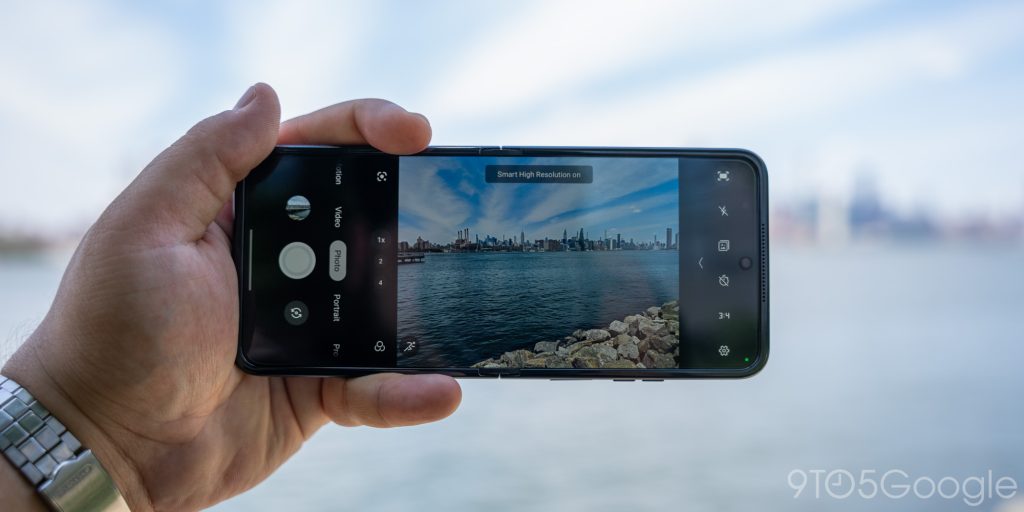
This is another improvement area over last year. The Razr+ packs a 50MP main sensor and 2x telephoto lens. Motorola has been boasting about its AI use throughout the phone, and I think this is where it shines the most. Images are crisp, clear, and vibrant 9 times out of 10. In fact, the images look like they are processed in a very similar manner to how Google handles Pixel images.
View the full-res Google Photos album here
Taking them is incredibly easy, and the camera app’s UI is pretty simple. One of the best features is Motorola’s camcorder mode, which lets you hold the phone like an old-school camcorder. Using your thumb, you can zoom in and out, somewhat like using a physical zoom toggle. It’s fun and useful, even though it seems like a gimmick.
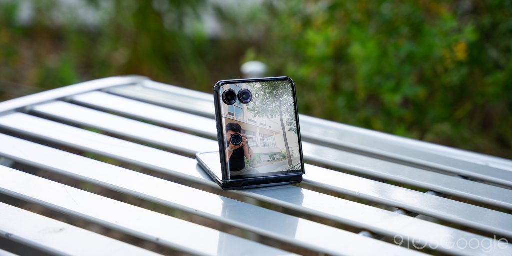
Of course, another huge benefit to the Razr+ is its ability to take selfies with the main camera. When the phone is propped up, it’s also easy to take group shots.
Battery improvements all around
Even though the 2024 Razr+ brings an always-on display and a bigger front display, I’ve had no problem making it a full day and then some. The capacity sits at 4,000mAh, and even though it’s only slightly better than the 2023 model, it feels like night and day – and then some more night.
Even though I liked using the phone through the front display alone sometimes, there were days when I really pressed it for power. That means capturing sessions, streaming, and everything else that could take the juice out of it. Even still, I’ve been impressed with how the battery has stood up.
Final thoughts
I think the Razr+ 2024 is finally at a point where it’s recommendable– not just recommendable, but encouraged.
The phone itself is physically better, with a bigger display and better hinge. It brings a much better camera and telephoto lens and packs a beefier battery. Overall, it’s a flip phone that can handle itself very well.
Any gripe I had with the device was minor at best. Maybe it’s a little slippery, but that can be fixed with a case. In general, the Razr+ 2024 is good.
At $999, the Motorola Razr+ 2024 maintains the same price as the year before and stays seated on its throne as the best flip phone so far. The Motorola Razr+ will be available for pre-order starting on July 10, right when Samsung launches its own flip competitor. On July 28, the phone will launch in full.
FTC: We use income earning auto affiliate links. More.


Comments