Amid the launch of the network and trackers, the Find My Device app has surpassed 500 million downloads on the Google Play Store.

Google released the app on Dec 11, 2013. For years, the app’s design remained the same with a green and white color palette. At the start of 2023, Google finally gave it a Material You redesign (and dark theme) that dropped the map-based UI with a device carousel up top.
You’re now greeted with a simple list of devices, with google.com/android/find also updated to match. For a time, Google would let you search “find my phone” and get the same functionality. That was removed a few years back, with the Find My Device app or website now required.


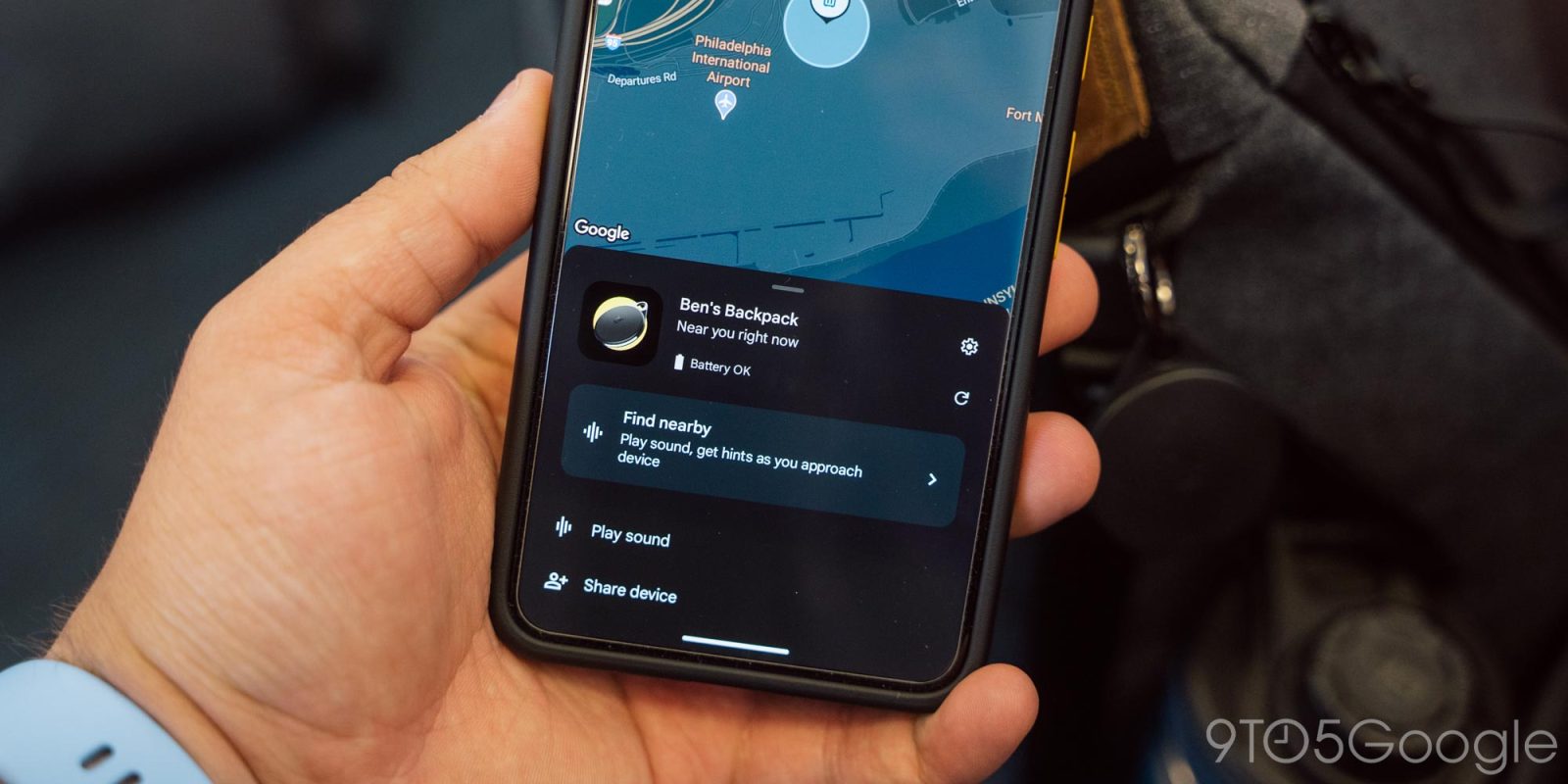
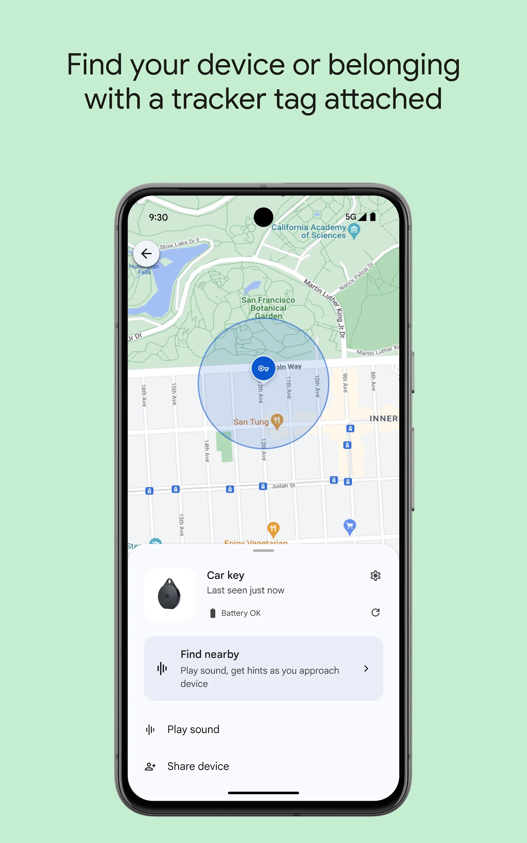
In addition to seeing the location and status — battery and network — of Android phones, tablets, Wear OS watches, Fast Pair headphones, and now trackers on a map, the app lets you play a noise, lock, add a custom message, and erase devices signed into your Google Account.
The layout is straightforward enough, though I wish Google would address the missing device icon issue already. In place of a live image (from the Google Play Console), you get a generic phone.
Towards the end of 2023, Google finally updated the logo. The green/white made away for a four-color icon inspired by radar.


You don’t actually use “Find Device” — which is the app name in launchers — to set-up the FMD network or trackers. All that is handled by Google Play services and the Fast Pair sheet that slides up.
More on Find My Device:
- Google defends Find My Device ‘aggregation by default’ as ‘key’ privacy difference
- Pebblebee trackers for Android initial review: The best option, for now, is still held back
- Chipolo One Point and Card Point initial review: Basic tracking and not much else [Video]
- The Moto Tag is the first UWB tracker to join Google’s Find My Device network
FTC: We use income earning auto affiliate links. More.


Comments