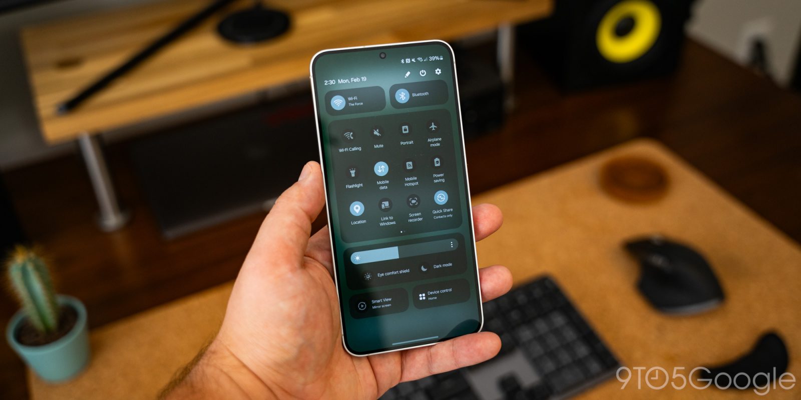
Samsung’s Android 15 update is just around the corner and, from the looks of it, it’s going to be a big one. According to leaked details, one of the most significant changes Samsung will make with its take on Android 15 is splitting the notifications and quick settings, a change that’s becoming increasing common in Android skins.
Way back in Android Lollipop, in 2014, Google updated Android to shift from a two-pane Quick Settings layout to a single menu. At the time, that took the form of notifications appearing first, with Quick Settings a further swipe away. Soon after, Google merged them even further, putting a few Quick Settings toggles on the notification shade, with the rest hidden below a second swipe. While the overall look has changed, that behavior has remained in place down to today.
At least, that’s true of Android at its core. In many cases, OEM skins on top of Android will change this.
Xiaomi’s HyperOS and Honor’s MagicOS are two key examples of this being changed. In both cases, notifications and Quick Settings are split into two fullscreen panels. With both, you can swipe in some portions of the display to get between the two panels, and you can also swipe (at least in Honor’s case) from the right side of the display to open up the Quick Settings directly.
Apparently, Samsung is planning something similar.
Alongside a bunch of other leaks of Samsung’s One UI 7 update, leaker Chun Bhai cites sources that say that Samsung will split the notifications and the Quick Settings panel into two separate panes. The first panel will only show notifications while a second will show an updated Quick Settings layout which is said to be “more rounded” in its design. Like Xiaomi and Honor, Samsung will let users swipe between the panes.
This was also shown in part in some more recent leaks.


Apple also uses a two-pane design for “Notification Center” and “Control Center,” though you can’t swipe in between the two. Given there are several other iOS-inspired changes in One UI 7, it seems reasonable to assume that at least part of Samsung’s inspiration here is to make things feel more familiar for Apple users.
Samsung is rumored to launch its first beta for One UI 7, which has other Apple-inspired features too, as soon as next week.
More on Samsung:
- Samsung’s One UI 7 update has new icons and iOS features in early leaks [Gallery]
- Galaxy phones now stop you from sideloading Android apps by default
- Samsung is pouring research into ‘AI phones’ with ‘radically different’ hardware
Follow Ben: Twitter/X, Threads, Bluesky, and Instagram
FTC: We use income earning auto affiliate links. More.


Comments