Built on top of Android 15, Nothing OS 3.0 is a pretty big overhaul to the company’s Android skin, which was already one of the best on the market. After playing around with the update, I’m pretty happy with the various upgrades Nothing has made, at least for the most part.
Nothing OS 3.0 is launching first in beta on the Nothing Phone (2a), and is probably the biggest update to the company’s Android skin thus far. The full changelog includes a lot of tweaks, but I think there are four core changes.
One of those you’ll find throughout the OS, as Nothing has changed up its design a far bit. The “Dot Matrix” look has been removed in a lot of places, replaced with a new serif text font that looks rather good on the whole. It’s easier to read more than anything else, which I appreciate. But that look isn’t completely gone, as Nothing has started sprinkling dots throughout animations all over the OS. One of the most prominent is when unlocking the device with the fingerprint sensor, and it’s a really nice touch!
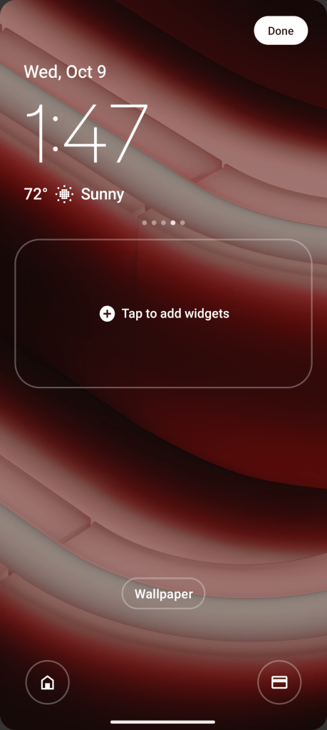
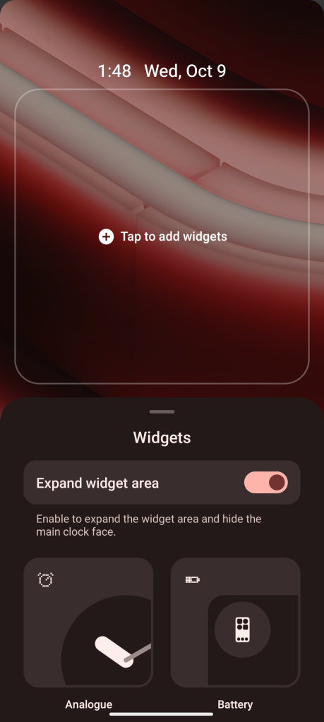
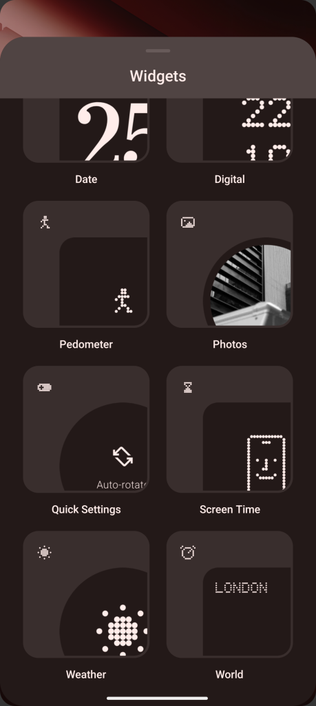
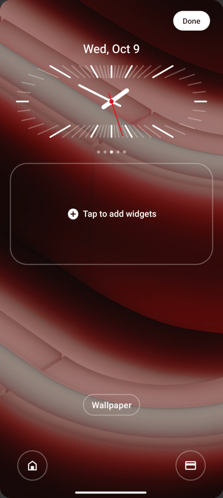
Beyond that, the next big change is to the lock screen. There’s a whole lot more customization to the clock, with a handful of styles to choose from. There’s also a new option for widgets, with more options to pick from (though you still can’t use any widget) as well as the option to minimize the clock in favor of space for the widgets. That’s a great choice, I just wish it worked with more than Nothing’s widgets.

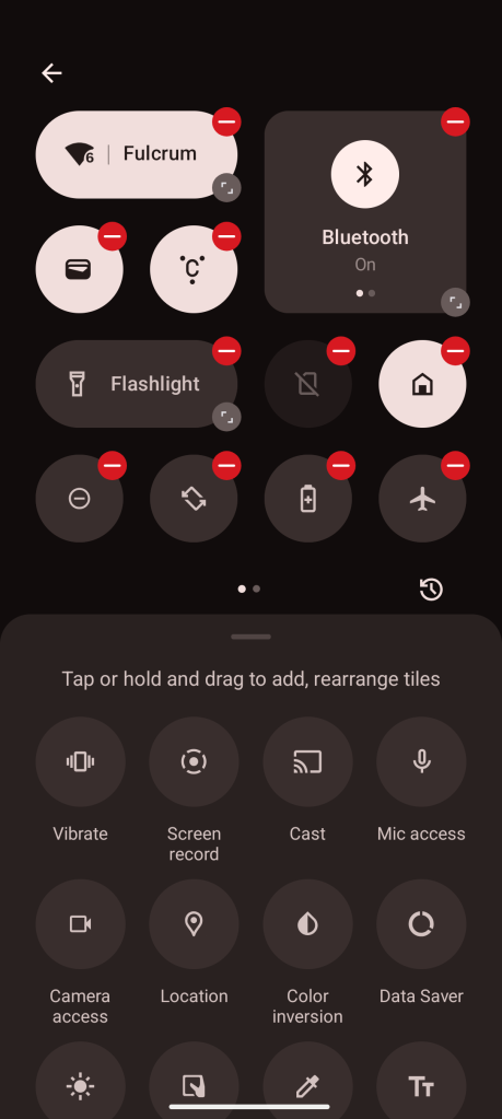
Another big change is found in Quick Settings, where Nothing has revamped the design and editing. You can now change the size of tiles as you see fit, expanding them for additional space for words, or making them smaller to fit more tiles. This lets you pick from between an info-dense or glanceable layout, or anything in between the two. Some expanded tiles, like Wi-Fi and Mobile Data, even let you tap on side for a quick toggle and the other for an expanded menu. Nice!
This is really well done, and frankly should just be how Android does this on all devices.

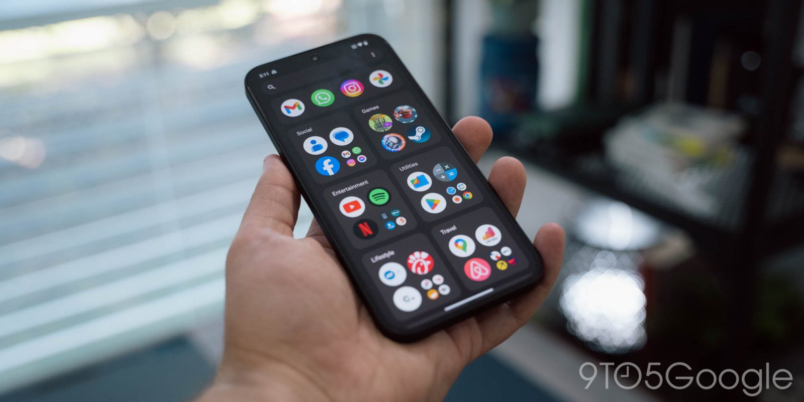
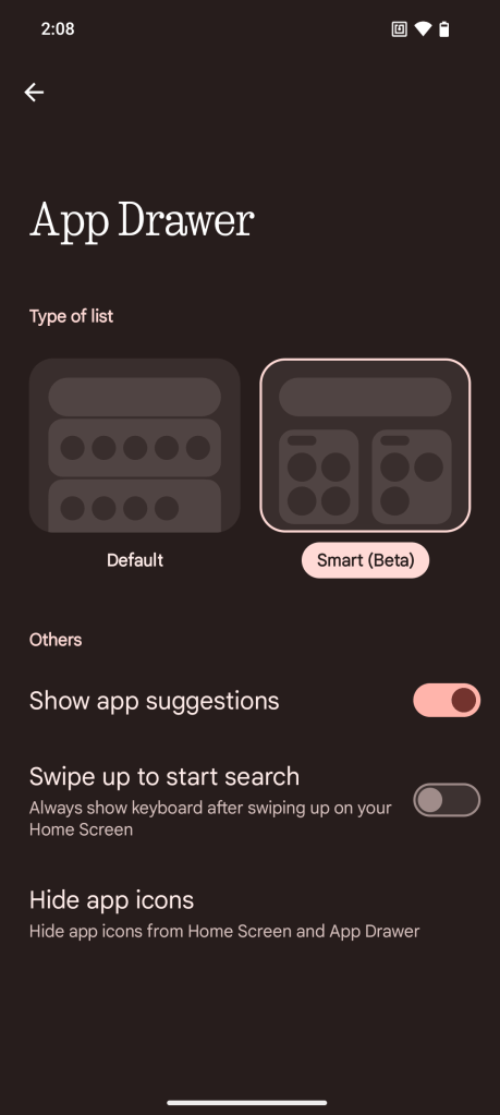
The part I’m struggling with in Nothing OS 3.0 is Nothing’s decision to copy the iOS App Library in its new “Smart Drawer” beta.
This feature, as Nothing describes it, will “automatically categorise your apps into folders” for “better organisation and easy access.” Not a bad idea on paper, but the implementation is just an outright clone of Apple’s terrible take on the app drawer. The folders are automatically added and laid out for you with no customization. You can tap on the three larger icons while pressing the smaller bunch to open the full folder.
This is certainly no faster than the standard, predictable and alphabetically-sorted Android app drawer, and also just ignores that Android already has a way to provide “easy access” to apps. Android has, for years, been able to offer predictive app suggestions in the app drawer, and Nothing supports this.
So, why do we need big folders?
I could see a version of these folders being useful at the top of the app drawer for some favorite apps, but the fact that you have to go all or nothing with this layout just ruins it for me.

Top comment by Good_ole_pinocchio
The iOS app drawer doesn't appeal to IOS users. It's probably the most ignored thing in iOS. Especially because it's a wild guessing game to figure out where apps are
Why did Nothing copy iOS in this regard? Realistically, it’s likely a bid to appeal to iOS users. I get it, every Android brand does that to some extent. But this outright clone doesn’t feel like it has any reason to exist. Apple built the App Library years after Android had already perfected the app drawer. I’d be shocked if anyone voluntarily chose to switch over to that.
What do you think of Nothing OS 3.0?
The update is available in beta on Phone (2a) now, and will start rolling out to all Nothing devices in December.
More on Nothing:
- Hands-on: Nothing Ear (open) fills a room with music that no one else can hear
- Nothing debuts AI-powered ‘News Reporter’ widget
- Nothing Phone (2a) Plus hands-on: So that’s what they meant by ‘nothing’
Follow Ben: Twitter/X, Threads, Bluesky, and Instagram
FTC: We use income earning auto affiliate links. More.


Comments