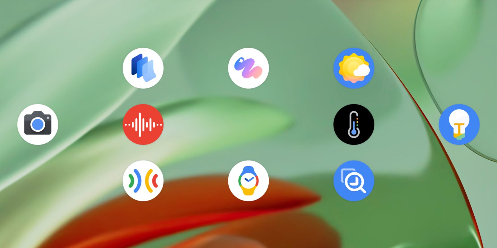
With the Pixel 9 series, Google released three new Pixel apps: Screenshots, Studio, and Weather. They join a family of other applications exclusive to Pixel: Camera, Recorder, Thermometer, and Tips. It’s also worth noting the Pixel Buds and Watch companion apps, while Personal Safety has since expanded to other devices. Another honorable mention is the Magnifier app exclusive to Pixel but not pre-installed.
9to5Google has a rebooted newsletter that highlights the biggest Google stories with added commentary and other tidbits. Sign up here!
Going in, I’d expect the 2024 Pixel apps to be similar in design and have the latest stylings. They mostly do, but there’s some variance that you could argue is par for the course with Google’s distributed team/division nature for app development. All three range from good-to-great, but they’re missing a bit of polish and consistency that I was hoping for from side-by-side releases.
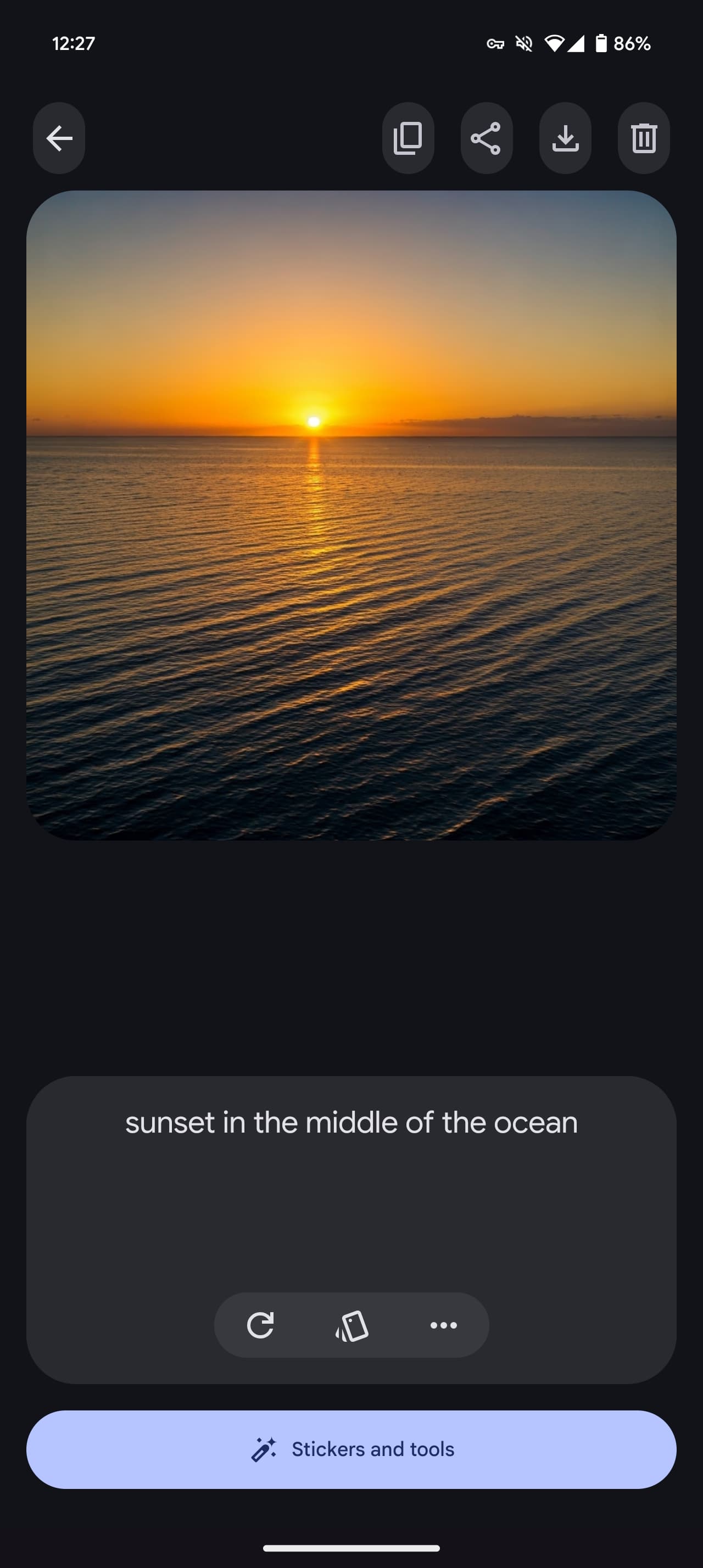
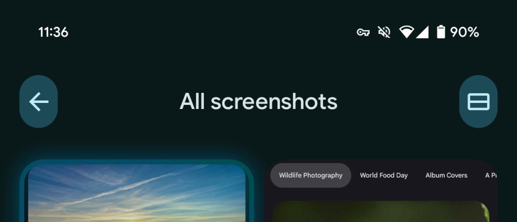
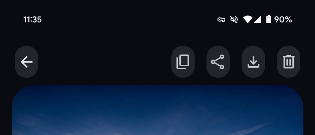
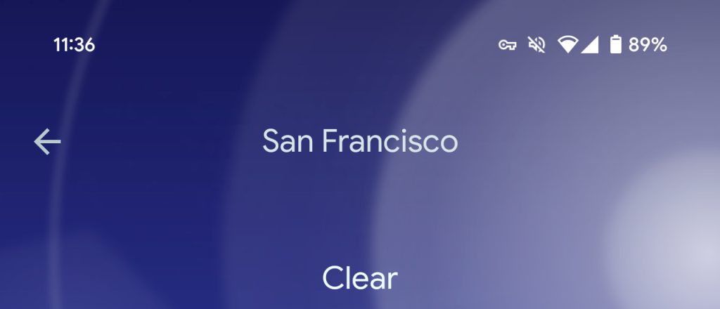
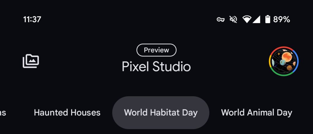
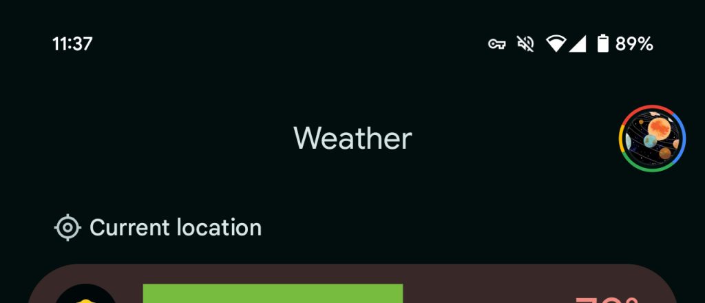
Screenshots and Studio place navigation (like back), overflow, and other buttons in a new vertical pill design. Meanwhile, Weather’s back arrow just stands alone like most other Google apps.
L-R: Screenshots, Studio, Weather
All three have top app bars that feature the name, with “Pixel Screenshots” and “Pixel Studio” the same but the last app being just “Weather.” That said, on the homescreen, it’s “Screenshots” and “Weather,” but “Pixel Studio.”
Screenshots and Studio place “Reminders” and “My Projects”/history, respectively, in the top-left corner of the app bar. On the other end, Weather and Studio have Google Account switchers, while Screenshots has a settings gear.
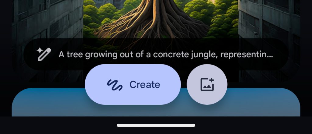
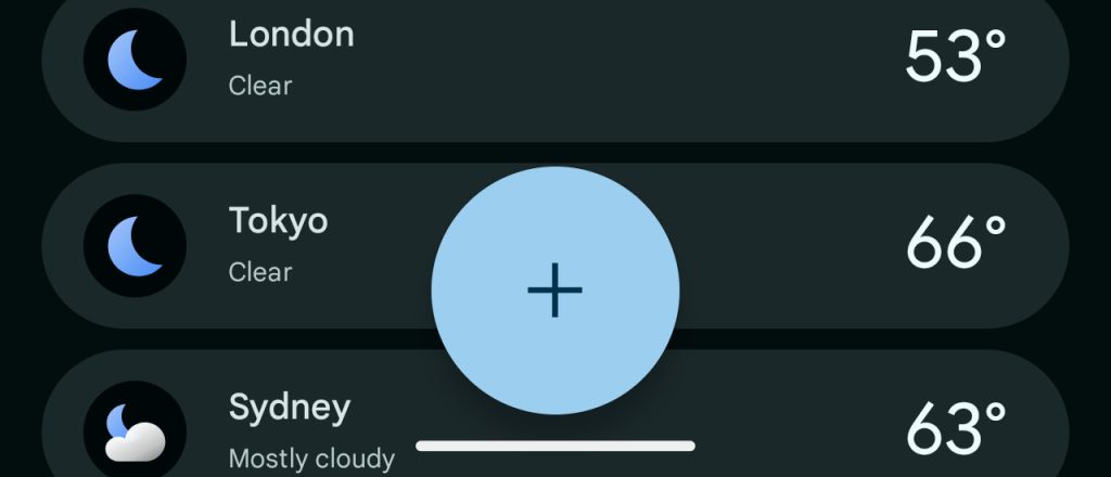
All three apps use centered FABs (floating action buttons), but that’s where the consistency ends. Weather uses a large centered FAB, like Recorder and Google Clock.
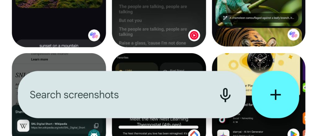
Studio has “Create” in a pill, while the button for viewing your gallery is the standard circle. Screenshots has a search bar and a ‘plus’ menu for “Camera” and “Gallery” in whatever that shape is.
Elsewhere, Screenshots is the sole app that supports predictive back, but it’s the only one without an animated splash screen. Studio is the only app to not go completely edge-to-edge (gesture navigation bar) and has no light theme, though I think that makes sense given the image-heavy nature.
Otherwise, I do think these are good modern apps that get the job done, with some truly delightful flourishes.
Microphones in Pixel Screenshots use Material You’s rotating scallop shape to signify speech-to-text is active when searching and adding notes. Dynamic Color theming plays an important role when viewing a screenshot to distinguish information about the capture from the actual image, especially text-heavy ones. I find myself using Pixel Screenshots for reminders that have assets, with the system preview in the bottom-left corner highly efficient for fast creation.
Finally, I enjoy the live Pixel Screenshots homepage with its two carousels for Reminders and Collections to the “All screenshots” grid that gives prominence to recent captures for faster identification.


I personally don’t need an image generator in my day-to-day life, but I’ve found myself opening Pixel Studio to casually browse the 10 categories that update on occasion. There are at least five generated pieces to scroll through in each feed, which you can easily swipe across.
Meanwhile, I think most people might find the image editing capabilities faster to access than Magic Editor, especially with the addition of the Pixel Studio target in the system share sheet. Personally, I’m still habitually opening Google Photos for edits, but I’m trying to use Pixel Studio more for casual edits that I don’t want backed up to my library.



Weather is everything I wanted the Pixel team to make. I think I’m coming around to the app’s main page being the list of saved locations instead of a city because it’s nice at a glance to track what’s happening elsewhere. I hope the next big update adds more widgets instead of sharing them with the Google app.
FTC: We use income earning auto affiliate links. More.



Comments