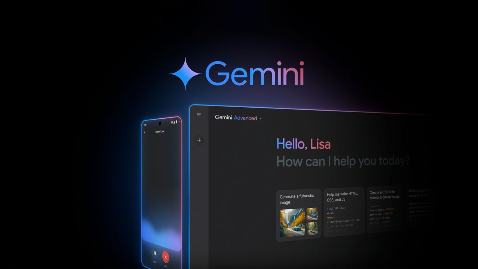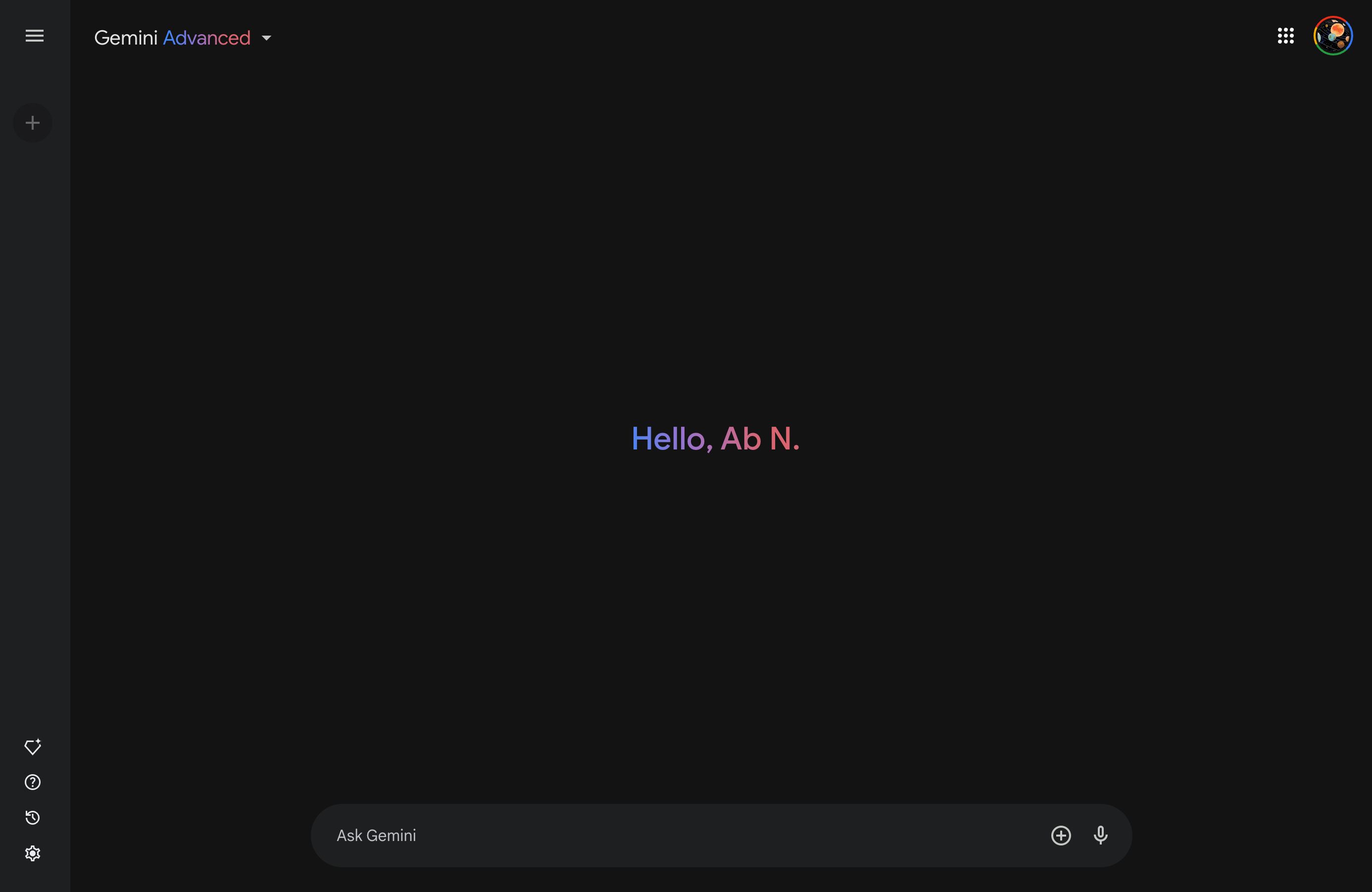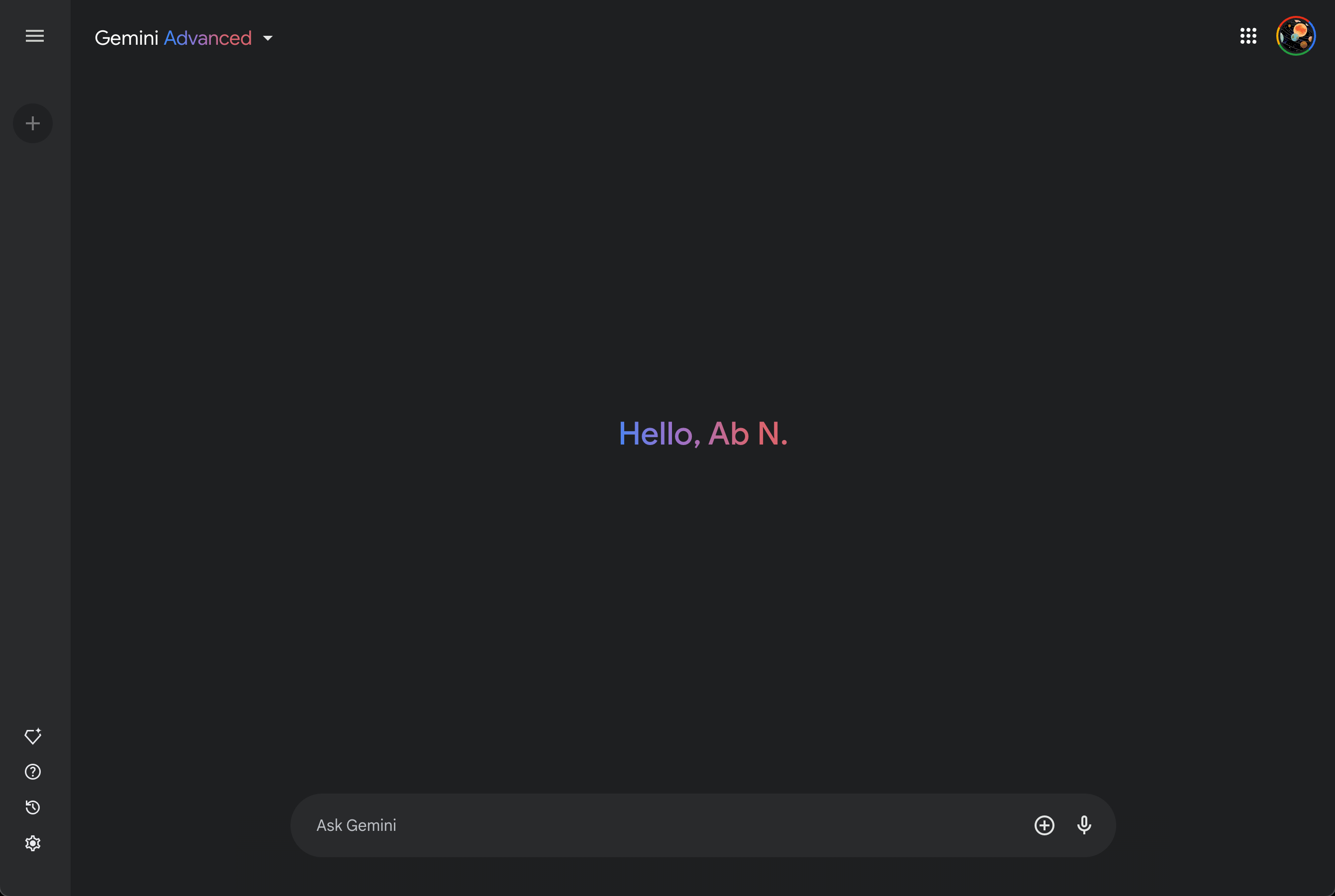
Google has rolled out a number of small tweaks to the Gemini app UI in recent weeks, and the latest changes the dark theme on the web.
Instead of a medium black or pretty dark gray, Gemini’s night-friendly appearance is light gray. The side panel and search field are also now lighter.
The new color palette online is in line with Google Search’s dark theme, which shouldn’t be surprising given how recent changes to the Gemini homepage have matched the sparse utilitarianism of google.com.


This change applies to every gemini.google.com surface, and you can see this mismatch in animations on the Extensions page that haven’t been updated.
This follows changes to the dark theme for Gemini on Android. There are still no changes to the iOS experience in the Google app.

More on Gemini:
- Gemini app rolling out ‘Utilities’ Extension for phone control: Here’s everything it can do
- Gemini Advanced gets updated 1.5 Pro model
- Report: Google targeting December launch for Gemini 2.0
- Gemini adds split-screen on Android tablets, foldables
FTC: We use income earning auto affiliate links. More.


Comments